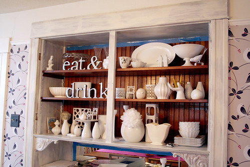
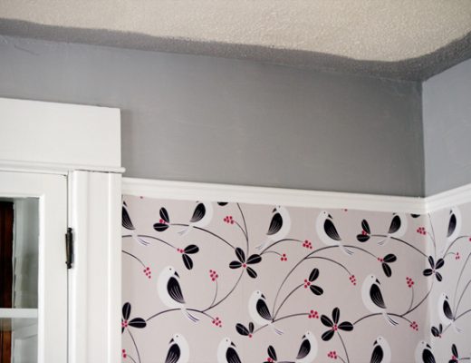
The baseboards and trim in the dining room have been painted white. The windows have been primed and painted, but are awaiting a second coat. The built-in hutch however, has only been partially primed.
I left the beadboard backing untouched because I thought it might be a nice contrast to the white (and nice to maintain just a touch of the original wood). I like it, and I think I’ll leave it, but what about the shelves? Do you think they should go white or stay natural? I can’t quite decide, and I would love to finish painting soon.


wanderluster
September 30, 2010 at 10:25 pmI’d paint the shelves white and keep the back in the wood tone, but I would change out some of the white accessories for something colourful. Maybe something pink to match the small pink accents in the wallpaper.
Pencils
September 30, 2010 at 10:57 pmtape some white paper over the shelves, put the ceramics back, leave it for a day or so, and then make a decision. Personally, I think they would look better white if you’re leaving the back natural.
BTW, I didn’t comment on this before, as I’ve been really busy lately, but I think painting your wood trim is a great idea and will make the place look so much better when it’s all finished. I say this from experience, as part of a larger project of painting the living room, dining room, and stairwell, we just painted the trim, stair woodwork, and the living room fireplace with Benjamin Moore Decorator white oil paint. And it looks SO much better than the awful discolored orangey midcentury stain. I particularly love the fireplace and the stairs, we painted all the woodwork except the treads, balusters and handrail. It all looks so clean and nice now! And looks appropriate with the recently refinished floors. I’m so happy with how it turned out!
kat
September 30, 2010 at 11:04 pmWow, so many white votes, which kind of surprises me. I think you should leave it natural. This way, the shelves blend into the background, and makes the white dishes stand out way more. I think it draws attention to your china / ceramic pieces. If you had lots colourful pieces, then I would say paint it white. I think leaving it natural makes the whole area pop beautifully! You get to see more details on the ceramics.
Melissa
October 1, 2010 at 12:13 amI think painting the back a nice grey, and then leaving the shelves as-is would be lovely. It would breakup the paint and accentuate your white accessories. White would make them fade into the background.
Melissa
October 1, 2010 at 1:51 amI’m with loads of others – I know you’re tired of painting and just want it to be done already, but I think the shelves and the beadboard would look great if you painted them all the same non-white color. The unpainted wood makes that part look kind of dingy and forgotten, maybe disordered. Just, it’s just off in a way I can’t quite pinpoint.
I would have suggested white, but I think the other commenters make a good point in noting that a slightly darker color (maybe a grey or pink) would really set your ceramics off!
mribaro
October 1, 2010 at 2:23 amSince the bottom shelf is already painted white, I think you should paint the other two as well, to be consistent. You’ll still have the back boards in natural wood for warmth and contrast. If it were my hatch, I’d probably prefer seeing the back boards painted in that dusty pink color, like your wallpaper, or I’d even go one or two shades darker.
Fiona
October 1, 2010 at 3:23 amDefinitely paint the shelves because the central spine is now painted. If you’d left it natural the shelves might’ve been ok natural. Personally I’d paint the back too, a pearly grey would be gorgeous.
Barb F (Australia)
October 1, 2010 at 4:37 amPutting in my vote for white shelves. Looking great!
Amanda @ Out of Square
October 1, 2010 at 5:27 amI would definitely leave the beadboard as is and paint the shelves white. We added a built-in bookcase that followed those details and it looks amazing! It’s all white except for the walnut veneer back we added. So sophisticated and simple. Good luck!
susan
October 1, 2010 at 7:52 amOrdinarily I’d say keep the wood but in this case I think the shelves would look better white. It’s really looking nice.
Mary Lynn
October 1, 2010 at 8:22 amI’d paint the shelves white and the back I’d try to color match with the pink of the wallpaper.
Kayzie
October 1, 2010 at 8:29 amWhite! Painting while preggers seems a bit much to bear, but the results are going to be gorgeous!
Emma
October 1, 2010 at 8:38 amI would paint the shelves white. The backdrop, though, I would paint a darker color, mimicking the dark gray (?) of the wallpaper detail.
Fiona
October 1, 2010 at 8:53 amLooks great! I think the inside should be white, but it looks good both ways.
annie
October 1, 2010 at 8:56 amI’d paint both the back and the shelves. Shelves — white, back — some other color.
It looks great. I’ll always adore that wallpaper.
kesikeno
October 1, 2010 at 9:15 amHello
love your blog
love your home
love your ideas
…
congratulations for your coming soon boy!
D
October 1, 2010 at 9:36 amsomething like this would be nice.
http://www.flickr.com/photos/71112133@N00/2340163751/in/set-72157604137514816/
Kiley Cogis
October 1, 2010 at 9:52 amWhite shelves, for sure! Otherwise it feels out of balance. And isn’t that bottom shelf already painted white?
Tiffany
October 1, 2010 at 10:21 amI think the background should be painted gray to pull from the wallpaper.
Jenni
October 1, 2010 at 10:45 ampainting the shelves white would make the beadboard backing pop event more. I think it would look better with white shelves.
Joy
October 1, 2010 at 10:50 amNatural, if you’re going to leave the beadboard natural. If you paint them white against the natural background with vertical stripes, it will look like a tic-tac-toe board.
Daria
October 1, 2010 at 10:54 amLeave them natural, to make your white dishware stand out.
margie
October 1, 2010 at 11:18 amI normally would be all for the white but since all of the things your are displaying are white I would leave it as is. I actually would suggest panting the shelves and the back a different color all together, perhaps a color from the wallpaper?
citydweller
October 1, 2010 at 11:40 ami vote white, esp if you plan to keep white ceramics on display
Ashley
October 1, 2010 at 11:54 ampaint them, but not white to match the trim. I would paint them a contrasting color!!
Averill (Odi et Amo)
October 1, 2010 at 12:13 pmHmm…I think I’d paint the shelves white, too.
Colleen
October 1, 2010 at 12:32 pmShelves white and the back beadboard black!
JLR
October 1, 2010 at 12:52 pmI’d paint the back too!
If not white – then another color, but I’d def paint it – Looks fab too BTW!
allison
October 1, 2010 at 1:00 pmMaybe I’m the minority, but I think you should keep the brown on the back and the shelves brown, I like the contrast. I love white trim but I like a little original wood as well.
Lynn
October 1, 2010 at 1:21 pmPaint them white for sure!! It’s starting to look really lovely – I’m so glad you decided to paint the trim. Will look amazing when you’re done!
Jennifer
October 1, 2010 at 1:51 pmMy vote is for white shelves and paint the back the pink that’s in the wallpaper.
ashleyD
October 1, 2010 at 2:22 pmi vote white shelves!!!
Valerie
October 1, 2010 at 2:29 pmLove all your ideas, Nicole. Congrats on the new baby, too! I’d paint the shelves white and I love the idea of painting the back bead board black or another dark color. Whatever you end up doing, I know it will look great!
Nerissamar
October 1, 2010 at 6:00 pmYou should paint the shelves & back of the hutch…. a mushroom color.. like a dark gray, similar to the color of the birds in the wall paper. That wait your white accesories would pop out.
hope it helps!
:D
lara from oakland,ca
October 1, 2010 at 8:42 pmwhite shelves, pink back!
Ann Wilson
October 2, 2010 at 1:20 amYou have been getting so much traffic on this, you should keep a scorecard.
Tape up some printer paper in the back of the cabinet to see if you like that look. It might be too much while. A pale gray might be better.
Beth
October 2, 2010 at 1:10 pmDEFINITELY paint them white. Another color would be too much going on.
Molly
October 2, 2010 at 11:00 pmI love the beautiful display of white and think that it contrasts so nicely with the natural wood. I would paint the shelves white.
Gwendolyn
October 3, 2010 at 10:12 amI think white would be better.
Julie
October 3, 2010 at 10:27 amI agree with the other posts – definitely paint the shelves white so they, and the items on them, pop out in contrast to the beadboard backing. But, I also like the idea of painting the beadboard a contrasting color – and really love the idea of grey. I think it would go nicely with the white trim, and would play off the wallpaper colors nicely too. Can’t wait to see the finished product!
Carol
October 3, 2010 at 10:39 amIf your items you are going to put on the self will be white do NOT paint the shelves white. You need a contrast to show off your lovely china/glassware. Paint the back a contrasting color to the items you wish to show off on the shelves. I’d match the back to the shelves on color. Gray is a popular color. I’d try several shades before choosing one. Good luck, you’re doing fine to far.
Erin R.
October 3, 2010 at 12:16 pmI would definitely paint the shelves. Then see if you like the back left wood or if you think you want to paint it a contrasting color.
Lacey
October 3, 2010 at 7:23 pmAt first I really wanted to vote white, but now I am not too sure since the majority of the items sitting on the shelves are white as well. I wonder how they would look painted a color pulled from the wallpaper. Too much?
meg
October 5, 2010 at 2:53 amthis might sound like it wouldn’t make a difference, BUT maybe you could paint the front edge of the shelves white. this is what we did when we replaced our kitchen cabinet doors with glass paned doors, to display our dishes and painted the interior shelves (for us it was black). it was kind of a pain to paint that narrow edge/strip white, but it looks really good. similarly with yours, the white ceramics would still pop against the wood shelves, but you’d have nice lines from the front and it would look well thought out…
Sandra Yeong
October 5, 2010 at 12:30 pmHey, i think this looks like yours buffet..
http://www.apartmenttherapy.com/sf/house-tours/amys-mission-dolores-apartment-house-call-122043
Ash
October 6, 2010 at 6:24 pmGo grey – soo chic! Check it out here especially the pic with the doors opening to the fireplace
http://www.calcotmanor.co.uk/restaurants/the-conservatory
chris rasga
October 7, 2010 at 5:38 pmHi..
I like your work!!
Chris Rasga/Brazil
my blog http://mixornia.blogspot.com
your work in my blog
http://mixornia.blogspot.com/2010/10/making-it-lovely.html