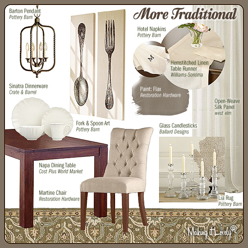
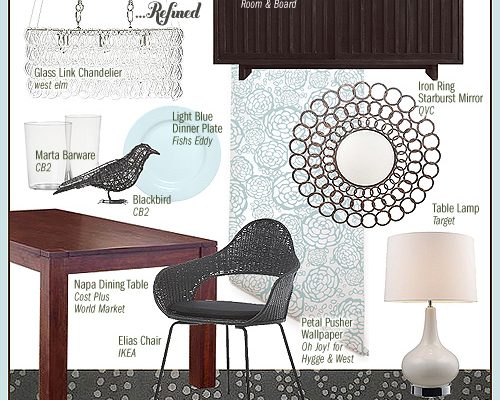
We first saw the Napa Dining Table in Anne’s Modern Country Dining Room. Her taste has changed a little since then though, and she’s now leaning toward a traditional look.
The rug, curtains, and linen table runner have remained, though the wall color is richer. She has also kept the two matching pendants above the table, and classic upholstered chairs elevate the room and make it a little more formal. She likes to set a monochromatic table in shades of cream and ivory with her new dinnerware and monogrammed napkins, and assorted glass candlesticks add some sparkle without being as formal as crystal. And Anne’s taste may have grown more sophisticated, but that doesn’t mean she can’t add a little fun with the oversized fork and spoon art.
What did you think of her dining room? It’s not my taste (you know me, I like lots of color and pattern), but I still think it’s very pretty. We’ll see the table go next to Anne’s sister Lia, who has always had a quirkier sense of style.


Erika
November 4, 2010 at 11:01 amSo pretty! Love all the cream/ivory tones.
tracy
November 4, 2010 at 11:14 ami do like the fork & spoon! Anne! Embrace color!!! ;)
Jenae
November 4, 2010 at 11:24 amI think it is very pretty. Formal dining rooms can really be elegant in a home.
jbhat
November 4, 2010 at 11:38 amWhat I love is that the basics stayed the same, but the accessories changed. Well, the chairs too. But you show that as one’s taste evolves, one doesn’t have to completely start over when deciding to redo a room. Nicely done!
jbhat
Danielle
November 4, 2010 at 11:40 amYes! Exactly!
Life with Kaishon
November 4, 2010 at 11:42 amIt is very pretty. Those glass candle holders are gorgeous. Simple and understated. Very nice.
Terri
November 4, 2010 at 11:53 amNot my style either. I can’t wait for Lia to get her little mitts on that table- she sounds more my type!
Elizabeth
November 4, 2010 at 12:13 pmI love it! Let’s not forget neutrals are colours too. :)
And that wall art is to DIE FOR!
Jess [tenpenny splendid]
November 4, 2010 at 12:24 pmPretty! I’m more for color too but I definitely wouldn’t mind this dining room.
donaville
November 4, 2010 at 7:30 pmgorgeous tufted chairs!
Clearly Composed
November 4, 2010 at 7:31 pmIt really is the perfect background for a meal. The colors in the food are the highlight in this scheme. :)
PriscilaPetersDecor
November 5, 2010 at 10:25 amLove the style! It’s chic.
tracey
November 6, 2010 at 5:50 amGiant fork and spoon art!!!! So darn cutlerly cute!
Karla
November 7, 2010 at 3:36 pmHiya Nicole. First of all…LOVE your blog. I’m a regular reader. I’m sure you’ve got a big list of topics to write about but if possible (and if you haven’t already done it), I’m in search of a design ideas for a gender neutral nursery. I’m really hating the run of the mill design/color ideas from the regular baby stores (I love winnie the pooh, but I’m looking for something a bit more unique) and would love to see your take on it. We’re not due until mid-next year so we’ve got a bit of time to research but your ideas would be great too. If not no worries, happy blogging!
Thanks!
Lila Ferraro
November 7, 2010 at 4:42 pmI think it’s a beautiful room, but definitely in need of some color or even patterns!
xoxo
Lila Ferraro
Kathryn Humphreys
November 8, 2010 at 2:14 pmJust saw this. Hope they’re giving you credit for the title :)
http://tinyurl.com/35w34lh
MiY 6c: Cheap, Quirky, & Colorful Dining Room | Making it Lovely
December 6, 2010 at 11:17 pm[…] at home in Anne’s modern country dining room, and it still looked great when her taste went more traditional. Now Anne has passed it on to her little sister Lia, who doesn’t have much money but […]