I am so jazzed. I have a whole new section to introduce to you today! I’m calling it The Filing Cabinet, because that’s where I’ll be filing away all kinds of extra goodies for you.
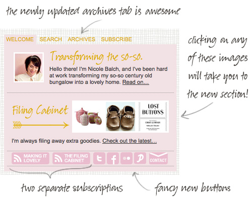
I have been working away, tweaking the design and making sure all of the technical details were taken care of. PHP and I have become good friends this week and I am happier than ever with all of the customization made possible by running WordPress. You may have noticed that the sidebar has changed. Check out the new features:
And when you’re actually in The Filing Cabinet the sidebar will show you images from the latest three posts on the main section of Making it Lovely. It’s all very fancy.
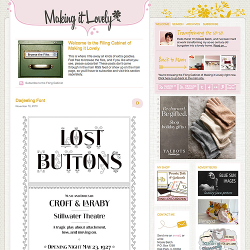
Here’s what the new section actually looks like. (And if it doesn’t look like this for you, let me know so that I can crawl into a corner and weep fix it. I’ve just finished coding this mere hours ago, so there may be a few bugs.)
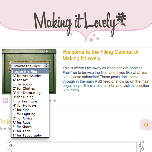
I mean, really. The filing cabinet opens and everything. Is that not the neatest feature? Am I a little too dorky to be as excited as I am about it? (Probably.)
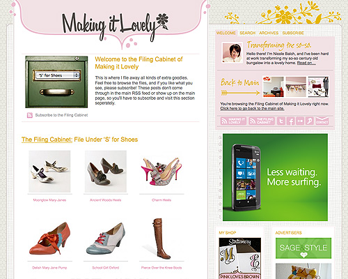
So what can you expect to find amongst the files? A little bit of everything and anything that catches my fancy. Furniture. Lighting. Fonts that set my hear aflutter. And you can quickly see what’s in each file at a glance. Here’s a peek at the ‘S’ for Shoes file.
Head on over and check it out. There are already about ten pages of goodies to look through, and I’ll be adding more all the time. The new posts can only be seen in The Filing Cabinet, and you can subscribe separately to that feed to have new entries delivered right to your feed reader or inbox. Yay!



marlene
November 17, 2010 at 10:45 amlove this new section!!! and yes, i think your newest addition could pull off those shoes :)
tina
November 17, 2010 at 10:49 amCongratulations on your new section!
The file cabinet graphic does not display for me in IE7. Let me know if you’d like me to send you a screen shot or need my JRE settings. (I’ve done a lot of user acceptance testing at work.)
Making it Lovely
November 17, 2010 at 10:53 amI had a feeling IE might give me problems. I’ll have to look into it.
Christine
November 17, 2010 at 10:51 amFun!! I always love checking out your ‘wists’ and this is so much prettier!! I love that the drop down menu fits perfectly in the cabinet, I have a basic programming knowledge and can only imagine the work that took. bravo!
Looking forward to some pretty goodies!!
Danielle
November 17, 2010 at 10:53 amsooo cool! as always, thanks for sharing – you always have such fun and beautiful style!
Kathy
November 17, 2010 at 11:14 amBrilliant! It looks fantastic!
And isn’t WordPress, like, the BEST!?!?!
michelle
November 17, 2010 at 11:28 amYou are totally awesome, any chance you are going to opne up Smart & Lovely soon??
Making it Lovely
November 19, 2010 at 11:21 amWell, I was going to, but now I’m not sure. The holiday season is a busy time for me with my shop, and life is sure to be a bit hectic when the baby arrives.
Cait @ Hernando House
November 17, 2010 at 11:36 amNice! Looks awesome!
jbhat
November 17, 2010 at 11:37 amWhat a good idea. I will be peeking into your files for sure.
jbhat
Jena
November 17, 2010 at 11:40 amGenius.
Stephanie
November 17, 2010 at 12:01 pmHow cute! What a great idea!
Jaime (Design Milk)
November 17, 2010 at 12:02 pmHoly amazeballs that filing cabinet graphic with the drop down is fantastic Nicole!
Amanda
November 17, 2010 at 12:04 pmLove this new feature!
Kelly | Glamour This
November 17, 2010 at 12:08 pmOoo love this new feature. I noticed some changes yesterday but was wondering what those were about. I started a wishlist category on my site, but nothing as fancy and neat looking as you. :)
Molly
November 17, 2010 at 12:10 pmKinda sorta obsessed with how charming the whole filing cabinet idea is. Love it!
Amanda Morrow
November 17, 2010 at 12:16 pmI love this feature and I love you new picture!!!
Jess
November 17, 2010 at 12:21 pmGood idea!
It looks like you’re trying to keep the two sections separate, so this may or may not be a bug. When viewing a normal post (ie, non filing cabinet post), the little links at the top of the page to see the previous or next post include content from the filing cabinet. Hopefully that makes sense, and if it’s done on purpose- nevermind :)
Making it Lovely
November 19, 2010 at 11:23 amOh, yes! I had been trying to fix that but ran into problems. I meant to come back to it, but I had forgotten. Thanks.
AnaLisa
November 17, 2010 at 12:29 pmCongrats on all the updates!
Roni
November 17, 2010 at 12:41 pmLove!
Mrslimestone
November 17, 2010 at 12:43 pmWhat a super fun feature. I bow down to your awesomeness :)
Kia
November 17, 2010 at 1:12 pmThank you for making sure a must read website you deserve all the accolades and sponserships you can get, because you work sooooo hard and you make a quality product.
I love this site.
Kia
Kia
November 17, 2010 at 1:14 pmOops typos. I meant thank you for making your site a must read website. :)
Claire
November 17, 2010 at 1:18 pmThe filing cabinet isn’t displaying for me properly either… (also using IE). There is a big blank part at the beginning with some text cut off to the far right. And it says “error on page”. But from what I do see, it looks great!
Leslie
November 17, 2010 at 1:29 pmLooks awesome on my computer! I’m so jealous of your coding skills. :)
Suzanne
November 17, 2010 at 1:44 pmWOW! this is amazing! The filing cabinet drop down thingy is so cool. i bow down to your amazing coding skills!
Suzanne
November 17, 2010 at 1:46 pmPS. I tried it in the new Rockmelt browser and it looks fantastic… just in case you were curious :)
Making it Lovely
November 19, 2010 at 11:23 amGood, thanks!
Kendra @ My First Kitchen
November 17, 2010 at 1:47 pmThis. Is. Awesome. I can’t imagine how much time it took you to do this, but what a great feature. And the individual subscriptions? Genius. You really thought about your readers and what we would want – even what we didn’t know we wanted! Job well done.
Ali
November 17, 2010 at 2:12 pmLovely! As always. I am agreeing with Jess’s comment on the links to your previous and next posts up at the top. If you are meaning to keep them separate, this is one area where it may not be working right :(
Super fun to browse your filing cabinet. I feel like I’m sitting cross-legged on the floor, going through your idea folder! Love it.
Laura Gaskill
November 17, 2010 at 2:37 pmWoot woot! You go, Nicole, with your bad coding self :) The Filing Cabinet is awesome. I love it. I am going to subscribe right now. xo Laura
Corie
November 17, 2010 at 3:53 pmThis is FUN! Yay! I think I’m going to love this… can’t wait to get a chance to sit down and peek inside the filing cabinet! :)
Thais
November 17, 2010 at 3:56 pmI love it!
Lesley
November 17, 2010 at 3:59 pmWell done! I love it.
I also love visiting you through your site to check out all the great things you do and make available for us all.
It’s so nice to meet (through blogs and websites)generous people who share their knowldge rather than some who expect you to pay for an amateurish tutorial on making something that, frankly is pretty simple
Thank you again
Lesley
Alicia Parsons | Atypical Type A
November 17, 2010 at 5:55 pmFunny I accidentally clicked on it yesterday and went, oo lookie here, what’s this?
I will definitely be checking it out when I finally get some new lighting or anything.
Emily S
November 17, 2010 at 6:02 pmHow awesome – I already added it to my reader! I’m jealous of your web writing ability. I’m completely clueless and will never be able to do anything cool to my blog!
elise
November 17, 2010 at 8:09 pmDon’t I spend enough time on your blog already?! Now I truly will accomplish nothing else in my life. Too much fun!
Gina D
November 17, 2010 at 9:36 pmI am so excited about the new addition! Someday I will be able to say,”PHP and I have become best friends!” ;)
misshotcakes
November 17, 2010 at 9:39 pmhaven’t had a chance to look yet but I am super stoked for you that it’s done…we know how hard you’ve been working on it :) yay for the filing cabinet. I already want to go check out the fonts…
Married In Chicago
November 17, 2010 at 10:22 pmI love it! Its so cute how you put the pull down menu right on the file cabinet@
Megan Elizabeth
November 17, 2010 at 10:28 pmI love it! My favourite part? The drop menu in the filing cabinet! :)
Nicolette @ {Momnivore's Dilemma}
November 17, 2010 at 11:01 pmNicole-
You should seriously teach coding classes to bloggers in Chicago.
I’d sign up.
This file cabinet idea is brilliant…
Would you consider teaching workshops and such?
Making it Lovely
November 19, 2010 at 11:25 amMaybe an e-class?
Rachael
November 18, 2010 at 8:52 amWhat a great idea! This will help me spend ever-expanding numbers of hours going through all your old posts, again!
Shreya
November 18, 2010 at 9:07 amIt works perfectly on Mozilla and is such a fantastic idea! I love the graphic of the green filing cabinet and the contents Alphabetized :)
Sasha
November 18, 2010 at 9:10 amI’m excited that you’re “this excited”…it makes me happy. Another job well done!
Miss B
November 18, 2010 at 2:25 pmI can’t wait, I love how organized you are and I am coo coo over your creativity!
Anne
November 18, 2010 at 2:40 pmHate to be uptight about spelling, but I am. The last word of the welcome paragraph is spelled wrong – it should be “separately”. Otherwise it looks great!
Making it Lovely
November 19, 2010 at 11:25 amOops. Thanks.
Libby James
November 19, 2010 at 9:38 amGREAT idea! I have subscribed and am looking forward to rifling through your cabinets! :)
2010 Recap: The Blog | Making it Lovely
January 6, 2011 at 8:53 am[…] a whole new section was added to Making it Lovely: The Filing Cabinet! Have you been checking it out? I post daily (often more than once) with fun finds and […]