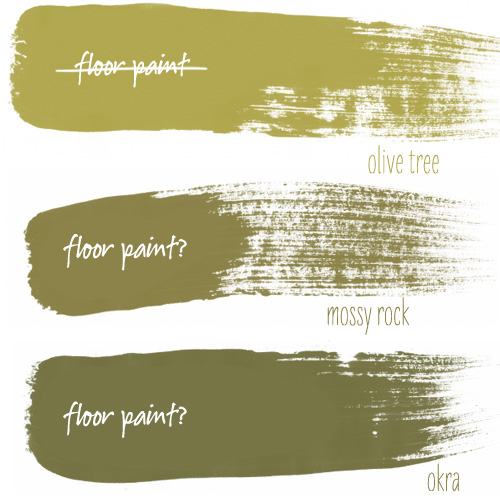
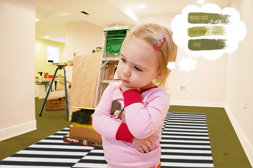
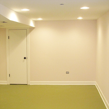
I’m having second thoughts about using Benjamin Moore’s ‘olive tree’ for the floor paint. Maybe I should go a shade or two darker? Brandon said the basement color palette was looking a little Easter basket-like, complete with the green Easter grass on the floor! I think going a shade or two darker might be the way to go to keep things from floating off into pastel territory.

The other two greens (‘mossy rock’ and ‘okra’) are both from the Martha Stewart line at Home Depot, but I’d have them matched in Benjamin Moore’s floor paint. I’m going to use IKEA’s Stockholm Rand rug for a little punch too. As you can see, this paint decision has been weighing heavily on Eleanor as well.

(unedited photo here)


Heather
January 25, 2011 at 10:09 amYour assistant looks so cute! The basement looks like it’s coming along really well!
Danielle@Newlyweds Paradise
January 25, 2011 at 10:12 amDarn it! I liked the olive tree choice, but Mossy rock would probably hide more dirt.
Making it Lovely
January 25, 2011 at 10:13 amI liked it too! I’m thinking of using ‘olive tree’ in the bathroom instead maybe.
Erin
January 25, 2011 at 10:22 amI like the Okra! :D
MIMI
January 25, 2011 at 10:22 amI like the mossy rock too it’s a good in between, but I am commenting mostly because that pose of Eleanors made me laugh out loud here at work! Adorable!
nicole i
January 25, 2011 at 10:27 ammy vote is okra!
Mackenzi
January 25, 2011 at 10:27 amOlive Tree is so lovely!! Can’t you ground it w darker furniture and throw rug options? I really admire your original color choices- so fresh and clean.
birdlover
January 25, 2011 at 10:27 amSo cute! I vote Okra.
Erika
January 25, 2011 at 10:28 amI’m liking okra!
Brandi H.
January 25, 2011 at 10:29 amMy vote is Mossy Rock. Okra looks a little to dark for me. Whatever you do, I am sure it will be beautiful.
Michelle Rosecrans
January 25, 2011 at 10:30 ami vote for okra!
Micki
January 25, 2011 at 10:32 amI also vote Okra…it love how dark it is! Looks much more dramatic.
But I think you do lose a little bit of the contrast in the rug…..
Allison
January 25, 2011 at 10:32 amThis isn’t what you wanted to hear, but I like Olive Tree! If the hubby absolutely says “no” I vote for Mossy Rock – I like the warm yellow undertones.
Rachel
January 25, 2011 at 10:32 amI think the okra is too dark. I’d go with Mossy Rock if you’re determined to go darker.
Samantha
January 25, 2011 at 10:33 amI recently put up a sample of Okra on my wall in the bathroom because my husband wanted it. It looks like someone smeared peas all over my wall. Maybe it’s because it has direct sunlight on it, but there are definitely not the brown undertones in it that the sample gives off. There is wayyyy more lime in it than I thought.
Just so you know. :)
katie
January 25, 2011 at 10:33 ami would go a different way entirely but that’s just cause i’m not an olive fan.. although anything is better than what i inherited when i moved in–a very saturated periwinkle-ish purple. i want pale warm grey floors, but i feel like they would show EVERYTHING, so i haven’t done it..
i was just going to note though, that you need to keep your eye out for the stockholm rand.. i had to buy the floor model last year when it was appearing that they’d be discontinued (we almost completely removed from the website). i don’t think they were, but they are never in stock, at least around me! just a heads up.
Meg
January 25, 2011 at 10:34 amI vote mossy rock!
Jenna
January 25, 2011 at 10:34 amOkara!
Tanya
January 25, 2011 at 10:38 amSuch a cute pic! I loved the choice you made, but the okra will look great too.
SarahV
January 25, 2011 at 10:38 amI’ve used Mossy Rock in the past, and it is beautiful, especially in darker rooms. It would be lovely in your basement!
Kate
January 25, 2011 at 10:38 amI love the okra, it makes the rug pop!
jen s
January 25, 2011 at 10:40 ami usually don’t comment, and it looks like i’m outvoted anyway, but since you asked – OLIVE TREE! go with your gut!
a) it doesn’t look like easter grass (although that’s a funny thought:)
b) you know as well as i do that your first instinct is usually the right one!
also, since you have low ceilings down there, a dark floor makes everything look tighter, no?
every color is beautiful!!
Beth
January 25, 2011 at 10:43 aminstead of painting the floor, you should paint her – a portrait. look at her thoughtful little pose. i love looking at little ones and seeing them contemplate things. adorable!
Allison
January 25, 2011 at 10:45 amI’d definitely be concerned about making it too dark. Basements usually have tiny windows and low ceilings, so to add a dark green floor might be problematic. The photo you have now might be deceptive because with a darker floor, not as much light will be bouncing around. I’d go with mossy rock if olive tree is out of the running.
Sarah L.
January 25, 2011 at 10:49 amI really like the Okra. It doesn’t read “Easter” at all and would blend well with any number of color schemes on walls/furniture/rugs.
natalyn
January 25, 2011 at 10:51 amWow it looks amazing! I really like the Okra color best. And her pose is priceless.
stephanie
January 25, 2011 at 11:03 ami may have missed this somewhere in the discussion…but…what about WHITE!! for the floors. i would give my left and right arms to paint a concrete floor white! and ,…oh…how it will enlarge your space! and, you can always change out rugs to add a pop of color. i think it would be great for this space!!
Making it Lovely
January 25, 2011 at 11:04 amI agree, white would be gorgeous! I just don’t want to clean up a white basement floor all the time. It’s going to be a kid-trafficked area and a heavily used studio.
Catherine
January 25, 2011 at 11:05 amI vote Mossy Rock!
stephanie
January 25, 2011 at 11:05 amp.s. the origianl pic that you posted on flickr with the UNfinished floor (looking rather white-ish) makes the room look soooo big! i think a white or very very light gray would look fantastic!
Kris Mays
January 25, 2011 at 11:06 amJust keep in mind that the darker it is the more it “shows.”
Kris Mays
January 25, 2011 at 11:07 amI do like the okra, though.
stephanie
January 25, 2011 at 11:07 ami have two littles (3 and 4 yo) and two dogs….i can attest to white NOT being a hassle! honestly, from experience, it’s not bad at all. in fact, i painted my kitchen a dark brown and it left more water stains and showed more dog hair than the white floors! plus, with carpets…definately not bad.
Karen
January 25, 2011 at 11:09 amIn a perfect world, I’d keep the floors light. They make the room look so much bigger.
But of the greens, I’d vote Okra.
PS – Eleanor is the cutest.
LauraC
January 25, 2011 at 11:10 amOkra!
shannon burch
January 25, 2011 at 11:11 amOKRA!!!
Cassie
January 25, 2011 at 11:16 amI saw Mossy Rock! What a fun transformation you are working with here! Can’t wait to see how it all turns out.
heidikins
January 25, 2011 at 11:22 amI love the darker color, I think it grounds things much better (and I LOVE it with the stripey rug!)
xox
Anna @ The Owl & The Phoenix
January 25, 2011 at 11:24 amI like the Okra a lot!
MichelleGB
January 25, 2011 at 11:25 amStill loving the Olive Tree, then the Mossy Rock. I think the Okra will show every speck of dust.
Jessica
January 25, 2011 at 11:31 amI vote Okra!
meryl rose
January 25, 2011 at 11:33 amI LOVE the Okra color!
Megan
January 25, 2011 at 11:35 amI like green floors; I have to admit I’m more of an “apple green” floor girl myself. I’d worry the darker green colors would look more dated. LOVING that great rug!
carrie
January 25, 2011 at 11:35 amI really loved Okra! I think it really grounds the room and offsets the light pink so well! I am DYING for that b&w striped rug, and am picking up the smaller version from IKEA this weekend. Lovely taste!
Marci
January 25, 2011 at 11:46 amOkra!
Kate @ Savour Fare
January 25, 2011 at 11:48 amI like Okra. I think in a room that doesn’t get a lot of natural light, like a basement, going with deep, rich tones is really going to bring a lot of warmth into a room that a more muted tone like the mossy rock won’t add.
jbhat
January 25, 2011 at 11:52 am1) Olive Tree
2) Mossy Rock
3) Okra
Voting for Olive Tree as first place, but extending an olive branch to Brandon as I do so.
It’s so beautiful down there! So light and bright. Fun!!
jbhat
Ann Ever
January 25, 2011 at 11:58 amOkra all the way!
my little apartment
January 25, 2011 at 12:03 pmyup, I’m also lovin’ the Okra!
Caroline
January 25, 2011 at 12:09 pmOkra is a beautiful color…looks slightly preppy with the pink walls. But, a word of caution: My in-laws have dark concrete floors, and they show every single speck of dust/crumbs. If they aren’t swept or vacuumed practically every day, the dust blows across from the A/C or heat like a (very visible) sandstorm. (Or worse, if you have dustbunnies–they look like tumbleweed!)
So, dark doesn’t necessary mean lower maintenance.
HollyP
January 25, 2011 at 12:10 pmThe ideal dirt-hider would be to rag paint (or other, random pattern) with the okra and one of the lighter colors.
Stacy @ Design Something Better
January 25, 2011 at 12:10 pmTotally… Okra!
Megan
January 25, 2011 at 12:11 pmI like them all! But then again, I love everything that you do and you don’t seem to make any wrong choices so go with your gut feeling because they don’t betray you. Although, I do think that’s a funny comment about Easter grass. Never thought that at all!
Funnelcloud Rachel
January 25, 2011 at 12:13 pmI like the Olive Tree – I think it will help lighten up an otherwise dark basement! Can’t wait to see the final product!
elissa @ faucethead
January 25, 2011 at 12:14 pmoh i do love the olive tree one, but i’m a bit biased. it looks just like the color in our logo! i’m sure whatever you decide it will turn out beautifully.
Jessika
January 25, 2011 at 12:14 pmI like the Okra. It definitely takes it to a non-Easter palette. I know you’re familiar with floor paint (on your front porch). But, to throw my experience in too, I went with a lighter floor paint in my laundry room recently. I was VERY upset with how it withstood the test of time. Plus, it was so impossible to get it to look clean. I think the Okra color, being a little bit darker, is a good counterbalance to the light walls and ceiling, but also a great color and one that will wear will and not show every speck of dust!
Leen
January 25, 2011 at 12:15 pmOkra! I like the Okra a lot.
Jessika
January 25, 2011 at 12:15 pm(or just put in cheap pergo floors!!!)
annie
January 25, 2011 at 12:16 pmOkra is my vote. The basement is looking great, by the way.
Laura Gaskill
January 25, 2011 at 12:22 pmOh dear. Well, I still think olive tree looks lovely, but I guess I can see Brandon’s point…Okra looks a little too dark to me, kind of industrial even, but Mossy Rock seems like a good compromise. But then again I can never be sure looking at a computer monitor, so I’m sure whichever you like best will be fan-tastic! xoxo Laura
sarah
January 25, 2011 at 12:22 pmmy living room is bm’s olive branch and it’s a great color. i get lots of compliments on it. check it out! :)
Bagley818
January 25, 2011 at 12:23 pmI’ve been enjoying your blog for quite some time now. Not sure why I’m just now chiming in … but i want to vote “OKRA” for sure and tell you that is a fantastic photoshop mock up! Your daughter is adorable.
Shelly
January 25, 2011 at 12:26 pmI vote the Okra. Go with your gut, everything you do is wonderful!
Justine
January 25, 2011 at 12:31 pmOkra! I think it’s got a nice amount of gray in it, making it a bit more neutral. It is dark, but yours walls will counterbalance that. Plus, the rug seems to brighten it up in your photoshopped imaged as well.
And Eleanor is adorable!
Jenna
January 25, 2011 at 12:31 pmI have used mossy rock before and it is a surprising gold undertones. I would go with okra
Stephanie
January 25, 2011 at 12:31 pmI like them all! I love the use of olive and don’t think it will be too easter-basket-y with the addition of the bold IKEA rug. I like okra or mossy rock. Olive tree looks to brown to me…
Melissa
January 25, 2011 at 12:38 pmI really like the Okra!
rebecca
January 25, 2011 at 12:40 pmI am partial to the olive tree… but really just wanted to comment on how adorable that pic of Eleanor is! They are weight decisions, indeed, to be on such small shoulders. :)
Joy
January 25, 2011 at 12:43 pmTeam Okra for me as well.
Cindy
January 25, 2011 at 12:45 pmI love the Okra as it really grounds the space. You can lighten it up with rugs. I think the Olive Tree looks like “afraid to commit” and a lot like pea soup!
Dayna
January 25, 2011 at 12:53 pmOkra!!
AK
January 25, 2011 at 12:57 pmI vote for Okra. The darker color will ground the room nicely. Still green, but not as bright.
lsaspacey
January 25, 2011 at 12:58 pmAt least in the pictures, it seems brighter with olive tree than with the other two. Just my opinion though.
tiina
January 25, 2011 at 1:03 pmokra, it looks great with pale pink
Erika
January 25, 2011 at 1:07 pmI think the first choice was nice, but the okra would definitely be my second choice for going darker. I love that rug too, by the way. I just can’t figure out a place in my home where it would fit and look good. Darn traditional place!
Kara @ KSS
January 25, 2011 at 1:07 pmI would vote Okra. The others look a little too green for me.
Jana
January 25, 2011 at 1:20 pmIf it were me I would choose Okra :)
Samantha
January 25, 2011 at 1:22 pmOkra!
aunt J
January 25, 2011 at 1:23 pmOkra.
Sierra
January 25, 2011 at 1:36 pmI love how you showed the paint colors, Eleanor looks so cute contemplating colors! I vote for Okra!
Heather
January 25, 2011 at 1:38 pmI love all the colors, but I would say Okra. I love the depth it adds to the color scheme.
Emily
January 25, 2011 at 1:44 pmAdorable pic, my vote is for Okra perfect contrast!
Katie
January 25, 2011 at 1:50 pmI personally vote for Okra. I like the contrast in the darkness of the green and the lightness of the pink on the walls
samantha
January 25, 2011 at 2:10 pmthe darker the floor, the more dust it shows…just warning ya!
Amy
January 25, 2011 at 2:15 pmOkra…Okra…Okra (in a singsongy, high school football sort of chant) Most definitely!
Amy Vermillion
January 25, 2011 at 2:26 pmI’ll be one of the lone voices of dissent. I like the Mossy Rock. I believe the okra will be too dark and draw too much attention towards the floor…making the space seem smaller.
Laura
January 25, 2011 at 2:28 pmOkra!
Dana
January 25, 2011 at 2:34 pmOkra.
Tiffany
January 25, 2011 at 2:38 pmI like Olive Tree
suzanne cabrera
January 25, 2011 at 2:48 pmWow! This is looking so great and fresh! Love the color ideas Nicole!
Circa1972
January 25, 2011 at 2:51 pmIt looks as though Baby E has done some deep thinking on the topic. What’s her choice?
Lora
January 25, 2011 at 2:56 pmOlive Tree
koryanshea
January 25, 2011 at 2:56 pmI don’t care about the color, but Eleanor is awesome! :)
Valerie
January 25, 2011 at 3:04 pmHi Nicole! I’ve been following your basement renovation … some great ideas here! My son, who is our resident color expert, and I agree on the Olive Tree. He thinks the Okra is too dark and will lose its ‘greenness’ once it’s on the floor. The Olive Tree will contrast better with the walls and the rug. Regardless, the basement will look awesome! Good Luck!
Felicity
January 25, 2011 at 3:04 pmI grew up in a house with very dark painted floors (greens, browns, grays all in colonial shades) and the rooms with the painted floors feel cold, closed in and unwelcoming. The one room with light gray feels open and airy. My parents have lived in the house for 34 years and the rooms with the darkest floors get the least use. We naturally were drawn to the rooms with the natural pine and or the light gray paint. Just some observations, do what you will with my floor color experience :)
tiffany
January 25, 2011 at 3:21 pmthe olive tree is definitely my fav!
JenWoodhouse.com
January 25, 2011 at 3:22 pmOkra gets my vote!
Alice
January 25, 2011 at 3:25 pmI love Olive Tree and Mossy Rock. I didn’t get an Easter vision at all! More like a soothing, light-filled space with colors inspired by nature :)
Stephanie P
January 25, 2011 at 3:33 pmI am all about the Okra!
ashleyD
January 25, 2011 at 3:59 pmi vote Okra!
Hallie
January 25, 2011 at 4:32 pmThanks for the photoshop–without it I wouldn’t have picked
OKRA!
kim
January 25, 2011 at 4:35 pmOkra. But I really like your ‘as-is’ colour as well! Nice Photoshop-ing too! ;)