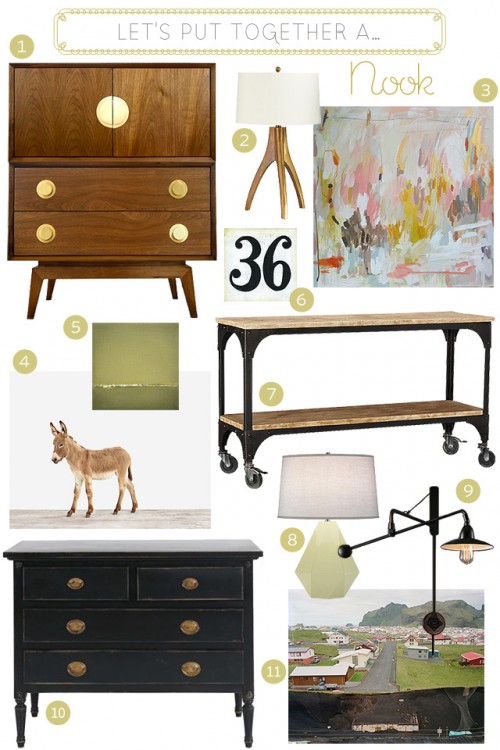
Which furniture, art, and lighting would you choose to put together a little nook? I’ll tell you what I’d choose below!
- Claude Walnut Bar
- Cleo Table Lamp *
- Keriloo *
- Baby Donkey
- Green Wave Print
- Number 36 Painting
- Verona Wheeled Console Table
- Delta Bone Table Lamp
- 1940s Architect’s Boom Lamp Sconce
- Louis XVI Dresser *
- Rift #26 (Heimaey Houses)
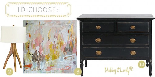
* I would be thrilled to put any of these in my home, but I think I’d go with 2, 3, and 10. I really, really want that painting.
Which ones would you choose?



Kate {domestikatedlife}
September 20, 2011 at 10:35 amI’d choose 3, 7, and 8!
Brandi
September 20, 2011 at 10:42 amI’d choose 10, 8 and 3!
misa
September 20, 2011 at 10:44 am1, 2, and 11! but i’ve been obsessed with that robert abbey delta lamp for a very long time!
MyPeaceOfFood
September 20, 2011 at 10:49 am3, 4, 8 & 10. I love that baby donkey!
Alice
September 20, 2011 at 10:59 am9, 7 and 4! Or 1, 8 and 11… I like all of the components in this round!
Making it Lovely
September 20, 2011 at 11:09 amMe too! I love everything here.
Britt
September 20, 2011 at 11:03 amThose choices for a little nook are perfect!! Love the Claude Walnut bar, the Delta Bone table lamp and the donkey picture. Thanks for sharing where we could find these items. Could make a very fun space with this stuff!
Catherine
September 20, 2011 at 11:13 amI like 3, 7, & 8. THe painting is a MUST. :)
Megan
September 20, 2011 at 11:15 am9, 10, and 11
Amanda
September 20, 2011 at 11:16 amI’d choose 1, 2, 3 and a smaller version of 4 for the table top in giraffe form (I’ve be ooh and ahhing over Sharon’s work for a while now!)
I love the colour and playfullness of 3 and the lines of the console table.
Renee Smith
September 20, 2011 at 11:23 am7, 3, 6, and 9. I’m going to have to double up on the art, and prop the numbers on the table… 36 doesn’t have much significance, though, so maybe a smaller version of the donkey for that purpose.
Down and Out Chic
September 20, 2011 at 11:35 ami adore all the pieces so this is difficult but i think i’d go with 1, 8, and 4.
Carla
September 20, 2011 at 11:39 am1,3,8 for sure, these are always so fun!
Jill Browning
September 20, 2011 at 12:06 pmI’m with Carla. The Claude Walnut Bar is awesome!
justine | lovemaki
September 20, 2011 at 11:52 ami love that michelle armas painting!
Lindsey
September 20, 2011 at 11:55 am6,8, & 10! Love your blog Nicole!
Jessica
September 20, 2011 at 12:06 pmI’m with you on 2, 3, 10. Usually I have a really hard time with these posts, because I just can’t picture the different items together very easily. But this time those three things just jumped out at me and now I’ve got some major “wanting” going on.
Priscilla
September 20, 2011 at 12:14 pmSuch a cute idea for a blog post. I love it! I’m a huge industrialist style fan and I love Sharon Montrose so I’d have to go with 4, 7 and 9.
reynok11
September 20, 2011 at 12:34 pm5, 8, 10 – looks so peaceful! I also really do love #3 as well!
Bohemian Zsi Zsi
September 20, 2011 at 12:47 pmGreat election! i´m with you, 2, 3, 10. The painting would look so well in my bedroom… :)
Nelle
September 20, 2011 at 1:17 pmI have the Cleo lamp and I love it so much I even had it rewired to work in England! Its so beautiful and gives of the perfect light… in case you needed more encouragement ;)
Kristin
September 20, 2011 at 1:39 pmI would choose what you did. :) but I also love the 36 and donkey print and like the idea of a collage of those three pictures in different sizes.
diane
September 20, 2011 at 1:44 pm1, 3, and 8 would be my choices. Love them
iris
September 20, 2011 at 2:17 pmOh, gawd. I love Michelle Armas’ work so much, I have TWO copies of her “Secret Garden” print in my apartment.
lea
September 20, 2011 at 2:31 pm7, 9 plus a comfy chair with a throw!
Sarah W
September 20, 2011 at 2:50 pmI’d do 123!
Anita K
September 20, 2011 at 3:03 pmThis room is done by a friend of mine, I thought of you with all the beautiful colors and awesome style!
http://jessicakesti.blogspot.com/2011/09/its-wrap.html?spref=fb
Erika
September 20, 2011 at 3:11 pmOh man, I need 3 nooks! Okay, I would choose 1, 3 and 9 plus a comfy chair. ;o)
Brittany
September 20, 2011 at 4:10 pm#2, #3, and #10!!!! Love all the pieces though :)
Dacia
September 20, 2011 at 5:25 pmI would go with 1, 3, and 8. I, too, LOVE that painting.
Emma
September 20, 2011 at 5:49 pm3,7,&9 … but I luuuuurve 1, its a bit tall for my nook, so it will just have to go somewhere else!
Cindy
September 20, 2011 at 5:53 pmAll good options, but I think I would go with 3,7,&9. But I would turn my nose up at any of them!
CJ
September 20, 2011 at 6:07 pmI love nearly everything here. But mainly I want to say thanks for introducing me to Sharon Montrose. I have just looked at her website and found about a dozen must haves for my little boys’ rooms! Now to decide how to justify shipping them all to Australia. Thx Nicole!
Making it Lovely
September 23, 2011 at 12:55 amHer work is fantastic, isn’t it?
Jan
September 20, 2011 at 7:39 pmI’d choose 3, 8, & 10.
Amanda
September 20, 2011 at 9:21 pmI’d choose 10, 3, & 9!
Viv
September 20, 2011 at 10:31 pmMichelle’s work is BEAUTIFUL! I’ve yet to have mine stretched and hung. I should get onto that and this post has reminded me, thank you.
Great choices – I’d go with 1, 2 & 3 myself. I’m crazy for that Jonathan Adler piece.
Desiree
September 20, 2011 at 11:12 pmI’d go 2, 3, 6, 7 – which, I know is two pieces of art but I would love to lean both pieces on that fantastic table to create a bit of a layered look. And that lamp adds just enough gild to the entire look.
ANDAC
September 21, 2011 at 12:36 am2-3-10 absolutely :)
VikaMoka
September 21, 2011 at 1:21 am2, 7 & 4 … The donkey is absolutely lovely !
Nat @ Dear Little House
September 21, 2011 at 1:26 am1,4,9! :)
Kathy
September 21, 2011 at 1:42 amAll I know is that #1 needs to be in my life, somehow, some way…So 1 and 3 for sure.
Kristín
September 21, 2011 at 9:23 amlove this post, especially #11, I was there last weekend, (http://kristinjona.blogspot.com/2011/09/we-visited-westman-islands-yesterday-it.html)- visiting my husbands relatives who live really close to where the picture was taken! Such a beautiful place.. If you ever come to Iceland (a big IF for most people, hehe) you must visit the Westman Islands! :)
Greetings from Iceland!
Kristín :)
Making it Lovely
September 23, 2011 at 12:56 amA big IF, but I’ll keep it in mind!
Rebecca
September 21, 2011 at 9:48 am1, 3, 8
Jennae @ Green Your Decor
September 21, 2011 at 10:07 amDefinitely 1, 3 & 8. LOVE the Claude Walnut Bar, and I am completely with you on the painting. It makes me want to pull out all my paint and try my hand at DIYing it.
kate
September 21, 2011 at 2:40 pm1, 2, 3.
Michelle Armas is an amazing painter. Her paintings look even better in person…I’m lucky enough to have one in my living room and I just love it.
Caitlin
September 21, 2011 at 4:22 pmI’d choose 3, 7 and 8!
Stefan
September 22, 2011 at 12:12 pm1, 3, 8(with a different lampshade) or 11,5,6,7,9. I really want 2 in my house.
Nichole
October 10, 2011 at 5:49 pmI’d choose 2, 5, and 7. Those three lend themselves most to my current color scheme (red, aqua, green), so I’d start with those and add a splash of aqua and red on the table with smaller accents or books. That is an awesome table.
La La La La Lovely Library | Making it Lovely
May 21, 2013 at 12:42 pm[…] wanted a Michelle Armas painting forever, and when the one I really wanted sold out before I could commit to buying it, I was disappointed. When I spotted that smaller pink […]