I have been working with American Express to redo a room for a reader.
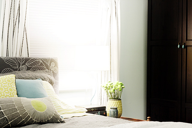
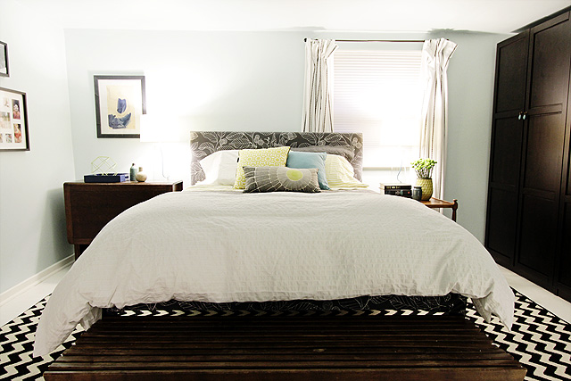
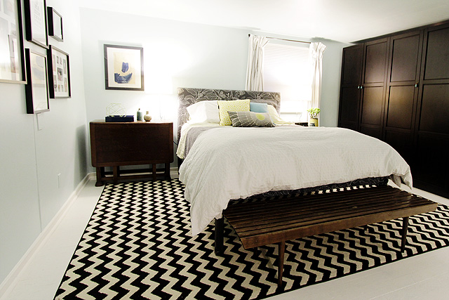
I’ve been busy redecorating a bedroom for Kathryn and her husband, Finn. They live in Oak Park with their two kids, and they asked for some help with finishing their bedroom. The space was an attic once upon a time, but previous homeowners had remodeled it. Poorly. They longed to make it feel more put together, but their kids came first and the bedroom kept getting pushed back. I showed the space to you, in progress, last week. Now the room is finished though, and I love the way it turned out! I think Kathryn and Finn are pretty darn happy too.
American Express had provided a $1500 budget, and I used their Prepaid Card to help keep me on track. It was great because I could login to check my balance anytime I wasn’t sure, which was so helpful while decorating quickly and on a tight budget.
Kathryn and I swapped the Prepaid Card back and forth a few times as I would send her to pick up things like painting supplies and the wardrobe, and then I took it back to get the smaller decorative details. I was even able to pull a little cash out to pay for the end table I found on Craigslist.
Lighting was my biggest concern when it came to budget. The room is large, but it only has one window. And that window? It directly faces their neighbor’s bathroom. Not exactly a room with a view.
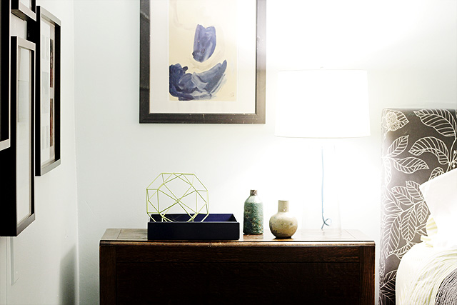
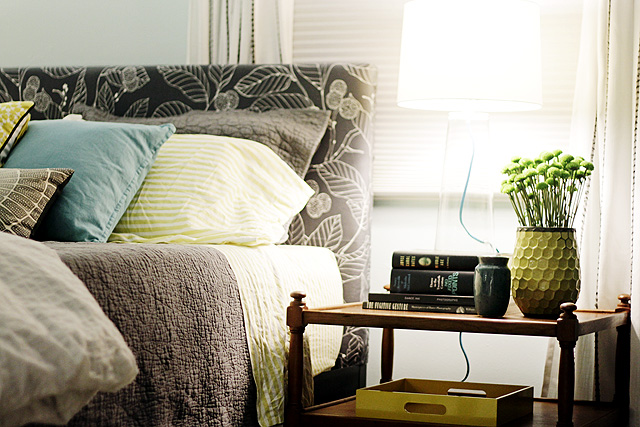
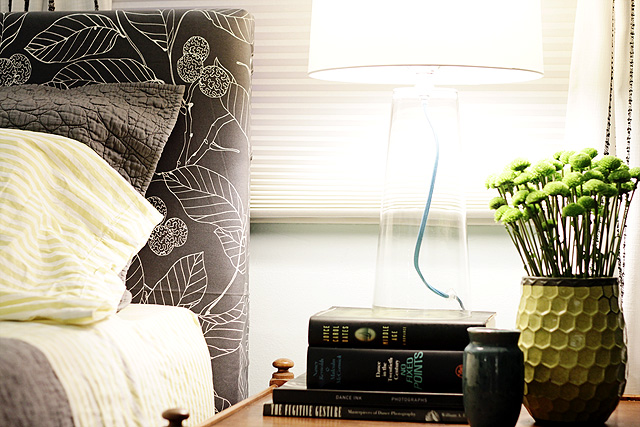
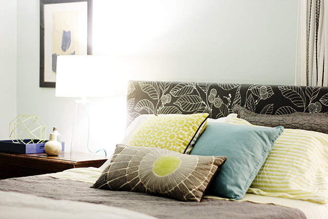
I wanted to be sure to provide plenty of light, but nice lamps tend to be expensive. It’s fairly easy to find inexpensive furniture that still looks good, but lamps are different for some reason. Luckily, I found some clear glass lamps on sale. They had a clean, simple shape with good proportions, and the added detail of the blue cord gives them some interest.
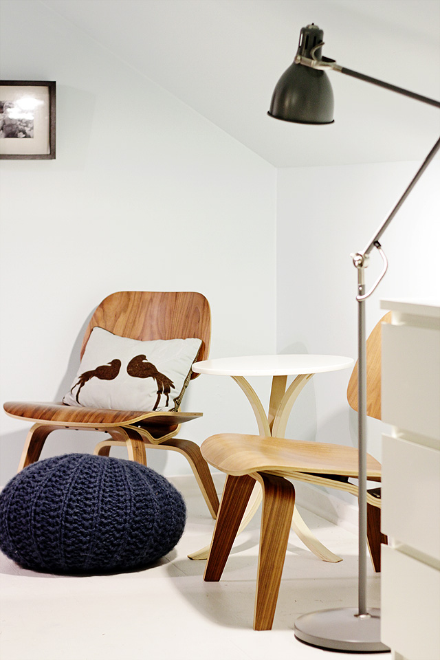
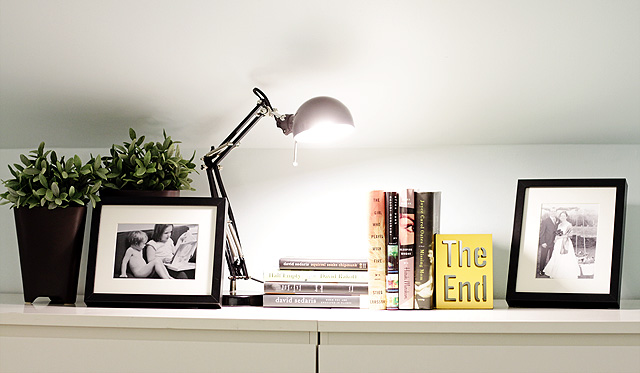
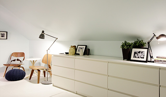
Originally, I thought I might put one lamp on the gateleg table and put the floor lamp I picked up on the other side, but I thought the room needed symmetrical lamps to balance the mismatched tables. The floor lamp ended up on the other side of the room, next to Kathryn’s pair of Eames chairs. A small task lamp that the homeowners already had was perfect on top of their dressers.
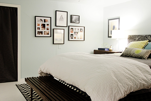
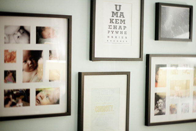
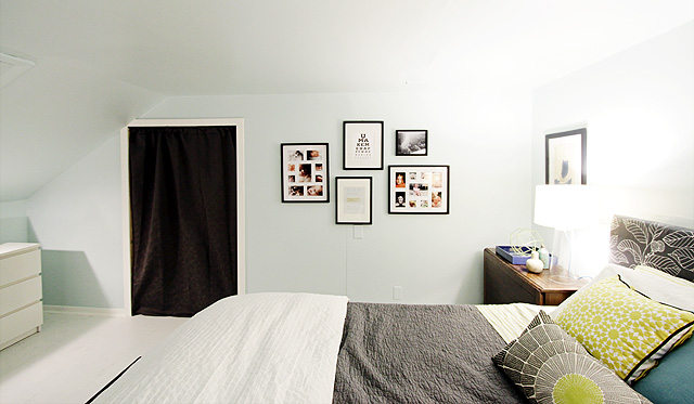
I hung art and photos that the homeowners already had in black frames, along with the print at the bottom that I created for them.
The doors to the kids’ bedrooms were curtained off. Perhaps Kathryn and Finn will add a sliding barn door in the future, but for now the curtains are a good solution. Such a simple thing to do, but it made a huge difference. Instead of feeling like an open area between two smaller rooms, it feels like a bedroom in its own right. The freestanding closet that we added helps too.
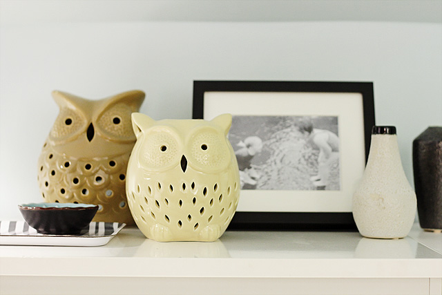
There were already four dressers in the room, but two were used as bedside tables and two were hidden beneath pipe and drape along the slanted end of the room. Pushing all four of them together made them look more deliberate in the space, and it was fun to decorate the top.
I loved working on a room in someone else’s home, and I hope to do more work for others in the future. Thanks, American Express for making this one possible. And thank you, Kathryn and Finn, for letting me takeover a room in your home!
* I’ll answer questions about where everything came from in the comments, but you can also check my Pinterest board for the room. Nearly everything (and more) is on there!



TerraSavvy / Jill V.
December 2, 2011 at 6:20 pmJust perfect! You’re hired! If you were closer I have a Master Bedroom in such need of decorating I’d let you go at.
You are amazing!
Ilana
December 3, 2011 at 10:11 pmI’ve seen the pillow with two birds (your eighth photo, sitting on a chair) in a handful of magazines & other designers portfolios, but I’ve never been able to find out where people get it. So please, can you tell me where it’s from?? Thanks!
Kathryn Humphreys
December 4, 2011 at 7:04 amchez Target, dwell studio line, several years ago. I’ve always been surprised at where that one pops up too considering its humble origins.
Sara
December 5, 2011 at 9:07 pmI love this bedroom! It’s modern without being sterile or unlivable. I love the color palette because it’s soothing and gender neutral, and you’ve added pattern without leaning on floral and there’s so much storage! I think this is a great master bedroom that any couple would be happy to retreat to.
corrin
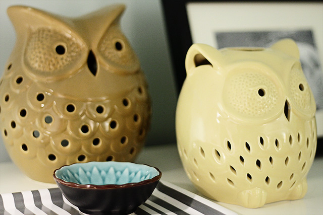
December 9, 2011 at 7:30 amCute! I have those same owls in orange that I picked up for a few dollars at Marshall’s last winter!
jennifer
December 9, 2011 at 9:08 ammakeover looks amazing! i have a question that I could not figure out from the photos – is there a staircase heading downstairs behind the wardrobe? What is keeping the wardrobe from (god forbid) tipping?
Wendy
December 9, 2011 at 2:57 pmWhere did you get the blue pouf ottoman?? LOVE!
nicole
December 13, 2011 at 6:46 pmBeautiful! Just the right mix of vintage and modern. Great choice with the glass table lamps. I never would have thought to pick those but they look great!
Kathleen
December 23, 2011 at 2:09 pmBeautiful room! I’m curious about how you like the rug? I’m thinking of purchasing it for my living room. I love the price (crazy isn’t it?). Will I love the rug?
Kathryn Humphreys
December 25, 2011 at 6:48 pmI bought the rug for my living room originally. It catches fuzz easily and with two kids and a cat, I needed to move it to somewhere that got less traffic. If you don’t have those issues, go for it. It does make a great statement.
Sara
January 17, 2012 at 6:34 pmJust amazing! Maybe Nicole you can help me with my attic conversion? Just a small flight to Australia is needed. No biggie? http://zaharadessert.blogspot.com/2012/01/converting-our-attic-into-3rd.html
cindy
February 1, 2012 at 10:53 pmNice work, Nicole. Love this room. I saw the photos in Adore and hopped over here to check out the details. So beautiful.
I’m also a fan of barn doors (but not the price for that hardware) and have that same door pinned, too. Anyhow, I wanted to let you know of a blogger who’s husband made their own barn door and hardware himself. (You do have to know how to weld or know someone who does)
At Mini Manor http://www.maillardvillemanor.com/2011/12/barn-door-done.html
you can see photos on their blog and they will send you detailed instructions on making the hardware (I already have and Ashli emailed them to me)
I plan to make these for the loft bedroom in our new house- both my husband and I can weld so that’s helpful. Perhaps you, Kathryn or Finn know someone who can or at least find a local handyman who could do it for a decent price.
Hope this is helpful- love the room
Kathryn’s Bedroom in Adore Home Magazine | Making it Lovely
February 6, 2012 at 1:07 pm[…] 6 Bookmark or Share 0 comments I helped a reader of Making it Lovely, Kathryn, with her bedroom not long ago. It was a fun project to work on, and the room is now featured in the new issue of […]
Audrey
March 3, 2012 at 1:49 pmWhere did you find those adorable ceramic owls? I love them!
Leah
March 11, 2012 at 7:18 pmCan you tell me the paint color? I love this room!
Leah
March 11, 2012 at 7:21 pmOh, nevermind – I didn’t realize Enamelware was a paint color :)
O(h) Gauge | Making it Lovely
March 15, 2012 at 2:20 am[…] Toys & Trains yesterday. It’s on Route 66, just a 10-minute drive from our house.Kathryn told me about the place, and indeed, it is the stuff that little train-loving hearts dream of. Big […]
Anatomy of a Room: The Office « Designing Around
May 15, 2012 at 8:55 pm[…] is similar to our bedroom, as many of the elements that I’d had up there moved down here when Making it Lovely redid the space for us. Even the color is the same, as I had half a gallon left over and liked the […]
Designing Around » Blog Archive The Barn Door » Designing Around
July 1, 2012 at 4:15 pm[…] we still have some patching to do around the beam, I need to find new homes for the art that Nicole so carefully arranged and I need to paint and install the handles. But I’m calling it done, […]
Honor Roll | Making it Lovely
September 29, 2012 at 3:01 am[…] Pin It September 29 Bookmark or Share 0 comments Remember when I helped Kathryn makeover her bedroom? Well, the rest of her house was already pretty awesome, and now she has a […]
Now We Are Six | Making it Lovely
January 15, 2013 at 1:33 pm[…] November 2011 – I completed my first makeover for a reader: Kathryn’s bedroom. […]
Texture vs Pattern - Designing Around
September 8, 2013 at 9:04 pm[…] Nicole redid our bedroom 2 years ago, it went from a messy disaster with no storage to a space that felt […]
Pattern vs Texture - Designing Around
September 8, 2013 at 9:13 pm[…] Nicole redid our bedroom 2 years ago, it went from a messy disaster with no storage to a space that felt […]
A Layered Bedroom in Navy, Gray, and Brass - designing around
January 18, 2014 at 9:17 pm[…] really liked the way Nicole had designed the space, but I’m also enjoying the lack of pattern there now, much more than I […]