I painted the door to the bathroom white this weekend, along with the door between the kitchen and dining room. I cleaned the bare wood, did a little sanding (and broke out my “retro safety glasses”), then primed and put two coats of paint on. I also got rid of the high chair.

I was looking through some of my decorating books, and I saw a kitchen I liked with an old industrial stool in it. I realized I had something similar from when I bought my dining room chairs, and I got excited. I also thought that maybe an old print we’ve had sitting in the basement (um, there are a lot of things “sitting” in the basement right now) would work on the wall where the high chair was. When I brought the two up, I got really excited. I may have fallen for my white kitchen.
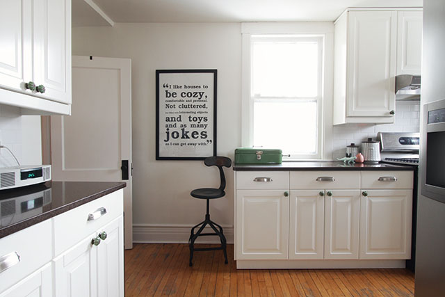
It looked like this before.
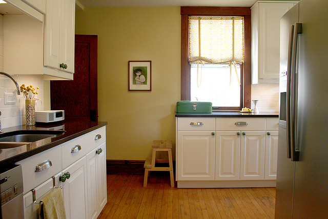
Not bad (and maybe preferred by some), but I do like the current look more. Brandon and I worked so hard on that kitchen (we demolished and replaced everything except the flooring when we moved in), but five years of yellow paint and shabby wood was enough.
Here’s the ‘get your bearings’ shot (taken from the dining room), complete with crazy lady scrawl to highlight all of my kitchen’s flaws. Yay!
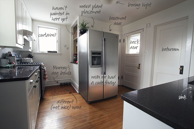
The wide-angle lens makes it look huge. It is not. The size doesn’t bother me, but all that white is a little boring. Maybe painting the back door would help? Or a colorful refrigerator! OK, the door is more doable, but I’ve been dreaming about having a cute fridge for years. I mean, COME ON. I could totally pull that look off in my kitchen.
Moving on.
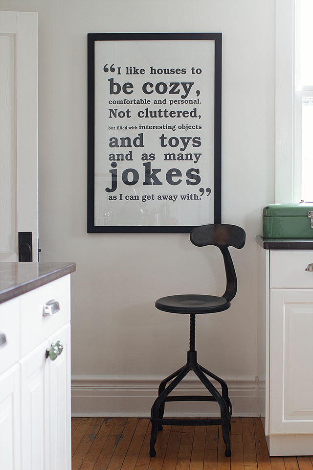
The print belonged to Brandon’s grandmother. My mother-in-law said that her mom talked a shop owner into selling it to her, though it wasn’t actually for sale. I was able to attribute the quote to Candice Bergen. I don’t know anything more about it, but I do like it a whole lot.
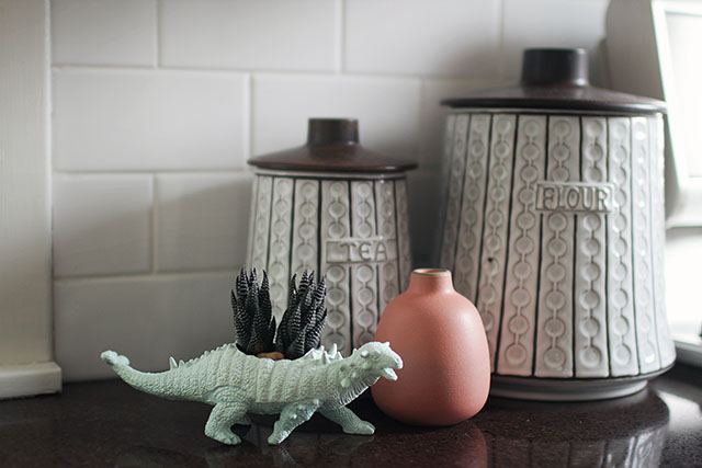
That little dino guy used to be lime green. He stays because August likes him so much, but I did give him a more subtle paint job. He and the vintage canisters were picked up at The Vintage Bazaar, and the Heath Ceramics vase was a San Francisco souvenir.
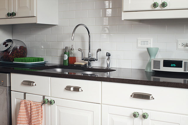
The sink side of the kitchen looks like it has all along. Some flowers would be nice in that vase, but alas, none on hand.
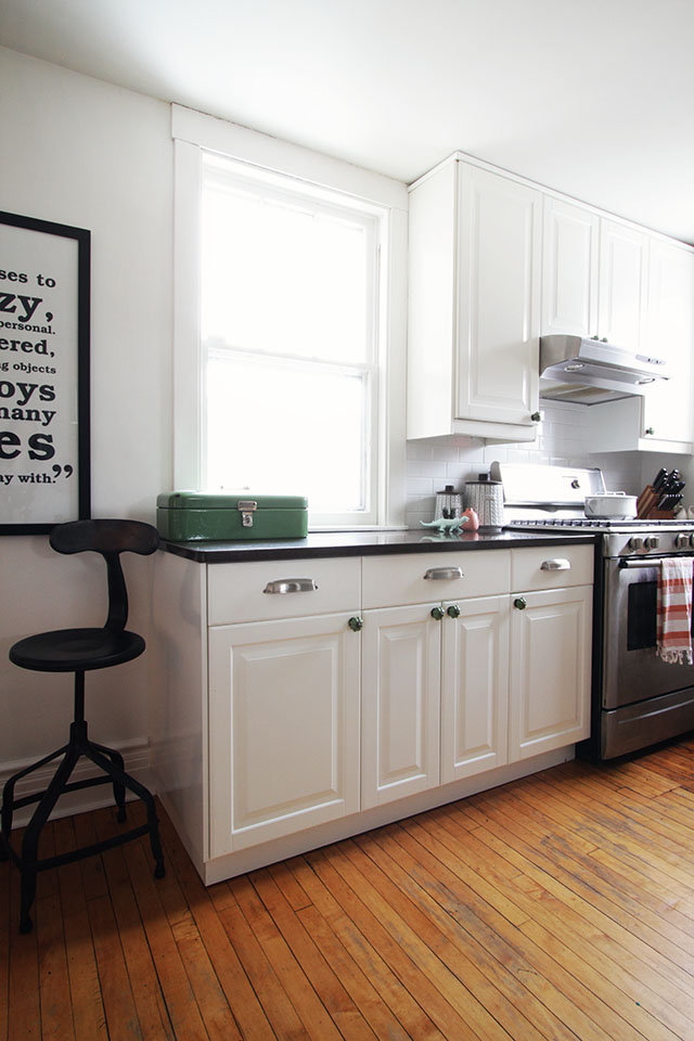
Just like last time, the window treatments are coming in last. I’m second guessing my decision to use the Rifle Paper backdrop fabric because the windows actually look good bare. Although maybe they could go from good to great with curtains? Roman shades? Roller shades? Or the fabric from the curtains I just tried in the office? (Those are likely being returned soon.)
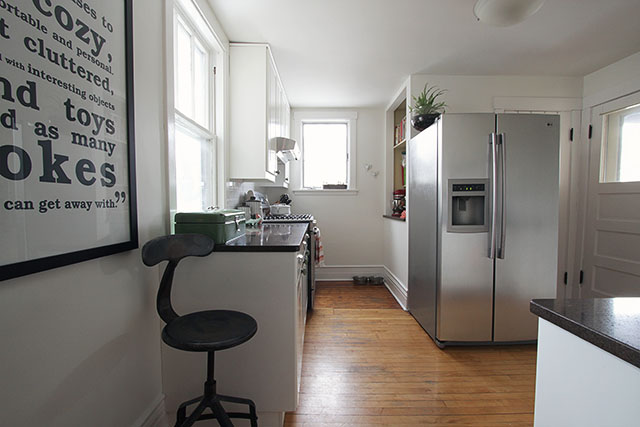
I was going to paint the lower cabinets. Again, now I’m not so sure. I think I should paint the back door, and maybe bring in a rug. New light? Keep the white paint? I don’t know anymore. I like the white a lot more than I did though, that’s for sure. Not bad for a DIY IKEA kitchen in a hundred-year-old bungalow.


barbara
February 12, 2013 at 4:36 pmI love your white kitchen! My husband came in as I was looking at it and we had to do the whole house tour- very impressed! You have a very excellent eye:).
Lisa
February 12, 2013 at 6:59 pmYou could paint the doors and window frames black? It would give you some contrast and highlight the windows. Looking lovely!
Carly
February 12, 2013 at 9:33 pmI like the white!
What about painting a thick bright stripe around the border of the ceiling–not right up against the wall, but set out a few inches?
Juliet
February 13, 2013 at 1:05 amOoh, I am so happy Emily Henderson asked her readers to vote on the Homies, because otherwise I never would have found your blog again! (p.s. I voted for you.) I got caught in a blogroll cycle and stumbled upon Making It Lovely in 2008 or so but cleared my history and then couldn’t remember your blog name or how to find it again. Cut to now, and you are in two blog bookmark folders, just in case.
I love your kitchen and I made a little pinterest board (since I have to live vicariously through others in pursuit of a lovely kitchen.) which is also more fun than typing a bunch of sugegstions out.
http://pinterest.com/julezburn/accents-for-white-kitchen/
Sarah @ 20 State
February 13, 2013 at 3:35 amI have just painted my kitchen today and I’m writing this in the recovery position! I love a white kitchen, super classic, classy and easy to retouch! The fun is in the accesories…curtains, dishes, rugs ect, thank goodness for Etsy.
nic
February 13, 2013 at 11:24 amI LOVE the all white and think that it really makes a smaller space look fresher….
Weird question, but I am doing my backsplash in my kitchen with white subway tile and I have been agonizing over what colour grout to go with – I love the look of yours – is your grout a “true white”?
Thursday's Things - Designing Around
February 13, 2013 at 8:36 pm[…] 1. 2. 3. 4. 5. 6. 7. 8. 9. […]
Amy
February 13, 2013 at 10:08 pmI love your white kitchen but it does need color somewhere. What about painting the ceiling a color? I actually love the fabric you were thinking for the windows. Maybe do a cafe curtain on just the bottom half of the curtain? And you can never go wrong with a rug. ……one more thought, you could also paint out the frame on the quote a fun color.
Nancy Haberman
February 14, 2013 at 8:30 pmLove it white. Paint the inside of those open shelves some nifty color!
Make-Living
February 15, 2013 at 3:36 amWow! I just love the change. So smart! We have just recently renovated our kitchen too in black & white.
Thank you for sharing!
Sacha (@zigged)
February 15, 2013 at 7:25 amI do think an all white kitchen can look boring too…but yours looks fresh and bright. I have no doubt that you will find just the right accent, whether it’s painting the door, adding a curtain, both, neither, who knows. I don’t have any helpful suggestions but I did want to say that I think your decisions are going in the right direction.
Oh! I do have one suggestion: Maybe a rug along that strip where the wood doesn’t match.
Karissa
February 15, 2013 at 10:58 amPaint the back door, add a rug and curtains. Your white cabinets – black countertops – wood floor – kitchen is my dream. Beautiful, and I love the print!
Adrienne
February 15, 2013 at 4:39 pmwhat about painting the ceiling a color? baby blue. Turquoise. pale pink. Then you’d have your B&W kitchen, with a splash of color on top. :)
Nikki
February 17, 2013 at 8:47 amI think an all white kitchen looks great, especially with contrasting countertops. I dont think I’d add anymore paint colors but I agree about the cute Smeg fridge. But have you looked inside one? OMG, It wont hold enought food to feed a family for one day! Maybe if you relocate you current fridge to the basement you could have your cake and eat it too! Love, love, love reshopping from your own home, the stool is perfect. I have a vintage “ladies counter stool” as the shop owner described it “…for peeling potatoes and such…” Well I dont peel alot of potatoes but I do make alot of cakes and its nice to have a place to perch.
Black and White Wall Art for the Kitchen | Making it Lovely
February 18, 2013 at 3:33 pm[…] didn’t like the white walls in the kitchen until I added our big black and white print. Now the walls look intentional instead of forgotten. I would love to recreate the print for you as […]
Bethany
February 20, 2013 at 12:10 pmLooks super crisp! I think that orange-red color of a desk you featured in another post (desk51)would look great on your backdoor…maybe even the bathroom door too…although that’s alotta color. Do you need to have full curtains? Cafe curtains might allow you more light.
Quite the transformation! You’ve made it lovely!
Kate
February 25, 2013 at 7:42 pmIt looks awesome! Where did you get your drawer pulls? They look large… I’m looking to replace the ones in my kitchen and need 5 inchers. I’m having a hard time finding anything sleek or industrial looking at this size.
A Striped Rug for August’s Room | Making it Lovely
February 27, 2013 at 9:29 am[…] Prepare thyselves for striped rug overload right this way! I’m considering this runner for the kitchen (such a good […]
Kitchen Lighting Options | Making it Lovely
March 5, 2013 at 10:03 am[…] the right size and has the right light output, but I never did like it all that much. Now that the kitchen has been updated a bit, I want to replace the semi-flush mount fixture with something prettier, but not lose too […]
A Colorful Door, Colorful Appliances | Making it Lovely
March 6, 2013 at 8:25 am[…] was thinking some more about lighting, and the plan for finishing the kitchen’s minor update. OK, really what I was doing was fixating on getting a new fridge in addition to painting the back […]
LJ
March 6, 2013 at 3:26 pmLove everything so far. 10 votes for a rug (something well priced and patterned for obvious reasons). I just added one in our kitchen (because our newly refinished hardwoods were taking a beating) — and in addition to seriously warming the kitchen visually and underfoot, I found that our toddlers play more in there now too which is nice when I’m cleaning up and cooking. Try something that you already have and see what you think!
Any chance of relocating the fridge to the recessed shelves area across from the stove? You could then add shelves where the fridge is and your beautiful cookbooks and accessories would become the focal point — while improving the traffic flow to the back door… which would also be more visible, should you choose to paint it with a pop of color.
A Big Ol’ Clock and Hanging Planters | Making it Lovely
March 14, 2013 at 11:29 am[…] the kitchen. I don’t think my old “Eat” sign above the fridge is coming back, and the fern in a punch bowl (yep) that’s on top of the fridge right now looks funny. A couple of these may be their […]
Catherine
March 14, 2013 at 1:37 pmI love the all white! It’s really working for me with your funky modern retro vibe. And I know you love it too, just had a thought after you posted the beautiful wall planters and that big wall clock. I haven’t read thru ALL of the 150 comments so I apologize if this is a repeat suggestion/question. Can you turn your exiting, not exciting but probably great size for 4ppl, fridge to face the range? And then give it a full height mdf side and back- painted white of course. I could totally see the clock and planters greeting you on the new wood side of the fridge as you walked into the kitchen. In my head, it looks so fun. Heck you could even do some chalkboard paint detail for E and A on that wall too. And you could have more closed storage above the fridge too. Well, I’m sold in my mind, but it is your house ;) just had to share!
xoxo
Audrie
May 29, 2013 at 1:22 pmWe’re about to move to a new house and your kitchen is my idea of a perfect kitchen! We have to paint the cabinets and change countertop / backsplash, so fingers crossed mine will be perfect very soon!