I’m basing three different looks on a single rug for this edition of Making it Yours, per a reader’s request. She wanted to know how to incorporate a traditional red rug with her more modern taste, so that’s exactly what I’ll be doing. When I announced it yesterday, many of you expressed interest because you, too, had a similar problem.
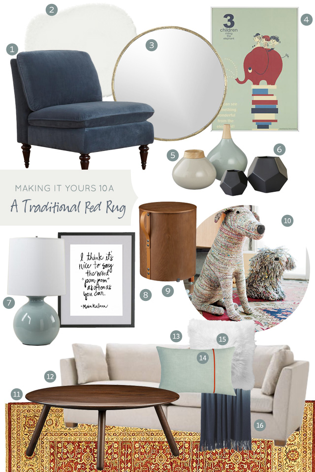
Today’s living room design bring in the color of the moment, mint, along with a deeper blue to counter all of the reds and golds in the carpet. The warm wood tones of the furniture, a little brass, and touches of red still speak to the rug (so it doesn’t feel like it was just plunked down in the space), and there’s a nice mix of round and curvy shapes to bring some femininity to the room. I chose art with a sense of humor to finish the look.
So, what do you think? We’ll see the red rug in another living room next time, but with a completely different color palette.


Elba :: Live Colorful ::
April 24, 2013 at 5:43 pmHi Nicole!
Those puppies are simply adorable! Almost as cute as the real ones.
Xo, Elba
Kristi -SIMPLEPRETTYTHINGS
April 24, 2013 at 5:54 pmI LOVE this and I had to pin the doggies!
eskimo*rose
April 24, 2013 at 6:17 pmOh those doggies are fab – do you think my son would be satisfied with one like that or would he still want a real one?!
Danielle
April 24, 2013 at 6:56 pmOh how I love it when you do interior design posts! Almost as much as the women’s clothing ones – tho maybe more becuz I’m more likely to justify furniture to my husband (that we can both enjoy) vs some amazing sparkly shoes for me!
patricia
April 24, 2013 at 8:20 pmOMG totally unbelievably awesome. I would have never thought of this! This is great inspiration!
emily
April 24, 2013 at 8:58 pmtotally impressed with the room you put together! i love the mint with the red. can’t wait to see the other options you put together.
Nicole @ Dutchie Love
April 24, 2013 at 10:36 pmI adore this color combination! Also, designing with a sense of humor is the absolute best :) Great first option for the traditional rug, can’t wait to see the next ones!
Yadira Batres
April 24, 2013 at 10:59 pmI love it, and I have to say those chairs are awesome I have them, and im just in love with them.
http://weallneedalilcreation.blogspot.com/2013/03/long-time-coming.html
Lauren McGregor
April 24, 2013 at 11:09 pmI own one of those dogs! (the tall one) We named him William :)
Imogen
April 24, 2013 at 11:16 pmMy father’s nick name since becoming a grand father is lovingly now ‘pom-pom’. Making this print beyond perfect, have just tried to buy it, but they don’t ship to New Zealand. Any ideas where else I could order it from?
Liz
April 24, 2013 at 11:18 pmLove this! I have a big rolled up oriental rug that I’ve been storing for years- this might inspire me to roll it out. “Making it Yours” are always my favorite posts. You have an excellent eye!
Brittany
April 25, 2013 at 6:23 amI kind of love this! Might be a bit biased because of the mint, but the art, the chair, mirror, couch, rug – love it all! Can’t wait to see what’s next!
Erin
April 25, 2013 at 7:34 amI LOVE this!
Cathy
April 25, 2013 at 7:42 amWow, LOVE what you did with this rug, it definitely reads modern! Great color choices to, gets my creative juices flowing for sure… can’t wait to see what else you have cooked up for this guy!
Joy
April 25, 2013 at 8:03 amOh, that blue chair. How I miss having a World Market 10 minutes away!
Megan @ Rappsody in Rooms
April 25, 2013 at 8:16 amWhat a fun series! I especially love this one because I feel like we all have that really nice item we can’t part with but it doesn’t exactly jive with our current style. I definitely did something like this with my china cabinet! http://rappsodyinrooms.com/2013/01/25/make-it-work-china-cabinet-makeover/
AliceB
April 25, 2013 at 8:45 amI really love this! I wouldn’t have thought to pair the colors in the rug with the blue hues you picked, but that’s why I don’t have a design blog – ha! I’m in love with both prints and the chair you chose, too.
Sara B
April 25, 2013 at 9:00 amThis is so amazing! Very nice work!
Nitya
April 25, 2013 at 9:10 amHey Nicole, I love this series, very creative! I really appreciate your input. I have a similar issue and have more modern taste but often cannot let go of my indian roots and have a beautiful Indian traditional wool rug from Pottery barn in my family room. I love red, gold but also like grays. So my family room is painted with Contented (Sherwin williams). and has dark wood/brown furniture with some oak wood tones to match a banister and my floors in the adjoining dining area (I have carpet in the family room which I have tried to mask with the lovely rug. I liked what you did here… but, I feel like maybe you included too many blue gray tones. Maybe, you could have accessorized a little more with red/yellow/orange gold tones. For example, the lampshade/base with a bold pattern or pillows with those colours but more modern to counter the rug. Just my humble opinion. Keep up the wonderful work. I simply love your blog.
Kayla aka Kilo Bravo
April 25, 2013 at 9:11 amLove it! That is all… :-)
Nitya
April 25, 2013 at 9:13 amHey Nicole, I love this series, very creative! I really appreciate your input. I have a similar issue and have more modern taste but often cannot let go of my Indian roots and have a beautiful Indian traditional wool rug from Pottery barn in my family room. I love red, gold but also like grays. So my family room is painted with Contented (Sherwin Williams) and has dark wood/brown furniture with some oak wood tones to match a banister and my floors in the adjoining dining area (I have carpet in the family room which I have tried to mask with the lovely rug). I liked what you did here… but, I feel like maybe you included too many blue gray tones. Maybe, you could have accessorized a little more with red/yellow/orange gold tones. For example, the lampshade/base with a bold pattern/color or pillows with those colors but more modern to counter the rug. Just my humble opinion. Keep up the wonderful work. I simply love your blog.
Henna | HENNA BLOSSOM BLOG
April 25, 2013 at 10:15 amI’m loving this series as well, Nicole! I thought that side table was a rubbish bin at first and I NEEDED it. ha. Although it’s quite cute as a side table at closer look. I’m not sure why I said “rubbish bin” (um, garbage can)…I’m from Chicago, ha. I guess I just felt fancy looking at your post. ^^weirdo
I reaaaally love that mirror as well. I would have mirrors everywhere if I could. :) I just realized that sounded really self obsessed…I just mean that I love the light and character that they add. ;)
And not to be TOO self promotional but it would make my day if you checked out my latest fashion post. I think it would be right up your alley. Every day fashion, and especially for those of us with sticky toddlers hanging around. :)
Here that is:
http://hennablossom.com/?p=2248 (<- Spring Style).
xo,
Henna
Tricia
April 25, 2013 at 12:22 pmThank you so much for this series. I have a red traditional rug that I actually bought on a trip to India! (I went years ago when I was young, way before kids.) I’m so sentimentally attached to this rug and there is no way I would ever sell it. But I have a much more modern house now and I’m struggling to incorporate it.
Making it Yours 10B: A Blush of Pink | Making it Lovely
April 25, 2013 at 12:47 pm[…] I’m basing three different looks on a single rug for this edition of Making it Yours, per a reader’s request. She wanted to know how to incorporate a traditional red rug with her more modern taste, so that’s exactly what I’m doing. Yesterday, we saw the rug paired with a cool palette of mint and blue. […]
Making it Yours 10C: Room for Reading and Writing | Making it Lovely
May 9, 2013 at 6:02 pm[…] series, you see a few pieces showing up again from previous looks. The lamp and vases were both in the first design, and now they’re being used again for this home office/library. In fact, the blue chair […]