We should have done this years ago.

Our house likely had both an unfinished attic and basement when it was built in 1910, so this bathroom on the main floor (right off the kitchen) would have been the only one. All of the fixtures are original: the hex tile, pedestal bathtub, toilet, and wall-mounted sink with separate hot and cold taps.
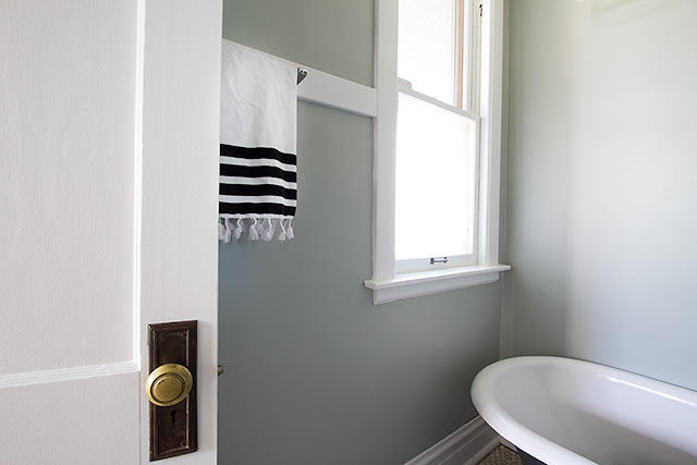
We changed the shower curtain when we moved in, but lived with the mint-toothpaste-green wall and trim color for over six years. I didn’t love it, but it didn’t bother me enough to change it right away. I bought a new shower curtain a little while ago to change it up again, and more recently I changed the toilet seat lid from white to black. I’d been planning to paint since, oh, forever, but couldn’t decide on a color. Turns out it’s much easier to pick a color when you step out of your own weirdness about choosing just the right hue and instead just pick something neutral-ish that will complement the blue in the tile! The bathroom is charming now that it’s a soft blueish gray with crisp white trim, and I’m kicking myself for having waited so long.
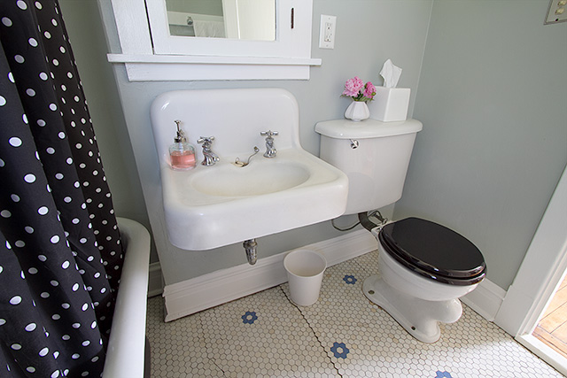
Now I’ll have a sweet little bathroom that I only get to enjoy for a couple of months or so, until we sell the house and move. Stupid earlier indecisiveness.
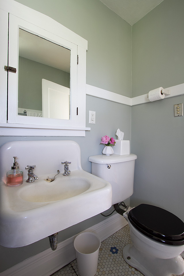
The wall color is Keystone Gray, and the exterior of the bathtub is Onyx. The white trim is Snowbound (leftover from painting my office), and the ceiling is White Dove (the pint leftover from testing whites for the kitchen was put to good use). The wall color is similar to the color in my office, but a little more subdued, and with a little less green. Both rooms are on the main floor, so it’s nice to have some continuity in the color palette.
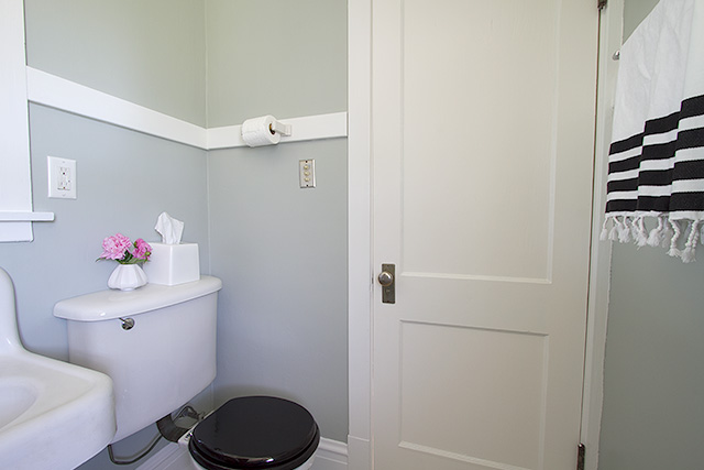
I always thought the bathroom was kind of cute, because I could see the potential in it. Now it’s cute in real life though — not just in my head. It’s much better this way.


Guylaine Côté
June 3, 2013 at 1:27 pmIt is very pretty!!!
miss alix
June 3, 2013 at 1:31 pmwow so much cuter. i really love the light grey, totally makes the original elements stand out.
Sarah from a fine line
June 3, 2013 at 1:34 pmLooks fantastic. It’s amazing how a coat of paint (in the right color) can completely transform a room. I love the tub, it’s really interesting and I like the two toned thing. Nice job, as usual!
Mary | lemongroveblog
June 3, 2013 at 1:41 pmSo cute!! I absolutely love it!
Ashley @ She Makes A Home
June 3, 2013 at 1:41 pmI LOVE that shower curtain! And I never considered changing just the toilet seat to another color. Great job!
julia-lifeonchurchill
June 3, 2013 at 4:10 pmlove the toilet cover choice. matches the shower curtain and emphasizes the vintage-ness of the space!
Andrea
June 3, 2013 at 4:19 pmI love it Nicole! That shower curtain is perfect. I have to ask though, can people really reach the toilet paper when they’re using the loo? Sorry, but curiosity is getting the best of me ; )
Making it Lovely
June 3, 2013 at 6:35 pmIt’s oddly high, I know! You can reach it while sitting down though, I promise.
robin
June 3, 2013 at 4:21 pmAndrea, I had the exact same thought. Its placement seems a bit odd.
Lynn Cicchetti
June 3, 2013 at 4:36 pmIt turned out really cute. I like color scheme a lot.
Katharine
June 3, 2013 at 5:47 pmThat is some crazy high toilet paper! (BTW, love the room!)
Making it Lovely
June 3, 2013 at 6:37 pmI know! If I had more time, I would have removed the holder, spackled the holes and painted, mounted the holder lower and anchored it into the plaster. I guess it’s a weird quirk that we learned to live with though, since it doesn’t bother us anymore.
Christine
June 5, 2013 at 3:37 pmhahaha, I didn’t even notice the toilet paper! Totally cute quirk, I like how it blends with the moulding.
Amazing job on this bathroom!
Ashley
June 3, 2013 at 6:09 pmWow – I never thought about changing the toilet seats to a different color, but I love the contrast!
Nicole
June 3, 2013 at 6:32 pmThe toilet paper roll is so high!!!! But I love the rest!
Sandra
June 3, 2013 at 7:42 pmCan I find your hand soap pump anywhere?
Making it Lovely
June 3, 2013 at 8:40 pmIt’s from Target.
allison
June 3, 2013 at 9:30 pmWe’ve got the exact same tile in our 1920’s bungalow in Beverly! Sad to say its going to go one day when we renovate, too many cracks.
Jen @ RamblingRenovators
June 3, 2013 at 10:38 pmWhat a completely adorable bathroom! Funny what we learn to live with.
Melissa
June 3, 2013 at 10:54 pmI love that shower curtain!! Oh my gosh, the black tub with the shower curtain and toilet seat is truly inspired!! Congratulations!
Lizzie
June 3, 2013 at 11:33 pmI like it! Now you’ve got me thinking about black toilet seats..it looks ever so cool. That toilet paper holder gave me a laugh:)
Lindsay
June 4, 2013 at 1:37 amSo much better yes! You are about to blow up double time with a new house and so many new projects! Go Lady!
Anna
June 4, 2013 at 2:36 amIt looks great. The shower curtain is cute too
Kate
June 4, 2013 at 3:54 amAwesome! This looks so great. We’re redoing our bathroom in black and white too! Any chance you can use your designer magic to find an affordable black & white bathmat to put in front of the tub that also happens to be washable? :D
Sarah
June 4, 2013 at 9:14 amOhh, it’s beautiful :)
Laura
June 4, 2013 at 10:54 amI love that subtle color on the wall – light and airy, but still providing contrast to the white things in the room. And it’s great that you have kept (and been able to actively use) so many of the original fixtures. Nice!
chris
June 4, 2013 at 11:38 amThe color really makes it seem crisp and fresh! (And as others mentioned, the toilet paper placement is just too funny. Maybe someone had a dog? Or kids who took too many sheets…)
Mary
June 4, 2013 at 12:38 pmEverything looks so cute. But if it was my bathroom…I’d be on the floor painting the blue tiles black.
Jenn
June 4, 2013 at 12:41 pmLove it! I personally was holding out for pink with that adorable polka dot shower curtain, but amazingly love the gray. And the tub is fabulous, btw. You’re so good. PS- where can I find the towel? All the ones I’ve found are a disappointing shade of gray that they touted as black :(
Alanna @Toronto Mama
June 5, 2013 at 12:41 pmSuch an awesome bathroom! I adore the hex tile, and the shower curtain. Great job! I can’t believe you’re selling…it’s just so sad!
tereza
June 6, 2013 at 10:48 amIt looks so good! I love the tile. I just recently repainted our bathroom and put up new decor, and what a world of difference!!
Stephany
June 7, 2013 at 10:29 amGorgeous. Just wondering if you had to use a special kind of paint for the tub…
Cindy
June 9, 2013 at 4:17 pmBeautiful. I LOVE gray rooms right now. How did you get such a glossy finish on the tub?
Making it Lovely
June 9, 2013 at 4:18 pmI used semi-gloss paint and a small roller.
Amanda @ Our Humble Abode
November 20, 2013 at 8:35 pmHi Nicole!
What type and brand of paint did you use? Anything special? Or just a normal latex? And a small foam roller? I’ve got a tub to refinish and yours looks great. :)
Thanks so much!
Making it Lovely
November 20, 2013 at 8:40 pmI think I used Benjamin Moore Advanced, and a small foam roller. I remember needing to wait a long time between coats (something like 16 hours, so I did one coat each day).
michelle
June 10, 2013 at 8:21 amso…. the top and bottom of the walls look like two different shades of grey…. or is this just a lighting thing playing tricks with my eyes?? is it really all the same paint of grey?? all in all… quick and clean fix. love it.
Making it Lovely
June 10, 2013 at 11:21 amIt’s all the same color throughout.
JanieP
June 10, 2013 at 10:58 pmLove the original door and hardware!For excellent reproductions try http://www.lookintheattic.com
Ashlee
July 29, 2013 at 8:54 amWhere did you find your black toilet lid? It is from a Lowe’s/Home Depot or is it a special order kind of thing? I love the look for a vintage/antique home and think I will do this in one, if not both bathrooms! :)
Making it Lovely
July 29, 2013 at 9:00 amI ordered it on Amazon. It was listed as an “ebony” finish, instead of calling it plain old “black.”
The Bathroom on the Third Floor | Making it Lovely
January 28, 2014 at 12:21 pm[…] appearance elsewhere on the blog, as far as I know. I think I bought it to use when I was redoing the main floor bathroom in the last house, but I ended up using a glass soap dispenser there instead. In this bathroom though? […]
Further Plans for the Bathroom | Making it Lovely
June 5, 2014 at 12:23 pm[…] I painted the pedestal tub in the last house dark grey, and here I think black will be fantastic. The Hicks pendant may wait a bit because I’m going to give the old light from Eleanor’s room a try first. It isn’t bad, and it’s free. The biggest expense will be from the wallpaper, and even that will only be a few hundred dollars since we can hang it ourselves. The cost is worth it for such a big impact. […]