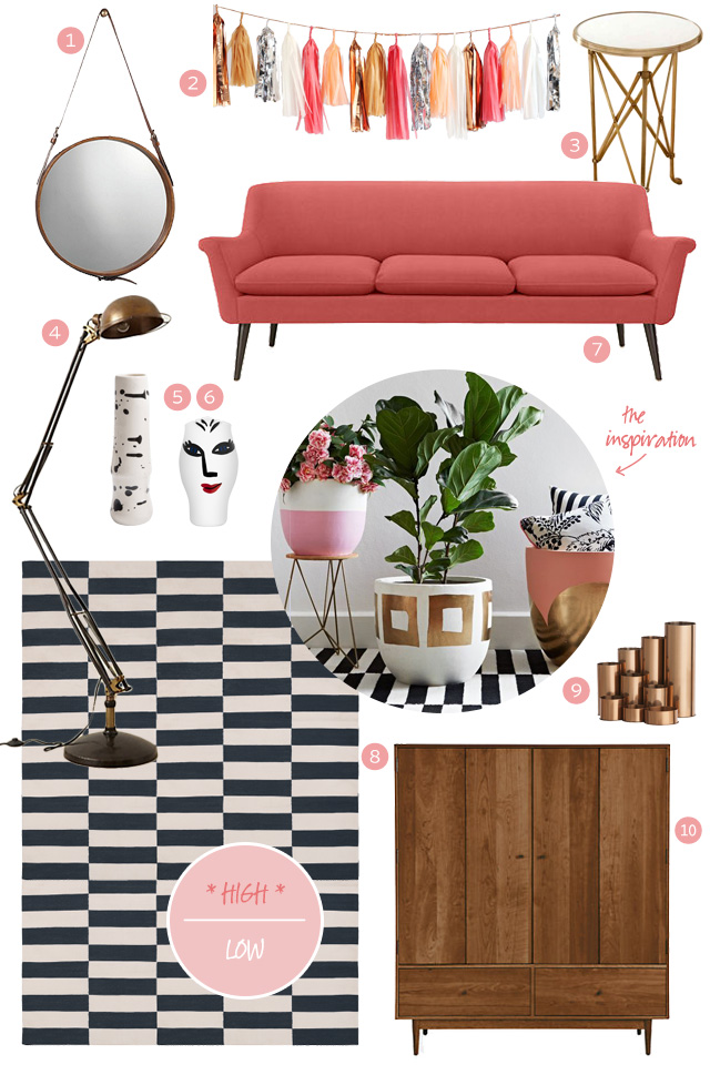
I was thinking about putting together another edition of Making it Yours, but as I began working on it, I realized I could split my design into high/low. I was inspired by the styling for Hunt & Bow’s hand-painted pots, which are only available in Australia, and I’ve put together two versions of a room featuring pink, stripes, warm metals (brass, copper, bronze, and gold), and wood. First up is the more expensive take.
-
Round Leather Mirror, $449
-
Tassel Garland, $130
-
Walter Spring Floor Lamp, $698
-
Open Minds Vase, $275
-
Murphy Sofa, $1399
-
Buche Cotton Carpet, $1550
-
Copper Pencil Holders, $100
-
Grove Armoire, $3499
Total: $9033
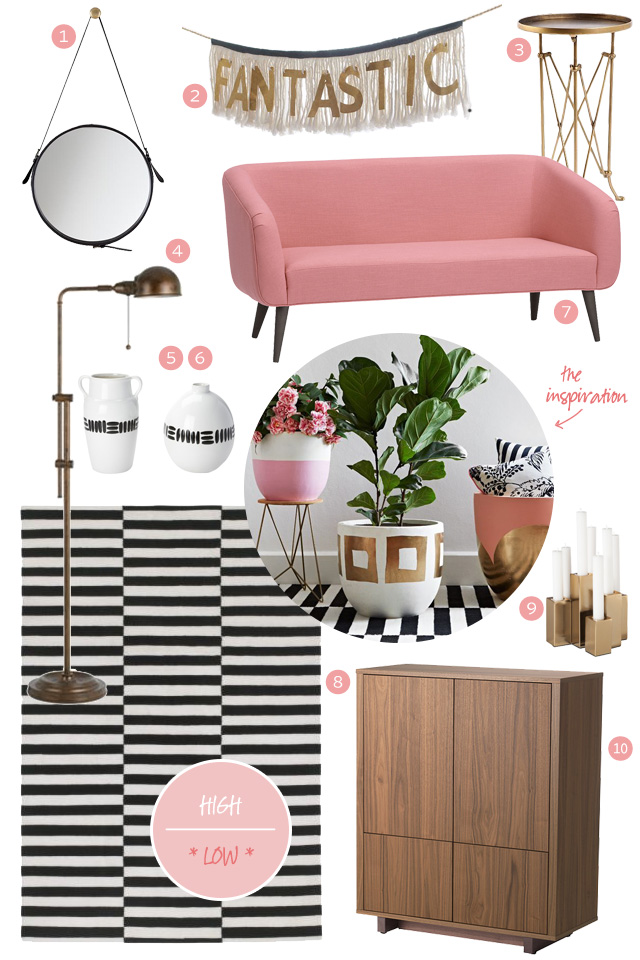
Cute! But we can do better on the cost. Here’s the lower-priced version.
![]()
-
One Two Buckle My Mirror, $159
-
Rue Petal Apartment Sofa, $999
-
Stockholm Flatwoven Rug, $399
-
Stockholm Walnut Cabinet, $349
Total: $2234*
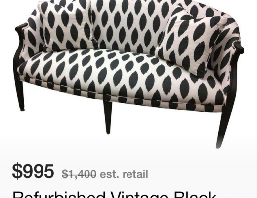
* If you reupholstered a vintage sofa, you may be able to bring the price down even further.
I like elements from both versions, and it was fun to see how close I could match them up. If this was for my home, I’d choose the more expensive sofa with the less expensive rug, and add hardware to the lower-priced cabinet to give it a higher-end look. How do you approach the high/low mix?


Mina Brinkey
November 5, 2013 at 11:24 amI love the sofa and cupboard on the first one so much! But you did a terrific job re-creating the look for a lower price!!
Laurie
November 5, 2013 at 11:25 amI’ll prioritize where the money goes. Either I build a room around the key piece I can’t live without (and is the expensive piece) or I put the money into the piece that has the most visbility.
Accessories are where I like to save money. Often, they are almost as good or even better. Looking at your low accessories, most of them I like better than the high.
Making it Lovely
November 5, 2013 at 11:57 amThat sounds a lot like the approach I take too.
Ali Murray
November 5, 2013 at 11:27 amI really love this post and would like to see more like it in the future. I’m with you, I love the splurge couch. I have almost the exact same rug in Navy from Pottery Barn in my office, it was a hand me down from my sister who lives in SFO, so I got the best price ever :) Can you recommend a less expensive option for the tassel garland without words? I just love your writing and have been reading your blog for years. I will be decorating my office with a pink Christmas tree this winter thanks to you. Take care.
Karen @sugarspicelivin
November 5, 2013 at 11:52 amGarland!! http://sucreconfetti.com/decorating?category=Tassel%20Garlands
Kelly | Sucre + Confetti
November 7, 2013 at 7:51 amThank you for the mention! :)
Inna Olimpiyuk
November 5, 2013 at 11:28 amI don’t know why, but at first I checked which style I liked, then the price. High it is! Always happens with me!
Laura at RatherSquare.com
November 5, 2013 at 11:36 amNice comparison! I’d be hard-pressed to notice the “bargains” as lower-priced compromises. I really like the accordion side tables, and I actually like the lower-priced rug pattern more than the higher-priced one.
Making it Lovely
November 5, 2013 at 11:49 amThe lower-priced rug is wool too, versus cotton. That’s one of the best rugs out there, price and value-wise.
Ms. Mitten
November 5, 2013 at 11:40 amI would also splurge on the sofa but would probably go with the low versions for everything else. Cute room!
Making it Lovely
November 5, 2013 at 11:50 amThat Murphy sofa is just so dang cute! Worth it.
Danielle
November 5, 2013 at 11:47 amThis is great! You need to do more like this! I actually have the side table in the low version and LOVE it! You would never know it was that cheap.
Karen @sugarspicelivin
November 5, 2013 at 11:50 amAn even cheaper Tassel Garland:
http://sucreconfetti.com/decorating?category=Tassel%20Garlands
LOVE the ‘high end’ sofa!! Still a good price.
Making it Lovely
November 5, 2013 at 11:52 amGood find. I’m a little concerned that she may be a little TOO directly influenced by the likes of Confetti System and Geronimo balloons, but I don’t know the full back story there.
amyks
November 5, 2013 at 4:57 pmI personally like the cheaper tassel garland “kit” that Karen found at sucreconfetti.com. I am not sure how selling big giant balloons and inexpensive paper tassels is “copy catting” another company, especially if they aren’t selling the balloons with the garlands attached.
And $130 for a paper tassel garland?! Come on, you have to admit that price is ridiculous. But I do love everything else about the rooms, especially the inspiration pieces.
Kelly | Sucre + Confetti
November 7, 2013 at 7:56 amI’m not sure what you mean? I simply sell decoration and I let the clients decide how they want to assemble a balloon and/or tassel. I won’t deny that I love the Geronimo balloons (and so many get inspired by them) but lets face it, they do source the balloons at the same place I do. What makes their product high end I would say would be all the work that goes in the tassels.
Making it Lovely
November 7, 2013 at 9:10 amKelly, my concern was more about the specific combination of giant balloon + tassel fringe that you feature on your about page than just the selling of large balloons. I’ve met Jihan (the founder of Geronimo) a couple of times, and as far as I know, she was the first to do that design. That, coupled with the obvious inspiration (without any mention/credit) in the tassel garland kit, gave me pause.
Kelly | Sucre + Confetti
November 7, 2013 at 9:28 amWell I will certainly forward that information to the supplier I purchase the kits from ;)
I usually source all images and / or inspiration and the balloon / tassels in my about image is actually a DIY. I am not selling it as a kit so its hard to distinguish where the line is crossed.
But I appreciate your view. I wouldn’t want to come off as a copy cat.
Another important factor is that I am in Canada and if a patent for that specific product was made in the US, unless they purchased one for every country there are bound to have others sell similar products. Again, that is not my motive (seeing I don’t sell them assembled or even together) All major party supply shops in the US sell exactly what I sell. Garland kits and balloons. (not together)
I love your blog post and blog. Sorry if I hijacked it a little.
Kristie
November 5, 2013 at 12:26 pmI don’t usually comment on design blogs, but this post grabbed my attention so much that I wanted to express my appreciation for the thoughtful content…and your hard work and research. The furniture and decor of my house is a wonderful mix of high/low. From custom pieces, to mod furniture from DWR, to thrift store and flea market finds. It’s all a wonderful process of creativity and having options-like what you have introduced-helps keep the costs reasonable. Loved this!
Nikki
November 5, 2013 at 12:41 pmI love this comparison! I agree with what others have said, that the low accessories still look fabulous. I’d totally splurge on the first pink couch though! Great lines and a gorgeous color!
Sarah from a fine line
November 5, 2013 at 12:45 pmI like some elements from the high better, and some from the low. I realize it’s a pretty small part of the overall budget, but that tassel garland is waaay overpriced. I made something very similar for my daughter’s birthday party. You can find tutorials all over pinterest to make the tassels. It probably took me an hr and cost about $5 to make.
Making it Lovely
November 6, 2013 at 11:49 amIt’s an easy DIY project, for sure.
liz b
November 5, 2013 at 12:48 pmI just love this post along with the Making it Yours posts…my personal favorites. Room and Board sofas are the best, very well made, the small price difference is worth it IMHO. I love the Murphy!
nancy @ adore to adorn
November 5, 2013 at 1:00 pmI love this high/low mix. I would do something similar for my home! =)
xo,
nancy
Helen Bird
November 5, 2013 at 1:01 pmOh, but kosta boda – it is my fav. It is always worth a little splurge!
Making it Lovely
November 6, 2013 at 11:48 amI love that little vase. SO much.
erin @ House Envy
November 5, 2013 at 1:14 pmI really liked your post! I think that if you mix some value pieces with a few splurges (splurges that you are committed to keeping and re-inventing over the years), a room can look like it was all splurges! I love your inspiration pots too! So chic!
deahne brigden
November 5, 2013 at 1:30 pmlove this look, so amazing the price difference! you have done well! love it all.
Tina@TravelingMama
November 5, 2013 at 2:22 pmI would totally splurge on the couch and not think twice about it. It’s not that much more! I might try to save up and splurge on the cabinet and then save on the rest. Either way, though, the room would be amazing!
Tena
November 5, 2013 at 4:28 pmWe don’t have a family room so our living room sees a lot of action. This means we just can’t skimp on our sofa and upholstered chairs. But, I can usually find lower end accessories that work just fine.
Jessica @ Of Sand & Snow
November 5, 2013 at 4:51 pmNicole,
I was wondering if you could recommend a lamp that’s comparable to this one at Schoolhouse Electric? http://ow.ly/qwJzH
I love it… And, though it’s not as pricey as the Anthropologie-option you’ve highlighted above, this “Schoolhouse” lamp is slightly out of my budget.
Thank you, in advance!
Making it Lovely
November 6, 2013 at 11:46 amI haven’t seen anyone else doing that cute rounded shape. West Elm has black and brass task lamp on sale for $79 if it’s the mix of colors that you like.
Jessica @ Of Sand & Snow
November 6, 2013 at 2:27 pmThanks for your response! It wasn’t so much the mix of colors that struck me, as it was the “curved” take on an industrial style…along with the brassy finish.
I appreciate your feedback! ;)
Emmie
November 6, 2013 at 8:26 pmUrban outfitters actually has one with that rounded head. It comes in some fun bright colors and a shiny gold. Not as good as the Schoolhouse lamp but pretty good for $69 http://www.urbanoutfitters.com/urban/catalog/productdetail.jsp?id=26622084&parentid=A_FURN_LIGHTING&color=070
emily
November 5, 2013 at 7:00 pmdarling post! i love this idea that you can have something well designed at so many price points. also, love the layout of the post…so cute!
Jessica @ SundayLoves.com
November 5, 2013 at 7:06 pmAs usual, I love what you’ve picked. I’ve been wondering about that second (less expensive) sofa for my office. Have you ever seen it or sat on it in person. If it were going in my living room, I’d splurge. But for my office, I’m willing to go a little less because I’ll be sitting mostly at my desk.
Actually, now that I look, the Murphy is only $400 more. Is it comfy?
Love, love, love everything. As usual!
Making it Lovely
November 6, 2013 at 11:44 amI’ve sat on both. Both are somewhat stiff, better for occasional use rather than as the sole/main sofa.
Tashya Dennis
November 5, 2013 at 7:50 pmPlease do more high end/ low end post. I love your style.
Jodi
November 6, 2013 at 10:12 amoooh! i love them both!
Emmie
November 6, 2013 at 11:15 amLove this! If I had the money I would go for the Murphy sofa from R&B but right now my budget is pretty tight. I was actually able to find a lot of lower priced items that mimic the look and feel of the items you chose. http://blue11interiors.blogspot.com/2013/11/recreating-it-for-less.html
Making it Lovely
November 6, 2013 at 11:42 amThat’s awesome! I love seeing another take on this!
Marissa
November 6, 2013 at 11:33 amThe Stockholm rug has a new lower price– only $299 for the 8×11 now. Even better!
Making it Lovely
November 6, 2013 at 11:42 amWhat!? Excuse me, I might need to head out to IKEA real quick.
Kelly | Sucre + Confetti
November 7, 2013 at 7:59 amI need that couch. and that rug. Great comparison.
Sarah from a fine line
November 7, 2013 at 9:13 amHave you seen this kids room image before? I love it so much, and just noticed it also has that same carpet from this post…Maybe for August’s room? http://www.pinterest.com/pin/97531148152050715/
Making it Lovely
November 7, 2013 at 9:39 amI hadn’t seen it before, thanks! I think I’m going to work with the blue and white striped wallpaper that’s in there for a few years (assuming I can replace the missing strip seamlessly), so that would be too many competing stripes. Definitely something to file away for future use though.
Kara
November 12, 2013 at 9:57 pmSo exciting to stumble across your wonderful post with my friends from Pop & Scott’s pots in it! Aren’t they so wonderful! It’s such a pity we can’t share the love of them in Australia to the rest of the world! Shipping would cost a bomb!
Kara x
Christine
December 18, 2013 at 5:30 pmI love the high / low options! There is (was?) a show on HGTV that was all about high / low projects by Sabrina Soto. It’s always amazing to see how close you can get on design, but spend substantially less.
Really like the pink theme … now only if my husband would buy into that! Thanks for sharing.