The dark blue walls and ceiling in Eleanor’s room look great, but the room definitely needs more light. The fixture hanging in there now only houses one bulb. She has a bedside lamp, one on her bookshelf, and a rabbit light on her dresser, but she’s a kid. She walks in and flips the light switch — she doesn’t look around and think “ooh, some ambient lighting over in the corner would really add to the space!” So I’ve been looking for a nice chandelier for her with more light output. Ideally, I would have liked it to be either brass or a fun color, and I’ve found plenty of fixtures that I like. But I have expensive taste in lighting, and some of my favorites were thousands of dollars. Thus, two bronze options from West Elm, both bought during their 20% off lighting sale.
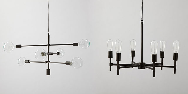
When I ordered them, the Mobile Chandelier was on backorder, supposedly until May. I bought the Industrial Chandelier at the same time, figuring that it might look OK and that I wouldn’t have to wait six months for a light. They both shipped out right away though, and I’m not sure which one would be better in E’s room.
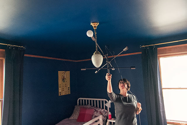
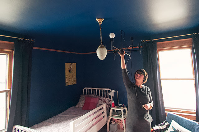
They both take on different looks, depending on which bulbs you pair with them (they don’t come with any). I had that frosted white globe in August’s sconce, and I think I like the look of it for E’s fixtures more than I would an Edison bulb, but smaller round bulbs could be cute too. And I would love to add some detail to whichever light I choose by adding brass tape* around each socket, but Kathryn wisely cautioned me to see how hot they get first.
What do you think?
* Or maybe gold adhesive vinyl? It hasn’t arrived yet, but I ordered some for Eleanor’s starry ceiling since a few comments mentioned some potential issues with covering painted stars later.


Sarah
November 25, 2013 at 12:37 pmI think you should use energy efficient bulbs no matter which one you chose. It’s one easy and cost-effective thing you can do for the environment.
Jewells
November 25, 2013 at 1:21 pmTurning off your computer is also a great way to help the environment Sarah.
Sarah
November 26, 2013 at 2:24 pmI do whenever I can! Thanks.
Making it Lovely
November 25, 2013 at 10:07 pmWe do use energy-efficient bulbs when they’re hidden by shades and diffusers, but they don’t look so great when exposed. If it’s any consolation, I do plan to use low-wattage bulbs (and not Edison style).
Elizabeth Peremans
November 26, 2013 at 9:30 pmI got the mobile lamp for our dining room. We purchased the edison style bulbs. Although it looks very beautiful and I love the look in our dining room, I must admit the light it gives off is very dim. I can’t imagine it in a bedroom. I’m sure it will look amazing in Eleanor’s room.
SEM
November 25, 2013 at 12:49 pmI like the mobile one best. Both are cute but the industrial looks like it belongs over a table. Have you tried urban walls decals? They have stars (and every shape you can imagine) and they are removable!
Making it Lovely
November 25, 2013 at 10:08 pmCute shapes! I have a die-cutting machine though, so I’ll be making my own decals.
Nathalie
November 25, 2013 at 12:54 pmI like the mobile one the best. It’s kind of reminiscent of…here me out… a constellation! and since you’re doing the patterned stars maybe that would be a nice play off of them?
Nathalie
November 25, 2013 at 12:54 pmugh…that would be “hear” :)
Eileen
November 25, 2013 at 7:55 pmTook the words right out of my mouth!
Eileen
November 25, 2013 at 7:56 pmI mean about the constellation aspect of the mobile :)
Making it Lovely
November 25, 2013 at 10:09 pmYeah, that was my initial reason for ordering it!
Kristin
November 25, 2013 at 12:56 pmI prefer the Mobile C. better I think. Something about the random angles of the arms seems in keeping with the starry ceiling. Like the varying angles of rings in an atom diagram which also reminds me of a ringed planet. It also feels more playful, and less like a dining room pendant.
The bronze is warm and might have the same effect as a brass fixture, just toned down a bit and not competing with your stars.
You should look up The Fountain on Locust in St. Louis (a restaurant and soda fountain – look at images of that space. It makes me think of E’s room. Very cool.
Making it Lovely
November 25, 2013 at 10:10 pmThat place looks fun! I like the use of murals, too. It’s funny — I’ve painted murals in kids rooms for other people, but I’m not into doing it in my own house.
Camille
November 25, 2013 at 1:05 pmI’m going to surprise myself here and say that I like the mobile chandelier better!
Cristen Parks
November 25, 2013 at 1:10 pmMobile all the way!
Nicole L
November 25, 2013 at 1:10 pmAnother mobile vote here! It’s a bit more fun for a kid’s room – I love the industrial one for a more grown-up room!
Mari
November 25, 2013 at 1:11 pmI’m gonna say the Mobile. The shape is unexpected and fun. The industrial looks a bit dining room-ish. So fun! I am loving the decorating posts!
Jessica from Of Sand & Snow
November 25, 2013 at 1:13 pmI “prefer” the mobile option, over the industrial one. But my gut tells me that the industrial chandelier is the best fit for E’s room.
The industrial option adds a modern touch to the space, while giving a nod to your home’s Victorian beginnings (since it’s a little more “traditional” of a look). Then again… I just read SEM’s comment and I understand the point that “the industrial looks like it belongs over a table.”
Which one does E prefer? After all, it IS her room. ;)
Making it Lovely
November 25, 2013 at 10:11 pmShe didn’t have an opinion on them at first, but tonight she said that she likes the Mobile Chandelier “because it’s all crazy.”
Jessica from Of Sand & Snow
November 26, 2013 at 8:42 amWhat a funny kid.
Christine e-e
November 25, 2013 at 1:20 pmMobile is my vote… Unless you can turn the lights so they are facing down in the chandelier! Kids need light to play, craft & read…
Laurie
November 25, 2013 at 1:22 pmBecause they are both cute, I’m leaning toward the function of each of them. Which distributes the light better for Eleanor? The mobile looks like it would do a better job reaching into the corners and I’m not sure how the industrial will do projecting the light up to the dark ceiling.
Isn’t that an awful way of saying you have to try them out to see?
I have to admit, I like the space station look of the Mobile one in that dark blue room too. I don’t think that is the theme you are going for but I went there!
Making it Lovely
November 25, 2013 at 10:12 pmI think the light output would be similar since there are no shades to hinder the bulbs.
Whitney
November 25, 2013 at 1:22 pmI actually prefer the industrial one – mostly because I think the bulbs used in it are fantastic :)
Making it Lovely
November 25, 2013 at 10:13 pmThey don’t come with the bulbs though! You can choose whichever you want for each fixture.
Rita from designmegillah
November 25, 2013 at 1:29 pmYou will be spray painting it, right? It looks dark against the dark blue.
Making it Lovely
November 25, 2013 at 10:13 pmI may modify the light, but I’m not sure if that includes spray painting. I’m holding off until after I get the stars on the ceiling.
Diane Lans
November 25, 2013 at 1:44 pmI definitely think the Mobile Chandelier, as well! I think it is a little more modern than the industrial fixture and is a nicer contrast with the victorian features of the room. Given the dark blue rooms, I also think it has a fun solar system reference! I guess the bigger question would be which one does Elenor like? She is the designer-in-training, after all. :-)
Making it Lovely
November 25, 2013 at 10:14 pmShe likes “the crazy one” although she didn’t have an opinion on them until all of a sudden after dinner tonight.
Laura
November 26, 2013 at 11:16 amHaha. She took her time to think it out then bam, out with a decision! What a kid!
Meghan
November 25, 2013 at 1:51 pmI LOVE the Mobile fixture! It’s much more fun.
patricia
November 25, 2013 at 1:54 pmI think the Mobile one is the right choice!
Sonchia
November 25, 2013 at 1:58 pmTop photo (I believe that’s the Mobile).
For sure.
Amber @ Wills Casa
November 25, 2013 at 1:59 pmI just want to take this opportunity to say I’m jealous that you can have a chandelier in Eleanor’s room. We are stuck with ceiling fans here in the south. Boo. Okay now that I’m done feeling sorry for myself, I’m going to go with the mobile chandelier. I like the industrial one, but it seems like a better fit for dining room.
Or you could talk Nick into building a brass fixture similar to the mobile chandelier. He’s doing it for our house, so maybe we can rely on the economies of scale! ;)
Making it Lovely
November 25, 2013 at 10:18 pmWe have a few ceiling fans in the house here, but we do OK with tabletop and standing fans in the other rooms.
I’m always so intrigued by DIY lighting fixtures! I feel like I would criticize my own work too heavily, but maybe I should give it a go one of these days.
Annie
November 25, 2013 at 2:00 pmI’m for the mobile chandelier too. It reaches out into the space a bit more in every direction which looks awesome with the high ceilings, room size and vibe. The other is nice but doesn’t have that reach.
Maria
November 25, 2013 at 3:17 pmmobile chandelier, hands down. so much more dynamic, particularly for a little girl’s room. :)
Trixxie
November 25, 2013 at 4:10 pmOf the two, I prefer the look of the Mobile, BUT the color isn’t working for me at all. I would either spay paint it brass or look for something else. Honestly I kind of hate the idea of spray painting a brand new fixture. Have you thought about looking for something vintage? Mind you not “needs to be rewired vintage” just new to you vintage. The space is just screaming for a real statement fixture and I’m afraid the bronze will just get lost in the dark blue.
Making it Lovely
November 25, 2013 at 10:19 pmI’ve been looking at vintage fixtures, but all of the ones that I like have been really expensive. I have plans to modify the light to bring in a little brass though!
Trixxie
November 25, 2013 at 4:12 pmSigh…spray not spay the fixture
Marcee ... ILLINOIS
December 6, 2013 at 2:12 pmJust a typo Trixxie …. do not be upset. Things happen. Breathe. Thank you.
Kathryn
November 25, 2013 at 4:22 pmThis explains why you were so good at holding these up at my place :)
Making it Lovely
November 25, 2013 at 10:19 pmIt’s probably my calling.
Annemie
November 25, 2013 at 5:32 pmMobile!
Joanne
November 25, 2013 at 5:36 pmMobile. It has a sense of whimsy to it, more movement in it.
Kerry
November 25, 2013 at 5:37 pmI love how the room is coming together, the dark walls in particular. But, I am not sure about either for a child’s room? The second one definitely looks “dining room” to me. The first one is super cool for an office or adult bedroom, but I just don’t think it looks right with the Jenny Lind bed and children’s bedding, and I love industrial light fixtures! We have the ubiquitous knappa from Ikea on one of our kid’s rooms and a similar fixture from Velocity (Norm 03) in the other. We also have the white Jenny Lind beds and both light fixtures look great with the beds. Just another idea for you …
Making it Lovely
November 25, 2013 at 10:21 pmI like both of those, but I think they’re a little too mid-century for the house. The west elm lights are borderline too trendy-industrial, but I they can work.
Kerry
November 26, 2013 at 10:25 pmCan’t wait to see how it turns out! The mobile is a great fixture.
Heidi S.
November 25, 2013 at 5:49 pmI just ordered the Mobile one for our dining room. Hopefully ours will arrive soon! It said January when I placed my order during the sale. I would totally vote for the Mobile one (especially with the stars that are going on the ceiling).
Making it Lovely
November 25, 2013 at 10:22 pmI hope you get yours soon! I called all of the stores trying to track one down, and then blammo, got the shipping notice for mine.
Elizabeth Peremans
November 26, 2013 at 9:38 pmI walked into the store and asked about it and they said it had been discontinued… at the time they did not have it on the website either. I was able to purchase the floor model for a little under $200. I danced right out of the store :)
Catherine
November 25, 2013 at 7:19 pmI love the Mobile Chandelier. It reminds me of the sun and planet models from science class, just with fewer orbs. :)
Michael Wurm, Jr.
November 25, 2013 at 7:37 pmMobile – for sure!
Ann
November 25, 2013 at 8:19 pmI say neither. Call me crazy but I think a crystal chandelier would look fabulous next to the dark walls and ceiling. Something like this:
http://www.amazon.com/Empire-Victorian-Chandelier-Swarovski-Crystal/dp/B004J4MWCM
Making it Lovely
November 25, 2013 at 10:23 pmSomething like that would look nice, but I’m not a big fan of crystal chandeliers. Admittedly, I usually like lighting that is either crazy-looking or insect-like!
Hollie @ I'm Busy Procrastinating
November 25, 2013 at 8:10 pmWhat about using Rub ‘n Buff instead of brass or gold tape or vinyl? It should stand up to the heat from the bulbs.
Making it Lovely
November 25, 2013 at 10:24 pmI’ve been adding it to my Amazon cart and always saving it for later. I haven’t worked with it before or seen the finish in person. It looks good?
Ann
November 26, 2013 at 8:28 amYou can buy Rub ‘n Buff at Michaels. They don’t have every color but with a 40% off coupon you could get some to experiment with pretty cheaply. I used it on a drawer pull and it worked well.
Haley J.
November 25, 2013 at 10:00 pmI’m loving the Mobile chandelier for that room. The shape is more whimsical, and recalls the shape of stars or even a Sputnik chandelier. I think it would play off the eventual stars on the ceiling nicely.
Sarah W
November 25, 2013 at 11:06 pmI’m another vote for Mobile. I love the shape of it, It’s so fun!
Jay V
November 26, 2013 at 9:13 amNeither- I think you need brass in there for a little levity.
kateS
November 26, 2013 at 9:19 amMy vote is for the Mobile- it’s “funner” looking. I have a similar one, the Sputnik ( I love the name) from CB2 with 3 big round bulbs. We put it on a dimmer switch, can now put out a lot of light or a little- I love it.
Kelly
November 26, 2013 at 10:15 amMobile! No question! I agree that the other is too dining-room-y.
Melissa
November 26, 2013 at 10:40 amI love the mobile chandelier the most. But what about using paint to add your gold details? Then the temperature of the sockets wouldn’t matter. Or what about spraying the whole fixture gold? A “brass” mobile would really pop off that gorgeous navy blue ceiling!!
Emily
November 26, 2013 at 12:17 pmHi! I prefer the mobile chandelier because it’s more whimsical. It also may have a satellite effect once the stars are up.
Mirela
November 26, 2013 at 1:09 pmThe Mobile Chandelier would be much cooler for kids!
Azure
November 26, 2013 at 1:33 pmI just this weekend put up the Mobile Chandelier in my bedroom. I had been waiting for it to come back in stock for months! It looks so great. I posted it on my Facebook page and everyone loved it. We bought the big 6″ 60W frosted bulbs at Home Depot for 5 dollars each. We also tried the smaller 40W clear bulbs, but they were much to glaring.
Lori
November 26, 2013 at 3:42 pmMobile for sure — the other one looks too builder standard to me, and it looks like it should be over a table — to “traditional”, not as much fun.
Jo
November 26, 2013 at 11:03 pmI prefer the Mobile, but I think you’re going o find something BETTER.
Kara
November 27, 2013 at 7:41 amI like the mobile version. The wall color is really growing on me!
Melody
November 27, 2013 at 1:02 pmI vote the first one! It reminds me of a fun solar system mobile; the other one feels too formal.
Cheers!
Melody
The Running Furniture List | Making it Lovely
December 10, 2013 at 2:22 pm[…] this house, I’m aiming for a mix of big-box pieces (the new sideboard, Eleanor’s light) and vintage/antique finds (the striped sofa, the old dresser). It’s a balance between […]
Art in Eleanor’s Room, and the New Light | Making it Lovely
December 12, 2013 at 1:49 pm[…] hung her new light (the Mobile Chandelier) over the weekend, too. I assume you guys aren’t looking to me for […]
Amber
March 7, 2014 at 8:31 pmIf there is a separate link, or a brand/name for this paint color, I would appreciate it. It is wonderful!
Amber
March 7, 2014 at 8:33 pmIf there is another link, or a brand/name for this paint color, I would love to know it. It is wonderful!