Hey now! The entryway is looking like a real, finished space!
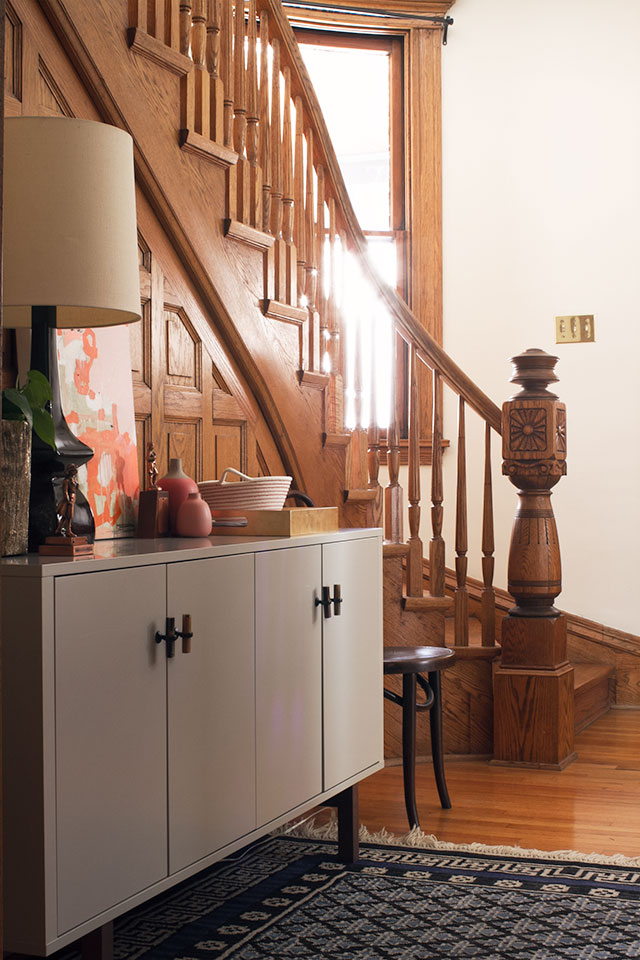
We do a lot of walking in this neighborhood, so we use the front door more often than the back. I had a runner along the wall for a while, where we would line up our shoes, but once the weather turned colder, we needed more storage for hats and mittens and the like. Plus our mail (and everything else) was piling up on the dining room table. Now everything has a home in the entryway.
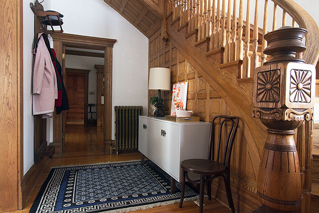
This house is well-suited to solid antiques and quirky pieces of furniture, but sometimes IKEA does the job (and does it well). The sideboard I chose is somewhat plain, but with the addition of some knobs and a vintage rug beneath, I really like it. Plus if it was too precious (read: expensive), I wouldn’t feel so great about using it as a glorified shoe cabinet.
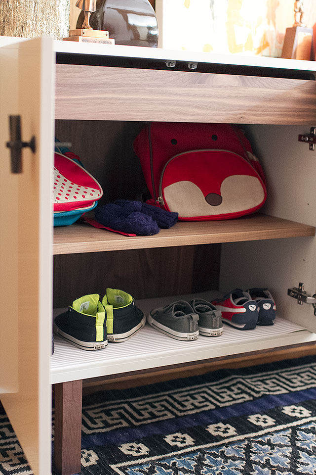
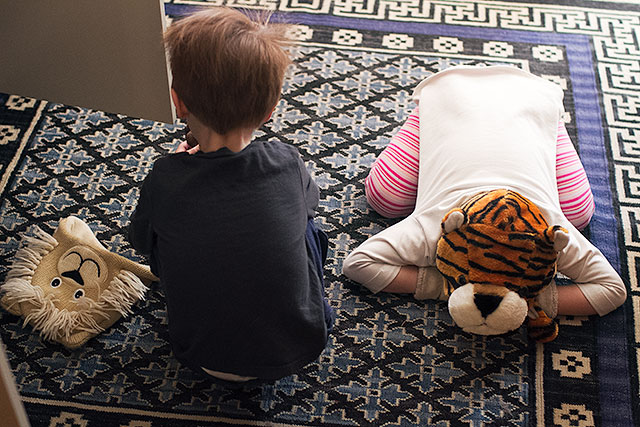
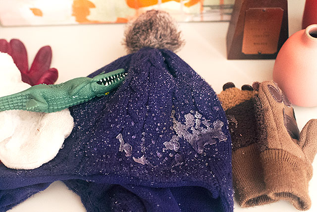
The kids backpacks are inside on the left half, along with two pairs of shoes each. I added cushioned shelf liner to the bottom so that it could be removed and cleaned if needed. Normally their hats and mittens are inside too, along the the top shelf, but when August and Eleanor saw me taking pictures, this happened.
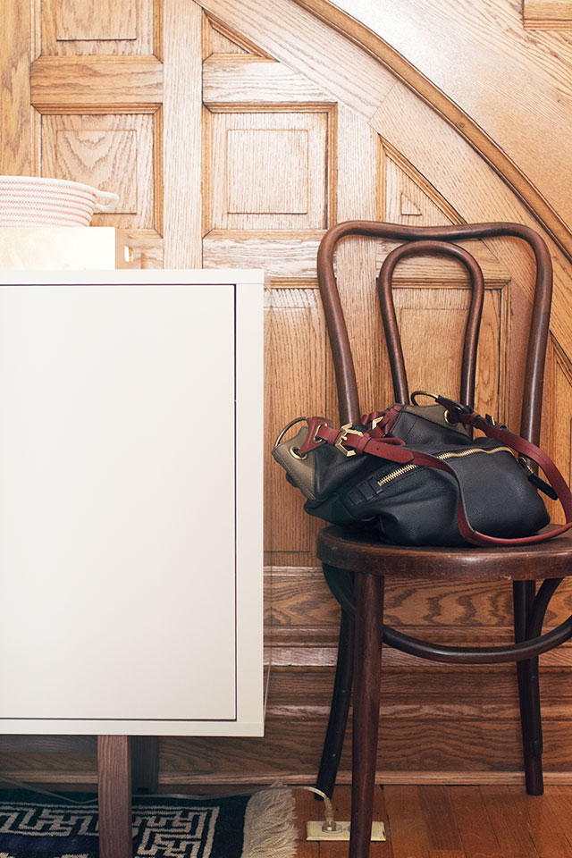
Our shoes go on the right side, and my purse can go inside too. More often than not though, I leave it on the chair (which is supposed to be a spot to sit down and put one’s shoes on). The tray holds mail, and the basket is for Brandon’s wallet, phone, and keys.
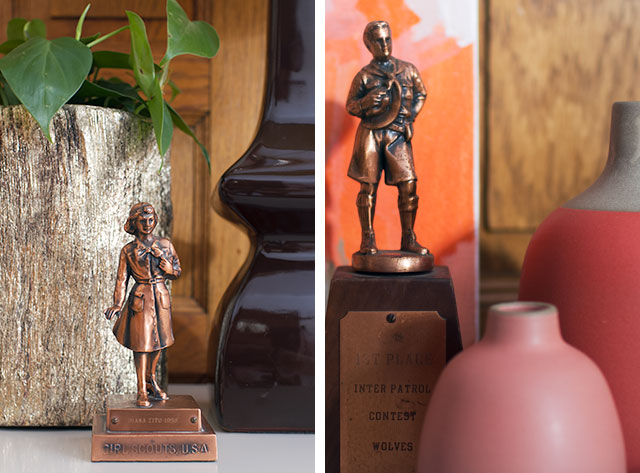
Vintage scouting trophies, because why not? The kids like them.
There are a few things to do still. The rug needs a thin pad underneath, and the floor outlet would blend more if the cover was wood instead of plastic. I’m a little worried that something will happen to the painting, since its within easy reach of the kids, so I’d like to frame and hang it. I’d also like to bring in more blue elsewhere, but that’s something that could happen in the larger context of the space with the adjoining rooms. Or if I come across another rug that I like equally but that fits the space better (longer), I can swap it out and find a new spot for the blue one.
Maybe I’ll paint (the walls, not the wood). Maybe I’ll add some art near the door. The house will grow and change in time, but for now, the entryway is done.
p.s. Here’s what the space looked like this morning after we went out to play in the snow. Clearly, I took the other pictures after I tidied up a bit.
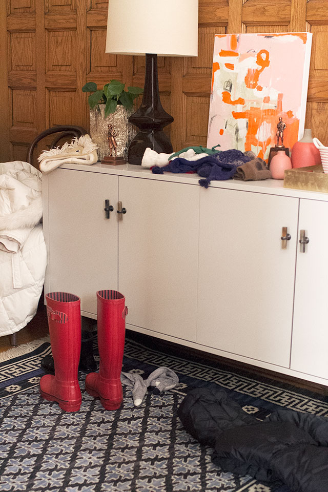
And this is why I want to get that painting up. Too close for comfort here!


Virginia (The Heartographer)
December 9, 2013 at 1:44 pmOh gosh, I’m so jealous of havin that much space in an entryway! I love what you’re doing with it. And yeah, a wood outlet cover for your floor (!?) outlet will help. I really like the leaned art look here, even though I normally don’t love that vibe—plus I’d be sad to see you nail into that wood to hang it, haha. Or rather, my dad would, and somehow he’s passed on that wood-preserving anxiety to me.
I can never get my husband to corral his stuff in one specific bowl or tray, but maybe I just haven’t found a cute and big enough one yet. :) Now I’m inspired!
Christina
December 9, 2013 at 1:56 pmHa, I had the same problem Virginia. You’re right, you need a bigger tray. :) When I had an Etsy shop, I sold corraling trays for men. If you are up for a simple DIY, find a deep picture frame at a thrift store, paint it a dark color, cover the picture with a swatch of leather and you have a nice manly tray. My hubs loved it.
Jessica @ SundayLoves.com
December 9, 2013 at 1:45 pmIt looks brill, Nicole! Nice job.
I was wondering about that painting. And what about the lamp and the other collections? How does everything fare with the kids?
I really struggle with three sets of wee hands always grabbing, moving, and playing with things they shouldn’t be! Ugh! Any solutions other than not putting things out? :) (That was a somewhat silent cry for help.)
Making it Lovely
December 9, 2013 at 2:47 pmThe kids were both super-into the trophies when I put them up, but the novelty wore off and they haven’t been messing with them anymore. They tend to throw their stuff on the ground (I’m the one who laid out the hat on top to dry), so luckily it hasn’t been an issue to have little tchotchkes around.
Christina
December 9, 2013 at 1:46 pmOff topic…love those Anthro knobs, that’s a great upgrade for an IKEA cabinet! We almost chose them for our kitchen, but picked sturdier ones for such regular use. I’m still trying to find another place for them because they’re so gorgeous.
The whole cabinet is a great choice, it really updates and balances the woodwork and details.
Making it Lovely
December 9, 2013 at 2:49 pmYeah, I’m hoping the knobs will hold up. Some of the reviews were mixed on their durability.
Laura @ Rather Square
December 9, 2013 at 1:50 pmThat’s a great placement of clean lines in a vintage space. And I love the functionality. We’re struggling right now with entryway organization as well. We have a little space, but it’s hard to design a system/setup that will STAY organized (especially when kids are involved).
Making it Lovely
December 9, 2013 at 2:51 pmI know! So far, so good, but it’s only been a week or so. There is a coat closet in the dining room (using the space beneath the stairs), so we keep one coat each on the hooks, then hang up the others in the closet. Spare winter gear is in the closet too, and I’m trying to really keep the entryway to what we use on a daily basis.
Jessica @ Of Sand & Snow
December 9, 2013 at 1:57 pmLooking good, lady!
I, too, have been considering the rustic console from West Elm, for my own entryway; and I quietly rooted from my work-desk, when I saw that it was included among the options you’d written about. (“Woot woot,” for pretty furniture! lol.)
Now that you’ve explained the intended purpose of shoe-storage, I see one of the reasons you did not end up selecting the piece, opting for the IKEA console instead.
Again, it came together nicely!
Nicole L
December 9, 2013 at 1:59 pmGreat choice for the entryway – looks fantastic!
Joanna
December 9, 2013 at 2:07 pmI was so curious how your style and the style of your new Victorian would meld and I have to say that I really love this look. It’s easy and accessible and it feels like the more modern furnishings cut through the formality of the Victorian to create a warm family home. Well done!
Laurie
December 9, 2013 at 2:12 pmOooh, I LOVE that blue rug against all that wood!
Rachel
December 9, 2013 at 2:16 pmThank you for posting that final picture—I deeply appreciate when bloggers show their “messes” as well..that I can live up to!
Mary
December 9, 2013 at 2:21 pmLove it! Could you tell me where you got the lamp please
Thanks!
Making it Lovely
December 9, 2013 at 2:53 pmI’ve had it for a decade, but Robert Abbey still makes it in a very similar color. Lamps Plus carries it.
Mary
December 9, 2013 at 3:05 pmThanks!
Whitney
December 9, 2013 at 2:22 pmOn the US website, I don’t see the sideboard just the TV stand?
Making it Lovely
December 9, 2013 at 2:53 pmIt’s not on the site, but it was in my local IKEA.
Jojo
December 9, 2013 at 2:29 pmLooking lovely! what about hanging the painting over the radiator?
Jessica
December 9, 2013 at 2:31 pmI know the outlet is out of the way, but do you have any concerns of moisture getting to it? I just saw it and thought of particularly snowy boots getting taken off and dripping in there. My 3 (almost 4) year old has gotten herself in to some interesting situations that I never thought to anticipate/prevent and could completely see something coming of it with her.
Just interested in your thoughts on the matter.
Making it Lovely
December 9, 2013 at 2:55 pmI hadn’t thought about it! The kids know not to mess with outlets, but we’ll have to have a little safety talk about that one specifically.
Heidi
December 9, 2013 at 2:42 pmIt looks awesome! I have a dumb question. How did you get it? I’ve been keeping an eye out for a side-boardy thing to use as a media cabinet, and this could be the one! I see they have an actual media cabinet version of this, but I’d like something taller.
Making it Lovely
December 9, 2013 at 2:57 pmMy local IKEA had it out on the floor, so I saw it there and didn’t realize it wasn’t on the site until I tried to link to it.
Sarah
December 9, 2013 at 2:42 pmThe cabinet hardware is so chunky and cool!
Maureen
December 9, 2013 at 2:46 pmLove the contrast between the styles and colors of the woodwork and cabinet. Yes, a wood outlet cover will look better. I love the styling of the cabinet, particularly the plant. Have you considered bringing in more color by painting the chair?
Kelly
December 9, 2013 at 2:50 pmYour entryway looks great! I think you made the right choice with this sideboard. If it’s not too much to ask, could you tell me the dimensions of it? Not sure why it isn’t on their site yet. The nearest IKEA is 5 hours away so it would be nice to know before I consider a trip! Thanks!!!
Kelly
December 10, 2013 at 8:19 pmNever mind! Found the dimensions in the catalog.
Making it Lovely
December 11, 2013 at 4:47 pmSorry for not getting the dimensions over right away, but I’m glad you found them!
Erica
December 9, 2013 at 3:07 pmwhere is the purse from?
Making it Lovely
December 9, 2013 at 3:13 pmI got in on clearance last year at Anthropologie; it’s by orYANY.
Charity
December 9, 2013 at 3:16 pmI looked at that Ikea piece on line. Fun to see real pictures of it. I think the trophies are charming. I like it!
CTDC
December 9, 2013 at 3:32 pmI won’t lie, I could not envision this at all when you told us your selection among the different sideboard/cabinet options! I was puzzled. But I LOVE where you took it! Really great job mixing different styles in one space. Nothing matches and everything goes. Well done!
HOLLY O
December 9, 2013 at 3:47 pmyou did good, girl! Looks great. Love the mix of old and new – trying to find my own balance in a 1926 Colonial!
Alisa
December 9, 2013 at 4:04 pmHow tall are those legs? Wonder if it would clear my baseboard heaters…
I love what you’ve done with the entry. Great contrast and layering. Perfect!
Amber @ Wills Casa
December 9, 2013 at 5:05 pmLove the vintage trophies! Of course the bentwood chair is my jam, so I’m in love with how it ties everything together – new sideboard, old rug, classic chair. Beautiful job Nicole!
Shawna
December 9, 2013 at 5:20 pmIt looks fantastic and I think the modern look of the cabinet is a great contrast with the more traditional millwork of the home.
Kerry
December 9, 2013 at 5:45 pmI love seeing how you are adding a few modern touches to your old home. I also live in a historic home (1890), and it’s been a constant battle for me to try to balance my style with my house’s. I think it’s taken me about three years for it to start to finally feel right!
Meg
December 9, 2013 at 6:47 pmThat end-post to your bannister rocks my world.
I just wanted to chime in that I’m so happy you’re doing your best to please us in the anti-wood painting lynch mob ;) I think keeping the wood unpainted is going to push you creatively and you’ll end up with a more unique and inspiring end product because you had the challenge of incorporating the old world style of woodwork with your more modern tastes. I think painting it white generally looks fine, but ultimately it becomes more of an accent that fades into the background than a statement about the house’s history. (Why buy such a special house and not celebrate it!?) As the recent owner of a 1920s house with some lovely warm wood trimmings I completely empathize with how challenging picking the right color and accents can become when you have to balance how it plays with the wood in addition to all other elements of a room. What you’ve done with this entryway has me very excited to see how you embrace the woodwork in the rest of the house!
Sarah from a fine line
December 9, 2013 at 7:03 pmIt looks great! I think you made a wise choice with that IKEA sideboard. Also, great bag! Who makes it?
Mari
December 9, 2013 at 7:28 pmI dig it. I like the way you styled it. Styling is what I need the most help on these days; I hope to see more of it! Really nice job.
Dana @ House*Tweaking
December 9, 2013 at 7:34 pmOoooh, I’ve had my eye on that same sideboard since I spied it in the new catalog. It looks great in your space!
kara
December 9, 2013 at 7:44 pmi’m so glad you bought a victorian! so interesting, and for the rest of us who live in chicago, so relatable!
Ddu
December 9, 2013 at 8:23 pmLooks great! Maybe more color from a jazzy lampshade? I never venture out in the snow without my crocodile! Best wishes.
Heather B.
December 9, 2013 at 8:33 pmMay I ask where the rug is from?? Space looks great!
Danielle
December 9, 2013 at 10:41 pmLove it! I always tell myself to stay away from IKEA furniture – and especially their casegoods – but that sideboard is calling my name! It looks perfect in that space and your styling, like always, is adorable. Thanks for sharing!
Crystal
December 10, 2013 at 7:49 amWhat a great way to store things. Nice idea!
Jen @ RamblingRenovators
December 10, 2013 at 9:54 amYour entry is looking lovely – and there’s so much space! The clean lines of the sideboard work really well with the more intricate woodwork.
The Running Furniture List | Making it Lovely
December 10, 2013 at 12:59 pm[…] this house, I’m aiming for a mix of big-box pieces (the new sideboard, Eleanor’s light) and vintage/antique finds (the striped sofa, the old dresser). It’s a […]
Alaina
December 10, 2013 at 4:49 pmIt looks great and I love that you are adding pictures of what your house looks like for real sometimes :)
Kelly
December 11, 2013 at 10:13 amThat radiator would make a nice play for drying wet winterwear. Boot tray in front and a metal tray on top for mittens and hats.
Making it Lovely
December 11, 2013 at 10:20 amThanks for the suggestion! We’ve been lying our things on the radiators, but I don’t know why I didn’t think to add a try to stop water from dripping down.
Constance
December 11, 2013 at 10:37 am1. LOVE IT!
2. Our daughter has the same fox backpack (she’s been using it for more than a year and the zipper / fox tail just broke off, but love that, too!)
Stephanie
December 11, 2013 at 5:13 pmWow! Seeing something like that on the floor at Ikea– I never would’ve mentally been able to place it in a Victorian styled home. But you’ve accessorized it beautifully and it looks great in there! Well done!
Jennifer
December 12, 2013 at 1:42 pmThe space looks fabulous! Loving your golden planter, wherever did you find it?
Making it Lovely
December 12, 2013 at 1:51 pmIt was from a local flower shop, a few years ago.
Sources for the Entryway | Making it Lovely
December 16, 2013 at 11:17 am[…] put together a guide for my entryway that I’d posted last week! I love making these […]
Hallway Runner Options | Making it Lovely
January 29, 2014 at 1:53 pm[…] a new (well, vintage) runner in the entryway downstairs (I’ll have to rephotograph the area and share soon), and I’ve turned my attention […]
25 Tips on How to Increase Property Value - Choice Home Warranty
February 22, 2016 at 7:57 am[…] if the area is clear of clutter and well lit. Take some inspiration from the entryway created on Making It Lovely, and for a very stylized version of an updated foyer, take a look at Live Laugh Decorate’s […]