In animated gif form! I figure it’s the easiest way to give a bird’s-eye view of things.
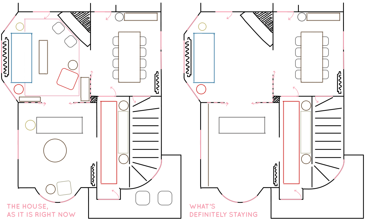
When I talk to people, I’m in the habit of saying “we just moved in to a new house…” but we’re at about six months here now, so I think I’m wearing that line out. I shared the first and second parlor recently, but they are definitely nowhere near done. Not that I’m complaining, mind you! This house has been the most fun project to work on, and I’m enjoying taking my time with it. Here’s what’s working, and a little of what I think is to come.
The Entryway
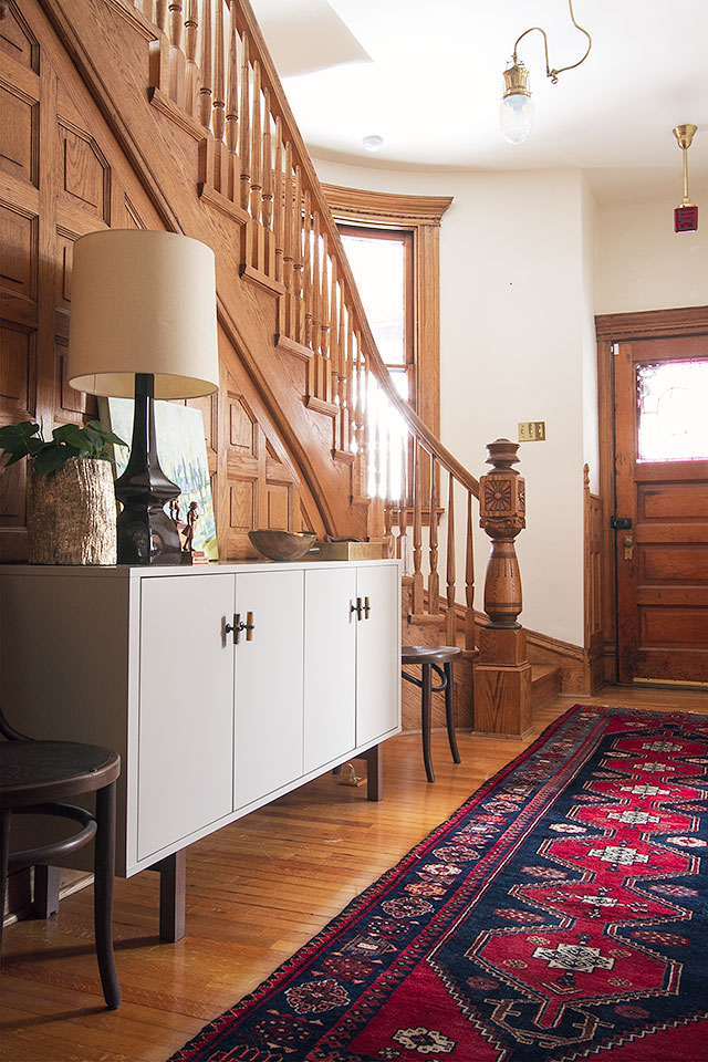
Awesome! Done! Bang. We had a million people over last weekend for August’s party, and that hardworking entryway was holding its own just fine.
The Dining Room
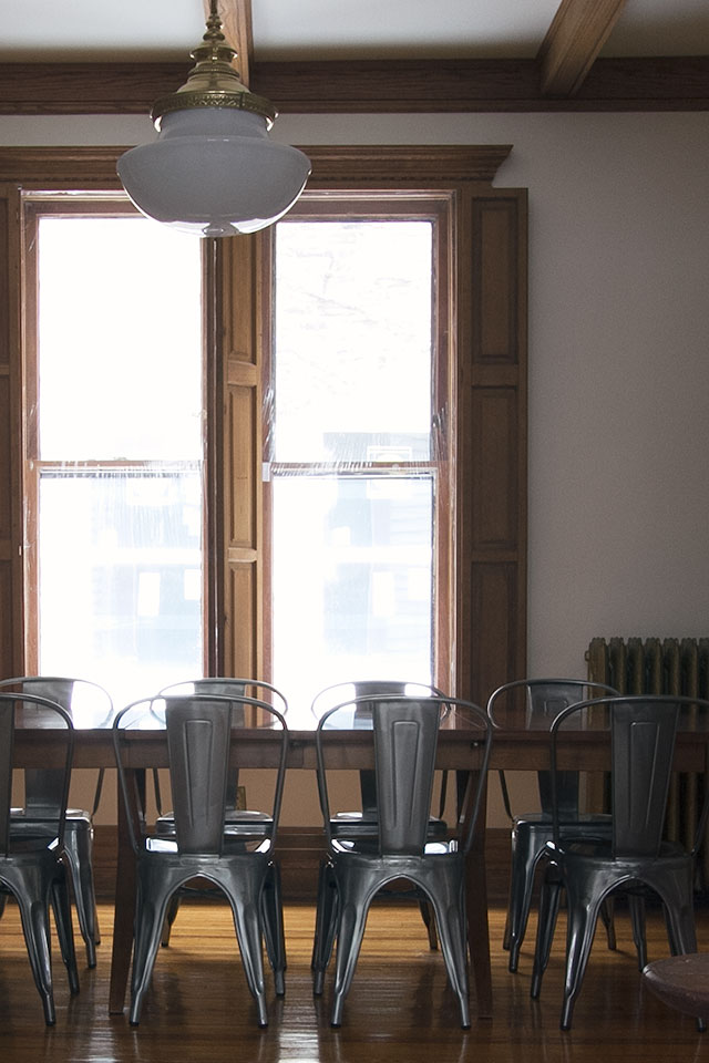
I love my table. It was part of a vintage set (reportedly Henredon, though I’ve never found an identifying mark). I have six matching wooden chairs in the basement (you can see them in the old house), but the kids were forever spilling on the fabric seats and my metal chairs are a better fit for us right now. Color on the walls and some great art will go far here. I’d like a rug under the table, but is that the best idea with said messy kids? Maybe not. We did have gray FLOR tiles in the last house because we could theoretically pull a tile up to clean it, but we always ended up spot treating in place. That shade of gray is not making me happy in this house though, so it might be time to let them go.
The First Parlor
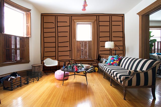
Poor little neglected room. You’ll be great soon, I promise! When we first moved in, I thought we’d watch TV in this space, but after living here for a few months, we like the television better upstairs. Our media cabinet moved up to a room on the second floor that would have been our library, and now the first parlor is going to get the built-in shelving treatment. It’s going to be amazing, as I’m sure you can no doubt see from the sea of brown in my sketch above.
I’m not sure what color the walls are going to be yet. Olive green, or emerald? Coral pink? A gorgeous blue, or a pale bluish gray? Ask me today and I’ll give you a different answer tomorrow. I’ll likely wait until after I’ve painted the second parlor and the bookshelves have been installed. Beyond that, the room needs more furniture. A rug. A whole lot. But it can wait.
The Second Parlor
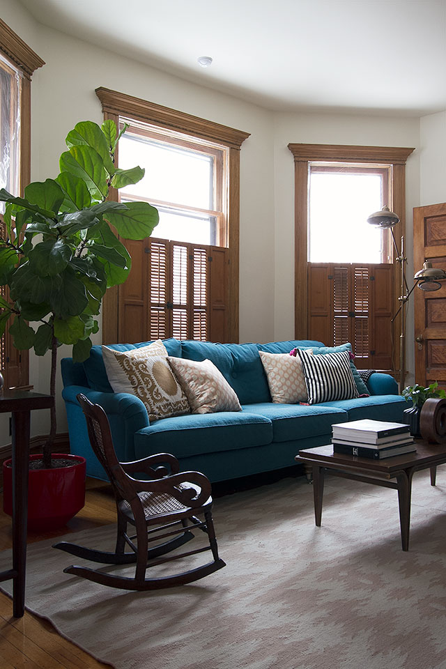
When I wrote about it, I mentioned that there is a lot of placeholder furniture in the room. I don’t mean that I’ll be getting rid of it all, but it might get shuffled around and repurposed. I love the sofa. Love my fancy blogger tree (a.k.a. fiddle leaf fig — thanks for coining the phrase, Lindsay). Everything else? Not set in stone yet. The floral chair might stay put, or it might move into the library when that’s done. The rugs? That angled fireplace is definitely throwing me there. One thing to come that I’m sure about: the room is going dark. I’m narrowing down my paint color choices now.
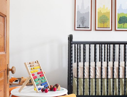
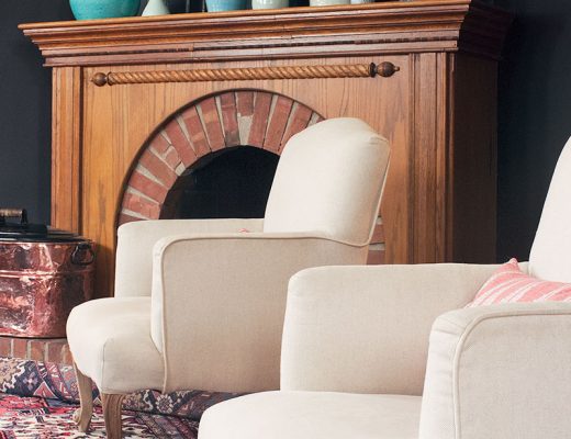
I saw this room today, which has a lot of the elements I’m going for. Dark walls, botanical print, boxy chairs, wood, and brass. My taste has definitely changed since I started on the first house in 2007, and the apartment before that (which was before I started this blog), but I’m excited to see where it leads.


barbara hess lucander
February 12, 2014 at 3:54 pmNicole, I invariably have the feeling that you are writing in reaction to GOMI. It’s… interesting.
I also love your blue sofa, it’s amazing.
Kathryn
February 12, 2014 at 4:12 pmWhile I’m sure that’s possible, I also think that much of what GOMI has to say lately is right in line with what would be written anyway as one adjusts to a new home. Some of their blog content “predictions” are just common sense and have probably been sitting in a drafts folder. Reading it does make me very glad I don’t have an audience of public critics.
Making it Lovely
February 12, 2014 at 5:26 pmNot really in reaction to anything, just trying to share the direction I’m going in with the house. I feel like I’ve been talking about it here and there, and showing what rooms look like as I work on them, but I haven’t done a great job of showing, concisely, where I’m headed. I have it in my head, but I don’t think anyone’s going to pick up on it via telepathy.
Andrew
February 12, 2014 at 4:47 pmLove that room & board room you linked to on Instagram! We just got that chair for our living room.
Black, grey, brass, navy & wood all the way!
http://instagram.com/p/hOe1STIuCA/
Making it Lovely
February 12, 2014 at 5:27 pmIt looks fantastic! How do you like your cowhide? I love the look, but can’t seem to commit one way or the other.
Andrew
February 13, 2014 at 9:00 amI love my cowhide. It’s almost a solid deep brown, and its asymmetrical shape is perfect under our Noguchi table. I could see one working in your fireplace parlor for that same reason. I’ve had this one about 3 years, and another one for about 7 years before that. They do get a little bare after years of use, but are incredibly resilient otherwise. I sold the old one to a client, and it still looked great. Spills are easy to spot clean. My old one was mostly white and I even was able to get red wine out of it with no trouble.
angela
February 12, 2014 at 5:35 pmI’ve completely enjoyed reading about your ideas and updates. I think yours is a house I would really struggle with decorating and it would be a lot of trial and error for me. (Mainly talking about all the wood, high ceilings, Victorian feel). It’s really important to get the scale of everything right along with having an interesting mix of textures and styles. So, I love seeing what you’ve been coming up with. I especially can’t wait to see the walls painted!
Angela @ Number Fifty-Three
Nancy50
February 12, 2014 at 6:19 pmCan I pretend for a minute that the house is mine? I would take the sofa in the first parlor out and replace it with 4 chairs – the room and board chairs look comfy. I would put a large round ottoman in the middle of the chairs and then pick out a good book from the newly built bookshelves and sit down for a good read.
Making it Lovely
February 12, 2014 at 9:53 pmI like that idea.
Jules
February 12, 2014 at 7:10 pmIt was either in Elsie De Wolfe’s A House in Good Taste or in Deborah Needleman’s The Perfectly Imperfect Home (I know, completely different books) where I read Victorian sitting rooms or parlors were typically all chairs/hard furniture because women’s fashion of the day made it very difficult to sit, or get up from, deep, soft chairs and sofas. There were two or more little groupings of hard, small chairs per room. That angled fireplace probably anchored one of those groupings. A lot of good that does you in 2014 but, you know, trivia!
If it were me, I would start researching Victorian photographs for inspiration on how to handle the fireplace and furniture placement/selection. Plus, history is cool.
Wikimedia, flickr, etc. would be good. The US National Archives and Library of Congress don’t have much–I admit I looked because see above “history is cool” comment.
Goodreads is also great for deepening the rabbit hole. https://www.goodreads.com/search?utf8=%E2%9C%93&query=victorian+homes
Making it Lovely
February 12, 2014 at 9:48 pmOne of the first books I looked at, on decorating a Victorian, started with a section on parlors. I should be keeping a family Bible on a corner table in front of the fireplace. Decorating dilemma solved!
But yes, there were always lots of little groupings of chairs and settees. All ornately carved, gilded, and richly upholstered. I should look again with fresh eyes though. There could be layouts to be gleaned if I look beyond the furniture itself. I do love this house, but I’ll pass on Victorian chairs.
Jules
February 13, 2014 at 12:14 pmHahaha! A Bible! Don’t forget the parlor palm on a plant stand.
Though, to be honest, I actually want a parlor palm. They are fantastic for areas with low light. #plantgeek
Making it Lovely
February 13, 2014 at 12:17 pmActually, I could (should!) be adding ferns everywhere. On plant stands, of course.
Jules
February 13, 2014 at 6:24 pmNot going to lie; I love plant stands. But I love plants, have a million throughout my home, and decided in 1990 I wanted my home to look like Andie MacDowell’s in Green Card. I’m frumpy and I know it. :)
sarah
February 12, 2014 at 7:52 pmwhere did you get the red planter?
Making it Lovely
February 12, 2014 at 9:52 pmIt’s a Gainey planter. I bought it from Sprout Home.
Emba
February 13, 2014 at 1:48 amHave you considered a very large oval rug in parlour 2? To work around the fire place issue? It might just skim inside the corner. Would be a more old fashioned look though, not sure if that would be a better or worse thing? Love everything you’ve done so far!
Making it Lovely
February 13, 2014 at 2:49 pmThat would fit, but I’m not keen on ovals.
Erin
February 13, 2014 at 8:04 amAny interest in refinishing the wood floors at some point? With so much great wood work in the house, I keep thinking they’d look even more lovely than they already do in a slightly richer tone.
Making it Lovely
February 13, 2014 at 2:51 pmThe floors are in good shape, so no plans to refinish anytime soon. I think they’re maple downstairs and oak upstairs, though it’s a bit mixed on the second floor. Then it seems to go back to maple on the third floor again, though part of the attic has wall-to-wall carpet.
Cristina
February 13, 2014 at 9:11 amI love that painting in the Room & Board picture. I could definitely see you recreating something similar with your mad watercoloring skills, hehe,. Overall, I like that general direction. I wasn’t a fan of dark room colors until I went a dark turquoise in my master bathroom. Now, not so scary!
Making it Lovely
February 13, 2014 at 2:54 pmI love dark walls! Abigail Ahern does them particularly well. (And that botanical print in the R&B room — we have one similar to it already!)
Rebecca
February 13, 2014 at 9:18 amI don’t think I’ve ever noticed the overhead lighting in your entryway before. I love the Exit sign! Is that leftover from when the house was divided into apartments?
Making it Lovely
February 13, 2014 at 2:55 pmThere are THREE exit sign lights in the house. That small red one in the front entry, a white one in the back stairwell, and a big red one IN THE BEDROOM. If we just turn on the two red lights, the house looks like a bordello from the outside at night. ;)
Tamara
February 13, 2014 at 9:20 amFirst, i love your blog & am really enjoying the evolution of your home (and i respect that it’s in real-time, and not manufactured; these things take time and tweaking…and oh yes, money ;) SECOND — can you tell me roughly how TALL your fancy blogger tree is? random question i realize, but i want one for my office, which has no windows (sigh) so am considering a silk (coughfakecough) one to avoid being an inadvertent tree killer. there’s a range of heights available and, proportionally, i love yours. merci :)
Making it Lovely
February 13, 2014 at 2:56 pmIt’s about six, maybe six and a half feet tall.
Meredith
February 13, 2014 at 1:38 pmHi Nicole! What are you using to sketch our your floor plan/animated gifs in your post here? I am loving it!!
Making it Lovely
February 13, 2014 at 2:57 pmPhotoshop. I had the floor plan all drawn up to scale in Sketchup, but something happened and now I can’t open the file! So frustrating. I had this Photoshop version accessible though, so I went in and drew all of the furniture with shapes, outlines, and brushes.
Laurie
February 13, 2014 at 2:19 pmI don’t know that you have to stop saying you just moved into a new house just because it’s been 6 months. First of all, you don’t yet know how warm/cool/comfortable/uncomfortable a room is yet until you’ve been there for all seasons. And it’s really hard to make decorating decisions for the same reason because of light, use, holidays, etc. I think you are still good for a while.
Besides, I’ve been in my house for 6 years and I’m still claiming this as I figure out what to do in rooms. It still hasn’t gelled perfectly for me in some areas.
Jenni
February 13, 2014 at 4:02 pmI just can’t get over all the beautiful wood in your house. Every time I see it I sigh at how wonderful it is! I think that turquoise sofa compliments it brilliantly. I’m really looking forward to see how things progress and I for one love your changing style.
erin
February 13, 2014 at 7:30 pmI’m with you on the rug in the dining room…I have a three-year-old and an 18-month-old and finally just took ours out as it was too much of a hassle to keep clean. Much easier to just sweep the floors.
I can’t wait to see what color you settle on for the second parlor!
TeaTowelDame
February 15, 2014 at 2:52 pmJust came over from Apartment Therapy after seeing your name in the nominations for the Homies and am definitely adding you to my blog favourites! I love what you’re doing with your house, I love the architectural details but would definitely find that much orangey-brown wood overwhelming. But you are handling it beautifully – I love the white cabinet and the dark bentwood chairs in the hall (I would never have thought to add more wood to all that wood, but it works brilliantly). And that blue sofa is perfect in the parlour. So looking forward to future posts. Oh and yes, of course I voted for you in the Homies!
Making it Lovely
February 15, 2014 at 8:35 pmThank you so much!