Last time I mentioned August’s room, we were starting to strip the wallpaper. That was right before a crew came out to photograph the house, so we wanted to take the peeling wallpaper off and throw a coat of paint on the walls as quickly as possible! I hate rushing to make decisions, and the color I chose is a good example of why. Blech.
You’ve seen a couple of glimpses here and there, and today I have more to share.
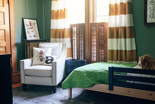
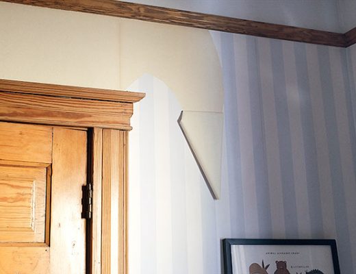
The old wallpaper was cute, but August ensured its exit status by peeling a huge portion of it off. So the room is looking better now than it was, but it’s not looking great yet. More to do!
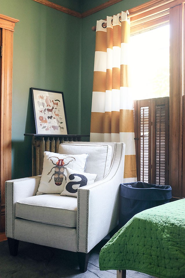
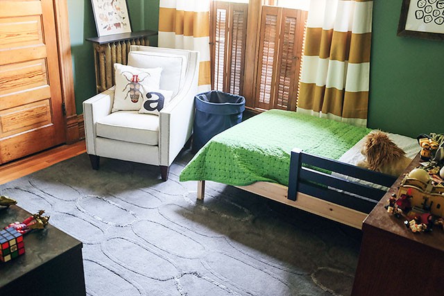
The rug is not staying. It looked good in the bedroom at our old house, but it doesn’t work with the wood here and I think it’s time to let it go. I mentioned before that I’m not in love with the green, and that’s still true. Once I bring in a new rug for the room, I’ll reevaluate the wall color and decide if it needs to be changed.
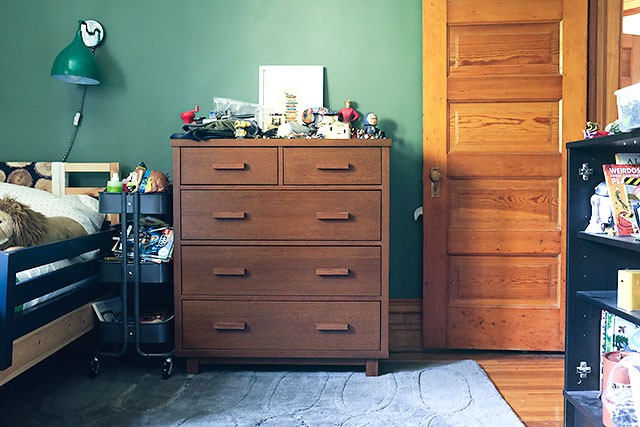
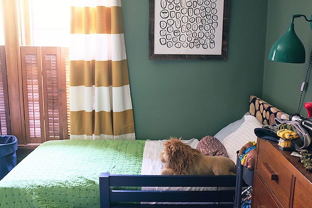
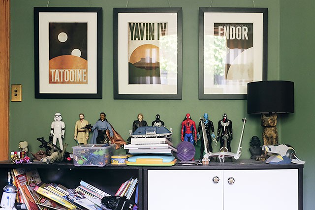
The toys are a mess! I picked up whatever and put it wherever so I could vacuum, and everything kind of ended up on the available horizontal surfaces. They could (and should) look a lot neater.
To do:
-
paint the bed frame
-
upholster the headboard
-
no more bed rail
-
new rug
-
rearrange the furniture
-
repaint (maybe)
-
add shelves above the radiator
-
more art
-
organize (and pare down) the toys
-
replace the light with a ceiling fan
That green looks even worse in these photos than it does in real life. Oof. I’m excited about pulling his room together though! I’m rolling up that gray rug today and getting it out of there.



Kelsey
July 8, 2015 at 11:01 amI actually thought the green looked great, but maybe it’s not as great in person?
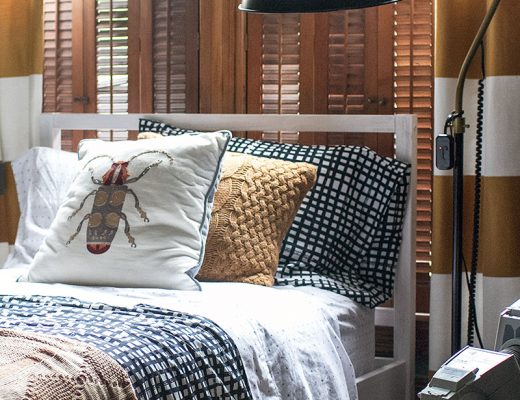
Could I ask where the beetle pillow is from? Thanks, Nicole!
Making it Lovely
July 8, 2015 at 11:18 amIt looks OK. It will look a lot better, I think, with some of the clashing elements out of there. But thanks! And the pillow was from Target last year.
SLR
July 8, 2015 at 11:13 amI love that beetle pillow too. Please share where you got it!!
Making it Lovely
July 8, 2015 at 11:18 amTarget, but they don’t sell them anymore.
Jane
July 8, 2015 at 11:13 amSeriously STUPID cute as always!! I love the posters above his dresser. Where are they from?
Making it Lovely
July 8, 2015 at 11:24 amThey’re from Justin Van Gendersen’s minimalist Star Wars series. I bought them for Brandon, initially. Maybe 2010? I think we’ve had them since before August was even born!
Allison
July 8, 2015 at 12:15 pmI was going to ask the same thing. Those posters are AWESOME. Sadly I think my 4 year-old would like more of a maximalist star wars style, but maybe it’s not up to him. ;)
Jane
July 8, 2015 at 3:24 pmThank you! Side note: I am a designer from Nashville (originally from chi-town, born in Cook County Hospital ;)) and have followed you for years. I am forever being inspired by your creative process. Thank you for giving me such a lovely place to visit on the web!
Courtney
July 8, 2015 at 11:13 amI am in love with the curtains, where did you find those?
Making it Lovely
July 8, 2015 at 11:26 amThey’re Alston curtains from Crate & Barrel.
Susan G
July 8, 2015 at 11:15 amI like the wall color, I just don’t like it with the bedspread and rug. I like it with everything else.
Jill
July 10, 2015 at 7:56 amI agree! The wall color is great.
Jane
July 8, 2015 at 11:15 amAnd do not repaint. It is so refreshing to use a classic color like forest green or kelly or whatever it is in a new and exciting way! You are a trend setter as always!!!
Jamie
July 8, 2015 at 11:39 amKeeping it real, who cares if the toys are not perfectly organized :) It looks authentic and lived in by a happy little boy.
Jacqui
July 8, 2015 at 11:49 amEven when you’re not super pumped about it, it’s still *so* cute! I’m wondering if you’re happy with his bed so far–I’m considering the same one (from IKEA, no?) for my kiddos but am a little worried about it holding up.
Making it Lovely
July 8, 2015 at 1:19 pmIt has held up fine! The design is not as refined as it could be, but I like it as a basic jumping off piece that can be customized.
Jacqui
July 8, 2015 at 10:51 pmThank you so much!
Laura @ The Quirky Bungalow
July 8, 2015 at 12:04 pmOh my lord, I love it! Especially love the travel Star Wars posters – I’ve been looking at getting those as well, as my husband and I are huge Star Wars fans. Etsy, right?
Making it Lovely
July 8, 2015 at 1:21 pmI think the designer used to sell through his Etsy shop, but now he’s at http://2046shop.bigcartel.com/. No more Star Wars posters though.
Laura @ The Quirky Bungalow
July 8, 2015 at 3:13 pmAhhh, gotcha. I think I found another designer on Etsy who is still doing the Star Wars travel posters (in case you or August are interested in any others, haha): https://www.etsy.com/listing/170556289/retro-travel-poster-star-wars-set-of-12?utm_source=Pinterest&utm_medium=PageTools&utm_campaign=Share
Antonia
July 8, 2015 at 12:08 pmI like the green and wouldn’t change it. It’s got a nice early 20th century Arts and Crafts vibe (I know this is a Victorian, but hey, still), complements the woodwork VERY nicely, and is a great color for a boy’s room. We painted our bedroom a similar color and it feels super cozy.
Making it Lovely
July 8, 2015 at 1:22 pmIt is very Arts & Crafts. It’s not very joyful for a little boy though, you know? I’m withholding final judgement until after the other elements come around a little more.
Kelly
July 8, 2015 at 12:21 pmI would try changing the rug and bedspread first as I think the green looks nice with everything but those (and maybe the color of the bed itself).
Chelsea T
July 8, 2015 at 12:32 pmI gotta disagree with above commentors – Those knots in the quilt tie in nicely with the green walls! I really love the green, black, white and wood/gold/yellow accents that are going on – specifically the feeling of the Star Wars poster photo, and the vertical crop photo second from the top. I don’t know that you need to avoid grey all together – but agree the rug is a bit blue, which is out of place in this scheme. Pops of red would go really nicely, and reinforce the traditional style of your home – and give those action toys an aesthetic purpose!! ;-)
Making it Lovely
July 8, 2015 at 1:29 pmGotta incorporate Spidey! Getting the rug out of there will do wonders, I’m certain.
Amy
July 8, 2015 at 1:07 pmThe room is coming together lovely as usual. Where is the animal print from (the one leaning against the wall to the left of the window)?
Making it Lovely
July 8, 2015 at 1:24 pmIt’s the Animal Alphabet Chart by Rifle Paper Co.
Natalie
July 8, 2015 at 1:22 pmI love the layout. May I inquire how big the room is?
Making it Lovely
July 8, 2015 at 1:27 pmThe layout works, but I have an idea for flipping it around a little. The room is 10.5 x 12.
Vanessa D.
July 8, 2015 at 1:36 pmThe green really does look fine, but it has a teen/young adult feel rather than a young child’s room.
Megan C.
July 8, 2015 at 1:50 pmI really like the paint color! Reminds me of nature and summer camp, which boys love! What about a Pendleton blanket instead of the current bedspread? https://www.pendleton-usa.com/product/YAKIMA-CAMP-BLANKET/166021/fs/true.uts
Also, I can’t help but notice that those thermoses you spied at the flea market last week would look great in here! I think the room is shaping up to be pretty awesome.
Kristi
July 8, 2015 at 2:06 pmThis looks really great!
Kristi | Be Loverly
Isabel
July 8, 2015 at 2:17 pmMaybe you know better, but I love the rugs and the very unusual wall colour. see if you get used to them!
HollYo
July 8, 2015 at 2:51 pmThis room is awesome. I am in love with the wall color, and have been waiting for this post! What color is it? I hope you don’t paint it :)
Stacy
July 8, 2015 at 3:44 pmI like the green but you’re right, it’s not very “little boy”. It would be great with those curtains for a den or office.
I might have to get those posters for my boyfriend as a new-house present. They’re awesome!
I’ve been looking for a chair just like that for my living room– do you mind sharing where you got it?
Emily
July 8, 2015 at 7:01 pmYou seem unhappy–out of your element–in this house. Your posts don’t seem joyful. Your meals are mail-order, your rooms from Target. Get back to you. You have a beautiful family, tons of money, endless possibilities.
Going bigger isn’t working. Have you considered going smaller? Paying cash for a smaller house? Fixing it up in a style that’s true to you, not Anthro-West Elm-Target-inspired?
Missing the days of “transforming the so-so”…
judy
July 8, 2015 at 8:39 pmI like the room and the green paint. I see your children as very bright and mature for their age so Baby Boy doesn’t ring true for August’s room. There use to be a Ralph Lauren green called Billiards that is slightly darker and less yellow than the one you have used that might go as well with the beautiful woodwork. I hope you get a kick out of all of our suggestions rather than a critique of your taste. Obviously we are all trying to replace your vision with our own but we all hear opinions from the In Laws and friends and we all happily ignore it and go with what we like.
Erin @ the honey home
July 9, 2015 at 7:01 amI’m like 75/25 on the green–I love it with the gold curtains. I think that 25% of me is wishing it were more saturated, but surely that can’t be right…? Can’t wait to see what you decide to do with it. :) I love kids rooms!
Kelly
July 9, 2015 at 7:48 amI like the green, and think your wait and see approach is good. At least if August starts scribbling on his walls the green would hide a lot.
I’m curious about the chair – I’ve been looking for occasional chairs for our bedroom and am having no luck – where do you suggest I look?
Thanks!
Antonina
July 9, 2015 at 5:20 pmHi,Nicole,
always a great job!
I love the green too! Cozy,but little dark to me.
Kids room a fun room to decorate,have fun with colors!
I think is good to bring up some brighter colors in a meeds of dark,or paint the walls a little lighter(?!)
May i ask,where this little green lamp is from?
Thanks,
Antonina
sarah
July 9, 2015 at 7:50 pmI can understand why you hate the green, but I kind of like it! Can’t wait to see more changes and see how it turns out!
Glam + Rust
July 13, 2015 at 9:06 amOh man, I think his room looks pretty great! I love the star wars art and the characters on the shelves!
Rugs and Plans for August’s Room | Making it Lovely
July 14, 2015 at 4:37 pm[…] at those photos of August’s room while I edited them and wrote up my post last week made it increasingly evident that the gray rug in there needed to go. I rolled it up later that day […]
emily
July 19, 2015 at 10:45 pmi’m really liking the green, but you’re so design saavy, and if you aren’t excited about it, then there probably isn’t any DIY you can do or product you can add to change that. follow your instincts!
The Bedding for August’s Room | Making it Lovely
September 28, 2015 at 12:48 pm[…] and I picked up a cable knit blanket and matching throw pillow in deeper color than the curtains. The green quilt that was in the room will be a spare, tucked away in the […]