All reviews and opinions expressed in this post are unbiased and based on my personal view.
David Bromstad is an artist, designer, and HGTV host. He has also gotten into the world of product design. Last year, he made a pair of limited-edition labels for Coffee-mate’s French Vanilla and Hazelnut flavors, and now he has designed four new looks — two each for the same two varieties — available exclusively at Target. I was able to chat with David recently about his inspiration behind the designs, what a typical morning looked like for him, and how his home is shaping up these days. Plus we bonded over a mutual love of pink. “It’s just a happy color!” he says.

Image provided by David Bromstad
This is Bromstad’s second collaboration with Coffee-mate, so I was curious about his inspiration and how he approached these new designs differently. He said that the first round was very painterly and artsy, on the contemporary side, but this time it was all inspired by his mom.
When David was twenty years old and first started drinking coffee, he’d have the summers off, and he and his mom would walk around her garden together. She taught him everything about flowers and gardening, explaining the differences between perennials and annuals, showing him what would come back or die off. The art of gardening is just as much science, and he was fascinated by it. When it came time to create his new bottle designs, he recalled those summer mornings spent with a cup of coffee and the company of his mom, and that led him to the floral imagery he used.
It seems like David is always doing a million things and is involved in multiple projects at any given time, but he still likes to start his day the same way he did when he was twenty! A little breakfast, followed by his morning coffee. Since he designed labels for both, I wondered if he had a favorite between Hazelnut and French Vanilla, but he couldn’t choose. He likes each on their own, but he loves them mixed together too. (I hadn’t even thought of mixing them, but I tried it and he’s onto something there.)

I’d seen Bromstad’s new home featured in an issue of HGTV Magazine recently, and it looked amazing but I remembered reading about his initial missteps in decorating it.
“When I first moved in, I tried to create a whole ‘Mr. Color Splash’ look. I painted the living room walls turquoise and put an orange cover on the couch with red pillows. Then I stopped, looked around and said, ‘I can’t live like this.’ It was the ugliest thing I’d ever done. So I returned 80 percent of the stuff I bought, painted the room white and added some ‘Mr. Color Splash’ touches.”
I’m always heartened to know that even the most experienced designers have trouble from time to time, especially since decorating and perfectionism had been on my mind when we spoke. I was curious about whether his home had continued to change, or if he considered it done.
His home, as it appeared in the magazine feature, was a “very fun, poppy house. Very black and white, which is very cool.” It has completely changed since being photographed though, because of a new furniture collection he had been working on. It hasn’t been professionally shot again yet, but he sent some photos over that he had taken with his phone so we could get a peek into his home’s latest look.
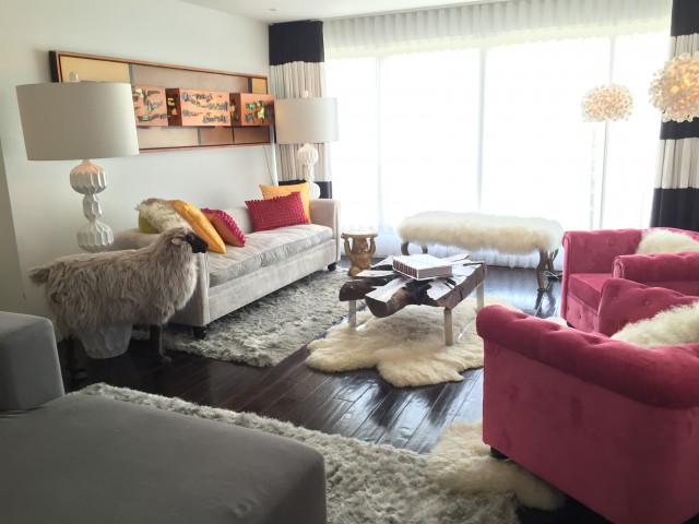
Image provided by David Bromstad
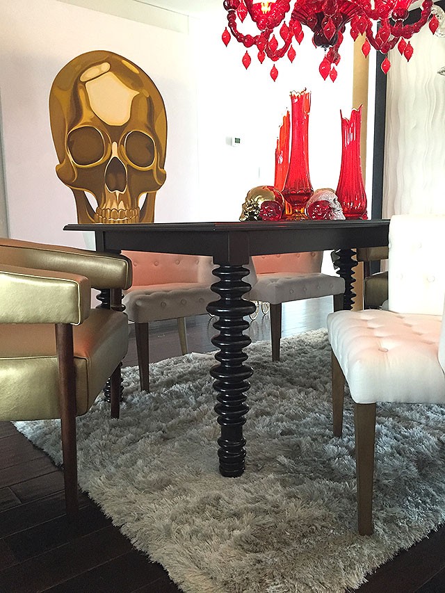
Image provided by David Bromstad
He loves it, and he loves that he was able to switch it up. Like a lot of us, it seems, David sees a house as an ever-changing thing! His partner is not as keen on change as David is, but he was open to it. He was (jokingly) kind of mad about the pink chairs, but even he had to admit that the texture made them “kind of amazing.”

Image provided by David Bromstad
David describes his home as effervescent, saying that it’s soft, chic, and sophisticated, but with tons of color. It’s a little more mature, more his age now, and more ‘him.’ And he seems like a pretty reserved guy, don’t ‘ya think?

Image provided by David Bromstad
I start my day with breakfast and a cup of coffee too, and chatting with David had me feeling inspired. I decided to break out my brushes, and I customized that tray you saw toward the top of the post. I’ll have more photos to share with you next week, but in the meantime, I’m thinking about trying my hand at another painting project. I was thinking about what I use every morning that could use a little sprucing up. Maybe a set of coffee mugs or a clock? I’ve got plenty of paint left — let me know what you’d like to see it used on!


Staci
July 20, 2015 at 11:02 amI love his cheery and positive attitude, home and show! :)
Susie
July 20, 2015 at 12:15 pmLove David Bromstad (and you)! Pink really is a happy color too. And I vote for a clock to paint. How would you wash a painted mug?
cn
July 20, 2015 at 12:17 pmDesigner chemical creamer bottles? Maybe we Americans have too much time and money on our hands. Sorry – I normally don’t mind sponsored stuff, but this is just really reaching, Coffeemate.
Puffin
July 20, 2015 at 2:24 pmTo me, these Coffeemate designs would have been fine with in-house graphic designers. I see nothing interesting or inspiring in either. And who uses Coffeemate anyway? I wish I knew how to make his money doing “designs” like that. I would leap in if this is what large companies want. You rarely miss but this post was a wild shot.
Paula
July 20, 2015 at 2:21 pmI dont mind sponsored stuff and I do get that you are supporting your family with this blog but these days I think this is just going no where. I am sorry to say but you will be loosing your readers if you keep posting such kind of stuff.
Lorelai
July 20, 2015 at 3:30 pmWhat kind of stuff? Interviews with other people? I don’t mind the tie-in, I like seeing David’s house and the interview.
DDU
July 20, 2015 at 3:00 pmA woman dedicated to breastfeeding her child who agrees to shill for Nestle? You always seemed to be more thoughtful and certainly more careful about your good name. You sadden me and you perpetuate a suspicion I’ve harbored for awhile: design blogs are becoming nothing more than the online equivalent of tacky TV hucksters. I’m done.
Making it Lovely
July 20, 2015 at 3:28 pmI’m sorry to hear that. This was a fun opportunity to talk to a designer I like, share a peek into his daily life, and I will have some DIY content to share next week. I didn’t look at this through a nursing/forumula-fed lens as I didn’t think it applied, but thank you for your perspective.
Katie
July 20, 2015 at 4:17 pmI don’t understand the connection you’ve made, DDU, between breastfeeding and sponsoring a post with a Nestle product. If it is because Nestle makes formula and Nicole breastfeeds, then . . . I still don’t understand. Breastfeeding moms support formula moms and vice versa, isn’t that where civilized conversations are landing these days?
I liked that this post was clearly labeled sponsored, had the obligatory product photo, but then continued on to focus largely on design and inspiration. Nicole shared David’s design process and mistakes with her readers. Now that’s a connection that makes sense: a design blog featuring a conversation about design.
Thank you Nicole!
Amy
July 20, 2015 at 7:47 pmIn response to Katie – I believe DDU was not trying to pin breastfeeding against formula feeding… I think she is referring to the Nestle controversy where they have been found to be unethically marketing their formula in 3rd world countries. You can google for more information but the gist is that they have spent decades promoting formula feeding in areas where clean water and other resources are hard to come by and causing hardships on newborns and their families. This controversy has been going on for decades.
Lorelai
July 20, 2015 at 3:31 pmAnother vote for a painted clock! I think it would be really cute.
Katie
July 20, 2015 at 8:07 pmAmy, perhaps that is the connection ddu was trying to make. I was unaware of the marketing controversy. Thank you for informing me about that. I do stand by my comments, though, that breastfeeding moms and formula moms are on the same team. The fact that Nicole does or does not breastfeed is irrelevant to her sponsorship of a nestle product.
Claire
July 20, 2015 at 9:25 pmNestle has been appearing on a lot of blogs lately. Could they be trying to improve their image with bad publicity in California and here in Canada? I would suggest you look into some of their practices.
sandi
July 20, 2015 at 10:24 pmWhile all interesting to read about a designer, I’m more disturbed that there is sponsorship of a company that provides products laden with aweful chemicals that are just wrong for consumption. Coffeemate is disgusting – the research is out there. Sad that we Americans don’t take the time to read labels and do our own research to understand the harm/burden to our society and health. From mothers to future children – not good. David’s beautiful talents surely could be manifested and recognized in other areas of the advertising world.
Kara
July 20, 2015 at 11:00 pmI’ve read your blog for a long time, before E came along, and I’ve seen you grow with your business and family. It’s been very exciting, inspiring even, to see you become such a powerhouse in the blogging world.
However, recently there seems to be a downturn in content – ranging from sporadic posting to what seems like forced sponsorship. I think I’d be fine with the lack of posts if when they came there was more meat to them.
You’ve mentioned before feeling a renewed sense of creativity and energy, while I too was more of a fan of your last house, I’m hoping some of that old spirit can be channeled into this one. Meanwhile, please less sponsorship, or maybe ones that integrate more smoothly with your work.
Ally
July 21, 2015 at 12:52 amI agree with you Kara, the last house had so much life and spirit this one feels forced and stuffy. I think the content has gone down significantly the posts reflect the forced feeling. Nestlé is a pure evil company to get into bed with not only do they engage in horrible practices in the third world but they ignore regulations here and have been stealing water. I am saddened by this sponsorship as well :/
kg
July 21, 2015 at 7:33 amI think what makes me the most sad about this post is David Bromstad’s living room. He can’t be serious with that over-sheeped mess, can he?
Alisa
July 21, 2015 at 9:31 amI have that sheep in my office! The kids come in and ride it as if they were in a mutton bustin’ contest.
Also, when are you visiting California? I think a trip to the rose bowl flea market is in order.
Amelia
July 21, 2015 at 11:11 amI don’t mind sponsored posts, but chalk me up as another reader who is really disappointed to see sponsorship by Nestle of all companies. It’s not about breastfeeding vs. formula, it’s about their beyond unethical practices that have led to the deaths of thousands of babies in third world countries. Their practices are problematic in other areas too: bottled water, cocoa, etc. Here is a quick overview: http://www.phdinparenting.com/blog/2010/8/2/why-i-protest-nestles-unethical-business-practices.html
DIY Abstract Art Clock and Serving Tray | Making it Lovely
July 27, 2015 at 8:51 am[…] of my own. I customized a tray, and wanted to take on another project too. I suggested a clock last week and you were into the idea, so I went for […]
Melissa Terry
July 27, 2015 at 6:06 pmI’d have to agree… I don’t mind sponsored posts but Nestle…really? SO many questionable CSR policies. Also, to each their own but that guy’s living room looks just creepy… like a dead sheep shrine.
judy
February 15, 2018 at 6:58 pmI am seeing more and more blogs that I love and enjoy being hassled by comments critical of the bloggers content. If a guest came into my home and began giving me the benefit of their opinions on all of my tastes I would be astonished. With hundreds of bloggers one can find a writer that is agreeable and will submit to threats of fewer followers.
I’m sorry if I am being offensive but the zeitgeist that seems to be the norm more and more is mildly mean or deliberately cruel and has an air of smug superiority about it. It just makes me want to cry and the persons who should hear from voters re: corporate malfeasance is your legislator because they are the only people who can force Big Business to act with integrity.