I’ve been working with Floor & Decor on a few posts for the blog around the three main things they carry: wood, tile, and stone. I’ve already shared my experience with wood (and bamboo), and six designs inspired by ceramic and porcelain tiles. Today, I’m sharing another six designs, but this time inspired by stone. I went to my local Floor & Decor and picked up a whole bunch of my favorites, then came home and played around with paint swatches, wallpaper samples, and other elements to create different designs.
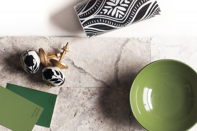
Travertine Tile
A lot of people, myself included, hear “travertine” and think “nineties.” It was used everywhere it seems, and it can read as boring (or worse, dated). It has a lovely, earthy quality to it though, and when paired with sharp contrast and/or vivid color, it serves as an organic element to ground a room.
![]()
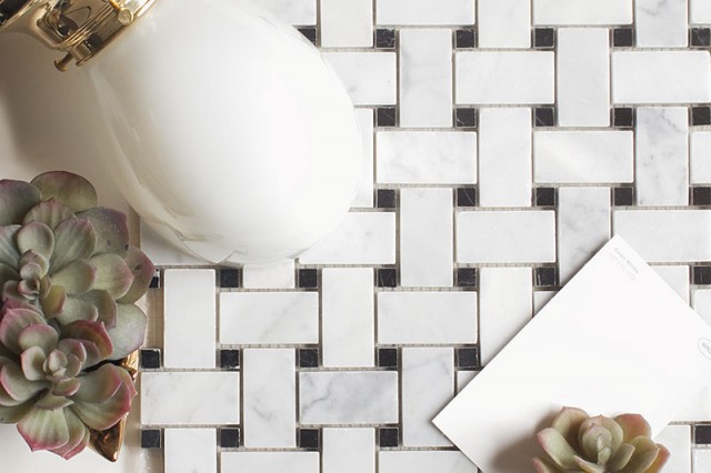
Basketweave Marble Tile
Classic. More formal than subway and hexagon tile, but versatile in the same way. It would look stunning in a room with white walls and white painted woodwork, letting the tile be the star, but it could easily take a supporting role too.
![]()
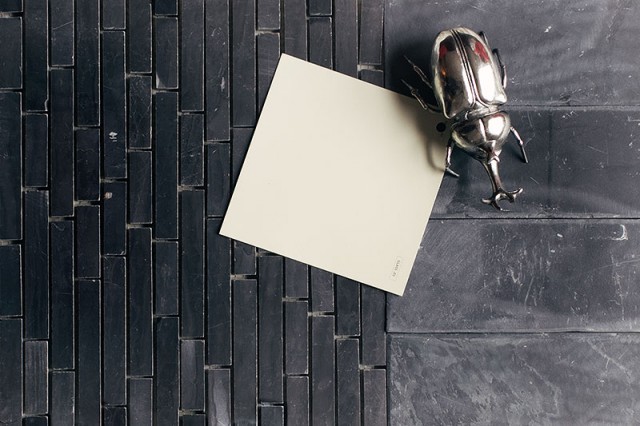
Slate and Marble Mix
These two almost match, but because they’re different materials, they play off of each other and are more interesting. A change in scale helps too. I would use slate for the floor and line the walls of a glass-enclosed shower with the mosaic marble, then bring in a muted color for the walls. The silver beetle here is representing silver finishes, but go ahead and add a random bug object too. Why not?
![]()
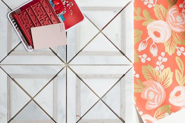
Geometric Marble Mosaic Tile
Cute, cute, cute. The geometry of the tile with all of its squares and triangles is cut by the looser style of the floral wallpaper. Paint the ceiling pale pink. Bring in a vintage dresser and cut the top for a sink, freshening the whole thing up with a glossy coat of paint. Boom — the most adorable bathroom.
![]()
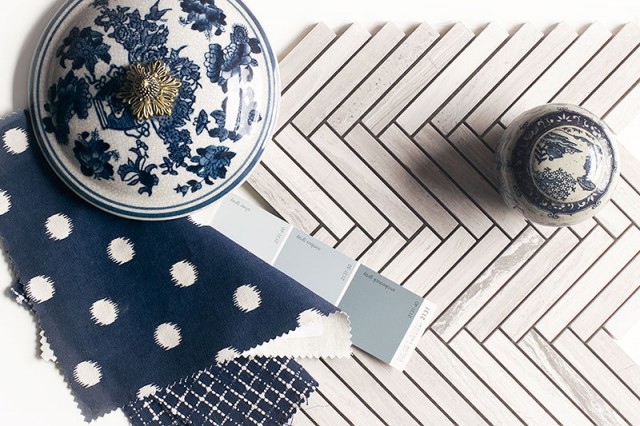
Gray Marble Chevron/Herringbone Tile
They’re calling this “chevron” but it’s really herringbone. Either way, it’s a classic pattern that went through a huge resurgence in popularity over the last, what, five to seven years? Done in a single color (of marble, in this case), it resists being pegged as trendy. Play off of that with a mix of trendy-right-now blue and white chinoiserie and more simply patterned fabrics. Grayish blue on the walls pulls the whole look together.
![]()
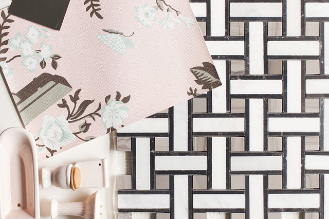
Graphic Basketweave Marble Tile
You can’t quite make it out from the sample of the wallpaper here, but those are surveillance cameras hidden among the flowers and butterflies. Brilliant, right? The perfect kind of quirk to bring to a bathroom with pink fixtures. Update the walls, bring in a little dark paint on a wooden mirror, use a mosaic on the floor that’s a nod to the designs of the fifties (but much more chic), and leave the pastel tub, toilet, and sink.
![]()
Do you find yourself drawn more to natural materials like stone, or do you like the options that ceramic and porcelain tiles make possible? I’m more often drawn to the latter category, but then aren’t we all smitten with marble?



Danielle
October 29, 2015 at 3:27 pmI can’t decide which vignette I love the most! That herringbone marble tile, tho…*swoon*. It’s classic, but feels modern to me, too.
I’ve never been a fan of travertine, either. It just feels dated – unless it’s in Italy, of course! But your pairings really update it. kudos!
Jess
October 29, 2015 at 3:50 pmLove the slate and marble.
Stacy
October 29, 2015 at 6:33 pmLOVE the basketweave! I can’t stop staring at it!
kara
October 30, 2015 at 12:36 pmi’m not usually a fan of the vignette – but these were super fun. love the dark slate – and the security cam wallpaper (also love the fact that there are people who will buy security camera wallpaper and i wish i knew some of them so they could invite me over and i could love on their wallpaper).
JUDY
October 30, 2015 at 1:55 pmWow! What wonderful combinations a Decorators eye can come up with, You manage what I never quite can….I’ll get some things together that I like but it just never is quite what I had envisioned…I’m happy that I got to redo the room/Bathroom etc. but I know if I had your talent I would be thrilled with the end result– not wishing I had done something differently
Kate Riley
October 30, 2015 at 4:16 pmLove these combos you have such and eye for great design! I’d take any one of those spaces!
erin @ thh
October 30, 2015 at 7:03 pmOh man! I love all of these, even the travertine, and I REALLY don’t like travertine! I think the herringbone is my favorite.
I am personally more drawn to natural stone instead of ceramic tile…probably because I can’t afford it. ;) Ha!
Lory
October 31, 2015 at 8:50 amI love the first and the last vignettes with the pops of color. I like natural stone. There are lots of faux stone material out there that actually looks like real stone. Have a GREAT weekend!
Friday Favorites | Cupcakes and Commentary
November 13, 2015 at 5:12 am[…] need more of these examples in my life (just match this, with this, with this). Thank […]
Nicolette Rose
December 4, 2015 at 5:46 pmLong time follower but I rarely comment anymore. This post just completely inspired me and I wanted to THANK YOU!! :)
Mountain Holly Quilters
February 16, 2016 at 11:36 amOh I love the herringbone tile! Would be perfect for my monochrome design!