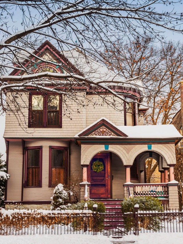
Someone from HGTV Magazine reached out to me back in December of last year. Would we be interested in having our home featured? Yes! Scouting shots were sent, the initial contact person passed them on to their editor, and by January we had signed an agreement. They wanted to feature our house “all dressed up for the holidays,” so they sent a wreath for the front door and arranged for an exterior shot to be taken while we still had snow.
There was an initial interview in March over the phone (how did you find your home, where did you get this, why did you decide on that, etc.), and then a date was set for the shoot in April. I spoke with Heather Bullard, the stylist, and she mentioned that boxes would start to arrive and I should just set them to the side. So many boxes! And rugs! (Because if there’s anything our house is lacking, surely it’s rugs.) I’m sure our delivery guy loved us — especially since he later picked it all up again when everything was being returned.
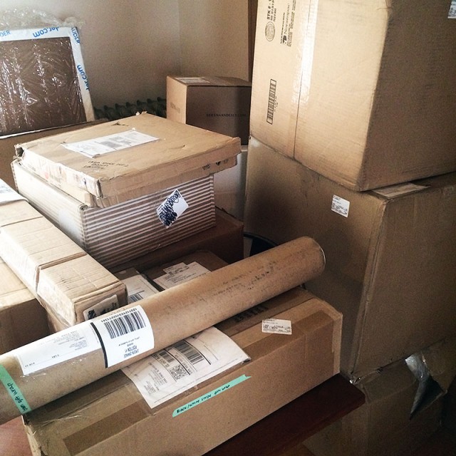
Four months and many phone calls, emails, and boxes later, it was time for the shoot. Our house was about to be filled with people from all over the country for a few days. The stylist and her assistants, the photographer, Kim Cornelison, and her team, and of course a team of people from the magazine. The Christmas trees (one large, one teeny) and all of the greenery was driven down from Wisconsin.
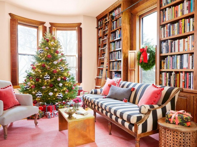
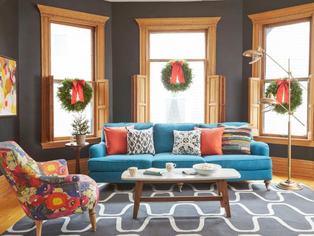
The stylists started with the tree and the brought bags of empty boxes wrapped in very cute paper. None of those ornaments on the tree were ours! That rug you can see peeking out isn’t ours either.

The library shot is my favorite. The brass coffee table is really a side table that’s usually tucked alongside the teal couch. The floral chair was swapped out for one stolen from the next room, and the pillows were mine except for the one trimmed in white ribbon.
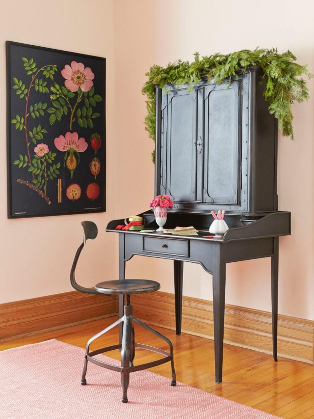
The secretary got a bit of greenery, and the stylist grabbed a chair that’s usually in the dining room.
And here’s where the floral chair ended up. This shot is the strangest one to see because while the shell is the same (only the rug, coffee table, and three of those pillows were brought in for the shoot), the overall effect is that it’s my house… but not.
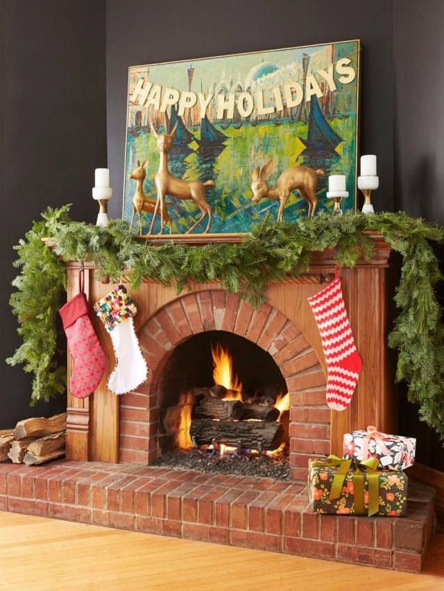
The fireplace looked mostly like it did when I decorated it last year. Same vintage painting of Venice with my sparkly HAPPY HOLIDAYS banner and vintage deer. Those are our stockings too, though we usually put five out — one for each member of the family instead of just the three kids. This shot was in the table of contents.
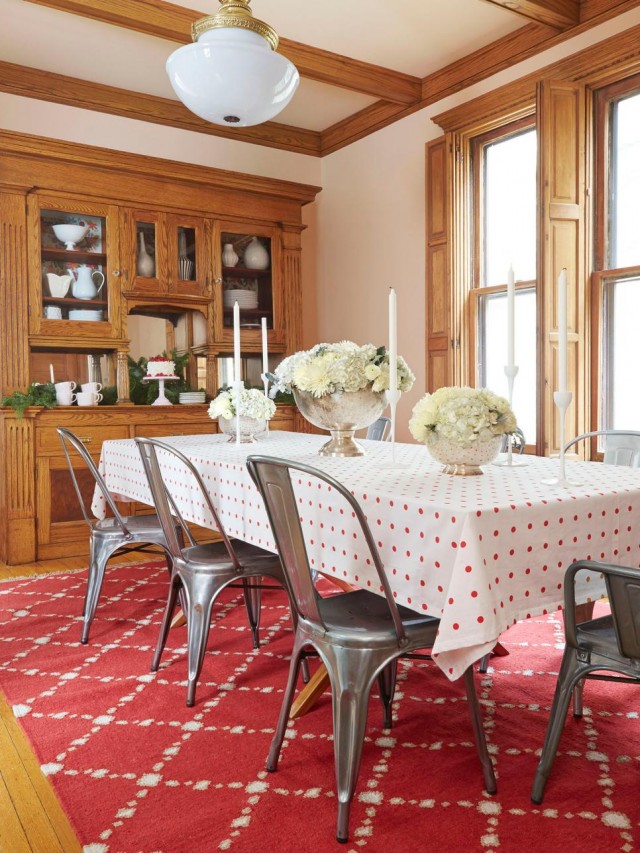
Our dining room is a chameleon. I change it up all the time with different tablecloths and settings, so while this room looks different too, it isn’t as jarring.
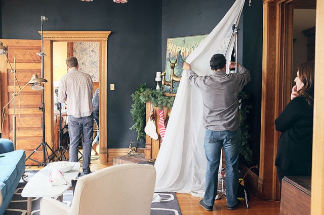
Everything looks so pretty. And then behind the camera, you’ve got a whole lot of this going on.
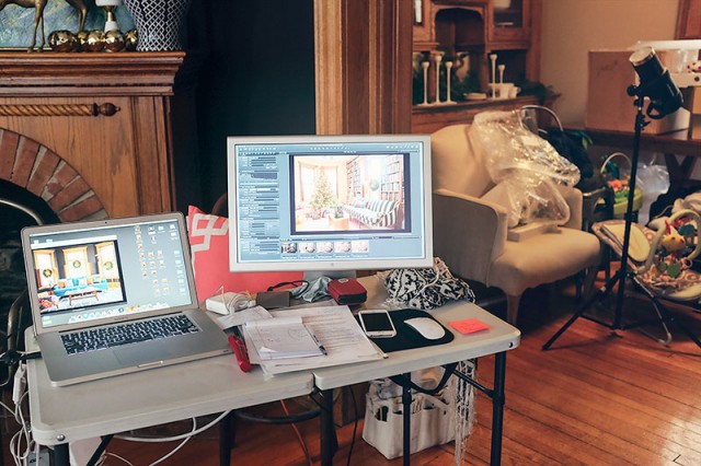
Two more rooms were shot on the first floor, but didn’t make the magazine. One was the bathroom. The stylist brought in some flowers and a couple of pink towels — which led me to pick up a few pink towels of our own. I hadn’t shown the bathroom after doing that because I didn’t want to ‘scoop’ the magazine, but then the shots weren’t in there! And then the other room was the kitchen. It looked so cute the way it was set up. There was berry garland along the glass shelf in front of the windows, the counter was cleared and styled up with pancakes, and they brought in a colorful rug. I don’t know why the other shot was cut, but I heard that the kitchen didn’t make it “because it didn’t look kitchen-y enough.” Ha! Are hundred-year-old stoves not in these days?
Next is the entryway. That rug is one of two that I brought back with me from Morocco, but it isn’t practical to actually have it there — it would get trashed pretty quickly with muddy shoes and winter salt. They wanted to switch our usual runner for one of theirs though, and I suggested this one instead. That chair is mine too, picked up a couple of years ago at Divine Consign. It’s super cute but also super wobbly.
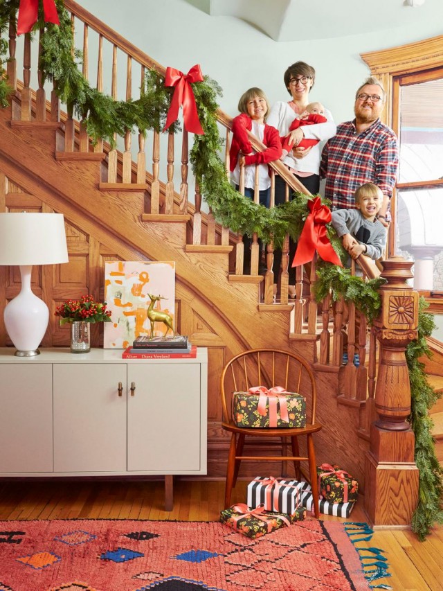
Family shot! ↑ Calvin was just a little peanut! He was six months old when we shot everything. I put him in a union suit, and the little buttons on the butt flap kept opening up.

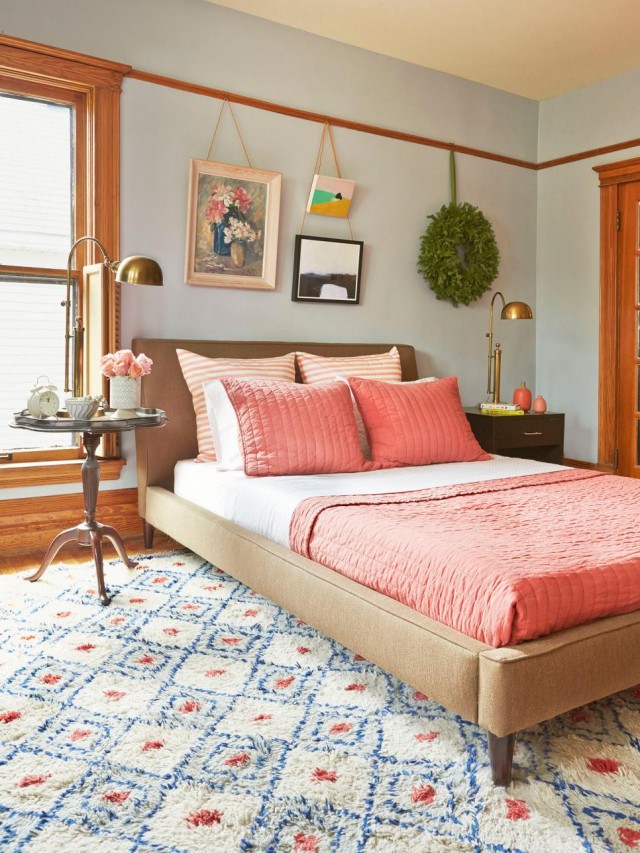
Heading upstairs. The bedroom looks completely different now! The only thing that remains is the wall color, which isn’t nearly as green in real life as it looks in the photo here (it’s more of a soft gray/blue.) We have, since the shoot, sold the bed, rolled up the carpet, and changed everything around. Aside from the wreath though, there wasn’t anything changed just for the shoot.
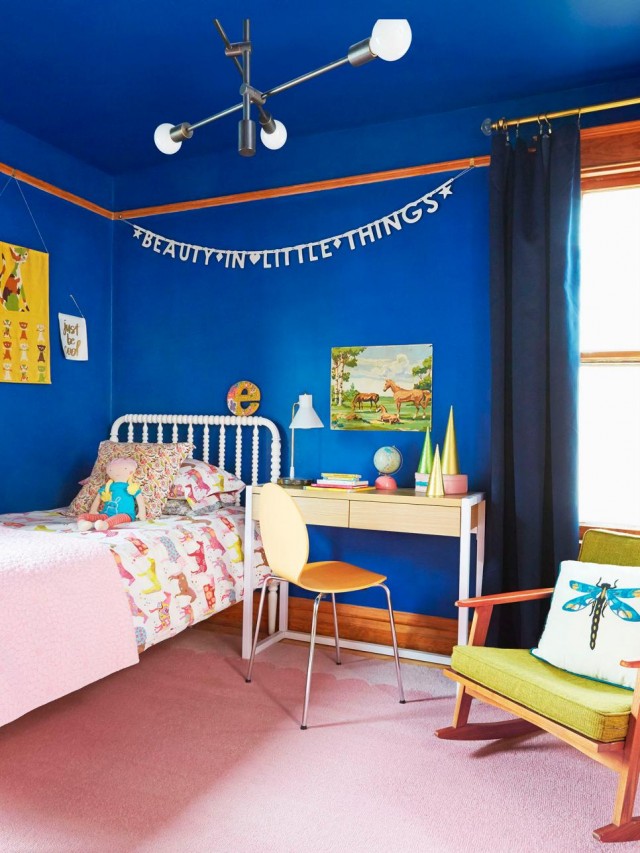
Eleanor’s room looks pretty much like it always looks, with the addition of three DIY Christmas trees that I made a few years back. And the ‘e’ is balanced on her headboard but is usually on the wall.
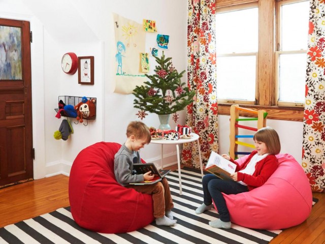
The other bedrooms weren’t photographed, but the playroom on the third floor was. The play kitchen was moved and a little Christmas tree was setup in its place. The kids liked those bean bags and the magazine copy states that they’re their favorite spots for reading, but they were only on loan for the shoot and the magazine had them sent back along with everything else. The kids really did like them though, so I went out after the shoot and bought a kid-sized chair.
The issue is out now and the whole thing is fantastic, so please do pick it up and see it in person. Thank you to the team at HGTV Magazine for featuring our house! It’s an honor to be in the Christmas issue, and so fun to see our house in print, all decked out in its holiday splendor.



Jennifer
December 17, 2015 at 12:44 pmThanks for this post. It is helpful to me to realize how totally fake these magazine shoots are! I’m sure that my house could look fantastic too if a stylist came with truckloads of props including expensive items like rugs (!) that can totally make a room! I knew that things were tidied and “styled” to look their best but I don’t think I ever realized how much faking was involved too. I don’t say this to take away from the thrill of your home being featured – that is really exciting for you – and I realize that a lot of the “style” is your own, but still, I can’t help but be annoyed by the trickery involved for the poor unsuspecting reader…. Do I sound a bit grinchy….?
Making it Lovely
December 17, 2015 at 2:16 pmWell, I should clarify that not all magazine shoots work the same way. Our first house was featured in a few magazines too, and I was my own stylist for those. We cleaned and tidied and might have scooted a piece of furniture over for a photo, but those weren’t styled to the extent that this shoot was. So it depends on the magazine, how much ‘trickery’ is at play!
Jess
December 18, 2015 at 10:41 amDo you really think it’s necessary though (to style it up with stuff that isn’t yours)- having been through two magazines where one was really styled and one wasn’t? I agree with those who don’t particularly care for it. It seems that you have more than enough style on your own where they don’t need to “fake it up” for a shoot. Why not print someone’s lovely home the way that they have it? I don’t know if I would feel excited that they wanted to do my home, or offended because they come in and change so much stuff up!
Claudia
December 19, 2015 at 8:40 amI agree, Jennifer. Pretty much every blogger who’s had their house featured in a magazine has reported the same thing – a team comes in, changes everything around, they bring in tons of stuff that changes the look of the house, photograph it, and then take everything away again.
Olive
December 17, 2015 at 1:12 pmMy sentiments exactly Jennifer. With that said, your house looks beautiful. I especially love the library .
Kim
December 17, 2015 at 2:46 pmHmm I was thinking the opposite actually — how much of “you” still sings through in the photos. It’s all your furniture (even the way it’s set up), your art and your personality. Things like throw pillows and table cloths changing? Even a rug? Doesn’t bother me a bit.
Danielle
December 17, 2015 at 2:46 pmHow awesome! I gotta say, I think I love your house the way you style it – vs the HGTV people. It still looks beautiful, but it’s missing your fun touches.
Kristin
December 17, 2015 at 3:31 pmI really enjoyed this post for several reasons.
First, because we had one of our rooms (not the whole house, thank goodness!) styled and shot for a magazine and I thought the process was both fascinating and exhausting. (I was also eight months pregnant, which they “hid” in the photos, so maybe I was just tired in general.) We had one photographer and assistant, but the magazine (This Old House) had communicated a long list of expectations for the shoot. They didn’t send anyone to the house though. I couldn’t believe how much of a process it was! We cleaned that bathroom to a sparkling shine, but they still came in and buffed and polished everything. Took out all the towels and replaced them with new ones. Took out all the toiletries and replaced them with new ones (that looked the same to me!) Took out all the bath toys and replaced them with other colorful bath toys! There were also a few things removed that were probably removed for copyright purposes, like a vintage bucket with Curious George on it. The biggest surprise of the whole thing is that we thought our project was going to be a small feature, but it ended up on the cover of the magazine, and then on future Bath Design books. It was kind of a kick to be standing in the checkout line at Lowe’s and see the girls’ bathroom peeking out of a nearby book stand two years later.
Second, as an architect, I’m fairly familiar with the process of having a project photographed for marketing / portfolio purposes – in those cases, we’re usually pulling almost everything out of space since it’s the architecture that’s the most important. Still, it’s easy to notice a certain “style” of furniture – the design classics – always seem to make it into these photo shoots. Everyone should always be aware that a fair amount of styling / editing goes into this work. HGTV magazine (and channel) are selling us products first and foremost, so there has to be a certain amount of items in each photo that are available for purchase at their larger retail partners.
Third, I think the photos look great. I love the greenery throughout, and it was great to see E’s room again. I had forgotten the blue – it’s a lot of fun.
Fourth, fun fact: they (TOH) never show toilet paper in a shot! Who knew?
Anyway, congrats on the fun spread. Merry Christmas.
Here’s our shoot, if you’re interested. :) http://www.thisoldhouse.com/toh/photos/0,,20302975,00.html
Kristin
December 17, 2015 at 3:36 pmSorry, that link came out weird. You have to have the whole thing, including all the numbers.
erin @ thh
December 18, 2015 at 6:54 am“HGTV magazine (and channel) are selling us products first and foremost, so there has to be a certain amount of items in each photo that are available for purchase at their larger retail partners.”
That makes sense! Thanks for sharing your experience. :)
Cynthia
December 17, 2015 at 4:33 pmThanks, Nicole, that was really fun to see and read. Your house looks beautiful and I quite like the flowered chair in the living room! Wishing you a lovely, relaxed holiday with your fun family.
Jen @ RamblingRenovators
December 17, 2015 at 9:29 pmReally interesting post Nicole! So interesting to see how different magazines handle photo shoots. The ones we’ve had at our house were mostly hands off, with only fresh flowers brought in and existing pieces moved from room to room. The photos are lovely and very “HGTV Magazine” – bright, colourful, composed – but as a previous commenter said, your style still shines through. Your retro style with a dash of quirk is still there!
Merry Christmas to you and the family!
Emily
December 18, 2015 at 5:45 amReaders/viewers are getting savvy about photoshopping of people and pictures. I hope it continues to styling and editorials, so that your kids might get to nominate their favourite place in the house rather than the opinion of someone who probably never met them!
Lauralou
December 18, 2015 at 9:22 amSuch an interesting process. Thanks for sharing. It would be really excellent if they had let you keep some of the items they used…like the bean bags your children enjoyed. Your home is so lovely!
Rena
December 18, 2015 at 10:17 amYour home is amazing even without all the added decor. I was wondering what the paint color is that you have in Eleanor’s room? It is exactly the color I want to paint in our bedroom. Thanks!
merlin513
December 18, 2015 at 10:39 amHahahahahaa! I opened my HGTV magazine and went, “I know that house! That’s NOT their rug!”
Jeanne
December 18, 2015 at 10:56 amLove, Love, Love this post…all the “real” and “not-so-real”. Glad to see HGTV kept your fun style – Our house was on an HGTV show (My House is Worth What?!) and we had a similar experience with staging…but in the end it was all fun!
Merry Christmas!
http://doodlet.me/
Caitlin
December 18, 2015 at 1:42 pmThis is adorable!
Very interesting to see all the work that goes into a shoot like this…a year in the making!
Where does one pick up a copy of HGTV Magazine?
Caitlin @ Moveable Mess
Kay
December 24, 2015 at 5:43 amI see HGTV magazine at the grocery store + Wal-Mart, etc. — all the usual suspects. If that doesn’t work, then a trip to Barnes + Noble will surely yield you a copy! They carry every magazine known to mankind, don’t they?
Alex P
December 18, 2015 at 4:01 pmWow! That’s amazing, congrats on being featured I absolutely LOVE your style! Started following you after YHL crashed your house and I have been hooked ever sense!
Alex P
Mercedes Conde
December 18, 2015 at 5:09 pmYour house looked amazing… It doesn’t matter if they added a few things here and there… the first picture, where you can see the house… it reminds me of Hansel and Gretel… it looks like it is made of candy… Just adorable. Congratulations!
Jennyg
December 18, 2015 at 10:00 pmSo cool to see an Oak Park house featured! Congrats on a great photo shoot! It looks amazing.
Amy
December 19, 2015 at 8:54 pmAt some point I heard/read that magazines do a lot of staging for these home shoots but thanks for including all the details of what was theirs vs yours. So interesting to see! Big eye opener!
To me the best part of your home is the character (not the pillows or even all those rugs – hehe). It has so much character!!
http://www.lifewithleroy.blogspot.com
Anna
December 21, 2015 at 12:13 pmI was just looking through your website and I don’t know if it’s on your radar or not, but you need to update your “Lovely Life List”. I think this magazine article might count as one.
Gwen, The Makerista
December 21, 2015 at 11:41 pmI just love your home and what you’ve done to it and they certainly were lucky to use it…beautiful!
A Look Back at 2015 | Making it Lovely
December 22, 2015 at 11:50 am[…] It was also the year my sister got married, I taught at Columbia college, and I did a few TV spots for WGN and WCIU (Chicago stations). I also worked with two publications — first, when I styled the coffee table three different ways for Make it Better Magazine, and then when the house was featured in the Christmas issue of HGTV Magazine. […]
kateS
January 4, 2016 at 3:59 pmMy that’s nice! Your natural woodwork has never looked better…just beautiful. Congrats! Especially love the grey rug in the LR and little Calvin in his union suit…the house looks great and so do you and your family
Dorothy
January 7, 2016 at 2:23 pmI enjoyed the your background info on the HGTV mag feature. While I expected staging to some extent, I was surprised and disappointed to see that they brought in so many large items for the shoot. I agree with other posters that your style shines through, but it makes it seem like they just wanted “a set” to style up for a feature. I am glad you are pleased with the feature, but I think I would feel a bit let down if they asked to feature my home and essentially refurnished it for their purposes. I think what most disappointed me most (I am a HGTV magazine subscriber) was that they went out of their way to deceive by mentioning things like the beanbag chairs were the kiddos favorite reading spot when they are not even part of the day to day life of the household, but only there for the purposes of the shoot. I should know by now not to be so naive. I was similarly disappointed when I read a blog about HGTV House Hunters and found out how totally staged/scripted that show is. I guess we can all feel a little better about our homes with the knowledge that the houses in these features are just like ours- professionals see room for improvement!
Holly
January 10, 2016 at 8:15 pmI know Christmas is now over but that was a great post! Loved looking at your home, beautiful. That cobalt bedroom is great, so daring! Congrats on the HGTV feature.
One Room Challenge: Week 1 (the Before Shots) – Making it Lovely
April 6, 2016 at 8:57 am[…] Our home was shot for HGTV Magazine last year, and at the time, the bedroom looked like this. […]