I ordered a few different styles and brands of black chandelier shades for our new sconces.
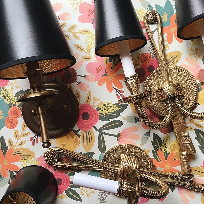
We can talk a bit more about those once they’ve been installed. (Soon!) As far as the shades go though, I ordered a bunch to gauge quality (Royal Designs ftw), and among the options were black pleated shades. I loved them! Brandon hated them! Friends gently suggested that they looked dated, and Brandon said they belonged in a hotel. Since nobody liked the dated hotel look (except me — I forever and always love granny details), I went with sleek paper shades. They look fine. They look great, actually. But I’m still longing for a pleated shade.
There’s a whole lot to love about this room designed by Miles Redd, but that pink pleated shade is particularly lovely.
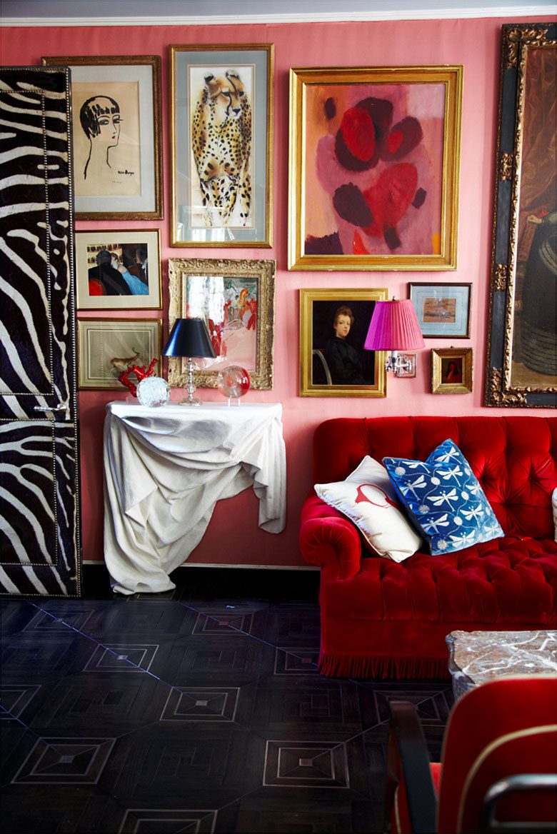
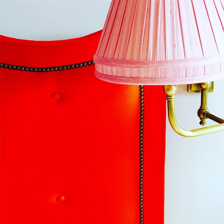
More pink pleats from Miles Redd.
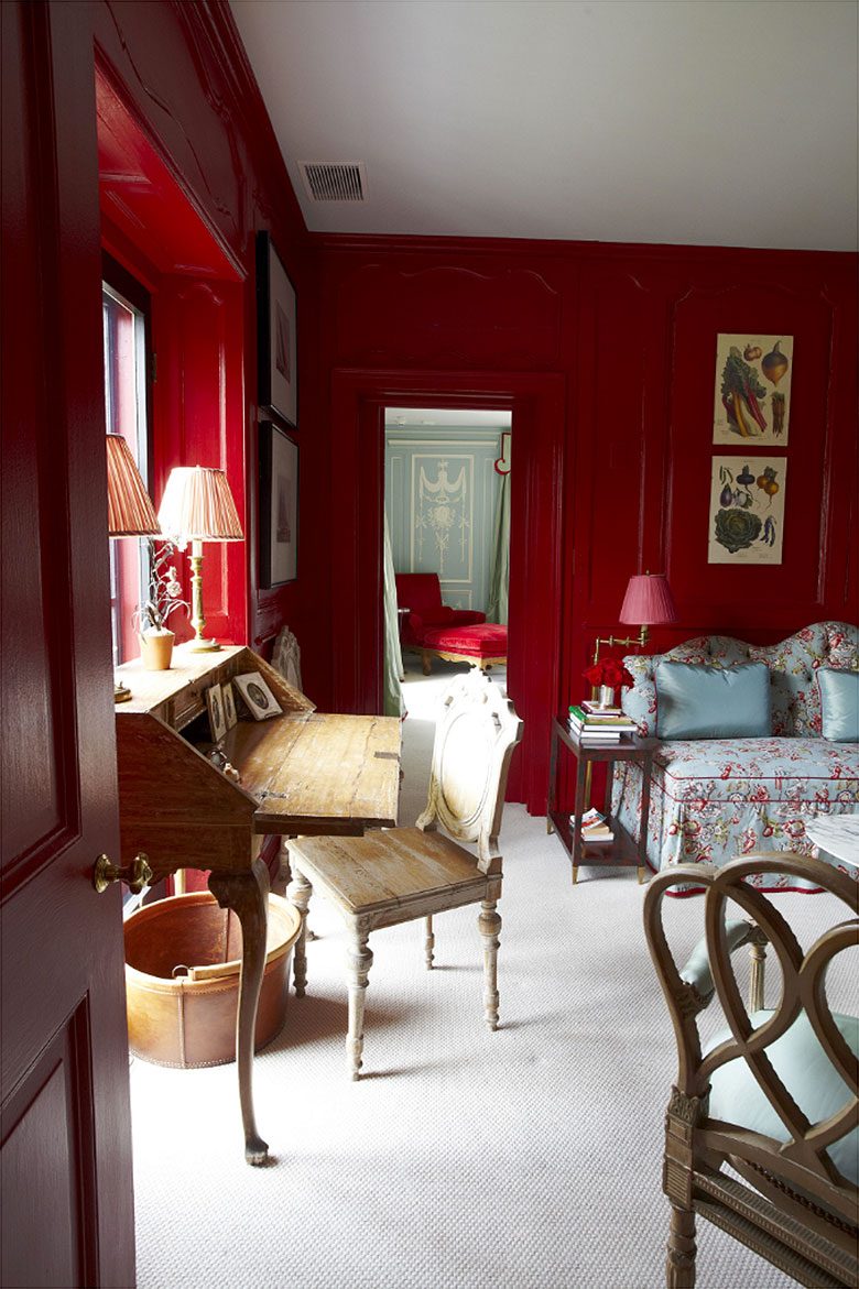
And Summer Thornton delivers too.
I noticed when I was browsing table lamps for this post that I passed right by the one below on the left, but instantly gravitated toward the one on the right. It’s a smidge more traditional than I would typically go for, but oh, the difference a shade can make.
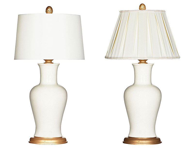
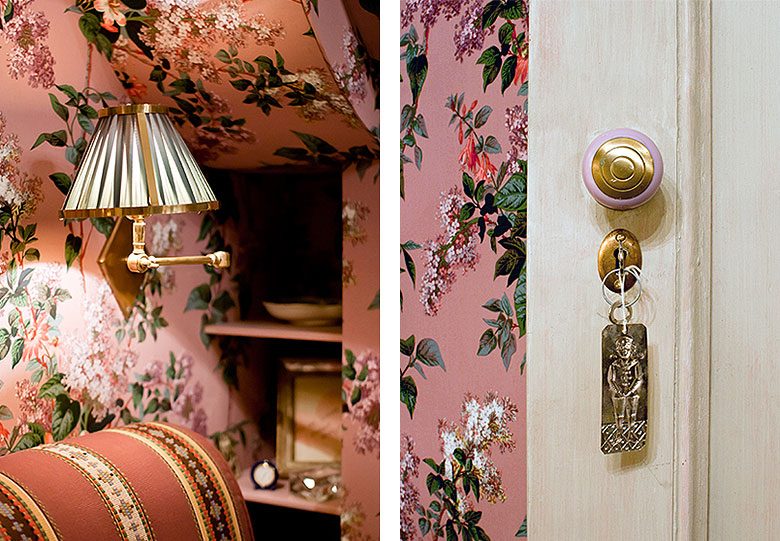
Yep. I’ve got to get some pleats in my home. I’ll leave you with a couple of vignettes from a room designed by Hamish Bowles to further make the case for granny details.



Sharon Rexroad
September 26, 2016 at 4:55 pmI’m loving on that couch / daybed in the 2nd Miles Redd picture. The red cording elevates it (as if the curved back needs elevating!)
judy
September 27, 2016 at 1:11 pmI love your blog,your style and I abhor pleated shades. Why? They are trying too hard. Difference between a woman dressed sleek and classic and one in a crinoline-too much makeup and yodeling……
Victoria
September 27, 2016 at 1:46 pmHa, funny differences. I hate the lamp on the right with the pleated shade and think the plain is more sophisticated. Pleated and granny tasselled shades appear to be in now though. There was a whole stall of them at a craft fair I was at recently.
Jen
September 27, 2016 at 2:16 pmHave you seen the pleated shades from Furbish Studio?? http://furbishstudio.com/collections/furniture-lighting They’re not the right size for this project, but I think they’re such a great mix of that granny style with more modern and poppy fabrics. Can’t wait to see the finished hallways!
Meegs
September 27, 2016 at 2:45 pmI think you would really like Shades of Soho: https://www.shadesofsoho.com/ Their custom stuff is amazing, and I’ve seen a few things of theirs that remind me of you!
karen
September 27, 2016 at 4:50 pmPleats are back girlfriend. Just like pink is back.Love the wallpaper behind door#1(1st picture).
E E Faris
September 28, 2016 at 3:10 pmI love pleated shades. They add texture and dimension. You are right on this one.
One Room Challenge: Week 2 (The Design Plan) – Making it Lovely
October 12, 2016 at 9:01 am[…] It’s going to look amazing! Although I have to say, the pleated pendant* (I’m getting my pleats!) and mirrored sconce* are not to be […]
One Room Challenge: Week 6 (Front and Back Entry, Stairs, and Hallways – Final Reveal!) – Making it Lovely
November 9, 2016 at 2:00 pm[…] excited about getting the pleats I had wanted, but I don’t think it’s going to mix well with sawdust and plaster dust! Better to wait […]
One Room Challenge: Week 1 (the Before Shots) – Making it Lovely
December 1, 2016 at 3:15 pm[…] as awful as the second floor hall, but it is in need of some repair. I was already planning on changing the sconces up there and the doors could use a bit of love at the same […]