I was going for drama and bold color in the guest room, but it’s just so damn dark in there.
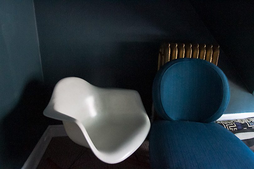
I had almost a gallon of paint leftover from the den, and I was eager to do some painting. I knew it was a risk, but I was excited about making a big change and I went for it. I love the color downstairs! I hate the color upstairs!
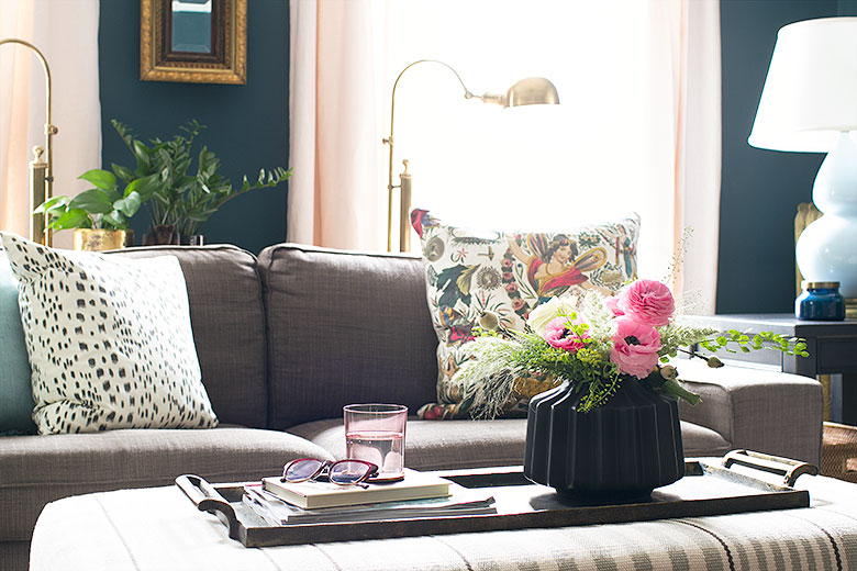
There’s more light coming in from two much larger windows. The ceiling is white. The wall color is broken up by blush pink curtains, art, and a wall of french doors. Upstairs? One small window placed low, walls that close in on you because of the roof pitch, and no delineation with just a single door breaking things up. I wanted cozy, but it’s more like a cave. And not a cute designery chic cave. It doesn’t feel good to be in that room. It’s not cute even walking by and seeing it from the hallway.
I still like the mockup and idea, but in reality, the bed is backlit and the white bedding reflects the dark teal surrounding it.
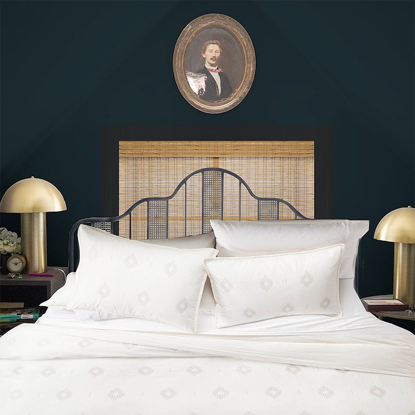
It was a big old mistake. But it’s just paint! Time to rethink and try again.
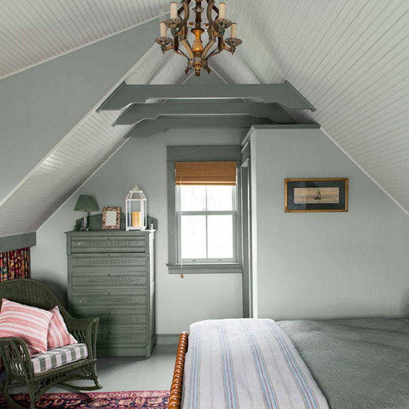
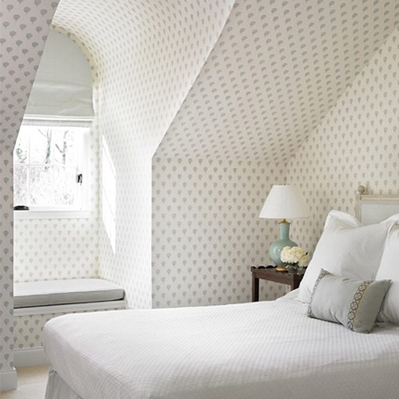
The walls curve to meet the ceiling throughout our finished attic, and I prefer to treat them as one rather than creating an arbitrary line to break them up. Wallpapering the entire room with a small scale print would be super sweet, but the plaster is textured and I wasn’t going to skim-coat the third floor anytime soon. I’m seriously wondering if I should do it now though? It’s messy and time-consuming to DIY, or messy and expensive to hire out, but you know I love a good wallpaper and that’s the only way it can happen.
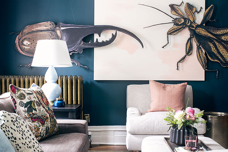
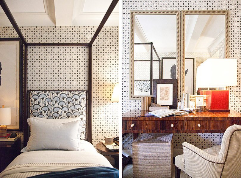
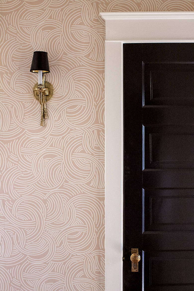
I’ve loved that room by Thomas O’Brien forever, though that print is probably too geometric for the wonky angles of our guest room. Something with more movement like our hallway paper would be easier to pull off.
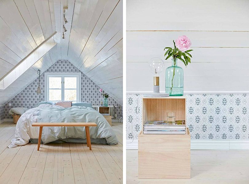
And while I’m not an accent wall fan, the example below is lovely. They actually do continue the wallpaper around, it’s just very low and the ceiling is planked.
Another planked ceiling example (this time with beadboard, which is a better fit for my house). I like the nonstandard trim color, too.
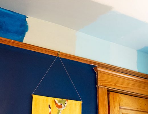
I’ve only done one coat, so at least I’ve only wasted one day’s work. The problem is that I’m not really sure yet what I’d rather see instead. This was supposed to be a quick and easy update. Cheap and cheerful. And now I’m like, I should skim-coat, rip up the carpeting, redo the floors, and hang wallpaper!
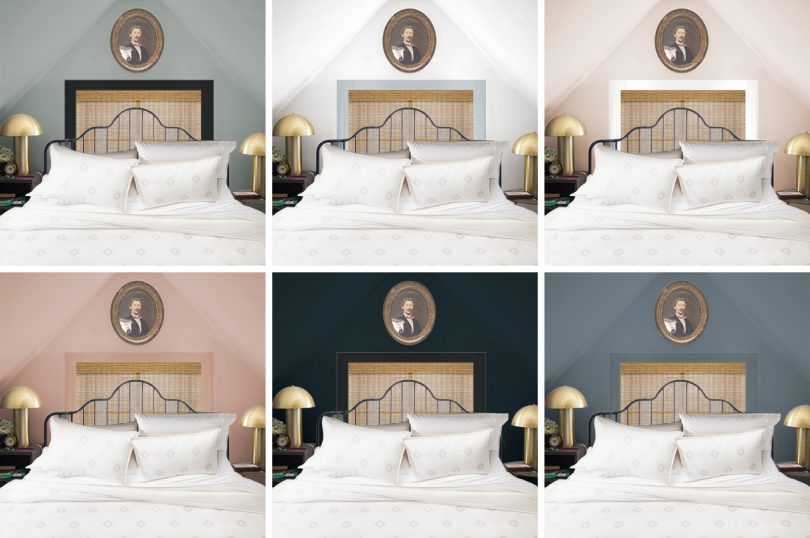
Or you know. Just repaint. But what color(s)?



Marty@A Stroll Thru Life
June 14, 2017 at 10:51 amI don’t know, I kind of like it.
Making it Lovely
June 16, 2017 at 3:58 pmBrandon does too.
gigi
June 14, 2017 at 11:20 amplank the ceiling , leave the wall color
Making it Lovely
June 16, 2017 at 3:59 pmIt would be so high-contrast though! Assuming the planked ceiling was painted white, which I guess doesn’t have to be the case.
Georgia
June 14, 2017 at 12:52 pmYou are right. Add white stripes :) It’s going to be fab!
Making it Lovely
June 16, 2017 at 3:59 pmStripes and textured walls don’t play well together, so not a good option here.
Carol Weston
June 14, 2017 at 1:17 pmIf you still need a cheap and cheerful update, go for the pink, it will still look lovely on a dull day and will be very cosy at night with the lamps on for your guests. All the other idea are gorgeous of course, but as you say, it is turning into a major project. I’ve done this too I painted a room grey for a chic understated update, the colour was called clay, it looked like a big lump of clay too, dour, damp and heavy! Took about 4 coats to paint over too. Dag nabbit!
Staci
June 15, 2017 at 11:21 amI second pink! Or what about pinky gray? Or light peach?
Making it Lovely
June 16, 2017 at 4:00 pmTotally turning into a project. I had the same thought about the pink and dreary days! Gray (and grayish greens/blues) could be mildly depressing, depending on the weather and time of day.
Kat
June 16, 2017 at 4:51 pmPink all the way! So pale that it reads as white in the day, but is definitely pink at night.
Anna
June 23, 2017 at 9:59 pmYes, pink! It will feel so cozy when the light comes through the window.
Caroline
June 14, 2017 at 1:59 pmI say don’t fuss with wallpaper right now, just paint it–and I’d also go with the pink. Looks lovely and flatters most people.
Making it Lovely
June 16, 2017 at 4:01 pmIt does for sure. I’m always a fan.
Danielle
June 14, 2017 at 2:08 pmI have been a wallpaper lover lately. It has just come such a long way and can be so fun! The idea of breaking up the wallpaper with the ceiling painted is really charming. I say go for it!
Making it Lovely
June 16, 2017 at 4:02 pmI fall in love with a new wallpaper regularly! ;) The fastest way to add charm, and there’s no paper on the third floor yet (because of those bumpy walls).
Linda Moore
June 14, 2017 at 2:15 pmLove wallpaper but skimming the walls, ugh! Been there done it. Two thoughts. One, I have used the anaglypta paper in old houses with great success without having perfect walls. The texture on this paper really hides a multitude of sins. But then you still have to paint it. I like the color way but think you could go several shades lighter. Or you could just paint it lighter.;)
Making it Lovely
June 16, 2017 at 4:04 pmSkimming is the worst. I mean, great when it’s done, but doing it is kind of awful. I hadn’t considered anaglypta — I do like it, but if I were to wallpaper it would be for the pattern, not just the texture. Still mulling over colors!
Kaitlin
June 14, 2017 at 2:23 pmI feel your pain. I have textured walls in my attic rooms as well and I hate it! But skim coating the entire thing to put up one accent wall of wallpaper seems crazy. Or not. I’m really just too lazy to take on that job. I never realized what a royal pain textured walls were until I moved into my house a year ago. I hate them forever and ever.
My initial thought on another paint color was the light blush color bc it’s so very of the moment and pretty. But just this morning I saw a round up of rooms painted lavender (on Apartment Therapy or Design Sponge or someplace like that). So lavender is the new blush maybe? Have you considered a light lavender with warm undertones? I think it’d feel cozy without feeling like you’ve jumped on board the blush wall trend.
Making it Lovely
June 16, 2017 at 4:07 pmIt’s not a fun job — I don’t blame you for not wanting to do it! I’m happy to DIY a lot, but skim coating is something I like to hire out. I’m not a pro, it takes forever, and someone else could do it better and faster than I can. Totally worth it, but then of course it’s kind of pricey, and do I care enough about this room?
As far as purple, you know, I think it’s coming back. Like the dusty purple of taupey nail polish. (We had a purple apartment, and I loved it at the time!)
Kim R
June 14, 2017 at 2:40 pmDoes it help if you put the curtains back up?
Making it Lovely
June 16, 2017 at 4:07 pmOh, maybe. I spackled over the holes, but I could kind of drape them over the headboard and approximate it.
lauralou
June 14, 2017 at 3:49 pmI like the top left greenish grayish color. It’s still “color” but light enough to reflect light. Also, white curtains. Of course, I also love the headboard look.
lauralou
June 14, 2017 at 3:49 pmThat should have said “beadboard” not “headboard”. Argh.
Making it Lovely
June 16, 2017 at 4:09 pmI like the beadboard too! We already have it in all three bathrooms and in the first floor kitchen, so it would feel like a natural extension of those design choices. I wonder if it would be kind of overwhelming though — the roofline really does make up the majority of that room.
Virginia
June 14, 2017 at 4:55 pmThere is a wallpaper guy tackling my 1946 plaster walls as I type this! He’s using a kind of thick plain liner paper that smooths out the surface somewhat before the real paper goes down. It doesn’t completely smooth things out like skim coating would, but it’s a hell of a lot cheaper and is good enough given that the paper I picked (Chiavi Segrete by Fornasetti, which I first discovered on your blog!) has enough pattern to help disguise that we’re cheating. Plus, it was on mega sale at Anthropologie! Still expensive but not as painful as it’d usually be, FWIW.
I like the idea of an allover wallpaper that’s a less traditional print than the one in the example photo. Good luck either way!
Making it Lovely
June 16, 2017 at 4:11 pmOOH! Pictures when it’s done, please! (And that liner paper is often recommended by the old school paper manufacturers. Sounds like you’ve got a good installer whose doing it right.)
Cat
June 14, 2017 at 6:06 pmWe have a very similar color to the green-gray (in the top left corner) in the upstairs bedroom of our 1908 home and love, love, love it. Our bedroom is also a converted attic, complete with wonky angles and ceiling pitches, and this color plays well in all light conditions.
Making it Lovely
June 16, 2017 at 4:13 pmThank you, good to know! Do you have photos, or remember the name of the color you used?
Alyssa
June 14, 2017 at 6:36 pmHave you considered temporary wallpaper, or a different ceiling colour? I love the colour of the walls. Huge fan of the beadboard as well.
Making it Lovely
June 16, 2017 at 4:14 pmThe walls would still need to be smoothed for a temporary wallpaper though, and that’s what’s holding me back. The color is beautiful, but just maybe not in that space.
Jenny
June 14, 2017 at 7:40 pmI say go with the pale pink and nix the bamboo shade. Do a Roman shade in a really fun, cheerful floral fabric. It’ll be a nice pop of color and pattern.
Making it Lovely
June 16, 2017 at 4:15 pmI should have mentioned that I haven’t chosen a shade yet! I put that one in there for the mockup because it was a neutral that blocked out the blinding white of the window. I agree, a fun print could be great there.
Jane @ quirk-shop.com
June 15, 2017 at 12:12 amBummer the dark teal didn’t work out! I love the pink walls, but I recently painted my bedroom a pale turquoise that is pretty magical. It works really well in my small space and is a joy to wake up to. http://quirk-shop.com/2017/06/09/summer-bedroom-reveal/
Making it Lovely
June 16, 2017 at 4:17 pmI love it! I’ve used Sea Salt before — the extra saturation in your color is nice.
Erin
June 15, 2017 at 8:04 amI vote for small scale print wallpaper <3 <3 It reminds me of Eliza's room in My Fair Lady which has always seemed like the epitome of quiet coziness to me.
Making it Lovely
June 16, 2017 at 4:18 pmAw, I want to see. I haven’t seen My Fair Lady, so I tried to google it, combined with “set design” and so many images came up.
Sheree
June 15, 2017 at 9:19 amI vote to paint the room pink that way the entire attic flows with the pink wallpaper in the hallway and the pink accents in the rest of the rooms upstairs.
Making it Lovely
June 16, 2017 at 4:19 pmThe pink wallpaper is on the second floor and this is the third, but I did paint my office the palest of pink (and of course it’s a color that appears throughout the house in various doses).
MaryMargaret
June 15, 2017 at 9:49 amI would leave it for a bit and see if it grows on you. I love it — moody and dramatic.
Making it Lovely
June 16, 2017 at 4:20 pmI have left it for now. No sense in rushing in with another color if I don’t have a clear direction yet.
Peggi
June 15, 2017 at 10:31 amAh, quick decorating… “It’s just paint” has lured us all at one time or another! I’m still on team olive, so that top left gray/green is my choice. I have to say it’s the bamboo blinds in all the pics that are ruining it for me; not sure why they’re distracting me so?! Of course, skim coating and a fun allover print would be my “sky’s the limit” selection.
Making it Lovely
June 16, 2017 at 4:22 pmDefinitely my choice too if I could snap my fingers and make it happen. I have some other projects I’m working on at the same time though, so I’m not sure I want to add this too! And the bamboo is just a placeholder. The window in the photo was so blown out and white that it was distracting. I’ve considered a subtle linen or a fun print.
Angela N
June 15, 2017 at 11:19 amLove the pink!! Cheery and fresh. Especially with all of the dark elements already going on.
T M
June 15, 2017 at 12:36 pmBlush/pink walls, matching Roman shade, (light blocking) , trim painted same color as walls and shade. Curtains that frame sweet roof line and add drama and focus to the bed/great headboard. That’s, what I would do, but I can’t wait to see what you do……..love your home and all you’ve done with it. Love following your progress.
Celeste
June 15, 2017 at 6:05 pmOh, man. What a letdown! I’d say don’t get sucked in to a huge project that will take energy from the things you’re already working on. Skim coating, bead board, wallpapering, etc. seems like a lot of energy (and money!) for a small tradeoff. Though, maybe your guest room gets a lot of mileage and you want it to be —I don’t know! But I haven’t gotten that impression, which is why I suggest waiting and redirecting.
That said, I like the idea of the top right or the top left for paint. They seem lovely and like they would be beautiful with your pretty wallpaper in the hallway!
Good luck! These turns of events have a way of nagging at us.
Vanessa Bailey
June 15, 2017 at 9:09 pmI like the “non-standard” trim color too. It does look dark the way it is and I do like the pink as so many others have said, so to keep it simple, just repaint.
Judith
June 17, 2017 at 3:06 pmI wouldn’t paint everything the same colour, but instead treat the wall with the window differently than the slanted ceiling. Probably a darker colour there than the ceiling. The ceiling basically acts like a canopy for the bed, so I’d try to keep that in mind and not put anything there that you couldn’t imagine using if it were made out fabric and hung over a rod.
You could also, in addition to painting, actually put fabric there, something light and airy, over a rod that runs very close to the peak of the ceiling and possibly affixed to two side rods positioned where the ceiling meets what is left of straight walls close to the floor. With just enough give in the fabric that it has a slight “hang” to it, but not enough to make the room smaller. Just enough so there’s texture and cozyness there.
I slept in a room for a year that basically was half of your room, with one slanted ceiling over a bed with similar width to your guest bed, and that’s what I did. I used some pretty much see-through white fabric from Ikea, it had a bit of shine to it and had been washed so it wasn’t stiff but “broken in”. Not sure they have it anymore. I also put some string lights behind it, but that was in my twenties and I’m not sure I’d do the same today. In total, it made the room feel bigger than before and also super cozy.
Tina slocum
June 18, 2017 at 5:03 pmYes to small scale print wallpaper! Light and airy up there but with cosy linens.
Lambrequins and Bed Skirts, Oh My – Making it Lovely
June 26, 2017 at 1:39 pm[…] Right Color, Wrong Space […]
HomesAndWeddings
June 29, 2017 at 12:40 pmJust want to say I enjoy watching your progress. Loving those planks though. And the dark green.
Helen
June 30, 2017 at 8:00 amPink!! Both shades of pink would look lovely, very cosy :)