This post is sponsored by Dutch Boy® Paints.
Red and light blue — those were the only parameters I was given by my six-year-old. You got it, kid!
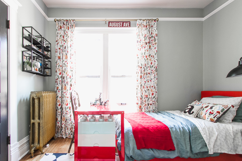
I approach kids’ rooms a little differently than I do the other spaces in a home. If it’s important to a child to incorporate their favorite color, there are ways to make it work. August had been adamant about red walls for a long time, and I was ready to go with it. I let him know that if and when he wanted to change his room, I would help him (read: do it for him). I had a plan in place, but then he started talking about light blue! I made a couple of mockups with different wall colors to show him, and blue won — with plenty of red incorporated elsewhere.
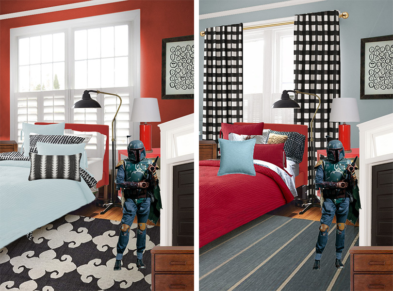
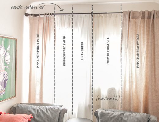
This was pretty early on in the process, so obviously some of those choices weren’t finalized and have changed. And I’m still into that black and white buffalo check, but August picked his fun colorful curtains when we were out together. Still totally cute, and I like encouraging my kids when they take an interest in their surroundings. (Someday they will probably learn to exploit this.)
The entire shell of the room was painted, except the floor.
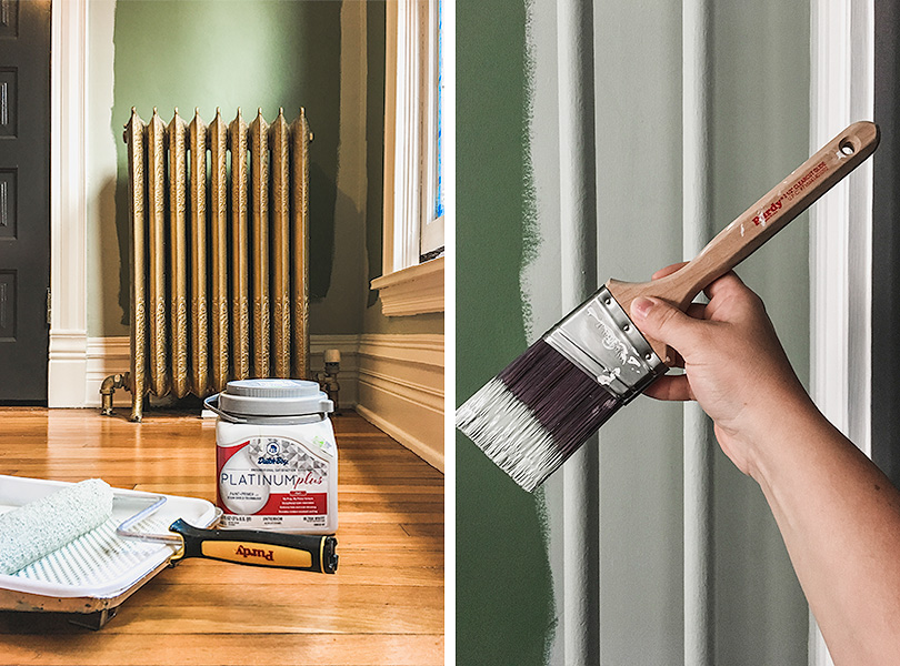
The ceiling had a few repaired patches from when we rewired, so it got a fresh coat of Dutch Boy® Platinum Plus Ceiling Interior Paint + Primer in Brightened Cream (005W), flat finish. I used the same color for the wood trim, but used Dutch Boy® Dura Clean™ Cabinet, Door, & Trim paint. I also used this product for the doors in Dutch Boy’s Authentic Black (437-7DB).
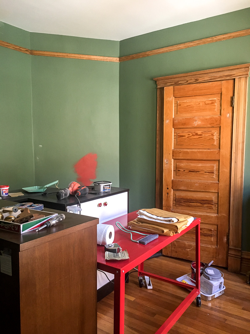
A quick reminder of the green walls and unpainted fir ‘before’ situation.
I cut in with a Purdy ClearCut Glide angled brush and rolled the walls with Purdy’s White Dove 9″ x 3/8″ roller cover. Someone had asked me for tips on painting behind a radiator without removing it. I say tape off as well as you can, use a mini roller, hope for the best, and don’t examine it too closely!
I knew the walls would be “light blue” per August’s request, but I waited to choose the exact shade until after we had picked up the bedding. I found a linen duvet cover that IKEA is calling green but that I am calling slate blue, and I chose the wall color to complement it — Dutch Boy Frosted Olive (425-2DB). I again used Dutch Boy® Platinum Plus Interior Paint + Primer in a flat finish. It has Stain-Shield Technology that allows stains to be easily wiped away, which is great for a kid’s room. I used it in our pink guest room recently too, and it’s a great paint priced around $35/gallon.
The walls are lovely, and the black door plus white trim combo gets me every time. That and the life-sized Boba Fett wall decal, of course.
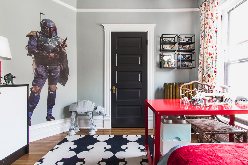
Kids often go for the really saturated, crayon-bright version of a color when you let them choose. If they want red, they want red! Blue is blue! Those vivid hues are great for a piece of furniture or in accessories, but could be overwhelming on the walls. I prefer a more muted color, and I love the way Dutch Boy has organized theirs. The color numbers that start with a ‘1’ are bright, ‘2’ is mid-tone, ‘3’ is muted, and ‘4’ is neutral. I wouldn’t consider any of the colors starting with ‘1’ for the walls — they’d be far too intense for my taste! The one I chose, Frosted Olive (425-2DB) is the perfect shifting blue/green/gray I was aiming for. Very subtle, very pretty.
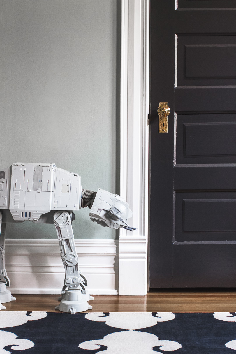
And why did I pick green when I wanted light blue? The color is on the spectrum where green and blue meet, and the room is north-facing and fairly close to the neighbors. This is not a space that’s flooded in bright sunlight, and northern light reads cooler (making everything look a little bluer). On the opposite side of the house, the “olive” in the name would definitely be more apparent.
The room is about 10×10′ and has the entrance door with transom, closet door, radiator, large windows, and an angled wall to work around. August likes to build and play with LEGO models (could you tell?), so I wanted to keep his red desk in there. I had arranged the room before with the bed centered on the windows, perpendicular, with the desk in the corner. I’ve always liked the idea of a desk or dresser backed up against a bed floated in the middle of the room, but there isn’t enough space to pull it off here. I came up with this somewhat unconventional version of that layout, and it works. The desk functions like a partners desk now, with one kid sitting in the chair and another (or two) at the foot of the bed.
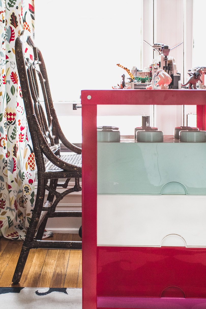
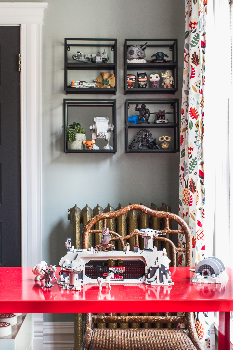
The wall behind has four wall-mounted shelves arranged in a grid (one with a mirrored back and three with double shelves) for display. Excellent for keeping certain models out of a little brother’s reach.
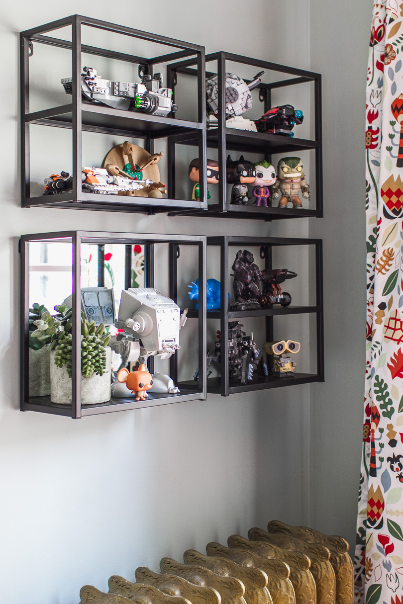
I wasn’t going for a theme room, but the kid has his preferences! Star Wars, LEGOs, superheroes, and video games. His toys are a major part of the decor.
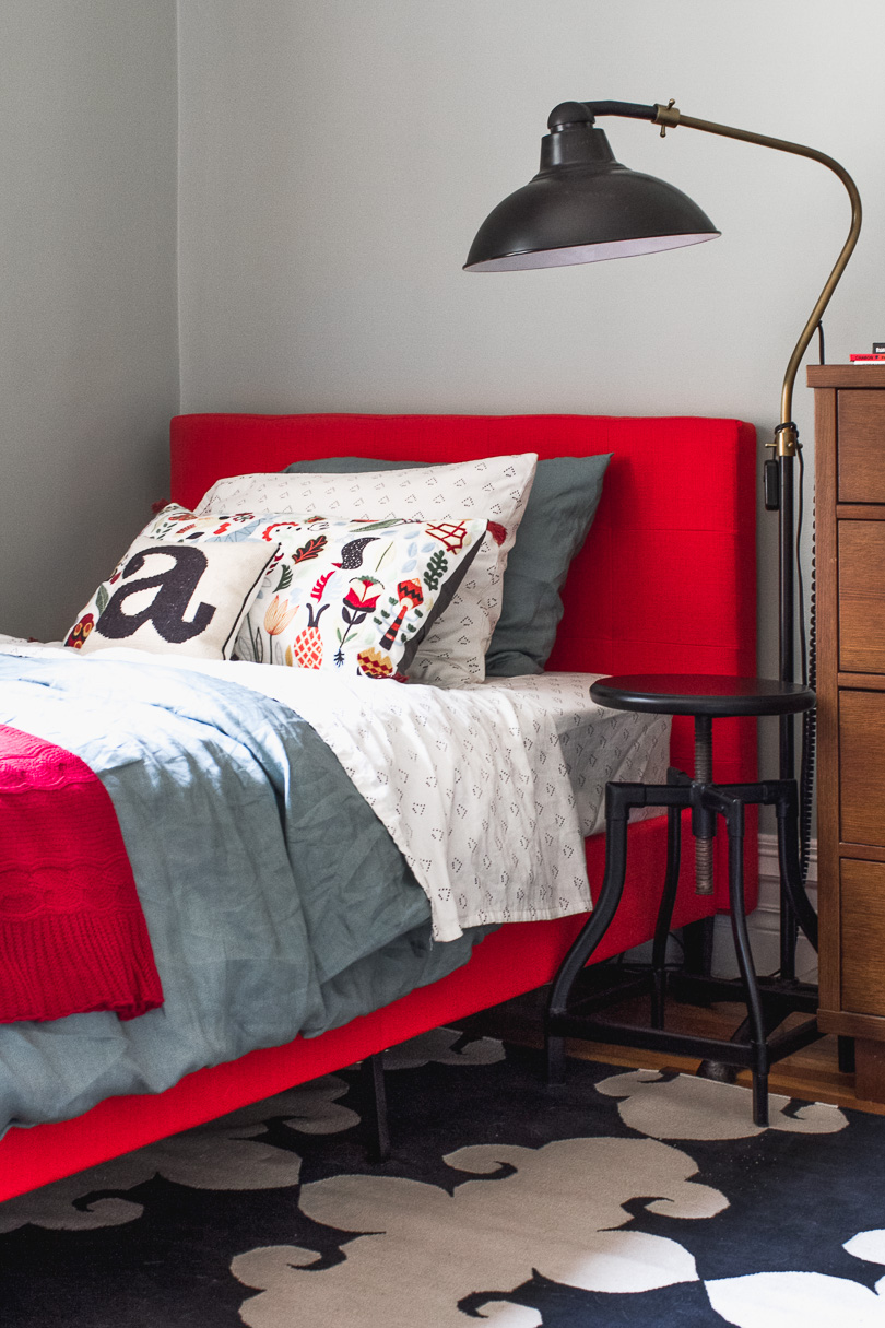
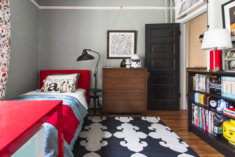
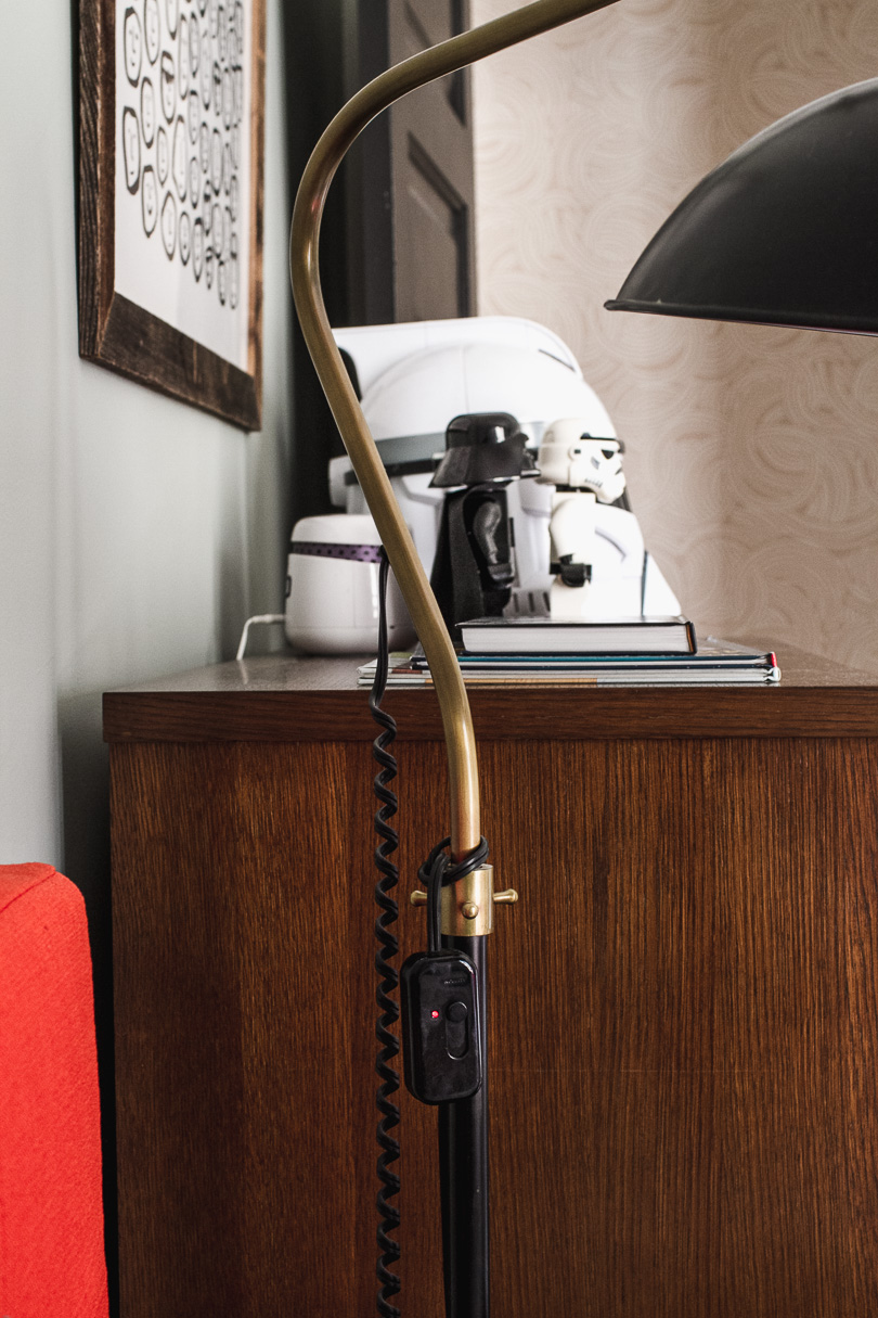
A red upholstered bed brings in more of August’s favorite color. We picked up an embroidered pillow in a print that matches the curtains, cute white sheets with triangles, and the green (blue) linen duvet set. We’ve had that little ‘a’ pillow for years, and we have other bedding that can be mixed and matched in and still go with the room. An adjustable stool that I grabbed from another room is standing in as a nightstand with a floor lamp beside it. I added a plug-in dimmer switch and looped it up to be within reach from the bed.
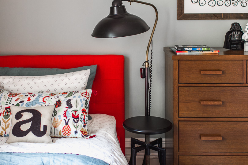
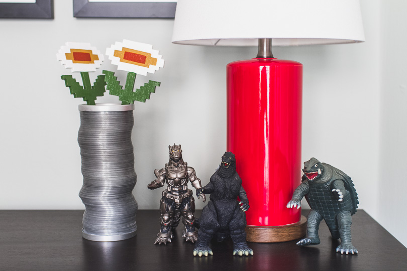
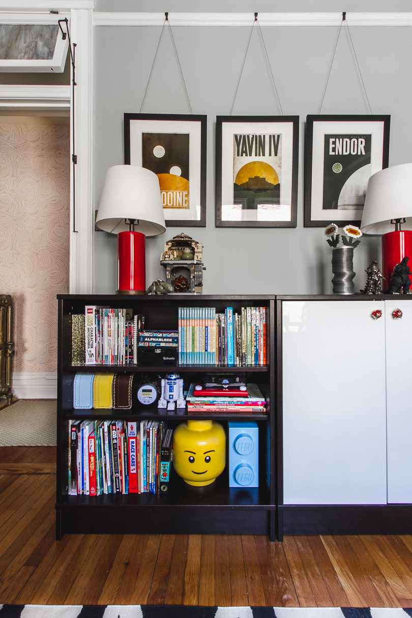
The dresser holds all of August’s clothes, freeing up the closet for toy storage. We also have some of the bulky sets behind doors in these old bookshelves we took with us from the last house. It’s a great mix of open and closed storage that keeps the room from feeling too cluttered. The books and toys are all super colorful (and not always neat, day to day), but the subtle paint color keeps it visually calm. The pair of red lamps bring more of that favorite color in, and I like the layered effect of the framed prints behind, suspended from the picture rail.
I took care to get my son’s opinions throughout the process of redoing his room. I incorporated the color scheme he wanted in a way that works within the larger context of our home. We set up areas for the way he likes to play — a large, open area in the middle to spread out, and a desk for detail-oriented work. His favorite toys are prominently displayed, and the art is guided by his interests. I want my kids to feel like their rooms are a reflection of themselves! He loves it, and what’s wonderful is that it makes me just as happy.


Marty Oravetz
August 22, 2017 at 3:35 pmI love it. What a fun room.
AnnW
August 22, 2017 at 4:53 pmI love the Chinese Chippendale chair. It reminds me of a pretzel! Or a twiggy tree. This is a great compromise as a room. You don’t always have to take kids literally. Beautiful.
stephka
August 22, 2017 at 5:05 pmYes, this is great and I thought the same thing about the chair! It looks like a pretzel. So much fun. And I love August’s curtain choice.
Mandolin
August 22, 2017 at 5:24 pmWhere did you get the large lego like storage boxes that are under his desk? I need those for my 9 year olds growing lego collection that I’m having trouble containing! I love the makeover!
Susan M Carter
August 22, 2017 at 6:23 pmWhat a great design, I love it! I’ve been looking for a bed for our 4 year old for several months now and this one would be perfect. Everything about this room design is great. We live in an older home as well (100 year old brick rowhouse in Washington DC) and our son’s is a similar size and look (gray paint, dark wood door, white trim). I love the mix of modern with old, the star wars legos with the nature print on the curtains and pillow. Thank you so much for this post, and the inspiration!
monica
August 22, 2017 at 7:23 pmMy son, now 14, also requested red walls. For a couple of years, I resisted, and hoped his desire would wane, but it did not. Two years ago, when he was 12, I bit the bullet and painted one wall red. He was very happy. I did not have to change anything else and the only money I spent was on the paint. I will be able to easily repaint the one wall when he grows or changes his mind.
Susan
August 23, 2017 at 8:33 amI really love what you’ve done here. We have the same curtains and duvet but in different rooms. I’ve always loved those curtains.
Molly Crawford
August 23, 2017 at 8:43 amLove it so much! I think the curtains and pillow bring a little sweetness in (hold on to that little boy as long as you can!). The wall color is really lovely and plays so well with the red. The furniture arrangement is also very clever and fun for kids. Great job!
Amanda
August 23, 2017 at 8:43 amLove this! Our home has picture rail as well. What type of cord did you use to hang the prints? It looks so crisp and clean!
Amie
August 23, 2017 at 12:01 pmThere are so many amazing things in this room! Well done, Nicole.
I agree about the kids wanting saturated versions of their favourite colours if they were allowed. When we moved our daughter into her big girl room, she requested purple walls. We found Lilac Mist by Behr that is barely purple, and it is magical. She would have went eggplant ;)
Shalini
August 23, 2017 at 1:01 pmLoved your design and color combination you chose, particularly the wall color that is cool and green :-)
Liz
August 23, 2017 at 2:06 pmLove it! So nice that you incorporated your son’s preferences, instead of just doing what you thought would be “Insta-worthy” (although IT SO IS). A win for moms and kids everywhere!
Caitlin
August 23, 2017 at 2:09 pmIt looks so great, Nicole! All the care and attention to detail has really paid off.
Chai and Home
August 23, 2017 at 2:57 pmI’m always amazed that this generation thinks of Boba Fett as a hero instead of a villain. Go figure. Oh, and the room looks great.
Katie
August 23, 2017 at 4:05 pmBeing a boy mom, I love everything about this room! So many great ideas and you can really sense your son’s personality. Well done!
Valerie Hill
August 23, 2017 at 5:21 pmI appreciate your efforts here…looks fantastic! A space to grow with! I think the best part of the whole design is that it can grow up with him and not feel like a little kid’s room for someday when he might be less enthused about the Star Wars items hanging around.
Vanessa Bailey
August 23, 2017 at 6:58 pmWhat a great result Nicole and I do think the Frosted Olive is a wonderful light blue with enough gray to make it reasonable.
bpgreenwood2013Bettye
August 24, 2017 at 8:49 amI love the evolved look of the room. It doesn’t look “decorated” but is cohesive and pleasing and it functions. Now I want to paint my bedroom Frosted Olive. I love it.
Kayla aka I Am Kilo Bravo
August 24, 2017 at 10:27 amI love this room! There was a time that red was my favorite decor color (like early 00’s) and then I for years I shuddered at the idea. I am in love with how well you used it here in A’s room! And the patterned curtains are my favorite. I’ve been looking for ideas for a shared boys room and I’m definitely tagging this one!
TraceyCK
August 24, 2017 at 1:36 pmLOVE the Godzilla trio – I want this in my room!
ReneeW
August 24, 2017 at 10:34 pmThis is super cute. I’d love to know where you got those lego storage containers under the red table.
Weekend Bakes
August 24, 2017 at 10:40 pmFantastic! I love it all! Those shelves are super cute.
doodletllc
August 25, 2017 at 3:09 pmI love your thought process and collaboration with this totally cute room…never thought red would work but you pulled it off…fabulous.
Celeste
August 25, 2017 at 3:29 pmSo, so great! It’s clear you took into account his preferences. I love that you let them be on display, too. Maybe I’m reading too much into things, but I think when kids are into “uncool” things or “nerdy” things, they get taught to hide that; and I think that sometimes parents do it, too, by hiding toys and whatever. I love that his room is unabashedly August but it’s also beautiful. Nicely done!
Suzanne
August 26, 2017 at 1:40 pmThe room turned out so nice. Especially love the scale of patterned rug, and red desk with chippendale chair. Well done as usual!
Ally S
August 29, 2017 at 10:47 pmSO beautiful, Nicole! Love the wall color with the brights. <3
Rachel
September 6, 2017 at 10:04 amSo cute! Also I’m in love with the floor lamp – could you tell us where you found it? Thanks!
Kelly Hunt
September 21, 2017 at 2:58 pmLong time follower,first time commenter. Thank you for the note about how the north facing windows would influence your color choice. Of all the design bloggers I follow, I think you are the only one I have seen make such comments and something like that is so important! I always learn a lot from your posts!
Friday Favorites | Cupcakes and Commentary
October 13, 2017 at 6:00 am[…] Updated room with some of J’s favorite colors and […]