I was going to DIY an upholstered headboard until I came across someone selling a Serena & Lily Pondicherry headboard on Facebook Marketplace. The luckiest find! The scale is perfect — tall and dramatic — and the curved top is great. I even like the fabric, but worry that it doesn’t go with the rug.
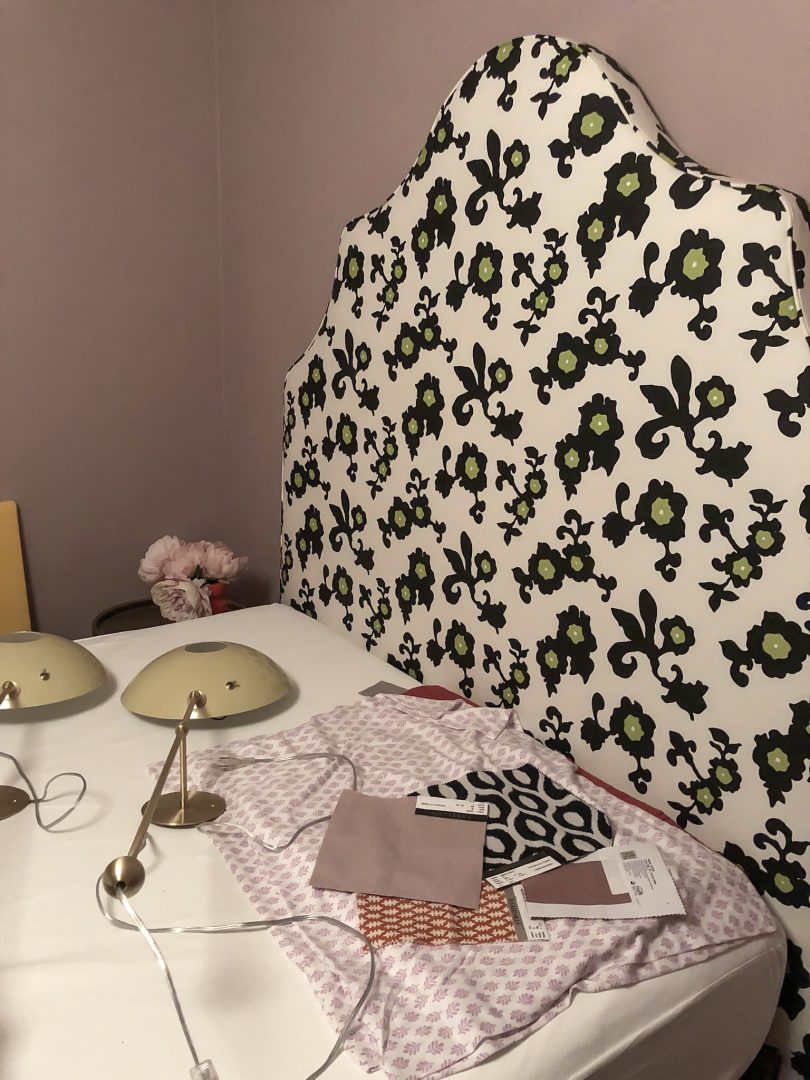
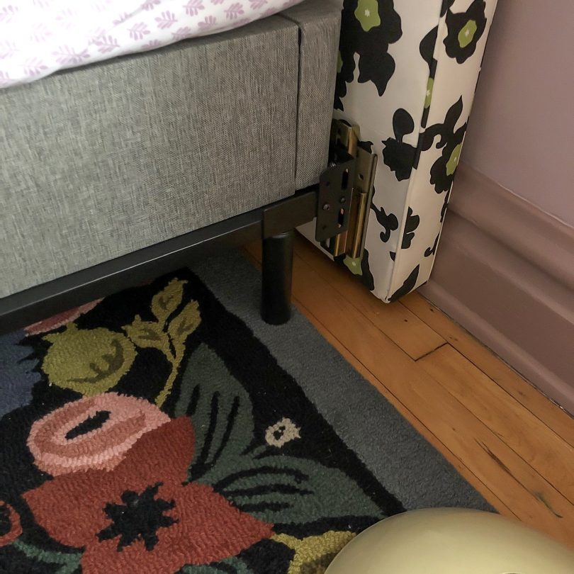
The combination is growing on me, but I do think a slipcover in my original fabric choice (tone on tone with the walls) is the way to go. Eleanor voted for a slipcover too, and then if we ever want to change it up in the future, the original pattern will be right there underneath. None of my fabric is here yet though, and I’m getting worried about having based a lot of my design on it. If it arrives, I’m going to have a lot of sewing to learn and do in a very short amount of time!
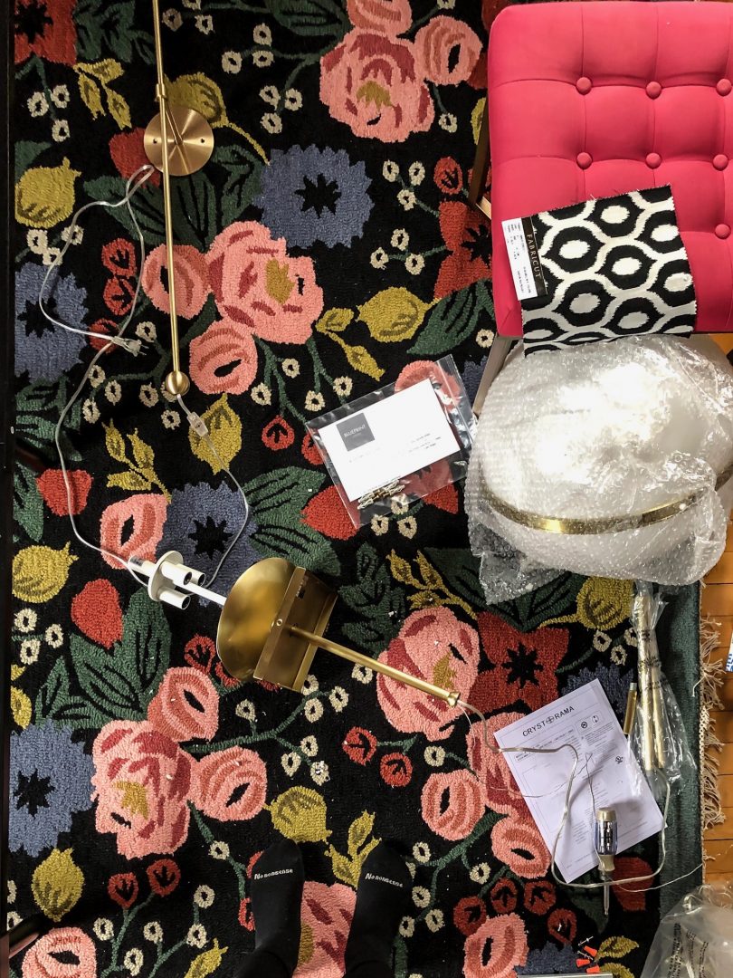
I installed the new light! It’s the 16″ 3-light Truax by Brian Patrick Flynn for Crystorama. I had originally thought I would add a ceiling medallion but the canopy is square. I could switch it out for a round one that would be compatible with a medallion, but having a square element in a room filled with circles and curves is nice! It may stay as-is.

I also have two POP Wall Sconces from Blueprint Lighting to flank the bed. I chose the color (Rubbed Sage) to work with the rug and our initial paint color of light blue. The sconces look great with the rug (tricky, since I only had online photos to go off of when placing the order). I would have chosen differently, probably darker, had I known we were going to paint the walls purple, but that’s in part because I have a specific personal aversion to purple and green together. The combination reminds me of a favorite childhood outfit: purple and green striped sweatpants with a green alligator across the chest of the matching sweatshirt. Chic! Luckily, no one else brings this particular baggage to the color scheme.
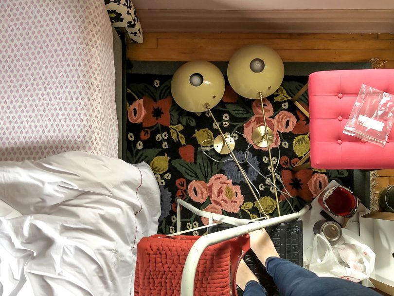
Here they are looking very much like eyeballs. I’m into it. (And that was the old twin mattress, plopped on the full-sized bed frame temporarily. From the side, this arrangement looked like a hungry alligator.)
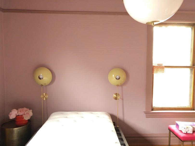
Eleanor has started sleeping in her new bed, even as I continue to work around her and there are tools all over one half of the room. Aside from the headboard, everything else about her bed is from Tuft & Needle. The mattress is on a box foundation, and that rests on a metal base that has brackets to attach to the headboard. She pleaded her case for a larger bed and is thrilled to have it. We have jersey-knit sheets on and she noted how soft they are. Like a favorite t-shirt! Her bed feels great.
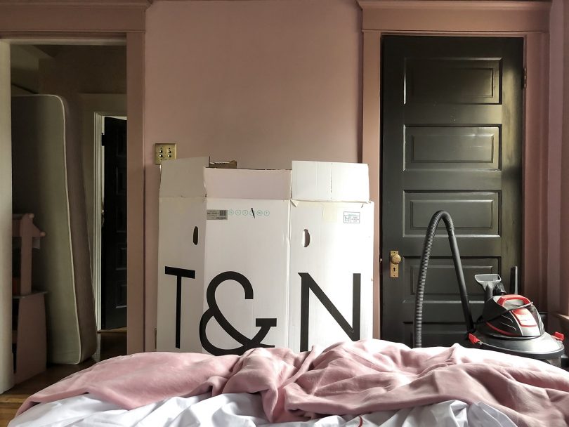
I stood the mattress box between the doorway and closet as a placeholder to show where a bookshelf will go. On the other side, I brought in a new-to-us Art Deco dresser and it’s beautiful. I can’t wait to show you the finished makeover next week!
Follow along with the One Room Challenge participants!

• At Charlotte’s House • Design Addict Mom • Erika Ward Interiors • Erin Kestenbaum • Girl & Grey • Gray Malin • Hommeboys • I Spy DIY • Jewel Marlowe • The Learner Observer • Making it Lovely • Nicole White Designs • Old Brand New • Oscar Bravo Home • Place of My Taste • The Rath Project • Room for Tuesday • SG Style • Undecorated Home • Veronica Solomon • Media BH&G • TM by ORC
My One Room Challenge Sponsors
Thank you to the following sponsors for generously providing product.
• Blueprint Lighting • Crystorama • Fabricut • Garnet Hill • Loloi • Tuft & Needle
My One Room Challenge Posts
Follow along from the beginning!
• Week 1: My Daughter’s Room • Week 2: The Design Plan • Week 3: Adding Interest • Week 4: A Disagreement
And check out my previous One Room Challenges!
• Spring ’16: Our Bedroom and Den • Fall ’16: Front and Back Entry, Stairs, and Hallways • Fall ’17: My Home Office



Jenifer Higgins
October 30, 2019 at 1:25 pmEverything looks great! If you have time you might consider making a trial slipcover with cheap fabric. It may save time and headache in the long run and you will be able to adjust your pattern. I can’t wait to see the final reveal!
ONE ROOM CHALLENGE - WEEK 5 RACE TO THE FINISH - Erika Ward Interiors Atlanta: Interior Design, Interior Decorating, Design Advice
October 30, 2019 at 5:37 pm[…] Gray Malin | Hommeboys | I Spy DIY | Jewel Marlowe | The Learner Observer | Making it Lovely […]
sandyc
October 31, 2019 at 7:34 pmI love, love, love that headboard but then my favorite color is green, and I love how it communicates with the rug. However, it isn’t comfortable with the wall color and I know how important that wall color is to the entire project. So what about taking Jenifer’s suggestion and making a slipcover, only not a trial and not cheap fabric but the fabric you had planned and use that. The advantage now would be that Eleanor would have a headboard she loved now but down the road when her tastes changed, she could have something else and somewhere down the road the lovely green could work maybe for her or in another bedroom. The project is so creative and exciting as your work always is. Good luck! I’m eager to see the final product.
Dorothy
November 1, 2019 at 3:46 pmSo glad those sconces aren’t pink- I look at them and see “boob”. If they were pink it would be even more booblike – LOL! (•) (•)
think that the black in the headboard is enough to connect it to the rug visually. Can’t wait to see the finished room.
mimzy
November 2, 2019 at 4:59 amWhat a lucky find!!!! That makes things a bunch easier to only have to make a slipcover. Love the sconces too…cant wait to see the finished room.
WEEK 6 - ONE ROOM CHALLENGE WEEK 6 REVEAL DAY! - Erika Ward Interiors Atlanta: Interior Design, Interior Decorating, Design Advice
December 9, 2019 at 4:25 am[…] Gray Malin | Hommeboys | I Spy DIY | Jewel Marlowe | The Learner Observer | Making it Lovely […]
Kelly Westman
December 16, 2019 at 10:13 pmI love Eleanor’s room.
I think you can do anything. The slipcover will be easy for you. Just remember to pin the piping in before you sew.
And, my heart aches at the beautiful dresser. I am so happy to see you using antiques. Adds soul to the room.
What do you think about me putting an old English armoire with a mirror in my kitchen? Its too big to get upstairs and I thought I could use it for pottery and whatever. I have a country cottage meets a bit mid century/ antiques vibe. And, its too feminine for my 15 year old boy with the wreath design. I have always wanted an old wardrobe/armoire and this was reasonable. I am thinking about putting cedar shelves in it too. So, it smells yummy when I open it up.