Welcome! Come on in and take a look around! My daughter Eleanor, 10-years-old and an absolute delight, wanted a room makeover. She and I worked together to update her room from little kid to tween, and it will carry her right through the teen years with way more style than I ever had when I was growing up.
Thank you to Linda at Calling it Home for organizing the One Room Challenge and inviting me to participate again! Six weeks goes by so quickly (especially when you have a somewhat indecisive kid and a major color scheme change midway through), but it’s always the most fun and a really good kick to get a room totally redone.
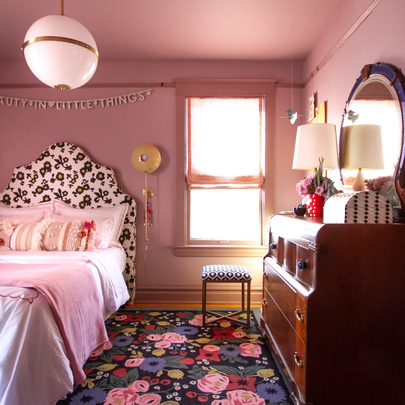
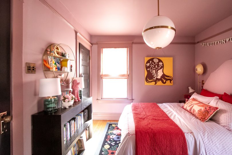
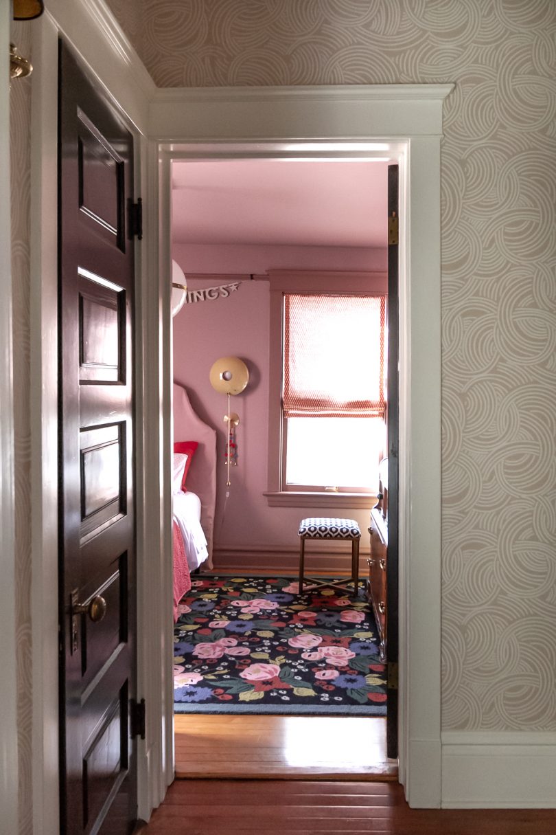
Pinky/purple/lilac/lavender/orchid/thistle. What do you call this color? I call it a color I never would have chosen myself, but one that my daughter wanted and that I have come to love. If you know me, you know I love pink, but I prefer it less saturated and on the peachy side. It may seem funny, but this particular color is a little outside of my comfort zone!
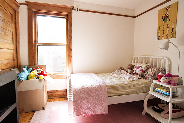
The room had white walls and wood trim when we moved in. We painted it dark blue when Eleanor was four (she chose the color then, too), but six years later is a long time in kid years, and she was ready for a change.
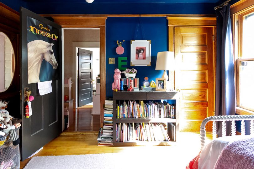
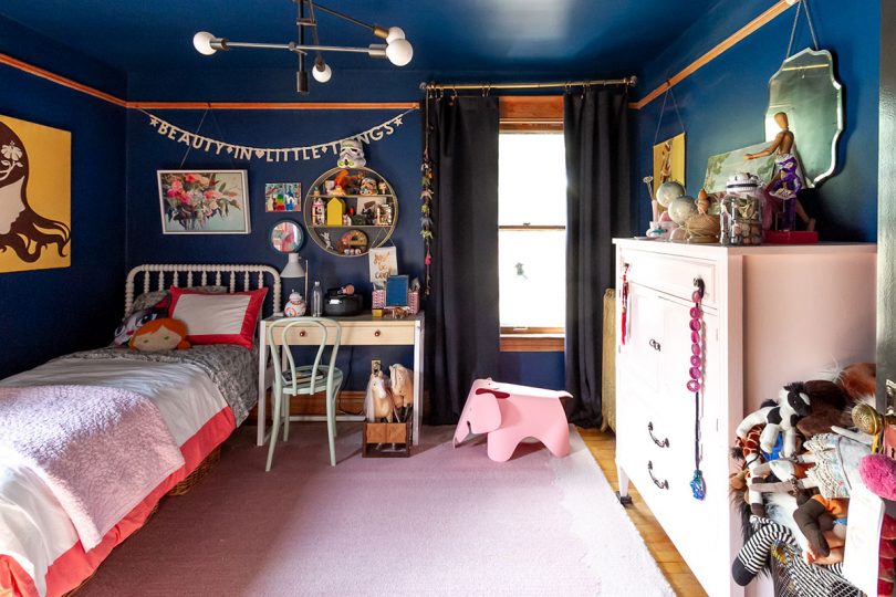
From Sherwin-Williams Loyal Blue to Benjamin Moore Magic Potion with Barberry painted trim.
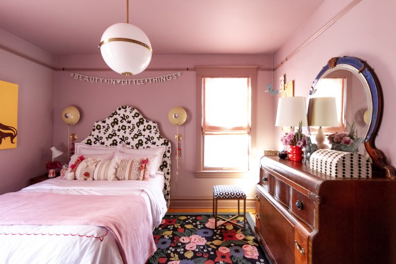
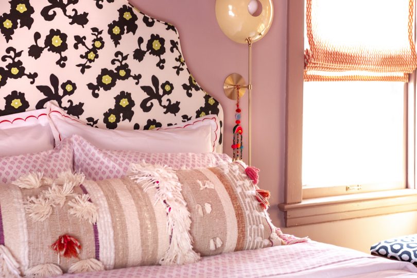
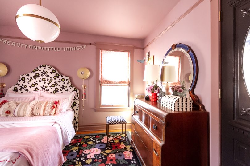
How pretty is that Rifle Paper Co. for Loloi Rosa rug? It was the first piece we decided on for the room and it set the tone for everything to come. It works beautifully with the mix of bedding you’ll see throughout the photos. The jersey-knit sheets are Eleanor’s favorite because not only does she like the lilac pattern, they feel like a soft t-shirt. All of the bedding is from Garnet Hill, and it can mix and match together in different ways to give E some options.
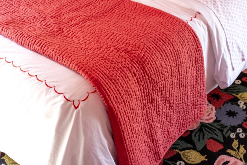
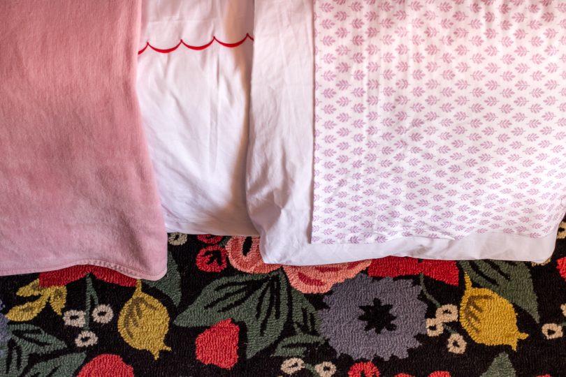
I had planned on making an upholstered headboard but instead found a secondhand Serena & Lily Pondicherry headboard to reupholster. Or more accurately, slipcover. It turns out we really liked the fabric it came with, so a slipcover will allow us to switch it up and keep the original patterned fabric safe and sound for future use. Slight problem: I’m not an experienced seamstress. It’s going to take me some time to learn how to do the slipcover, so I draped the fabric over top as best I could to give you an idea of what it will look like with the different bedding combinations. Which version do you like best?
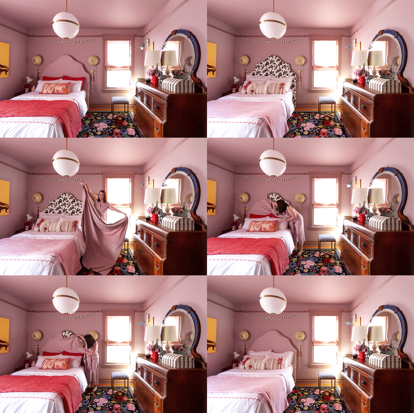
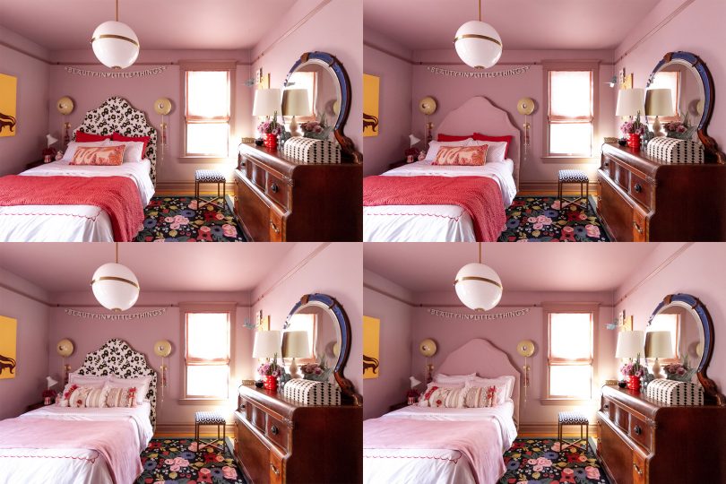
Obviously the bed in a bedroom, especially when it takes up as much space in the room as it does here, has a huge impact on the entire look. The tone on tone look quiets the design and is in line with my original intent for the room. E prefers the slipcover option too — every big decision in the room was made together.
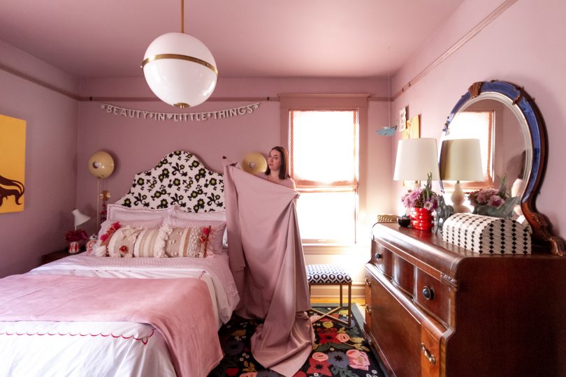
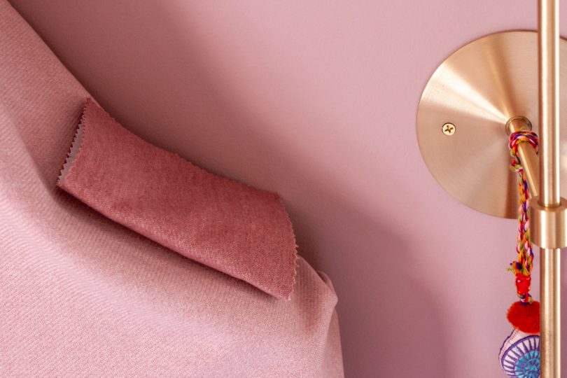
The slipcover will be made from Fabricut Devon wool fabric in Orchid with Lotus piping. Curves and piping on a huge upholstered piece for someone with the cheapest base model sewing machine from a decade ago. Ambitious! I’ll figure it out.
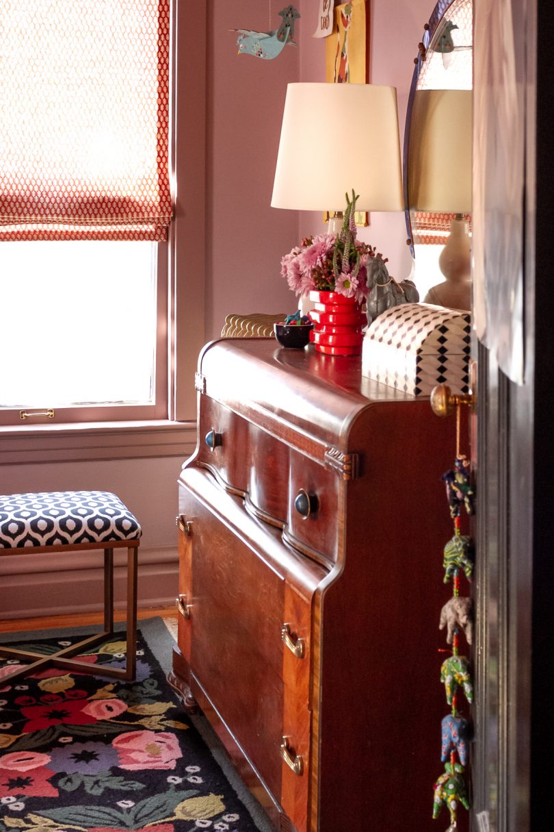
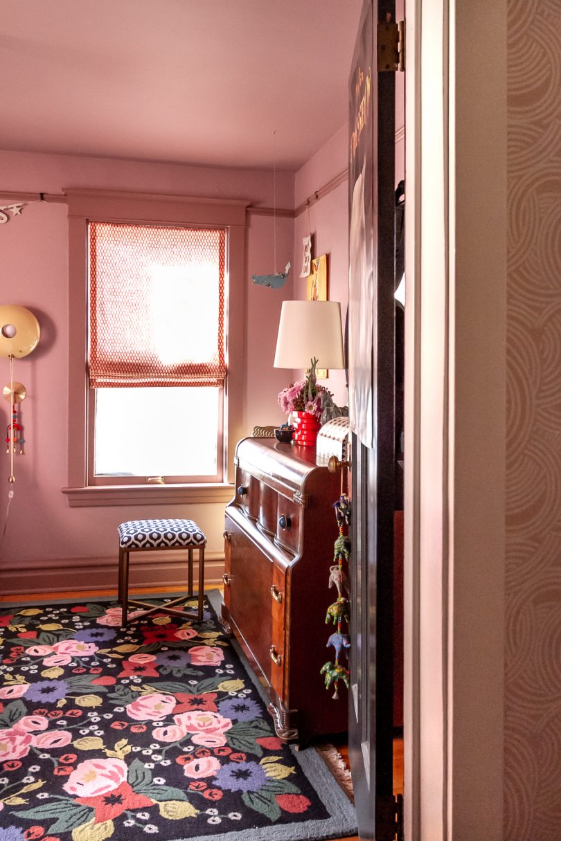
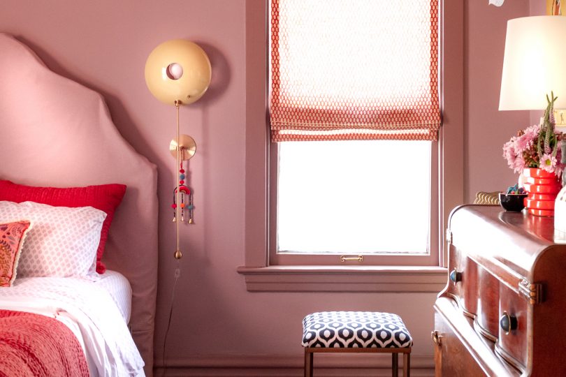
I recovered a small ottoman with Inner Circle fabric to give E a place to perch besides her bed. I also figured out how to make functional Roman shades!
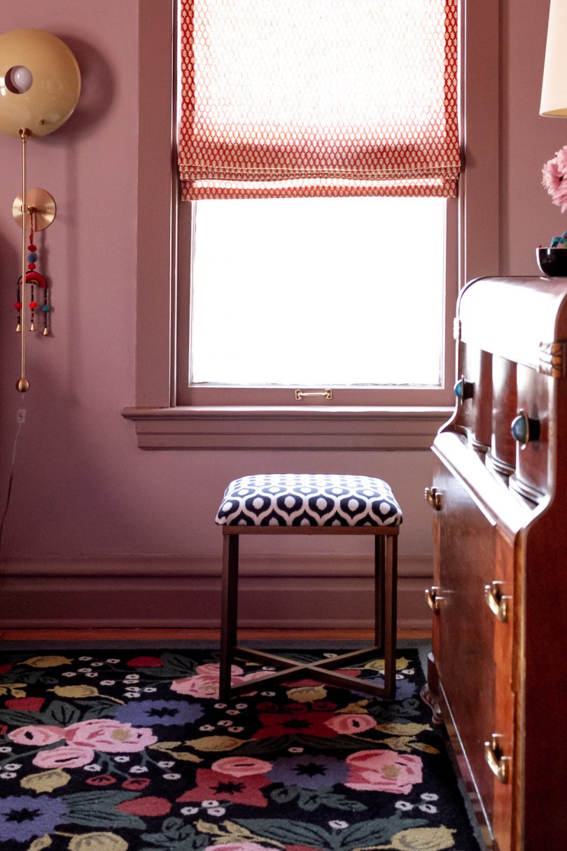
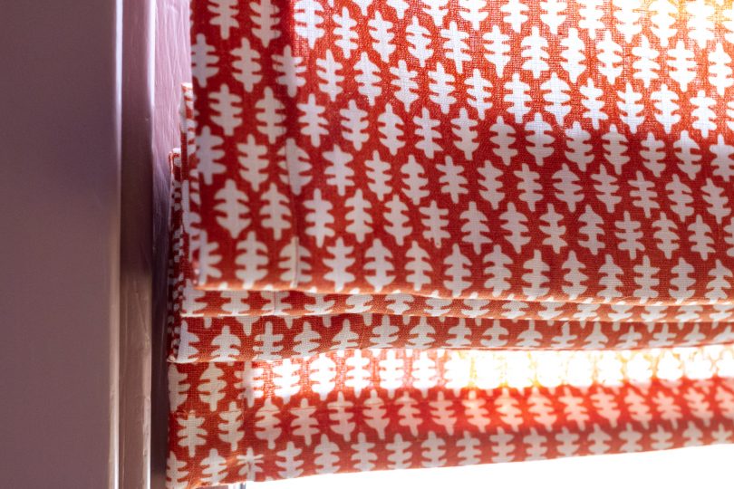
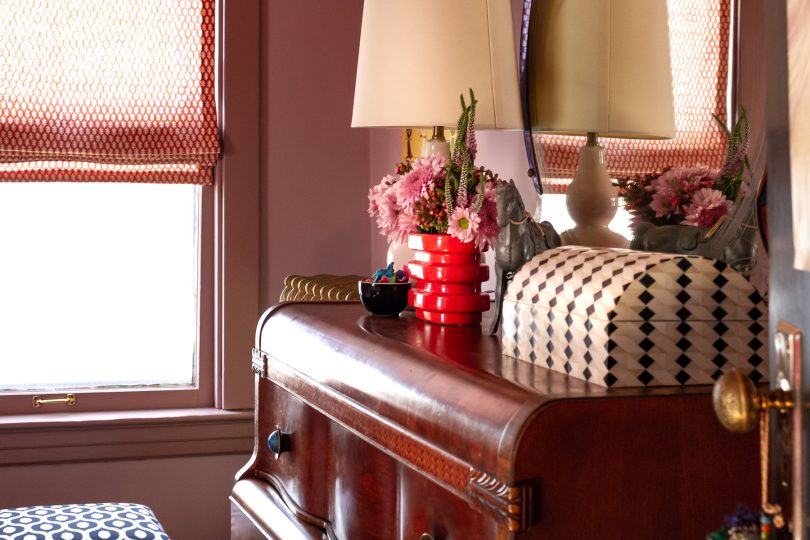
I’ve wanted to use this Edie Stroheim fabric for years. It looks amazing in E’s windows, and I love that red/orange Spice color against the walls and trim. And friends, I see that some of you have doubted this particular fabric choice perhaps more than anything else in the room. I get where you’re coming from! It works because the wood tones in the dresser and floor are very orange, and the red in the rug has a lot of warmth to it (rather than being a primary bright). Also, take into account the sun streaming through the linen, and it all just works. I adore it.
I stole my favorite decorative pillow from the guest room because it looked so dang good with the bedding, but most of the time E will probably have the other one in here (with the horse print). She says this one is too bumpy for her. It’s almost like kids don’t realize that sometimes the pretty pillows you put on the bed are just for show and they aren’t always the most functional thing but we buy them and put them there only to take them off each night and put them back in the morning, but I digress.
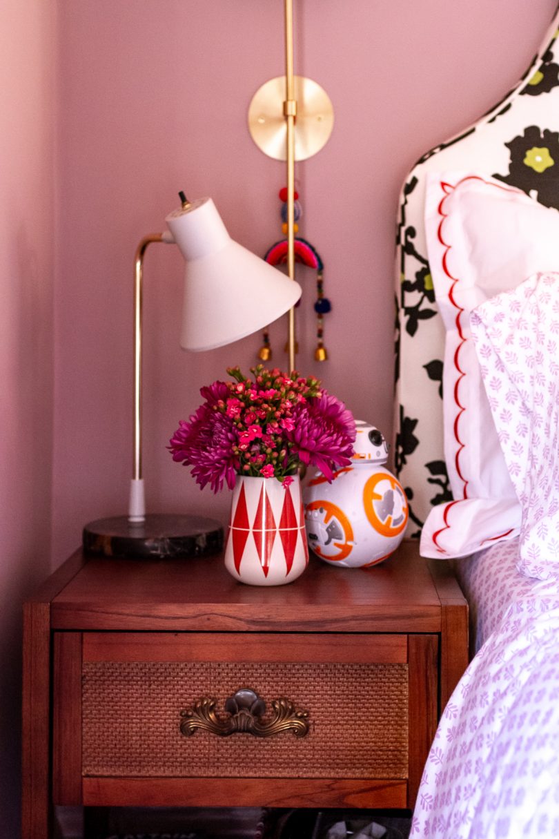
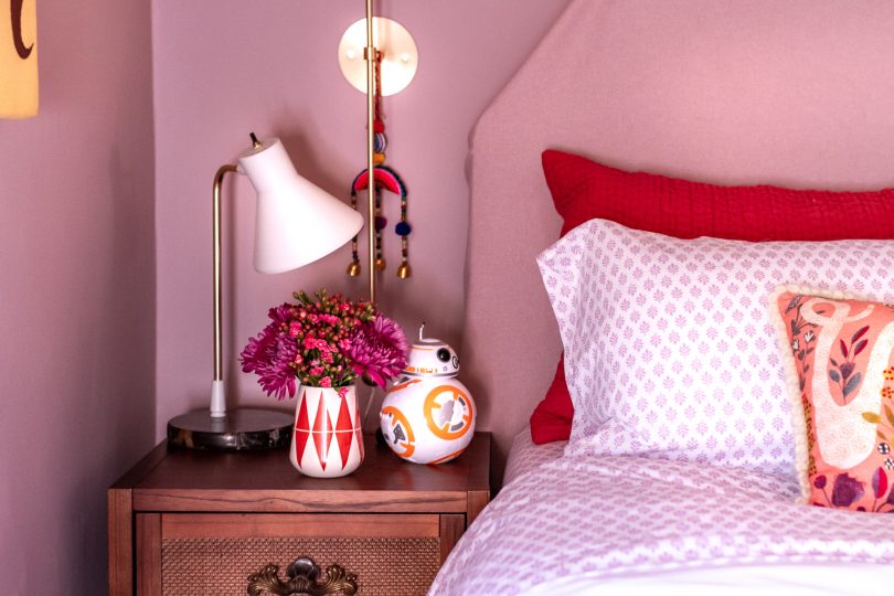
The nightstand is from Target, and I used one of the original Art Deco handles from her dresser on it to tie the two together. A nightstand with both a drawer and a shelf is always optimal, and E’s radio is tucked underneath so she can listen with (or often without) headphones in bed. The BB8 is her alarm clock.
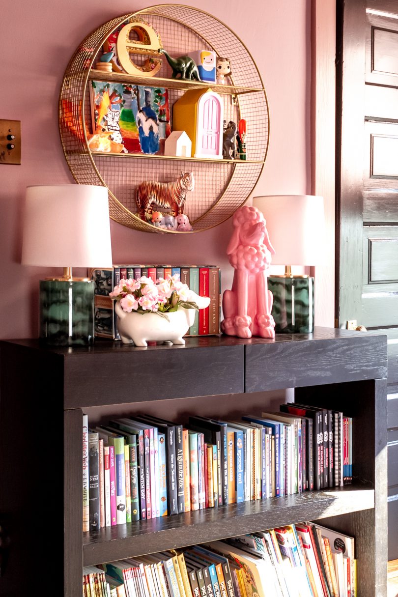
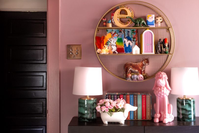
Opposite the bed is the entrance to the room, and Eleanor’s closet. Most of her toys are on shelves in the closet, but I rehung the circular shelf that was in the room before for E to display some of her favorite things.
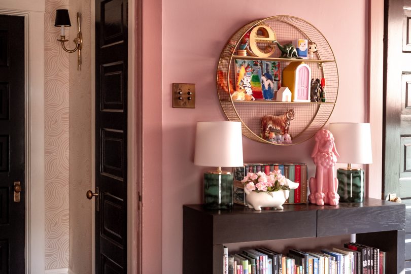
Books, books, books on a low Parsons bookcase. She’s a voracious reader! (Takes after her mom and dad. *dusts shoulders off*) We had to pare the books down quite a bit to get them to fit, but she had a lot that she had outgrown so those got passed down to her little brothers and it worked out.
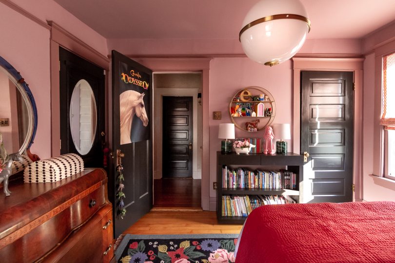
The details in Eleanor’s room will no doubt change over time. That’s what will let this room grow and change with her as she moves on from her tween years. Will she always love decorating with horses and cute animals? Maybe, but that’s for her to keep or change as she decides.
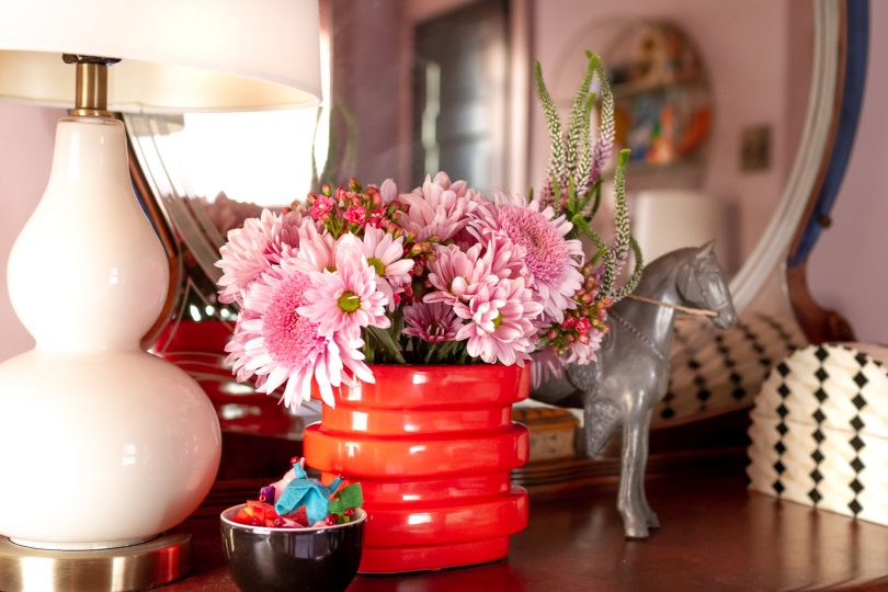
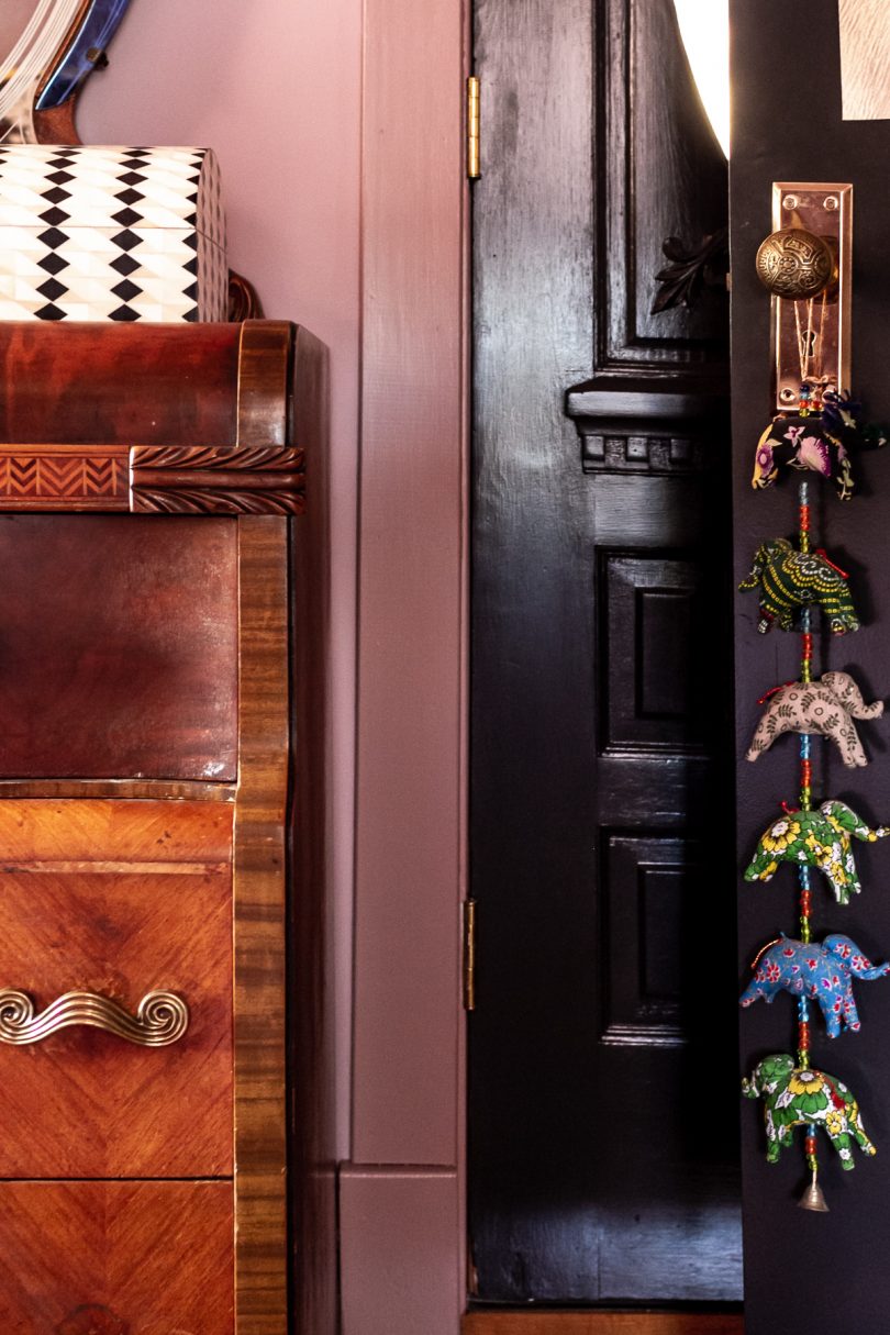
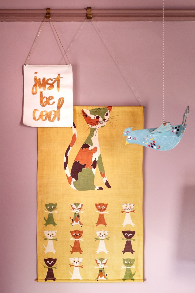
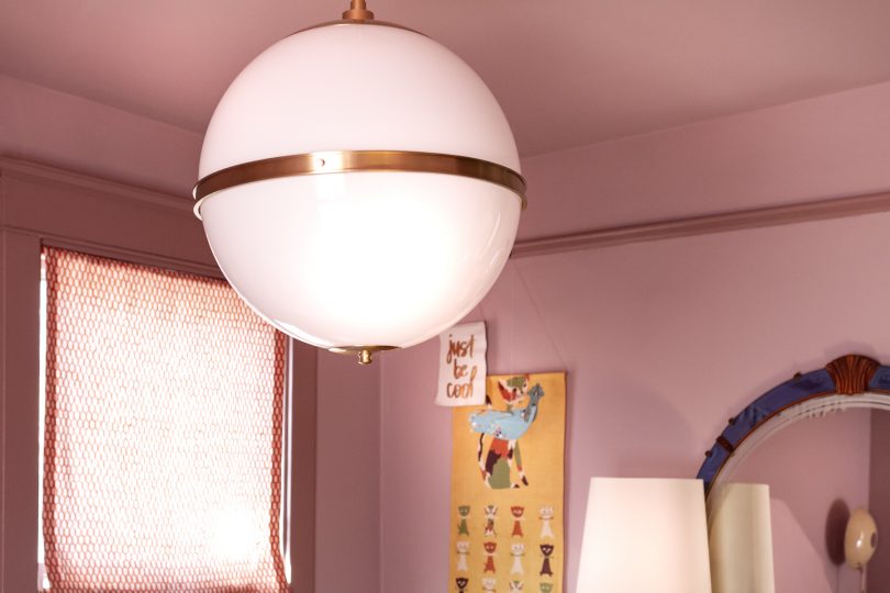
We kept the art that was in the room before, just shuffled it around some. The hanging bird was from Land of Nod years ago, the cats are a vintage tea towel hung with dowels, and the “just be cool” banner was a favor from when I took a video editing workshop that DesignLoveFest taught.
The silhouette art is actually a quilt! It used to hang in our living room ages ago, before Eleanor was even born. It was a made by an Etsy seller, long out of business (Dream of Stars), and I stretched it over canvas stretcher bars.
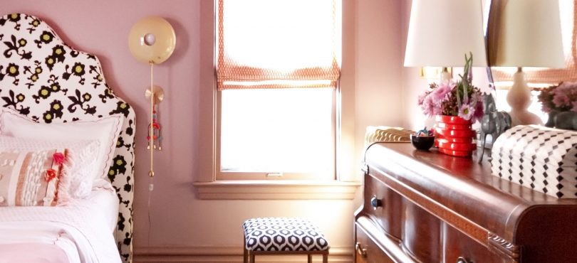
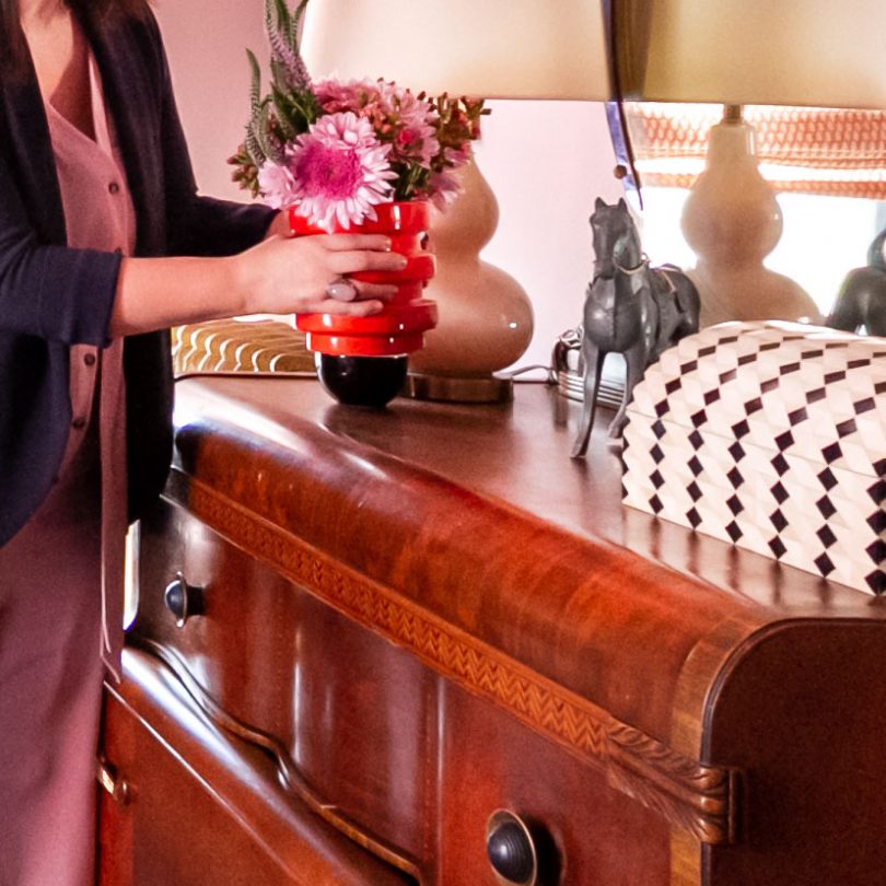
The antique Art Deco dresser was a Facebook Marketplace find. That and the Pondicherry headboard are probably two of my best FB Marketplace finds ever! E is a lucky girl.
The bed itself is from Tuft & Needle. E went from a twin size to a full (that was important to her — I think it makes her feel more grown up), so she needed a new mattress. It’s sitting on a box foundation and metal base that has supports to attach the headboard. The bed is so comfortable, it’s been a tempting distraction to me while working on her room all these weeks! Like, maybe a quick nap might be in order? Zzzzzzz.
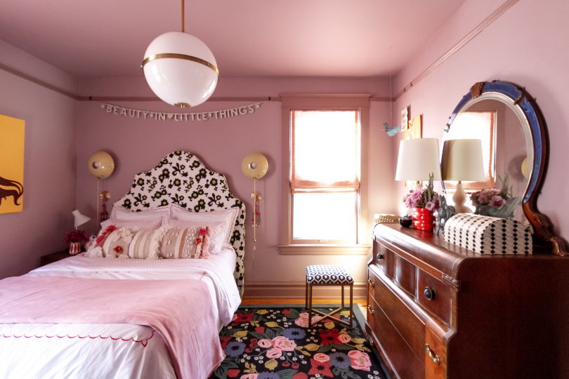
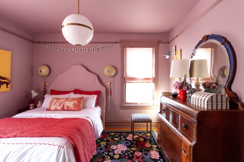
Her room glows beautifully at night. The Crystorama Truax Pendant in the center of the room is oversized (16″ diameter, which is larger than the globes I have in our much larger double parlor), but it provides a dramatic sense of scale. There are three candelabra bulbs inside, so it’s bright without being harsh.
Flanking the headboard are a pair of POP Wall Sconces from Blueprint Lighting. They look like eyeballs and I love them! A happy bit of happenstance is that the headboard I found had curves that perfectly mirror the circles of the sconces. I hung colorful tassels from World Market to zhush them up a bit but if they look too little kid for E as she gets older, she can take them off and they’ll look cleaner and more modern.
I wasn’t sure about also including a task light on the nightstand. E says she can read by the sconces, but the task light is far brighter and I thought she may like it. It’s the same light she had before (from Target a few years ago).
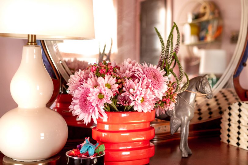
The bookshelf got a pair of small resin lamps lamps from Target which were very cute and super affordable at $20 each. They came in pink and black versions too, but the green looked prettiest. The pink gourd lamp that used to be on the dresser before got moved over to the dresser. It was yet another lamp from Target (I think they’re always a great source for cute, inexpensive lighting for the kids’ rooms).
Thank you for following along as this room came together. It has been one of the most fun makeovers I’ve done because it was a true collaboration between me and my daughter. I hope you’ve enjoyed seeing it come together as much as we have!
I’ll work to get all of the sources listed on the Shop Our House page and will also add them below!
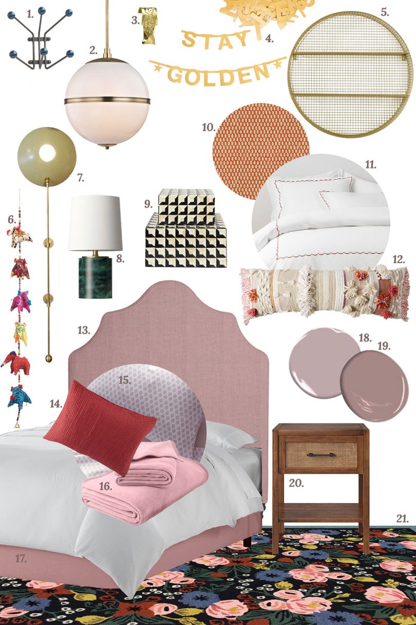
- Mollie Hook (Peacock Blue), Schoolhouse
- Truax Pendant, Brian Patrick Flynn for Crystorama
- Decorative Picture Rail Hooks, Rejuvenation
- Make Your Own Banner, Oh Happy Day Shop
- Circular Shelf, Target (Pillowfort)
- Fabric Elephants Hanging Decor, World Market
- POP Wall Sconces, Blueprint Lighting
- Resin Green Accent Lamp, Target (Project 62)
- Coffered Inlay Boxes, Jayson Home
- Edie Linen Fabric, Stroheim
- Signature Scallop Embroidered Percale Bedding, Garnet Hill
- All Roads Open Market Pillow, Anthropologie
- Pondicherry Headboard, Serena & Lily, Devon Wool Fabric (Orchid), Fabricut
- Dream Quilt Collection (Pomegranate), Garnet Hill
- Playful Prints Jersey Knit Bedding (Wisteria Branches), Garnet Hill
- Cotton Fleece Blanket (Rose Blush), Garnet Hill
- Tuft & Needle Mattress, Box Foundation, and Metal Base
- Magic Potion (1250) Flat Aura Paint, Benjamin Moore
- Barberry (1244) Satin Aura Paint, Benjamin Moore
- Warwick Wood & Rattan Side Table, Target (Threshold)
- Rosa Rug (Black), Rifle Paper Co. for Loloi
Follow along with the One Room Challenge participants!
• At Charlotte’s House • Design Addict Mom • Erika Ward Interiors • Erin Kestenbaum • Girl & Grey • Gray Malin • Hommeboys • I Spy DIY • Jewel Marlowe • The Learner Observer • Making it Lovely • Nicole White Designs • Old Brand New • Oscar Bravo Home • Place of My Taste • The Rath Project • Room for Tuesday • SG Style • Undecorated Home • Veronica Solomon • Media BH&G • TM by ORC
My One Room Challenge Sponsors
Thank you to the following sponsors for generously providing product.
• Blueprint Lighting • Crystorama • Fabricut • Garnet Hill • Loloi • Tuft & Needle
My One Room Challenge Posts
Follow along from the beginning!
• Week 1: My Daughter’s Room • Week 2: The Design Plan • Week 3: Adding Interest • Week 4: A Disagreement • Week 5: A Lucky Find • Week 6: My Daughter’s Room Reveal
And check out my previous One Room Challenges!
• Spring ’16: Our Bedroom and Den • Fall ’16: Front and Back Entry, Stairs, and Hallways • Fall ’17: My Home Office



Rebecca Sweeton
November 6, 2019 at 12:44 pmOf the four bedding and headboard options, I like the top left-hand one best. The tone on tone kind of gets lost for me.
Jennifer
November 6, 2019 at 12:52 pmWhat a great reveal and a precious room! I have to say I enjoy the patterned headboard. The black & white picks up on the stool and the cute box sitting on top of the dresser. It also seems like the green color in the headboard ties in with one of the green shades in the rug. Kudos on the DIY roman shades! Will there be a tutorial or a link to the one you might have followed? (Or did I miss it?)
Justynn
November 6, 2019 at 1:22 pmI also like the top left!
Kim R
November 6, 2019 at 1:36 pmIt is beautiful! You have a unique ability to pull things together that I would have never thought would look well together. I am envious of your FB Marketplace finds! The lighting is fabulous, and I love the rug especially for a tween room.
I’m with E – I think I would prefer the slipcovered headboard, especially if you incorporate the two tones. You are a better woman than I am if you tackle that, though. I can tell you that piping is not hard at all – I’ve done that. But putting the slipcover together so that it is a good fit will be a challenge. I assume you would use the headboard as a “dress dummy” and pin everything on it with the right side in, then sew together along the pinning. Of course you have to incorporate the piping in there too. I am rooting for you!
Meanwhile, the current headboard looks great, too!
Robin Parke
November 6, 2019 at 1:53 pmThe top left is my favorite. The original headboard ties in well with the other things in the room. The throw pillows coordinate with the window coverings and the variety of patterns in this combo makes the room joyful. The pink headboard doesn’t have any presence so the whole bed then looks rather bland to me.
EmilyH
November 6, 2019 at 2:03 pmIt looks great! Most stylish room for a 10-year old ever! My favorite bedding combination is the slip covered headboard with the red accented bedding. Great job, Nicole!
Jenifer Higgins
November 6, 2019 at 2:22 pmA job well done! I love the color scheme.❤️
Charisse
November 6, 2019 at 4:37 pmWonderful reveal. I also like the top left. The patterns work together without being too busy for the eye. I hope E. enjoys it for many, many joyous years….even thru the teen drama ones.
Lindsay
November 6, 2019 at 4:55 pmTop left is my favorite for sure!
Kelley
November 7, 2019 at 6:42 amI’ll always choose pattern on pattern if they work together, so the original fabric is my pick, but the tonal wool slipcover sounds gorgeous too. Eleanor sounds like a stylish girl who knows what she wants, so I absolutely think the slipcovered version will look gorgeous as well.
The room looks amazing! Love every bit of it.
Kim
November 6, 2019 at 4:57 pmThe room looks AMAZING! Another great finish to your One Room Challenges. My favorite bed option is the top left – the punch of black & white on the headboard really looks good. I am curious about the black & white box that’s on the dresser – is that a new find? If so, will you let me know where you got it? Thanks!
Carrie
November 6, 2019 at 5:16 pmThis turned out so good! Well done! I like the tone on tone bedding/headboard option, so the rug and shades sing, but none of them are bad! fun to have the ability to change it up! I never got good at sewing, so the whole putting together a slipcover is so admirable to me!
I really love how great it looks with the wallpaper in the hallway too!
As a huge fan of ambient lighting I’m curious how many of the lamps she uses in here.
And I’m also curious where that gorgeous door next to her bedroom leads!
Stephany Aulenback
November 6, 2019 at 5:38 pmTop left is my favourite as well! I never would have expected that patterned headboard to work in the room with everything else going on but I think it looks absolutely fabulous. Gorgeous room.
Rachel Serene
November 6, 2019 at 5:57 pmHow fun to do this with your daughter! It’s fabulous. The purple-y pink is amazing and one I wouldn’t have chosen myself either but love it here! I love the art deco and antique elements. Great job and congrats!
Susan Androff
November 6, 2019 at 8:40 pmNice job! I like the slipcover option better. I could also see the headboard in an orangey-red color.
Patricia Olert
November 6, 2019 at 8:56 pmNo one is better at mixing pattern, picking interesting and beautiful furniture pieces, choosing the perfect paint color than YOU! And, putter it all together? Pure art. The room is just gorgeous.
Deb meyers
November 7, 2019 at 5:50 amTotally approve that ‘series of unfortunate events’ collection occupies prime real estate on the bookshelf.
Beautiful room! Well done.
Tiffanie Hall
November 7, 2019 at 6:38 amLove the room! My favorite bed option is the slip covered version with the darker poppy pink bedding. I’d love to see what you’ve done with Calvin’s room sometime.
Sarah
November 7, 2019 at 8:18 amI love it! It’s such a nice balance of a pretty, designed foundation, with your daughter’s personalized touch. I really like both looks with the pink headboard, as it looks calming in the midst of her artwork and eclectic furniture. And how did you find an outfit to perfectly match the room?! Also love all the second-hand pieces; they add depth. And I never would have thought to do the trim in that shade–it looks beautiful!
KC
November 7, 2019 at 9:44 amLooks great! UGH I miss Chicagoland craigslisting! SO GOOD.
DAF
November 7, 2019 at 10:17 amGreat job. As for the headboard, I’d go with red or the wall color but a few shades darker (maybe even see what a black does over there?). I think it needs to anchor the space more and the tone on tone doesn’t do it. But otherwise I like everything about the space.
Melanie
November 7, 2019 at 11:17 amI just love how you do color/pattern, Nicole. SO BEAUTIFUL and saturated and then the hits of black. It was fun following along! Off to buy that green lamp asap!
Melissa
November 7, 2019 at 12:04 pmThis is SO amazing!! When you picked the rug weeks and weeks ago, I wasn’t entirely sure where it was headed. I LOVE the black floral headboard – the contrast looks amazing. Perhaps the pink headboard needs black trim to tie in with the rug?? I know you’ll be back to the black floral though :)
Great job as always!
Vanessa
November 7, 2019 at 7:00 pmI have a mate to your cat dishcloth but in blue. Same artist though, so that was interesting to see! Well done.
Cherie
November 7, 2019 at 7:51 pmEvery time you are in The Challenge I know I am in for a ride.
Early on I always question something on the mood board.
This time it was the rug that I thought was super busy.
But then you and your magic wand pulled it all together and I absolutely loved it. I don’t know how you do it but every single time I end up with a WOW moment. I so appreciate that you left much of Eleanor’s collections in the room which makes us know the lucky lady who sleeps there. GREAT JOB AS USUAL!
Victoria
November 8, 2019 at 3:24 amLove that rug, and the Target lamps on the bookcase. The room looks great.
I don’t like the original pattern on the headboard and prefer the slipcover fabric, but it will tone too much so I think you need a dark green somewhere over there. Dark green piping?
cat
November 10, 2019 at 10:33 pmAs ever, you’ve done wonderful work here, and what a treasure that you and your daughter decided on everything together. So many thoughtful/surprising details at every turn. Like several others, I love the patterned headboard: bold, graphic, and carries the black+white pattern theme over to that corner of the room. Lucky daughter, lucky mom!
MASTER BATHROOM MAKEOVER - PLACE OF MY TASTE
November 11, 2019 at 8:25 am[…] Gray Malin | Hommeboys | I Spy DIY | Jewel Marlowe | The Learner Observer | Making it Lovely […]
CH
November 11, 2019 at 9:12 ambeautiful transformation. It is just right for a tween.
Please give a tutorial on making functioning roman blinds. The punches of red are perfect.
What a fun and inspiring project for mom and daughter to collaborate on to make the room more functional and beautiful.
Kelsey Williams
November 11, 2019 at 2:51 pmWe are gearing up to paint all the doors in our house black — I’d love to hear how you did yours and any tips you have on the process!
Eileen Kellh
November 20, 2019 at 8:24 pmTruly lovely, you and your daughter have such a wondersul sense of scale, color and a bit of funky whimsy!
Judy
November 23, 2019 at 8:34 pmTruly lovely! I vote for the top left, or the bottom right (love that bumpy pillow!).
Did you make the roman shade yourself? I’m trying to decide about making one for my kitchen window. I love the relaxed look of yours. (Sorry if I missed it in your description somewhere.)
architecte d'intérieur à paris
December 3, 2019 at 9:55 amUn style de déco que j’aime particulièrement, bravo.
Kelly
December 16, 2019 at 10:22 pmI love the roman shade. I read once to always have a punch of red in a room. Do they teach you that in design school/
Please add a tutorial.
And, I am knew to your blog. Did the incredible oven come with the house? I think I would buy the house just for the oven!
Kari
January 18, 2020 at 6:58 pmwow! I remember when you painted it blue, was that really six years ago?!
The new look is amazing and should be able to grow with her through high school with minimal changes.
I could totally see a “lawyer’s bookcase” in place of the open Parson’s when she’s a bit older!
Vanessa
January 28, 2020 at 4:50 amOMG. Too much of everything.