
The things I want tend to fall into a cohesive color palette. Shall we just ooh and ah over warm caramels together? Plus a hint of blush? Let’s.
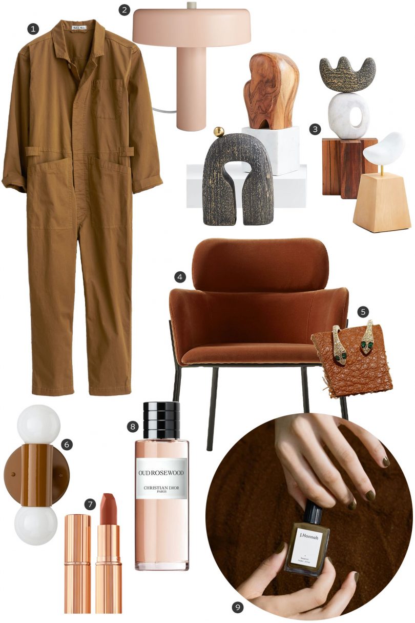
- Standard Jumpsuit in Cotton Twill, Alex Mill
I shied away from dresses for a while and went almost exclusively to jumpsuits. I’m back into midi skirts and dresses, but this jumpsuit remains a go-to. - Punk Lamp, Blu Dot
Brilliant proportions, super cute. - Lockhart Tabletop Sculptures, Crate & Barrel
Sculptures and art from mainstream or big box retailers lose a sense of their cool, but these are really good. - Azalea Brown Chair, CB2
I want these in my library around our round table with the black and white striped sofa in the background. Or I want to see them in a baby blue room, just surrounded in a sea of pastel. - 14K Gold Diamond Snake Huggies, Gem
The prettiest snakes. Sparkly and subtle from a distance, but up close badass. - Cylinder Double Sconce, Schoolhouse
Butterscotch is a new color for this one and it’s perfect. Everything in this color is yummy. - Matte Revolution Lipstick (Rosewood), Charlotte Tilbury; Sephora
Brown meets orange meets red meets pink. My color. - Oud Rosewood, Dior
They have crafted a fragrance description to appeal directly to me. “FAVORITE COLOUR: With the most evocative shades of brown, Oud Rosewood conveys both the olfactory image of a warm brown streaked with light brown, found on the round, soft and lustrous rosewood, and the more rugged, nomadic brown of oud wood.” - Compost Nail Polish, J. Hannah
“Organic Drab. Jolie-Laide. Baroque Mulch.” My favorite. ♥ Called “the ugliest color in the world,” now available in polish for those of us that like that sort of thing.
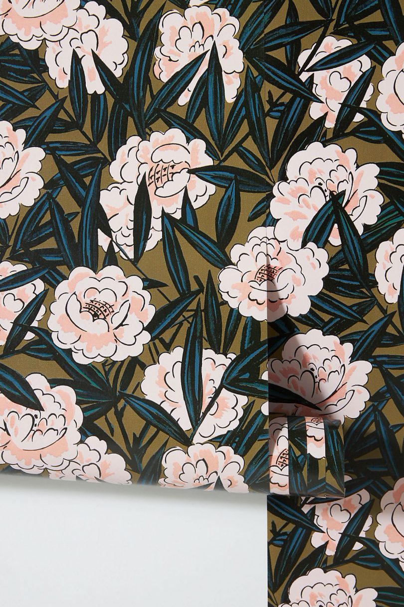
↑ Effie Wallpaper, Anthropologie
I want to line drawers with this because it’s a little too cute for my house.
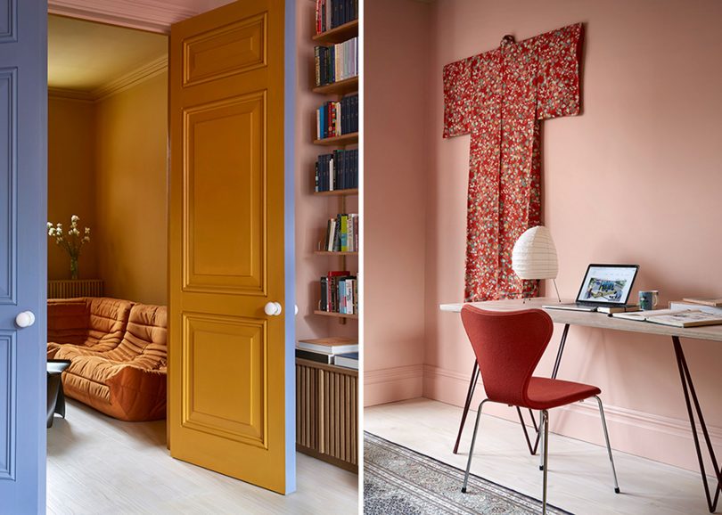
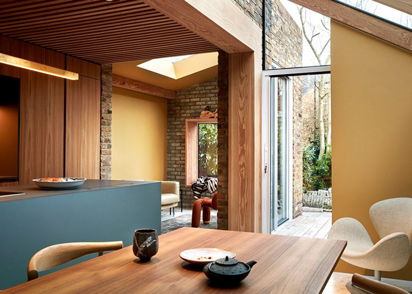
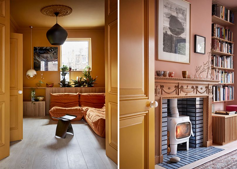
↓ Up-side-down House, Collective Works
This project runs through just about every color, but I’m most drawn to the caramels and pinks (no surprise).
credits: Collective Works • Colour Design: KOI Colour Studio • Paints: Pure&Original Paints • Photography: Margaret M. DeLange • Stylist: Kirsten Visdal
A thought occurred to me as I was pulling this together. Am I just coming up with different ways to say Pink Loves Brown forever? Possibly yes.


4 comments
vezi
I really love caramels – what a delight
Danielle
These posts are always a delight! That Collective Works project is gorgeous and the nail polish is giving me major early 90s flashbacks. I can still remember going into a MAC store for the first time, in search of a beautiful, deep brown lipstick that I had seen in a magazine. Compost is definitely the modern update!
Jen
Such a fun way to incorporate blush. I can’t wear either color due to my skin tone but I love it for my neutral clients. I have a new makeup palette that oozes the two! Thanks for inspiring me to create a Fall look with it.
Jennifer Laura
Absolutely love this color palette!!
Comments are closed.