I’ve finally finished the redesign of Making it Lovely!
Well, that’s not entirely true. There are a million and one little tweaks and additions that I’d still like to make, but the changes are ones that don’t impact the overall look and function, so I can add them in over the next few days/weeks.
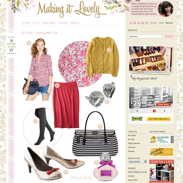
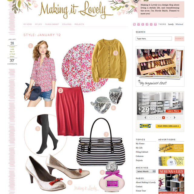
I do all of my own designing and coding (I used to offer web design as Smart & Lovely), and this time around I built these themes off of Standard Theme for WordPress. It’s been been great to work with. I made a lot of changes visually, and a few changes to the core PHP files, but for the most part it gave me the structure I needed. And as for the pretty? I have Moglea to thank for the custom floral illustrations in the header, and I used a couple of elements from Pugly Pixel as well (the glitter and the honeycomb). The background floral pattern is a licensed image, and the logo and all the rest were done by yours truly.
Hold up, did I say themes in that previous paragraph? Plural? Yep. Remember the whole minimal vs. maximal debate I’d been having in regard to the new design? Jessica left a comment suggesting both with a theme switcher, and that was a genius idea. I’d forgotten that was even a possibility! So the default is the “Lovely” theme, full of pattern, but if it’s a bit much (and it may be), you could choose the “Minimal” theme instead. You can switch between the two themes at the top right, next to the social media links. Everyone wins! *
* Well, everyone will win. Eventually. It’s a bit buggy right now (I’m working on it), but you should be able to switch between the two themes with a hard refresh.
So what’s still to come? More organization of categories on the backend, making the design responsive (resizing to fit smaller screens for the 7% of you that need to scroll left to right a little on the site as it is now), more post layouts for different types of content, fine tuning the sidebar, perhaps adding to the footer, some changes to the social sharing options, and on and on. Good stuff, but not essential to launching. And I’ve been dying to launch, so it feels good to push on ahead, right on schedule.
And now, onward! Onward with bigger pictures, interesting new layouts, and different post formats. Onward with a select few new contributors (soon)! Onward with more content, and more awesomeness. And thank you for your patience as I’ve devoted myself to all of this design work lately. Hopefully you’ll love the new look and everything to come as much as I do.


Jenny at Spry On The Wall
February 1, 2012 at 1:10 pmIt looks beautiful!
Lindsey @ arkadian belle woods
February 1, 2012 at 1:11 pmIt looks gorgeous! I love the new design! Great job Nicole!
jodi
February 1, 2012 at 1:11 pmlooks great nicole! LOVE the new header.
srrraah
February 1, 2012 at 1:14 pmLOVE love love the new themes. great job nicole!
Dana
February 1, 2012 at 1:16 pmNicole, you made it lovely! ;)
Amanda @ willful/joyful
February 1, 2012 at 1:18 pmI love the idea of multiple themes, but if I HAD to choose I’d go for the Lovely design. It’s just so darn lovely :)
agnes miles
February 1, 2012 at 1:19 pmlooks GREAT! love the new themes! xxoo
Lauren
February 1, 2012 at 1:20 pmLooks great! I personally like the Lovely theme. Thanks for including both flavors!
Lauren@BaylorSays...
February 1, 2012 at 1:20 pmI’m speechless that you did this yourself. One talented lady…looks FAB.
Amy Awesome
February 1, 2012 at 1:22 pmBeautiful!
Amelia @ House Pretty
February 1, 2012 at 1:25 pmI love the new site design – you are so talented!!
Anouk
February 1, 2012 at 1:26 pmI love it !
Jill Browning
February 1, 2012 at 1:28 pmI LOVE the lovely version!!! The flower-patterned background really seals the deal for me.
(I’m a little sad to hear that you’re taking on contributors. I know you’re a very busy lady, but I enjoy your voice the best!)
Great work :)
Jill
Making it Lovely
February 1, 2012 at 8:29 pmReserve judgement until you see the contributors. I’m incredibly excited about having them on board!
Jill Browning
February 2, 2012 at 11:11 amYou’re the boss! I’m sure I will love it.
PS. The new fonts are very nice. ;)
heather s.
February 1, 2012 at 1:30 pmLove it! The minimal theme was the default for me when I came to the page (which is what I prefer) but leaving a comment was a little confusing since I didn’t see the boxes to enter your info. I just clicked around until I was able to type. :)
Making it Lovely
February 1, 2012 at 8:30 pmAh, the comment boxes are a little faint. I’ll be tweaking a lot of things like that over the next few days.
Desiree
February 1, 2012 at 1:32 pmI love the redesign! It looks great! Such a cute a design and so whimsical! Adore!
Juliette
February 1, 2012 at 1:39 pmooooh…the bar has been reset. I love this! The toggle feature is above and beyond, wow. And you have pink highlighting like Jules -LOVE that!
Totally worth the time and effort! Great job!
Making it Lovely
February 1, 2012 at 8:31 pmThere are lots of little touches like that! They aren’t all evident right away, but they make me happy.
Caroline
February 1, 2012 at 1:45 pmI thought it was lovely before and even better now. Can’t wait for more new loveliness to enjoy.
Erin
February 1, 2012 at 1:52 pmIt’s beautiful! This is the only site re-design I’ve seen in the past year or so that I actually really, really liked.
I’m in firefox, though, and though I’m clicking to see the other site design, nothing changes. It defaulted to minimal for me…I can’t see the “lovely”.
Making it Lovely
February 1, 2012 at 8:32 pmThanks!
Firefox has been buggy for me too. It’s a tricky problem, but I’m working on it.
Erin
February 5, 2012 at 6:29 pmWorks now! :) Love it! :D
Rachel
February 1, 2012 at 2:12 pmIt looks gorgeous! Love the details, colors and of course the glitter! :)
Heather
February 1, 2012 at 2:13 pmAmazing job Nicole! It looks so pretty. I love it!
Mona
February 1, 2012 at 2:14 pmThis looks fabulous! I look forward to reading all of your inspiring blogs!
Kelly
February 1, 2012 at 2:15 pmAmazing is all that needs to be said!
lea
February 1, 2012 at 2:17 pmNow that I have experienced the minimal and lovely design I have to say I’m over the moon for lovely!
Cindy Miller, Bliss Designs
February 1, 2012 at 2:18 pmLove your site! How do you make the pinned board with all the photos? Love this
christine // darling studio
February 1, 2012 at 2:25 pmI especially love the bling in your logo! So fun. xo
Loren
February 1, 2012 at 2:28 pmReally nice job, the new header is lovely!
Jo-Anna
February 1, 2012 at 2:31 pmIt looks positively gorgeous over here!! LOVE it all!
Jo-Anna
arin
February 1, 2012 at 2:32 pmI really, really love the new design. I am viewing it in the “lovely” version and it is so pretty and easy to read and navigate. It may be maximal, but it certainly isn’t cluttered.
Kylie @ All Things Lovely
February 1, 2012 at 2:36 pmFreaking love it!!! I love the maximal theme, so lovely and gorgeous.
Jill V / TerraSavvy
February 1, 2012 at 2:45 pmYou are AMAZING!
I am partial to honeycomb myself for personal reasons and I love love love the choice of two themes!!
You’re one cool chick!
xo
Jill
christel
February 1, 2012 at 2:49 pmVery nice, congratulations!
Molly the Waffler
February 1, 2012 at 2:56 pmI especially like the 5 categories you chose to highlight (My home, Projects, etc.). I can’t remember if these were the same ones you used to have, but it now looks so clean and uncluttered that my eye is drawn to them and I know I’ll check them out more frequently.
Making it Lovely
February 1, 2012 at 8:34 pmI had about 13,000 categories before. I still have some organization to do in that regard, but narrowing them down to a main five is a good thing, I think!
stef
February 1, 2012 at 3:00 pmLove it, especially the new header and background flowers.
I’m excited to check out the Standard Theme, too. I’m in the process of customizing an existing WordPress theme and it’s just not as flexible as I’d like.
Jen @ Rambling Renovators
February 1, 2012 at 3:16 pmLove it Nicole! It feels so fresh and new but consistent with your brand. And the font for comments is so cute!! Well done!
colleen
February 1, 2012 at 3:22 pmDefinitely loving the minimal look! Congrats!
Emily @ Peck Life
February 1, 2012 at 3:26 pmCongrats on all your hard work, this looks AMAZING! :)
Kiran @ KiranTarun.com
February 1, 2012 at 3:28 pmLove the new site redesign — amazing!!!
Kristin
February 1, 2012 at 3:35 pmredesign looks really fab!! – go take a break and play with those kids :) You really do deserve a break after the past few years!~!
Rebecca @ beautiful square feet
February 1, 2012 at 3:45 pmIt looks brilliant Nicole – really looking forward to your new features! Well done!
Katie
February 1, 2012 at 3:46 pmPretty! I like the maximal. The minimal feels barren after viewing lovely.
ol
February 1, 2012 at 3:46 pmThe new site is fantastic. But I vote for a different photo of you. You have a great face, but this particular angle does not do it justice. Just my two cents.
katie
February 1, 2012 at 4:07 pmthe theme switching is a cool trick!
one thing i noticed, though, is that the page had to have a forced refresh (ctr-r) after changing the theme selection before it went into effect — just clicking on it didn’t get the job done.
bink & boo
February 1, 2012 at 4:12 pmOh my gosh Nicole, you make everything lovely. Actually you made this beautiful! I am luuuuving the flowers at the top with your name all glittery. You are so talented.
Andrea Howe
February 1, 2012 at 4:16 pmabsolutely amazing Nicole. So fancy yet still so whimsical and pretty. I recognized the glitter header right away from PP. Bravo lady!
kelly
February 1, 2012 at 4:25 pmCongrats Nicole! I’m sure this was no small feat!
Ashley
February 1, 2012 at 5:03 pmHi Nicole,
Will there ever be an option to go back to the old theme? The new design is very pretty, but I do prefer the old one quite a bit.
Making it Lovely
February 1, 2012 at 8:37 pmSorry, onward and upward. The old theme won’t support the new photo sizes and layouts I have planned.
Krissy
February 1, 2012 at 5:11 pmRock on, Nicole! The new design brought to life looks FANTASTIC.
Dora
February 1, 2012 at 7:21 pmAs a fellow web designer (and one the 7% who has looked at the site on a small screen device), I’m super psyched that you’re thinking about making your site responsive. I hope it turns out to be a fun project. Best of luck!
I’m a fan of the new design too!
Erin | Holtwood Hipster
February 1, 2012 at 8:06 pmIt’s kick ass Nicole. Love that the reader can customize the view based on their preference. I’m a minimal girl myself, but the lovely pattern is just that. Well done!
Holly
February 1, 2012 at 8:12 pmI think it is lovely! I love the floral illustration and the licensed floral on the sides. Very pretty! Excited to see the other updates that you have in store.
Jenna
February 1, 2012 at 8:32 pmOh, yes, Nicole, it’ is LOVELY!
Jeannie
February 1, 2012 at 9:26 pmThis whole blog redesign is just absolutely wonderful and well lovely! The floral illustration is so striking and modern. Just love it all. Oh I accidentally highlighted a word and I was so excited to see pink! Such a cool detail and when you take in everything together it is the perfect bit of color.
kate
February 1, 2012 at 10:22 pmI simply love the design/s. Well done!
Naomi A.
February 1, 2012 at 10:42 pmHoly wow, this is absolutely gorgeous!! You KNOW I’m gonna have to click through every time now!
Josephine
February 1, 2012 at 10:54 pmSo fresh, it’s a pleasure to read! Well done you! Also, snaps for allowing a choice in theme ;-)
Heather
February 1, 2012 at 11:04 pmCongrats, Nicole! Love the two options! I’m in the middle of my own site re-design, yours is giving me even more ideas! :)
TieDye64
February 1, 2012 at 11:05 pmYou’re so clever! This is really fabulous. Adore the header and the honeycombs. Honeycomb circles for the little comments icons is really cute, too.
katrina
February 2, 2012 at 12:41 amOMG. your blog is LOVELY and the max/minimal options are perfect!!
Sprout
February 2, 2012 at 4:00 amOddly I can only get the theme button to work when I am in comments…
Sasha
February 2, 2012 at 9:19 amLovely indeed! You did an awesome job!
April
February 2, 2012 at 9:22 amLOVE IT!!!!
Tory
February 2, 2012 at 9:33 amI originally voted for minimal but I was so wrong. I’m totally in love with the maximal version. That’s going to be my default!
Lynette@Dustwithflour
February 2, 2012 at 11:11 amGorgeous. I love, love, love the background. The colors are nice as well.
Mary S
February 2, 2012 at 12:21 pmHmmm, I am on google Chrome and the the theme change does not work for me – it’s maximal regardless of what I choose.
Also, since I’m providing feed back, the pink color you’ve chosen for some of the headers -the ‘Leave a Reply’ above is one example – is so faint it’s barely visible.
I just checked on Firefox and the the theme change works there, but the colors of the header are just slightly better.
That said, I like the design change!
kelle
February 2, 2012 at 2:15 pmNicole, I simply love your blog redesign. It’s so very pretty.
A Lovely Life List | Making it Lovely
February 3, 2012 at 1:20 am[…] of creative movement (like a chain letter but more fulfilling)Meet Martha StewartMeet Jonathan AdlerRedesign Making it LovelyLaunch a magazineSell my designs through a nationwide storeArt direct a photo shootName paint […]
jessica
February 3, 2012 at 12:55 pmHooray! Love it, so happy my suggestion worked out. I love the maximal, it’s so you!
Sarah van Loon
February 3, 2012 at 12:58 pmIt looks incredible! What a beautiful space to come and visit. Thank you for putting all the hard work and energy into it! I’d love to learn more about how you learned about coding, etc, and if you took classes or taught yourself, or have and tips for people who want to customize their site more (I know that’s not exactly what you blog about, but your site is so gorgeous, I’m sure I’m not the only one wondering how you do it! :) ).
Leslie
February 3, 2012 at 5:18 pmCongratulations! Love seeing your new logotype up top! Looks good. I’m gonna stick with the maximal. That’s how I roll too.
A New Look for the Blog – Making it Lovely
February 15, 2016 at 12:44 pm[…] etched clouds and flowering branches. The glittery script is gone, replaced by a storybook title. I had designed the previous blog theme in 2012 (!) and it was a perfect representation of where I was at in the old house, but the direction […]