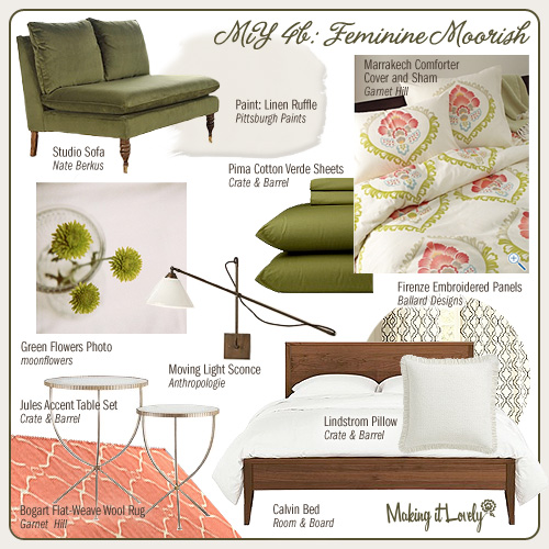
We’ve already seen the first look (striking stripes and polka dots) in this fourth edition of Making it Yours, and now we’re on to the second. I love that this one is so different, yet we’re still using the same bed, lighting, seating, tables, and even the same sheets.
The rug has a moorish tile design, yet it’s done in a cheery coral and the bedding picks up on that. The curtains also echo the shape in the rug, but on a smaller scale. Creamy white paint, a white pillow with feminine details, and the photography keep the look light and sweet.
Next time, we’re drawing inspiration from the fresh produce section.


K.
February 1, 2010 at 10:41 amvery nice. good work!
Tatyana
February 1, 2010 at 11:11 amLove the rug!
mrs boo radley
February 1, 2010 at 11:19 amYes please to the studio sofa!
Averill
February 1, 2010 at 11:34 amI think this is my favorite iteration yet! I love the coral with the green!
Sugar
February 1, 2010 at 11:44 amI absolutely adore this room inspiration. LOVE IT.
Brooke
February 1, 2010 at 11:51 amI love the color palette! The coral and green mixed with the brown is so playful and cheery.
Victoria
February 1, 2010 at 11:56 ami´ve been following your blog since 3 weeks ago, and I love it!!! I am from argentina and I am a fashion designer. I can´t wait to see your next post.
xoxo
Sarah S
February 1, 2010 at 12:01 pmThis is so, so lovely. Is it naptime yet?
Susan
February 1, 2010 at 12:05 pmI love this one!!!
beth
February 1, 2010 at 12:13 pmi love this making it yours series so far.
i’ve been reading your blog for a while now, and i have to confess: i hate pink. :-) but i love how completely and totally YOU your house is: that’s what a home should be! thanks for the great ideas and inspiration: i always look forward to your posts.
Danielle
February 1, 2010 at 12:48 pmI love the pop of color with the peachy, pink rug!
Bailey@peppermintbliss
February 1, 2010 at 1:01 pmI love this series, esp this version BECAUSE of the challenging green couch. It is a great piece and shows how masculine furniture can be more feminine and vice versa, great for couples decorating or ANYONE for that matter!
luuve
February 1, 2010 at 1:07 pmi could totally pull this off in my bed room..thanks for the inspiration! :)
Natalie
February 1, 2010 at 1:17 pmHow pretty! That rug is just divine.
Question: I’d like to hang a panel from our patio door like you did in your stairway. However, I’ve never hung cafe rods before. We rent, so screwing them directly into the door isn’t an option for us.
Natalie
February 1, 2010 at 1:18 pmI guess I never got around to the question! haha :)
The question is, how can I hang up the panel without damaging the door?
Making it Lovely
February 3, 2010 at 4:32 pmYou can hang thin hooks over the door, or maybe use these wire Command hooks, and then use a thin rod to go across. In fact, you may want to pick up a set of café curtain rods to use for parts – they’re only about $5 at the Big-Box stores.
Brigite
February 1, 2010 at 1:39 pmI adore this series…I’m jealous I didn’t think of it first! :)
Kathy
February 1, 2010 at 2:17 pmI have been eyeing the blue version of that rug, and when I saw it on here today, that sealed the deal! This coupon gave me $50 off too (since I ordered the 8 x 11′): G9KMENT – what a deal! Thanks for the inspiration!
Redlilocks
February 1, 2010 at 2:46 pmI have never ever liked the colour coral – I think it just seemed too wishy-washy, neither orange nor pink. But I adore it in this combination, it’s gorgeous! Love this one!!! I so wished that bedding shipped to the UK… *sigh*
Allison
February 1, 2010 at 3:09 pmI’ve been searching for a rug just like this for a year. Thanks!
Tracy Luinge
February 1, 2010 at 3:20 pmI’m really liking the bedspread!
Emma
February 1, 2010 at 4:24 pmOh you are making me so jealous Nicole – because most of that stuff can’t be shipped internationally! LOVE the bedding. Your mood boards have inspired me so much I’ve started doing them for rooms in our little cottage in rural Australia – my latest for our master bedroom I blogged here:
http://littlemissemmadesign.blogspot.com/2010/01/bedroom-plans.html
P.S. Eleanor – too cute and growing too fast!
Liz @ It's Great To Be Home
February 1, 2010 at 5:04 pmYou’re right, this one is SO different from the last! I love this bedroom, it’s so beautiful without being too sweet.
Lucia M
February 1, 2010 at 5:15 pmI love all those colors! Especially, those bed sheets are amazing!
jules @the diversion project
February 1, 2010 at 5:25 pmWow, stunning ideas. The colours are just fabulous. Really loving this one in a BIG way.
jules
The Zhush
February 1, 2010 at 5:41 pmThe table and the sconces are amazing! Also, I think I need to learn photo shop, or whatever it is that you use to make these cool posts!
colie
February 1, 2010 at 7:23 pmthis is my kind of girlie, not too sweet with strong lines in the bed, not to tough with tons of pink. Great board!
Caroline @ The Feminist Housewife
February 1, 2010 at 7:29 pmThis is definitely my favorite! I love it!
Jessica at Lavender & Lilies
February 1, 2010 at 8:12 pmOkay I am going to need that rug. Beautiful!
Nicolette
February 1, 2010 at 8:18 pmOh, this is so fresh… and lovely! It’s inspiring dreams of springtime!
Pathom
February 1, 2010 at 8:37 pmThis is really pretty – and totally do-able. Great job.
Cecilia
February 1, 2010 at 11:01 pmHi!
I have been checking out your blog, it’s fabulous. Curious if you would be willing to be interviewed regarding your experience. We are hoping to understand influences that drive awareness/selection/purchase requirements for home owner/renter and/or interior decorator.
We are studying small renovation projects. We appreciate if you take a few minutes to fill out this survey. https://spreadsheets.google.com/viewform?formkey=dHBQMGNCQ0NHSDgySGlEYnpCRmY5R2c6MA
Emily A. Clark
February 2, 2010 at 8:19 amI love those Ballard Designs panels. I’m trying to find somewhere in my house to use them in the persimmon :)
rachel
February 2, 2010 at 9:50 amooo. I love this one. That duvet cover is beautiful. Gonna go check out Garnett Hill now…
Lydia, Clueless Crafter
February 2, 2010 at 9:58 amI grew up with heavy, rich textiles and have been thinking about how I could incorporate the beauty of them in a more modern way and in my way.
I don’t want to ditch the pieces, especially since they will be handed down, but I truly see that I can incorporate the rug above or the panels in a way that will still honor the aesthetic.
A true thank you for this!
Sara
February 2, 2010 at 11:20 amI love, love, love this! I am such a fan of the moorish patterns. It’s great to see them more and more in the stores.
Nuit
February 2, 2010 at 1:22 pmthis is definitely my fave! love-love-love the palette!
lana @ make a house a home
February 3, 2010 at 11:17 amlove the rug! you always pick out the best rugs!
xo
lana
Jennae @ Green Your Decor
February 3, 2010 at 1:14 pmThis is beautiful! It’s feminine, but not so much that a man would feel out of place. I never thought I’d like these colors together, but the bedding gives you a point of reference to use them throughout the design. Gorgeous!
Joi
February 3, 2010 at 8:16 pmI think I need that duvet. I adore this series!
Natalie
February 3, 2010 at 10:28 pmGREAT idea about the hooks and using the cafe rod! Thanks so much! :)
Link Time! | My.BuzzCritic.com
February 4, 2010 at 4:13 am[…] design director. – The SelbyI love this feminine Moorish bedroom design. – Making It LovelyMattia Bonetti’s furniture looks alive! – Design Milk You can leave a response, or […]
Cheryl
February 4, 2010 at 10:49 amLove the duvet cover! so much so that I ordered it, after much thought. yum colors and I like the energy in them and yet they are soft enough for a bedroom.
In Honor Of Design
February 4, 2010 at 5:52 pmbeautiful hues! Its great to find a fun print in the duvet and go from there!
erica
February 8, 2010 at 1:28 amDONT BUY THAT COUCH!! my husband and I did, we were so excited to get it (in the ikat pattern). We assembled it and he sat down and the casters popped right off. the whole construction was poor, so we returned it. it is really cute- I originally saw it in Vogue, but it was a heart break to have it not work out.
Making it Lovely | Transforming the so-so. » Blog Archive » MiY 4c: Fresh Picked
February 10, 2010 at 5:27 pm[…] and tables are the same as in the first two designs (4a: Striking Stripes and Polka Dots and 4b: Feminine Moorish), and there will be two more looks after this […]
Mini Updates « the[artful]abode
June 22, 2010 at 7:07 pm[…] since I saw this rug on Making It Lovely, I knew I had to have it. I reminded me of the Pottery Barn moorish rug that […]