Things are moving along with my One Room Challenge space! Let’s talk design this week. First up, the bedroom. It will look a little something like this.
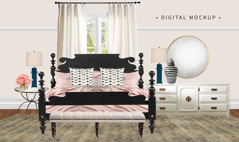
And here’s how we’ll get there.
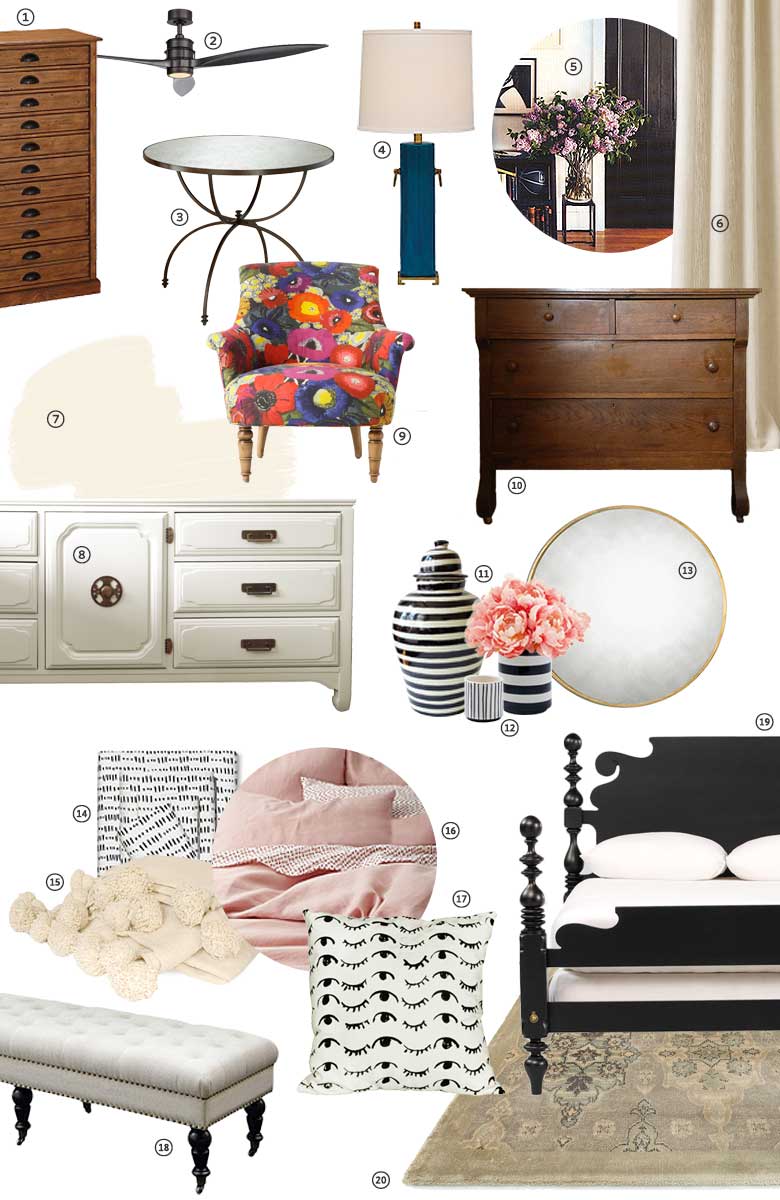
-
Shelby Accessory Tower, Pottery Barn
This has been in the room since shortly after we moved in. Glasses, scarves, belts, jewelry… it’s all inside. -
Falcon LED Ceiling Fan, Rejuvenation
We took the ceiling fan down from the room and are looking to replace it. This is the frontrunner (form + function!), though I’m considering others. -
Willow Bedside Table, Pottery Barn
I bought the floor model when these went on clearance a few months ago. I had been eyeing it at full price, so I was happy to score a deal! -
Beverly Turquoise Ceramic Table Lamp, Lamps Plus*
The color bridges the two rooms, the brass details are darling, and the simple shape contrasts with the bed. -
White Trim, Black Doors (example)
Our stripped fir millwork, windows, and doors have been painted! -
Linen Curtains (?)
Still up for debate. -
White Blush Paint, Benjamin Moore; Painting by Paintzen*
The palest pink, and not at all ‘baby.’ -
Custom Vintage Dresser, MegMade*
This dresser is on the other side of the bed. I selected the piece and chose the color, they painted and delivered it. -
Accent (Blythe) Chair (?)
I already own this, having bought a floor model and repaired it, but I’d be stealing it from another room. I the right vintage/used/antique chair comes along, I’ll go with that. -
Antique Wooden Dresser
From an antiques store in Northern Wisconsin. I bought this right before we moved in. -
Black Striped Tibor Ginger Jar, Houzz (Talavera Vazquez Pottery)
Hand-painted black and white stripes update a classic ginger jar shape. -
Striped Cachepots, West Elm
More black and white stripes in smaller, more affordable accessories. -
Round Gold Mirror, Bellacor*
One large round mirror to go above the painted dresser. The glass is antiqued, so it’s more about the size and scale than needing a true reflection. -
Nate Berkus Microdash Sheets, Target
These, combined with the throw pillows, make it seem like we’re sleeping on millions of little eyelashes. But you know. In a way that’s pretty. -
Moroccan Pom Pom Throw Blanket (example)
I have one from my trip to Marrakech! -
Pink Belgian Flax Linen Duvet Cover & Shams, West Elm
I bought this set in white for my old bed, but when we upgraded and needed king-sized bedding, I opted for pink. Best decision. -
Wink Wink Pillow, People I’ve Loved
Seemingly the source of our sheets’ eyelashes. (Fun sentence to write!) -
Isabelle Tufted Bench, Joss & Main*
I underestimated the functional appeal of a bench at the foot of the bed until we had a bed so high off the ground that my feet didn’t touch when I sat on the edge. Bench welcome home! -
Quincy Bed, Ethan Allen
I’ve written before about my thoughts on choosing this bed. No regrets. -
Taupe/Gold Nyla Rug, Loloi*
Quiet enough to work as a complement to everything else, but still beautiful in its own right.
And then we have the den. Photoshop! This isn’t the layout, just an overall idea of how everything works together.
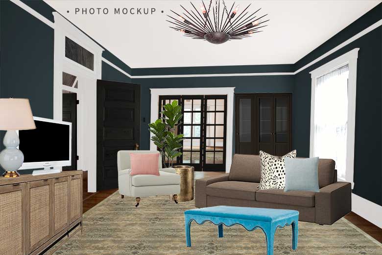
Ta da, the plan.
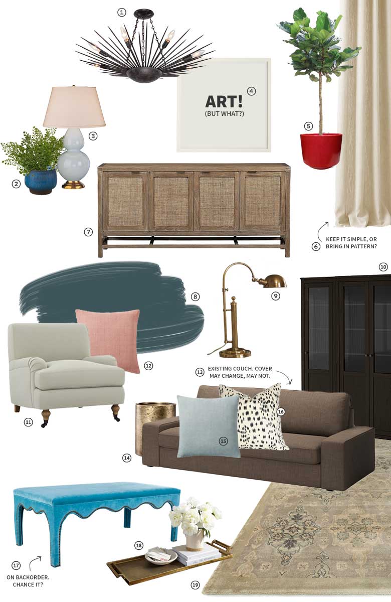
-
Galileo 8-ight Forged Bronze Chandelier, Crystorama*
Spiky and kind of tough, but kind of sweet too. A good blend of masculine and feminine. -
Aqua Round Cachepot, Jayson Home
I bought one when I was pregnant and for some reason the life growing within me translated to a need to surround myself with life of the growing green plant kind. Weird. This was in the entry, and now it will move to the den. -
Robert Abbey Light Blue Ceramic and Brass Gourd Table Lamp, Lamps Plus*
Shapely, and the color looks great with the walls. -
ART! (But what?)
That’s the question, isn’t it. I have some ideas — see below. -
Fiddle-Leaf Fig in a Gainey Planter
I had my Fancy Blogger Tree setup like this in the library of our first house, and I miss it. -
Linen Curtains (?)
Again, still up for debate. This room needs pattern more than the bedroom, and curtains are an easy way to add it. -
Blake Grey Wash Media Stand, Crate & Barrel
Picked up a couple of years ago at the C&B outlet when we first moved in. -
Everard Blue Paint, Benjamin Moore; Painting by Paintzen*
Right there at the intersection of green and blue. Lots of depth. -
Barclay Arc Table Lamps, Pottery Barn
These looked great when we had them on either side of the platform bed, but I’m thinking of moving them to a simple console table behind the sofa. -
Hemnes Glass-Door Bookshelves, IKEA
Because we have too many books. -
Rose Chair in Stone Basketweave, Interior Define*
A pair of these will flank the couch. They’re great for curling up in — good for movie nights. -
Silk Hand-Loomed Pink Rosette Pillow, West Elm
Pink, to tie-in with the bedding the next room over. -
Kivik Sofa in Isunda Brown, IKEA
The only way to get a sofa upstairs is to do it in pieces, so IKEA worked well for this room. Maybe a new cover? -
Threshold Granby Brass Cylinder Drum Table, Target
A sturdy little side table in hammered brass. -
Silk Hand-Loomed Moonstone Pillow, West Elm
I like the texture of these pillows a lot. This one picks up on the color of the lamp. -
Les Touches Black Pillow, Arianna Belle*
Grown up polka dots! Reminiscent of animal print, but not a literal copy. -
Ivy Ottoman in Turquoise Velvet, One Kings Lane
The original delivery date for this has already passed. It was pushed back and now it’s supposed to get here between “April 29 – March 24.” Say what? I love it, but do I try to find something else and cancel this, or take a chance that it will get here in time? -
Long Gold Metal Tray, Pottery Barn
If we’re going to do an ottoman in place of a coffee table, we’ll need a tray on top. -
Taupe/Gold Nyla Rug, Loloi*
I chose matching rugs for both spaces for continuity.
So overall, on track. The rooms have already been painted and I’ll have photos for you next week. The colors look so good together! And the white trim? Black doors? YES. I need to order a ceiling fan, then install it along with the other new light. I’m keeping an eye out for the right accent chair, but if nothing turns up I’ll steal from another room in the house. Do I forget about the turquoise ottoman, or trust that it will arrive in time? And go simple with window treatments, or bring in color or pattern (or both)?
And then there’s the big blank wall. It’s the wall that used to have a door in it, before we remodeled the second floor. There’s a big cast iron radiator on one end, and a bump out for the chimney on the other. Trio of beetles? Ten matching brass frames with DIY something inside? Farts neon sign? (Probably that last one, right? It’s super sophisticated.)
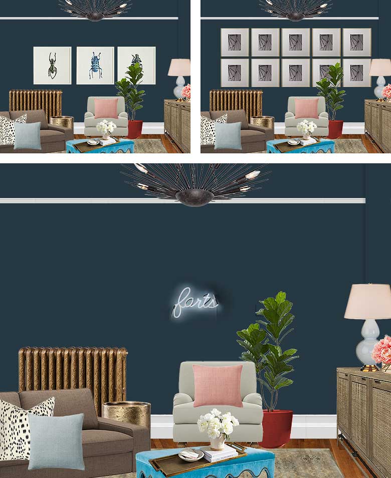
Decisions, decisions.
Follow along with the One Room Challenge participants!
 • Claire Brody • The Curated House • Design Manifest • Driven by Decor • Honey We’re Home • Hunted Interior • The Makerista • Making it Lovely • My Sweet Savannah • Pencil and Paper Co. • The Pink Clutch • Savvy Home • Simplified Bee • Sketch 42 • Jill Sorensen • Orlando Soria • Thou Swell • The Vault Files • Waiting on Martha • The Zhush • Media Partner House Beautiful • TM by CIH
* An asterisk denotes the sponsors providing product for this makeover. Their partnership is greatly appreciated!


Nina
April 13, 2016 at 7:56 amIf you´re still undecided about the linen curtains- i can´t sing enough praises, honestly. I have some in my bedroom,which i just “made over” and they are just lovely. They are soft (and get better with every wash and dry) but still add texture and depth. Plus, to me they are fancy enough to say “grown-up”, but still neutral enough to go with everything. I love them. And i got them for a steal at H&M Home, though i don´t know if they sell in the US.
Megan C.
April 13, 2016 at 8:10 amSo excited to see the final reveal! I would recover the sofa in a gray fabric, if that’s possible? The brown is a little too…brown. I would also cancel the ottoman and maybe get something less bright? Maybe it’s just the mock-up but the turquoise seems jarring and overwhelming with the rest of the colors in the room. Like it’s trying too hard to be a “pop of color”. For art I choose “farts” definitely. Not really, I choose the beetles, all those little frames look too busy.
Making it Lovely
April 13, 2016 at 9:44 amI chose the brown cover initially to match our platform bed, but since that’s gone, there’s no reason I can’t change it up. The turquoise though… I really like it! It would make more sense within the context of the room once everything was in place.
Elise
April 13, 2016 at 8:30 amHoly moly I think you need to chance it because my eyes popped right when I saw that piece and I immediately scrolled to #17 for the details!!!! xx
Making it Lovely
April 13, 2016 at 9:42 amIt’s so good, right? But if it isn’t here for the reveal, that’s a major piece of the design missing.
JenW
April 13, 2016 at 8:34 amYes, neon farts. Of course. LOL! I like the three frames vs the 10. The 10 is just too busy to me.
Amie M
April 13, 2016 at 8:50 amGo with the insects! I love a good trio of photos/art, and the insects are really cool.
sarah
April 13, 2016 at 8:51 amClearly the neon ‘farts’ sign is the winner. And I’ll be chuckling to myself about it all day (which shows what a grown-up sense of humor I have!) :)
Making it Lovely
April 13, 2016 at 11:49 amSame here.
Sa
April 13, 2016 at 9:37 amIf the den is your primary TV place, you may want the couch directly facing the TV.
Making it Lovely
April 13, 2016 at 9:41 amYes, it will be. The mockup doesn’t accurately reflect the floor plan, it’s more for an idea of how the individual pieces will look together.
Bethany Mihalik
April 13, 2016 at 9:44 amLove love love the den paint color!
Laurie
April 13, 2016 at 9:58 amOh I LOVE the trio of beetles!
emily @ go haus go
April 13, 2016 at 10:15 amThis is stunning Nicole. Eyeballs and beetles… this is why I love your style. I want to swim in beetles and eyeballs at my house too. My kids are wearing eyeball pants as I type this. Lol!
Making it Lovely
April 13, 2016 at 11:48 amOoh, from where? My kids need eyeball pants too!
Michaela @ The Lodge on Haydon
April 13, 2016 at 11:35 amHAHA @ neon farts! : ) Too good. LOVE LOVE LOVE the pinks and blues and the entire color scheme. This might be one of my favorite designs from this round of the ORC!! It’s going to be BEAUTIFUL, good luck this week!
Making it Lovely
April 13, 2016 at 11:48 amIt cracks me up. Thank you!
silver bells
April 13, 2016 at 11:39 amFarts? Is that the best you can do?
Making it Lovely
April 13, 2016 at 11:47 amNot a fan?
gerskine
April 13, 2016 at 11:57 amI say “farts” ONLY because it shows your personality. I feel that everything else about the scheme looks impersonal, could be anyone’s room… like a nice hotel room. Go for FARTS AND turquoise ottoman!
laurie at laurie jones home
April 13, 2016 at 12:05 pmLoving the plans! I love how your style is evolving, love the deep rich colors and especially the lighting!!
Ashly Schilling
April 13, 2016 at 12:22 pmI am team neon farts. Throw everything out and design around that!
thirtyyearhouse
April 13, 2016 at 12:25 pmI am also on Team Neon Farts. #teamfarts
Is it classy? No. Is it good for us to not always be classy? Yes.
Bonnie Morscher
April 13, 2016 at 12:32 pmI love pink, but your links in pink are barely legible. Could you maybe try a fuschia, or something that will contrast to the white background more?
Sarah
April 13, 2016 at 1:46 pmI love both rooms! I’m just renting and can’t paint or invest in light fixtures so watching this makeover is the next best thing!
Crissy
April 13, 2016 at 2:37 pmThe “farts” neon…as soon as I saw in Brooklyn Decker’s house, I thought I needed to find a space for it, too! Good luck!
Ellie
April 13, 2016 at 4:04 pmThis is so beautiful! I hope the bench/ottoman works out, it’s gorgeous!
Linda @ Calling it Home
April 13, 2016 at 5:53 pmI love the two spaces. That round mirror is beautiful. I did not think I would like the dark wall, but I really do. I will wait to see the final art before I decide :)
Jenny
April 13, 2016 at 6:10 pmI really hope you go with the linen drapes! They would add such an elegant sophistication with the colors and items you’ve selected. Every space needs that soothing break when something so bold is involved. They would play off of the beautiful rugs, as well, adding balance. Also really love the ten brass frames. I think out of the choices, it appears the most ‘finished’. Loving these ideas, feeling very inspired!
Sarah Walker of The Curated House
April 13, 2016 at 8:25 pmI absolutely love the soft warmth of the palette juxtaposed with the bolder elements like the dark bed frame in the bedroom and the walls in the lounge. The rooms feel like inversions of one another, and the overall mood is quietly comforting and so invitational. Your attention to detail is downright loving, and can I just nerd out for a second and say that your presentation of all of your concepts makes me want to sit at your feet and learn from your ways? Seriously. You are the blogging bomb diggity. Can’t wait to see it all come together and learn from you along the way! xx Sarah
thouswellblog
April 13, 2016 at 9:43 pmThat turquoise ottoman is to die for! I hate that it’s on back order, such a frustrating situation for such a tight project turnaround. Love this mix and the fun elements – especially the winking pillows (so perfect for a bedroom)!
Nitya
April 14, 2016 at 9:43 amLove the bugs artwork!Best of luck, can’t want to see how this space unfolds!
Barbara A Town
April 14, 2016 at 6:32 pmWOW!! This is going to be beautiful!! I love the pop of teal and all the feminine accents. Cant wait to see the finished product :)
Mary
April 15, 2016 at 5:57 amI absolutely thought the mock up of “Art. But what?” was real art. I would buy that in a heart beat! (And will probably go make it myself this weekend!)
simple nature decor
April 15, 2016 at 10:04 pmYou have the gold touch! beautiful choices,I Iove the only turquoise table among the muted colors brilliant! its an added bonus for anyones eyes! I have enjoyed reading all the featured designers. This is my first OCR.. Have a grand weekend!
Maria
Jalene
April 16, 2016 at 9:29 pmFirst time visitor. I really like your blog! The neon farts sign cracked me up. I think we are on a similar wavelength…check out some of my ideas for our master bedroom! My mood board has some similarities to yours for sure, and you will see that you own my dream bed (or my previous dream bed). http://www.ourcorneroftheworldblog.com/master-bedroom-baby-steps/
One Room Challenge: Week 3 (All That Painted Woodwork) – Making it Lovely
April 20, 2016 at 9:13 am[…] into place, the rooms started to shape up! I had a few things left up in the air when I showed you the design plan last week, but I’ve made progress on that front. I went ahead and ordered the ceiling fan, and I picked […]
One Room Challenge :: Week 2 - Simplified Bee
April 24, 2016 at 4:53 pm[…] Manifest | Driven by Decor | Honey We’re Home | Hunted Interior | The Makerista | Making it Lovely | My Sweet Savannah | Pencil and Paper Co. | The Pink Clutch | Savvy Home | Simplified […]
One Room Challenge: Week 4 (Rugs, Curtains, Bedding, and Other Fabrics) – Making it Lovely
April 27, 2016 at 8:36 am[…] how the paint colors from the chips below have been incorporated, and of course it’s all in the design plan. The fabrics represent the duvet cover and sheets, pink linen curtains, and a pair of […]
One Room Challenge: Week 5 (The Lighting) – Making it Lovely
May 4, 2016 at 10:14 am[…] along from the beginning! • Week 1: The Before Shots • Week 2: The Design Plan • Week 3: All That Painted Woodwork • Week 4: Rugs, Curtains, […]
One Room Challenge: Week 6 (Bedroom and Den Reveal!) – Making it Lovely
May 11, 2016 at 8:56 am[…] but I was worried that the room wouldn’t come together as I’d hoped when I learned that the turquoise velvet ottoman I’d ordered had been pushed back for delivery yet again. I had grabbed a wooden coffee table […]