This post is sponsored by Legrand.
The first and second floors retained most of the original Victorian hardware but there was a mishmash of light switches when we bought the house, so we swapped them all out for brass plates with period-appropriate push-button switches. The third floor, however, had remained cobbled together. The paneled wood doors were different styles, sizes, and colors, and all had mismatched hardware. The lighting fixtures were blech and the generic white toggle switches were nothing special. My plan for the space has been to elevate the details, bringing them in line with the rest of the house so they would feel less like an afterthought.
I kept the white trim but painted all of the doors black a few months ago. The old doorknobs were replaced with brass knobs and mortise locks chosen to reference the ornate detailing of the original hardware downstairs. I also installed brass sconces and added black shades that look amazing with the black doors. With those upgrades taken care of, I turned my attention to the light switches.
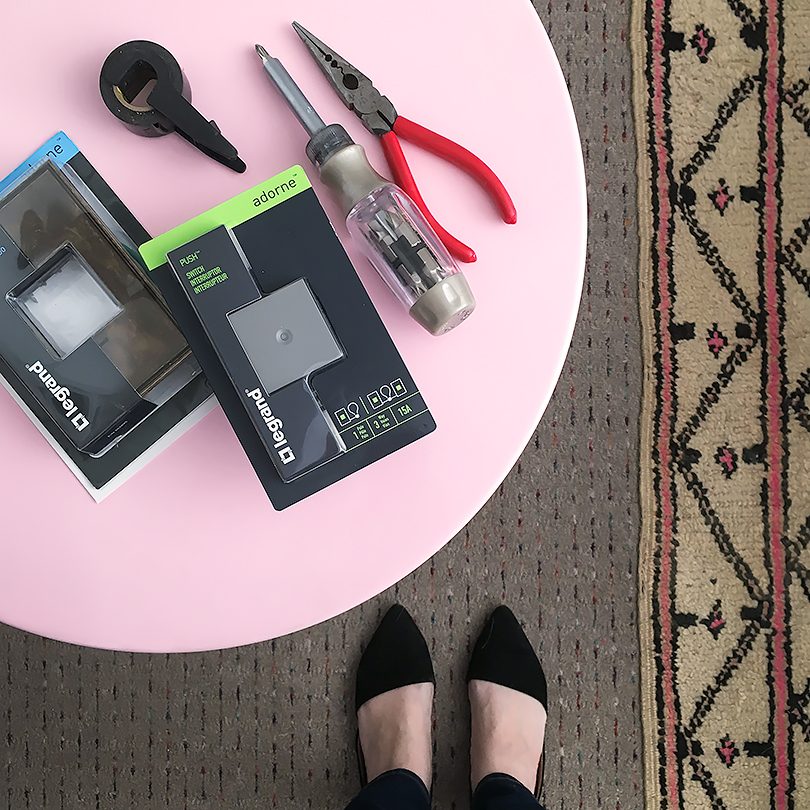
Legrand offered to send my choice of their Adorne switches and wall plates, and I first thought about going with all white. The third floor is more modern and less period than the rest of the Victorian, but I do still want it to feel like it belongs. White didn’t seem right. The doorknobs that I installed are a sort of modern take on Victorian hardware, so I went with the Adorne Push Switch, which I figure is the modern version of the old style push-button switches on the first and second floors.
Magnesium gray switches and aged brass are a nod to the black and polished brass of the past. There are tons of styles and colors to choose from for the wall plates though, including a customizable option that can be painted or wallpapered. There aren’t any visible screws on the plates, so the overall effect is super sleek.
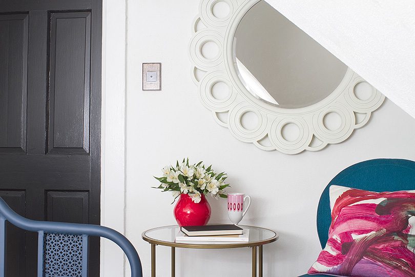
I turned off power at the electrical panel for the circuits I was going to be working on. There are instructions included with each Adorne switch or outlet, but the short version is to start by removing the old switch plate and switch. Pull the wires through the new backplate and screw it in, connect the hot wire and neutral to the new switch, then tighten the screws to hold them in place. I added electrical tape around them before pushing them in, but maybe that’s overkill? You push it into place until it clicks in, then do the same with the wall plate. Done.
I documented the whole installation on my Instagram Stories and saved the video. Apologies for the tight closeups, but I cropped it from a vertical to a horizontal format.
Some of those switches on the third floor had definitely seen better days. They’re so much better now!
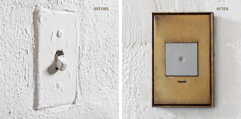
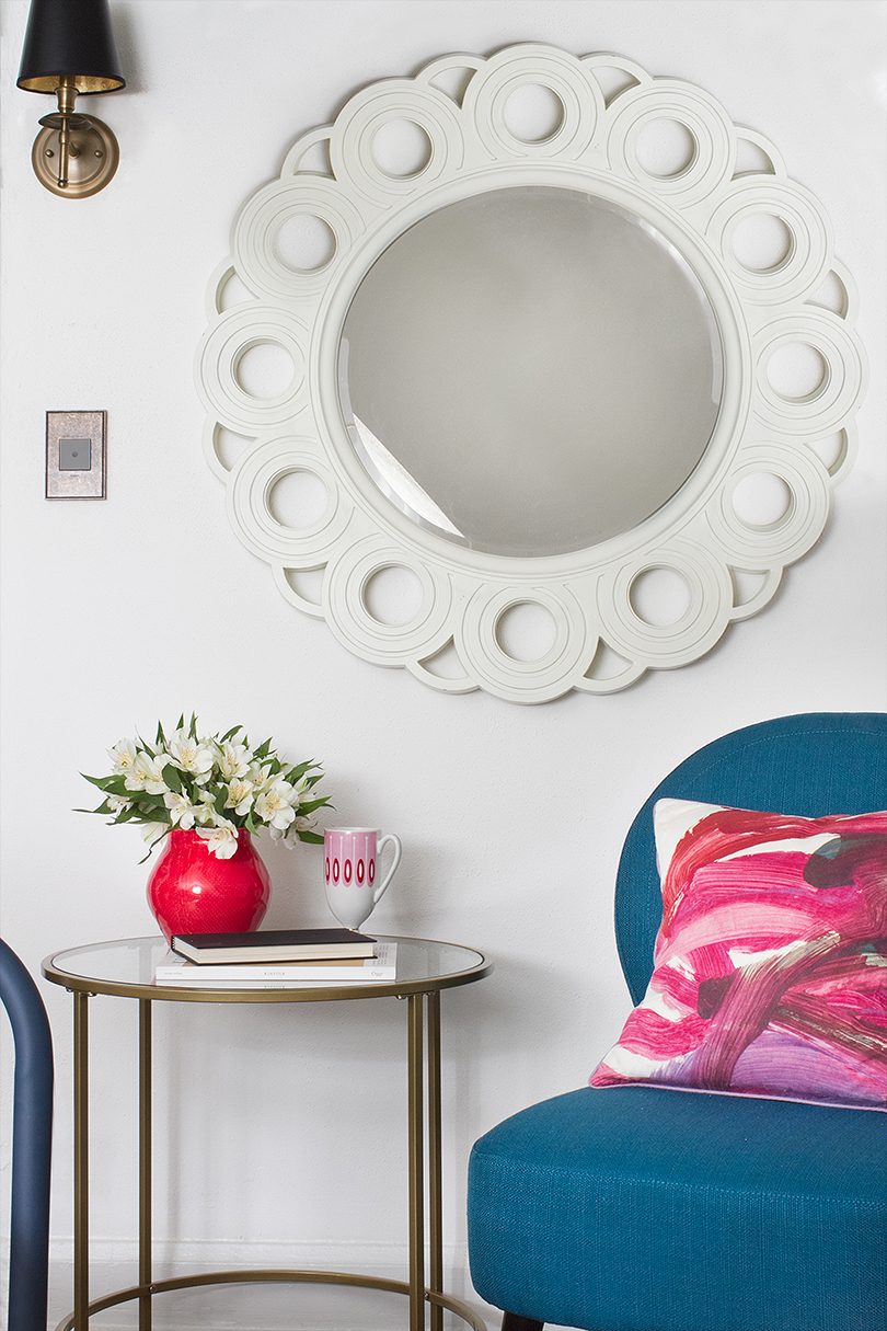
Upgrading the details of a house, especially those that you touch and interact with daily like light switches, make such a difference. Our Adorne light switches feel modern, but also like they totally belong.



Peggi
February 14, 2017 at 5:47 amGenius choice. Those look awesome! (Exclamation points for a light switch. Who knew?)
Making it Lovely
February 15, 2017 at 9:32 amYes! It’s something I’ve been doing little by little since we moved in, and I think we’ve finally gotten to every little switch now. It’s a noticeable little detail that just makes the house feel nicer.
Barb
February 14, 2017 at 6:22 amThe new switches look great, especially with the sconces in that last photo. My only issue is that LeGrand has put their logo on the front of the plate. I suppose I should be used to this type of advertising. Most pieces in a bathroom – toilet, faucets, etc. have their logo somewhere. I wish they all would place logos in a more inconspicuous place. But the overall upgrade is terrific.
Alicia
February 14, 2017 at 2:33 pmI agree with Barb. Much better than before, but the company logo (and the gray box) throws it off for me a bit. Too bad the gray box couldn’t blend with the plate color. Fabulous concept though!
Making it Lovely
February 15, 2017 at 9:36 amIsn’t it funny how companies do that? It’s subtle and if I had my druthers, I would have a logo-less house, but my deadbolt, toilet, faucet, etc. all have little logos on them too.
Martha
February 15, 2017 at 7:47 amThe new switches are great – they look perfect. But also great is that mirror – is that a current find or an antique piece? If current, could you tell me the name / store? Thanks.
Making it Lovely
February 15, 2017 at 9:38 amThanks! That’s the Lily mirror from Ballard Designs, but from years and years ago.
Martha
February 21, 2017 at 1:54 pmthank you!
Kelly Whited-Ford
February 17, 2017 at 9:26 amHave you replaced any of your outlets with their pop out outlets? Wondering how well they work.
Making it Lovely
February 17, 2017 at 9:29 amI haven’t. I’m kind of wondering if that might be another project for another time because there are what, three or four times as many outlets as light switches in a house usually, right? That’s a lot! And I’m a weirdo that wants consistency, so if I do them, I would do them all, floor by floor. :)
lisamaceda
March 8, 2017 at 10:50 amWe bought some Lagrande switches for our old Victorian and we really like them. Light switches are something that just haven’t changed all that much over the years but these really look sharp. We tried different kinds to see what we liked best and can’t wait to change out all those clunky, painted over switches that make that loud *snap* when you flip them. Yours look quite nice!
Buying Guide for Switches, Dimmers and Outlets | Mystic Lights
January 16, 2020 at 9:44 pm[…] Before and after – Image source: Making It Lovely […]