The library and living room got an update!
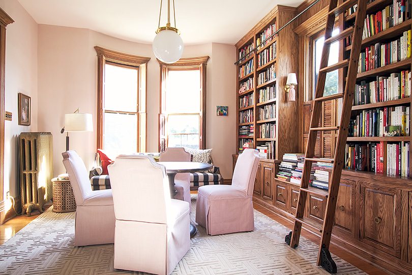
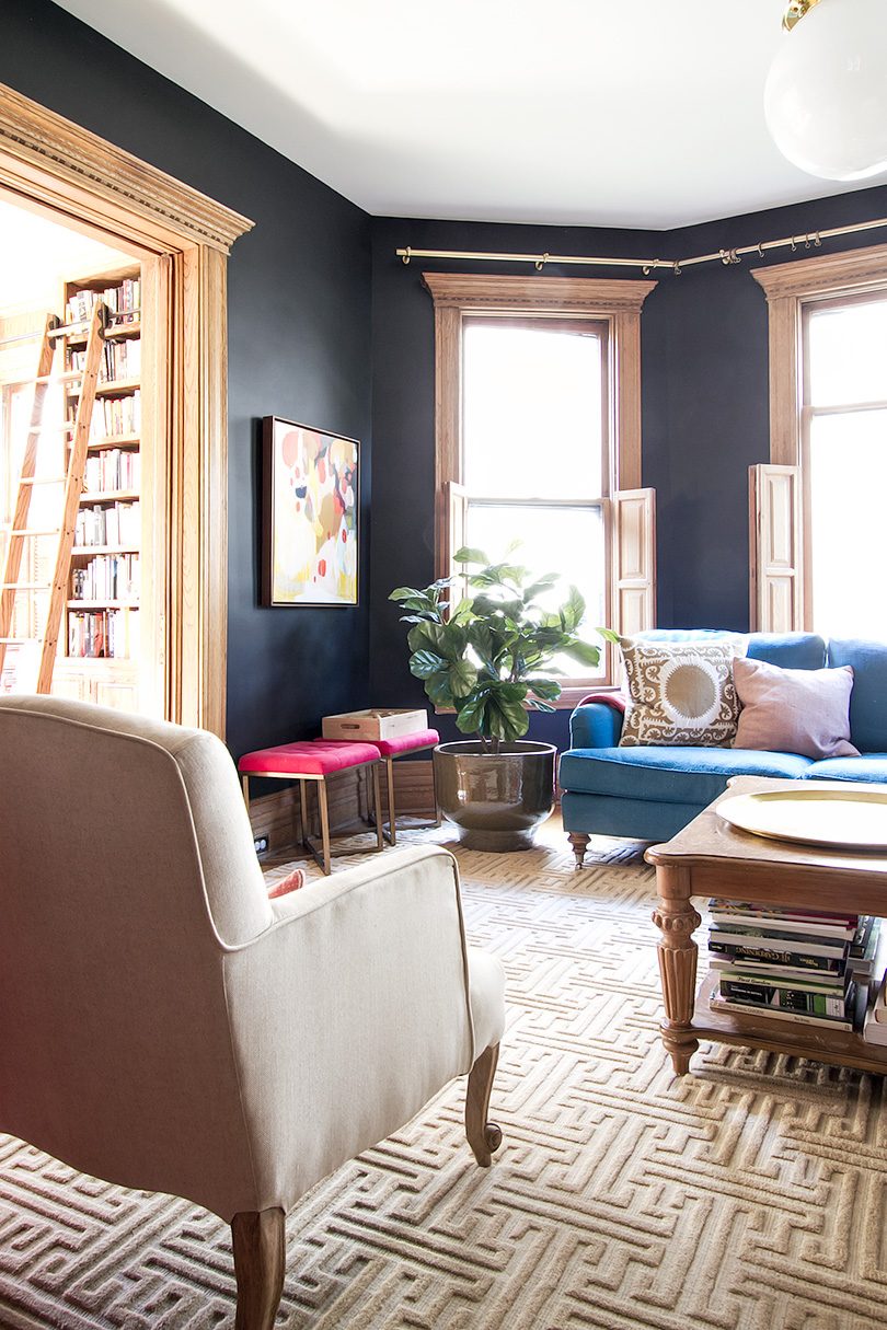
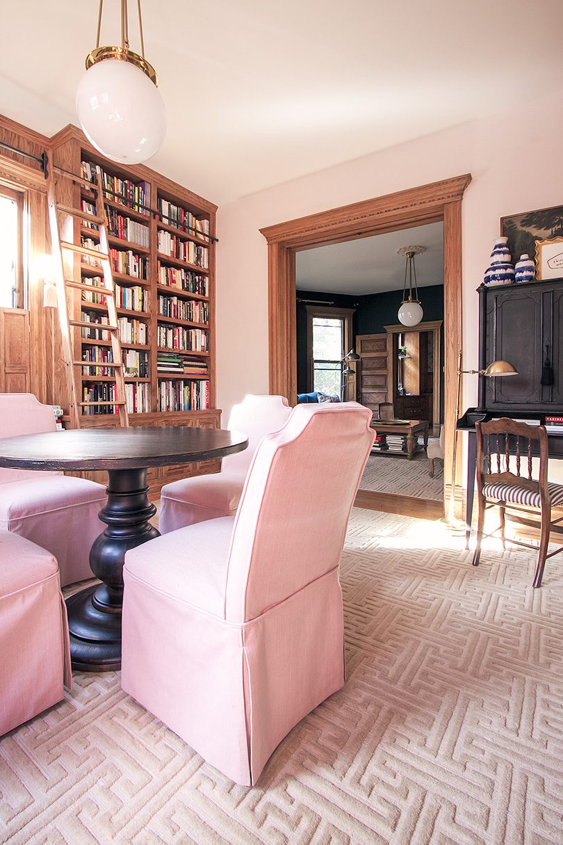
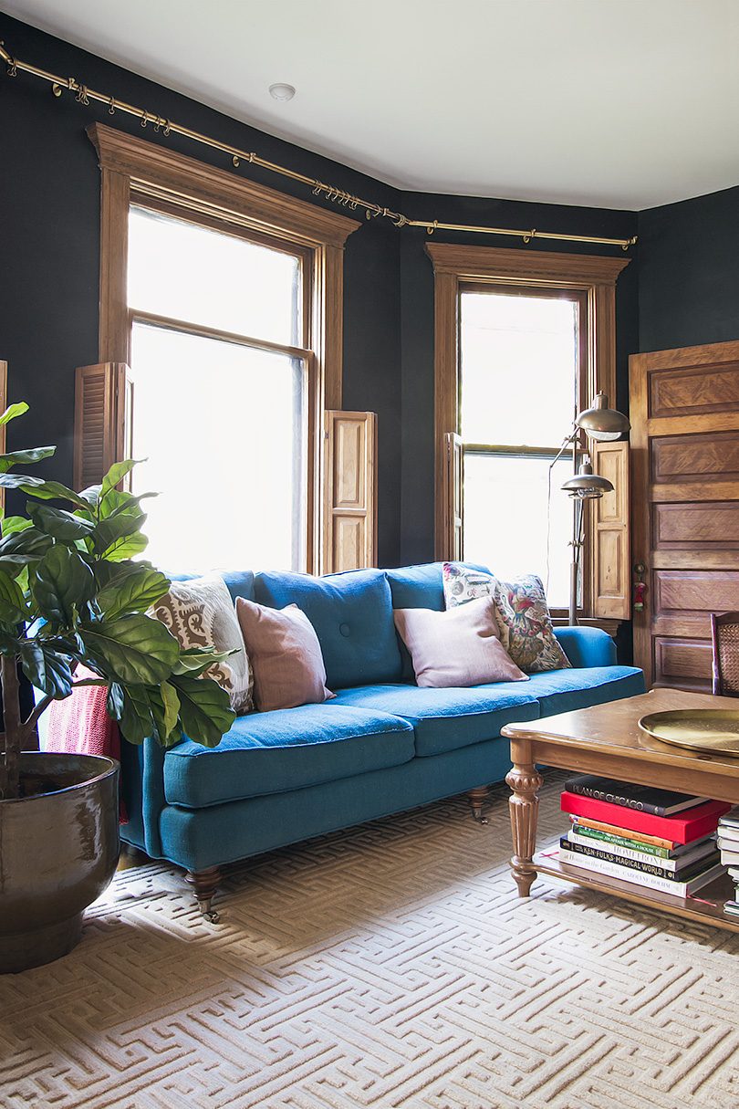
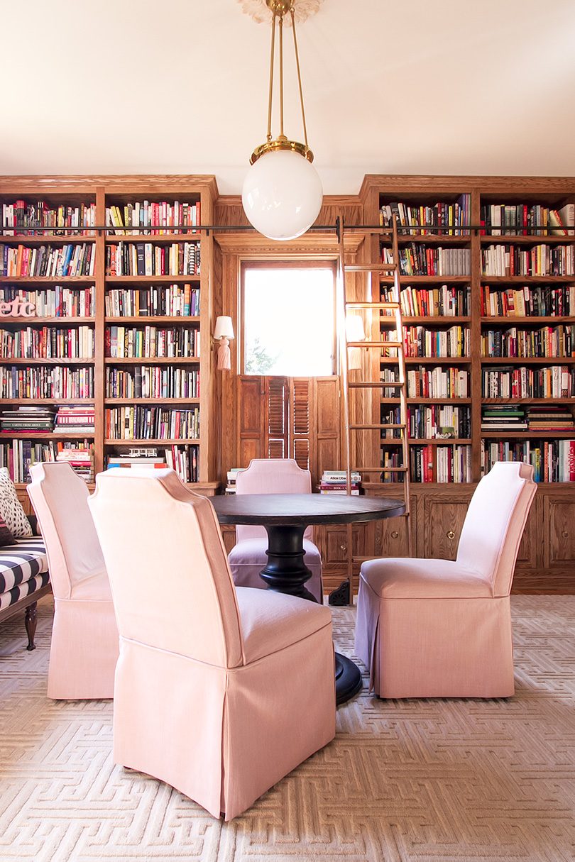
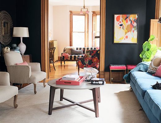
Matching rugs, finally! This has been the vision from the beginning, but I messed around, experimenting with every other possible variation. Annie Selke has provided products in the past for my One Room Challenge spaces, and while I didn’t need a new rug for my ORC office, I was excited about working with them to get the double parlor settled. I ordered samples of different options I had been considering. Some were more colorful and some more plush, but I kept coming back to the classic greek key tufting of the Beekman rug in semolina, a great golden/wheat neutral.
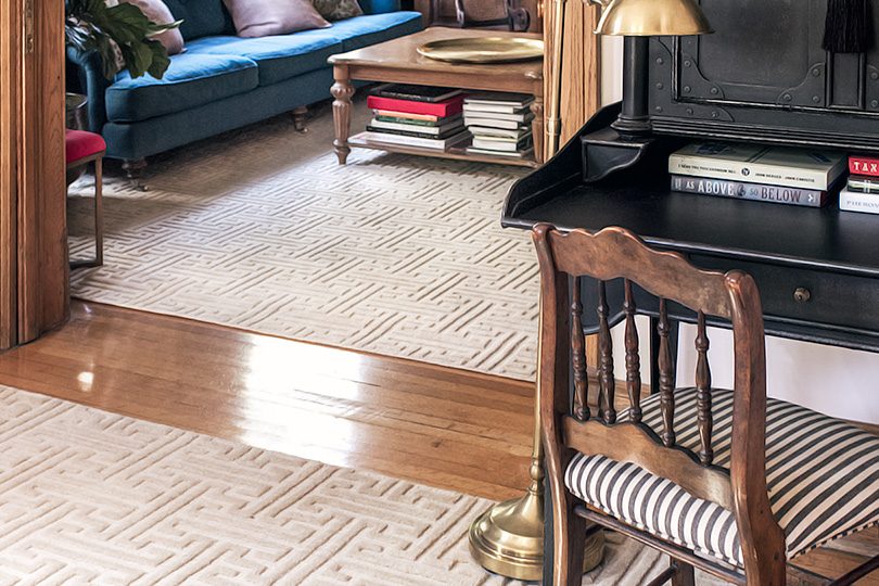
I love color and a big, bold moment, but that’s not what I wanted here. The two spaces needed to be unified with something soft and understated. Quietly luxe.
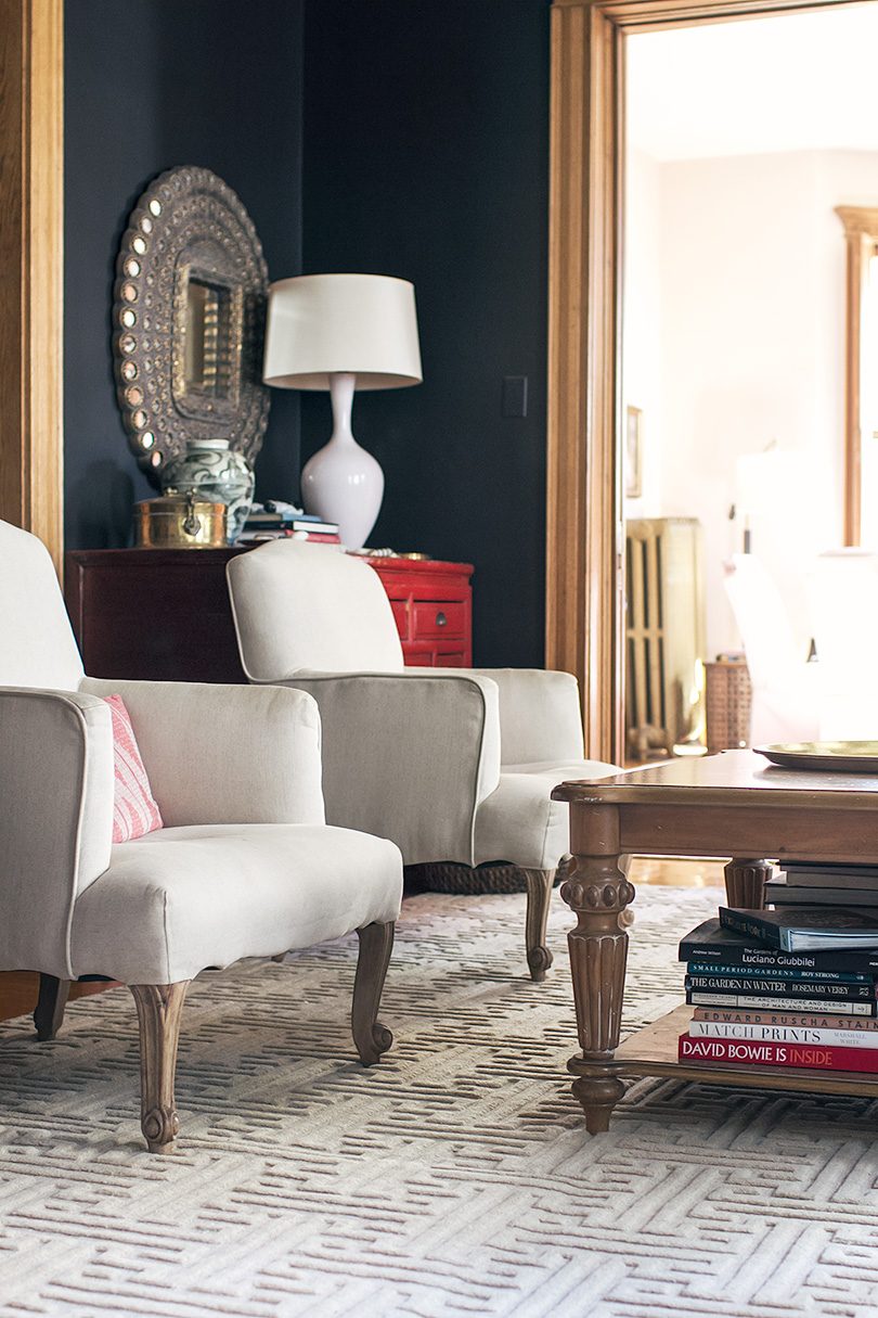
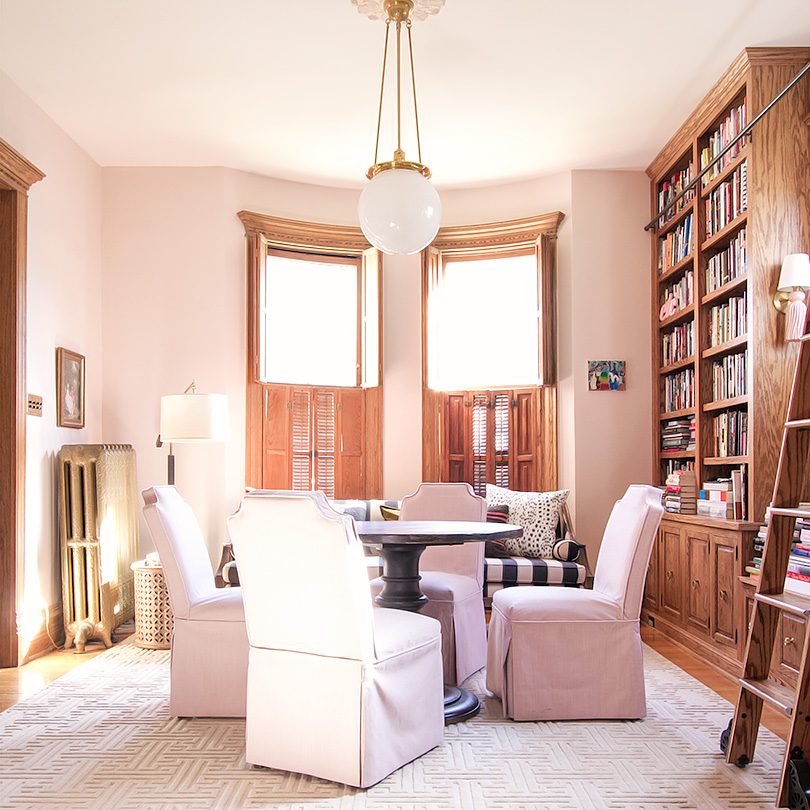
The details in the Beekman rugs make these feel really special. They come in a handful of other colors, but obviously this one is my favorite. Plus it’s 100% wool, so the rugs will stand up to the kids and pets (we still have the guinea pigs and one cat, and when we’re ready, maybe another dog someday).
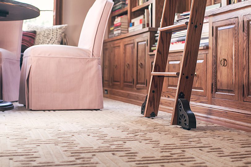
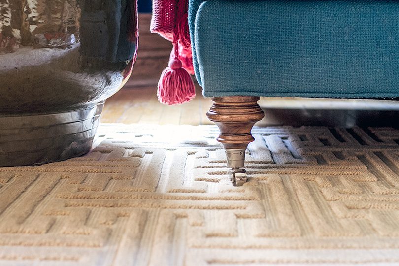
My rug design for Annie Selke will be available next year (!), and I’m looking forward to incorporating it into a room. For this space though, the tone on tone tufting and classic style is just right.
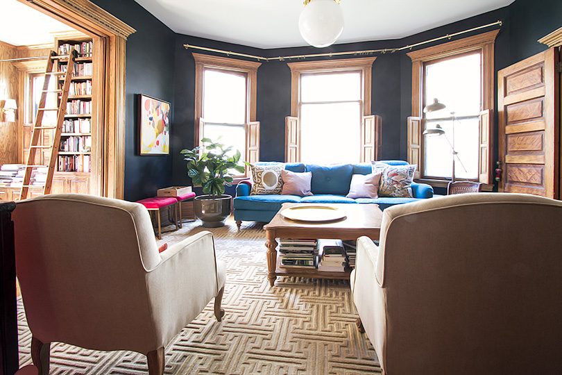
There are still things to do in here. I want to address the windows (hello, curtain rods that I hung forever ago!). The art could be more layered, especially in the library. The coffee table is not my favorite, the styling of the fireplace mantel could use some work, and I want to bring in more pattern. But overall it’s feeling really good. I like how it has evolved over time to come together.
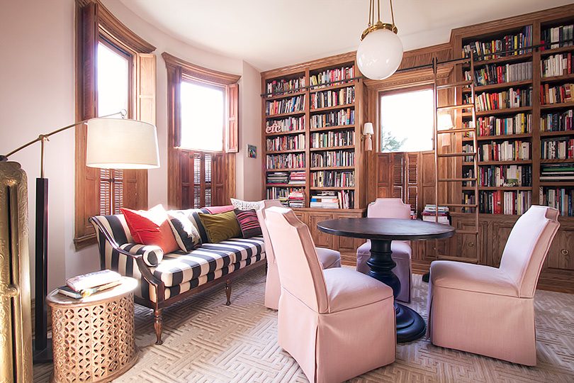
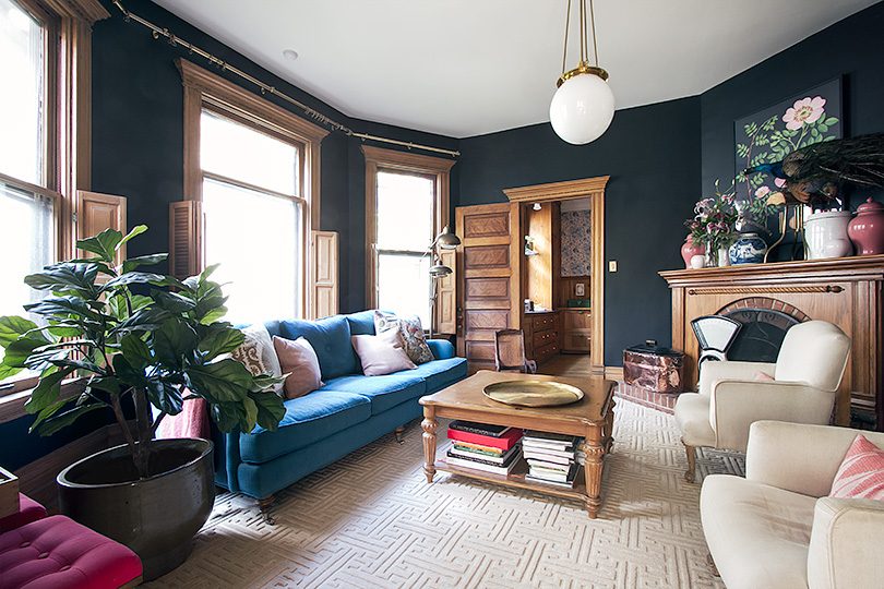
These matching rugs are a giant step in the right direction. (Thank you, Annie Selke.) The whole first floor feels much more polished and beautiful.


Jessibee
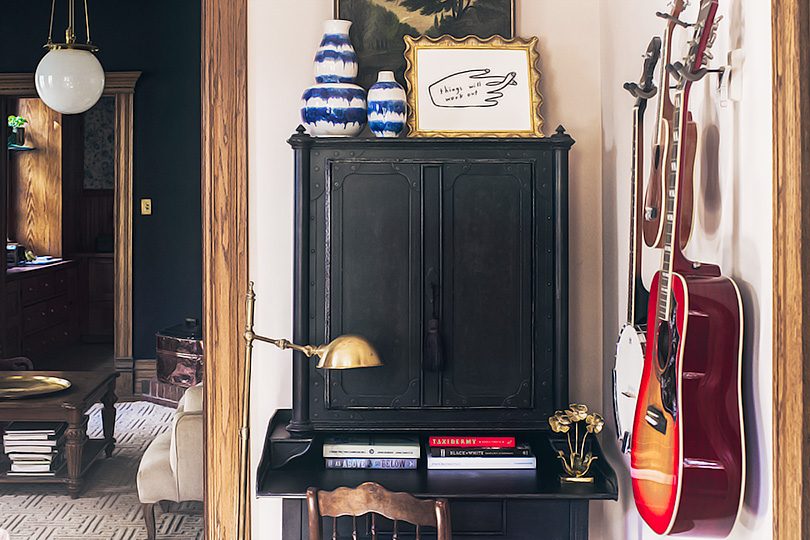
October 26, 2017 at 6:22 pm“Quietly luxe.” So perfectly put. Those rugs are beautiful! So into that gorgeous black secretary too!
Marissa
October 27, 2017 at 6:52 amThey’re lovely! It’s been so fun to see the different iterations of the room. Just curious– did you have the corner of the rug recut to fit around the fireplace? It looks like a custom fit.
Does the flower chair have a new home?
Kimberly Westby
October 27, 2017 at 10:51 amAbsolutely love, love, love the black and white stripes on the chair at the desk, with the striped couch. Happy accident or intentional??
Celeste
October 27, 2017 at 10:54 amWhoa! I don’t mean to be The Dude here, but these rugs really do tie these rooms together in such a special way. I couldn’t ever put my finger on what wasn’t working about previous rugs, but I think you nailed it!
Valerie Hill
October 27, 2017 at 2:11 pmI love the change. I like that it is a little more moody/broody in the space. Brings some sophistication after the light and fun pink. Love following your blog!
Emily
October 30, 2017 at 1:44 amBeautiful
Jay V
October 30, 2017 at 5:11 pmNot quite the pizzazz I have come to expect from you. Yes, the rugs look elegant, but… YAWN. I have followed you for about 10 years now, and I feel that those rugs are quite a departure from your usual bold funky traditionalism.
Nikki
November 3, 2017 at 9:33 amLovely! The living room and library combo is looking really nice together.
katwachter80
November 3, 2017 at 10:52 amLove! I just want your house. It’s so gorgeous, and you’ve done such a wonderful job decorating it. Sigh.
Deborah Raney
November 7, 2017 at 8:33 amI could absolutely LIVE in those two rooms forever! Just stunning, and the rugs unify the space beautifully and offer a perfect backdrop that only highlights your trademark funky vibe.
Alternate Picks from The Mine and Other ORC Sponsors - Making it Lovely
November 10, 2017 at 3:32 pm[…] lot (I have my rug coming out with them next year!) and their products are always top quality. Our rugs in the library and living room are gorgeous, and the quilt and ottoman I have of theirs from a past ORC are lovely. These are some […]
One Room Challenge: Week 7 (The Office Reveal!) - Making it Lovely
November 15, 2017 at 9:34 am[…] specifically for this room, but the the vintage portrait is from the 30s and I wanted her to grace the library. I’m stealing her for here, at least for now, but maybe things will change over […]
Custom Window Treatments for the Double Parlor - Making it Lovely
March 5, 2018 at 3:22 pm[…] been focusing on style upgrades and finishing touches for the main floor. I chose matching rugs for the double parlor with a greek key pattern late last year, and I love the design continuity between the two spaces. I […]