Coral & Gray, with Black & White Details
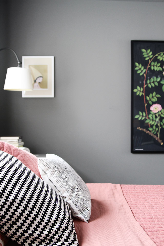
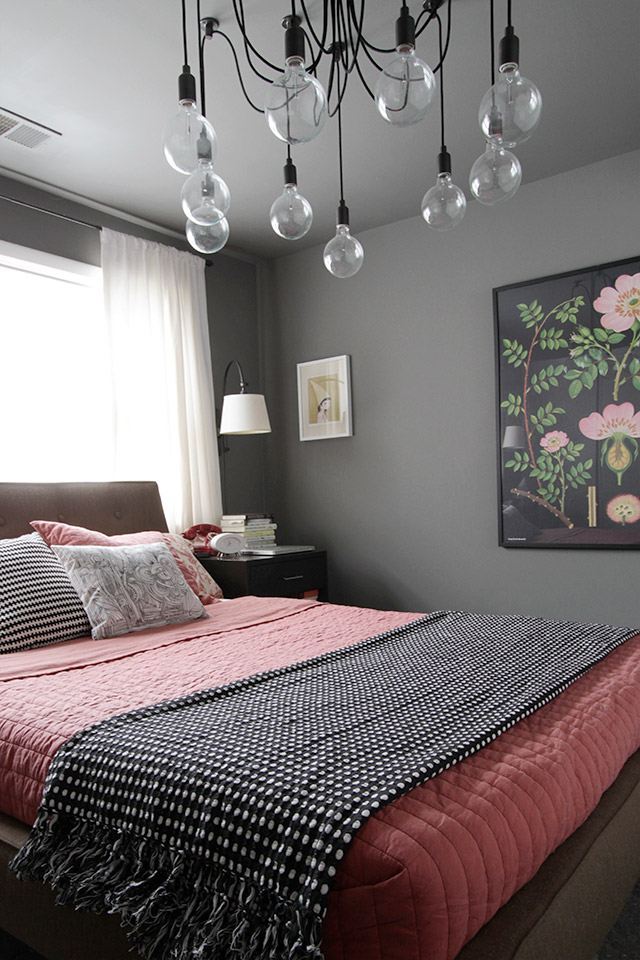
The bedroom is looking a bit different these days. The shell of the room is the same. Same charcoal gray walls, same layout, same bed. All the furniture is the same, actually. The only changes have been the bed linens and the botanical print from the living room.
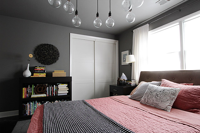
I’m not sure how much longer we’ll be able to keep the lighting fixture in the room. Both kids want to swing from it.
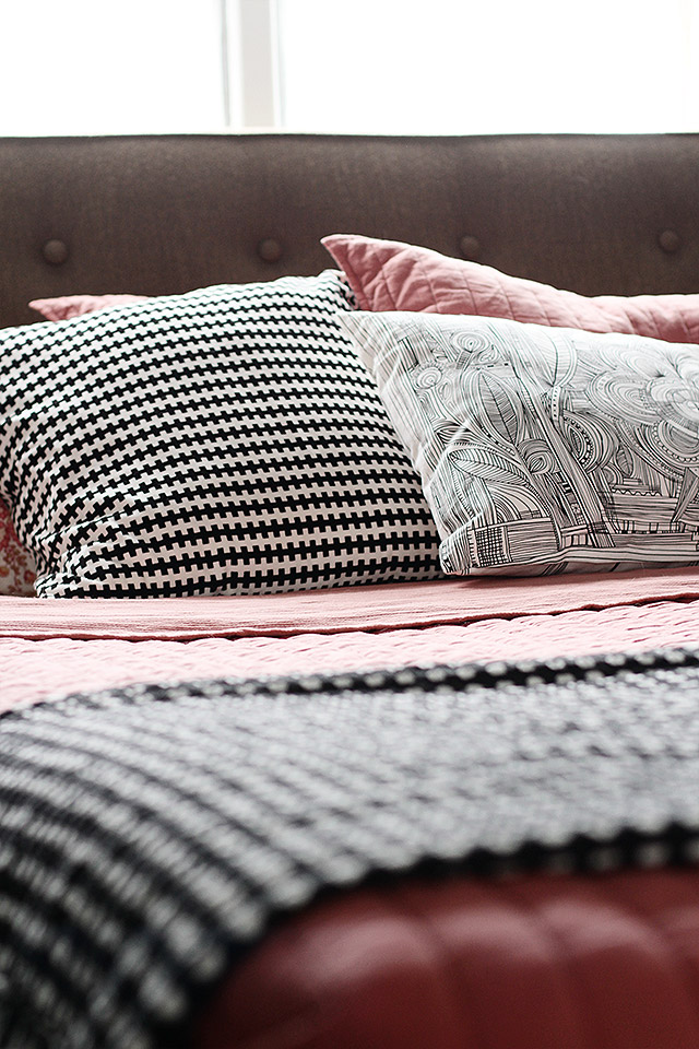
Details, texture…
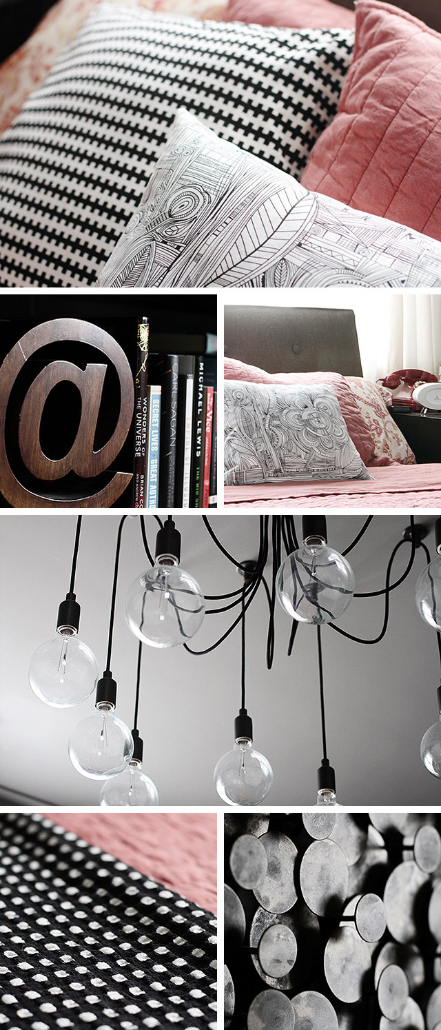
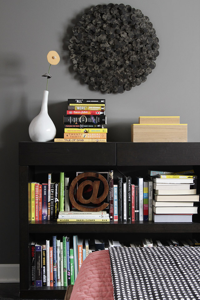
The book situation, as usual, is a little out of hand. The bookshelf is starting to see books stacked two deep, and Brandon and I each have stacks on top of, underneath, and to the sides of our bedside tables. The library bookshelves are already full though.

The black and white pillows and throw were from IKEA, and the coral bedding was from west elm. Little changes (only a mini-makeover, remember), but I love the look.



78 comments
Jackson
I live in an eency weency space and have tons of books myself, mostly art, photography, architecture coffee table books, oodles of fiction, and sundry non-fiction. Your book situation looks like mine. It’s time for double duty furniture. I have hollow ottomans full of books, for example. The list goes on. I think every major furniture designer and design house has some variation.
Marie Vlasic
I’m so glad I stumbled on this! I am working on a “forced” bedroom re-do right now (the wall was literally falling in ;-) and decided on gray before I saw this. Love it! Looks terrific. The plan so far is white and black accents with a couple shots of magenta for pop. Wish me luck! BTW What shade is your gray? See my “before” wall here: http://theyearoflivingfabulously.com/2013/03/29/when-the-walls-come-tumbling-down/
Pamela
Hi there! I love the @ sign on the bookcase. Where did you find it?
Making it Lovely
It was from Crate & Barrel.
Lauren
What a lovely space! I’ve been thinking about painting our bedroom a similar gray color and I think you’ve just pushed me over the edge!
Stacey
absolutely stunning! where are the curtains and rod from?
Eva
If you decide to sell that light, i’ll buy it! I have always loved that light and missed it at PB when it was there. I recently moved to Oak Park, so no shipping required!
kathryn
Thank you! I am also happy to hear that it has held up so beautifully for 5 years!
Jove Arthur
Great work on this. I like the combination of colors. It is very girly even though black is used. I find the closet doors very simple yet elegant.
Sarah K
Love the coral combined with the pops of black and white!
Kim @ Yellow Brick Home
I really love the graphic black and white mixed with the coral and grey – just stunning! We also have that Ikea pillow, but we may need to pick up that throw now, too!
Caty
2 questions: Do you happen to remember the color name of your wall paint? Is you ceiling the same gray, or is it a lighter shade? I can’t tell.
PS Gorgeous room.
Making it Lovely
The ceiling and walls are all Martha Stewart, “Zinc.”
eskimo*rose
Love the line drawing cushion … do you mind me asking where its from?
Making it Lovely
It’s from IKEA.
Uncle Beefy
It’s STUNNING, Nicole! I love it! And it’s such a great balance between light and dark and I’d be plenty happy to slumber in such a lovely space. :)
Mona
Love it! Thought you’d like to see your botannical print in another room at
http://www.williamwaldron.com/portfolios/interiors/#
I like your black frame better!!
Making it Lovely
I love seeing it in a different space – thank you!
Jen
It is so pretty. I would want to stay in bed allllll day. <3
xoxo,
Jen
kat
have you done a book purge? it sounds like you need to go through and evaluate what you’re going to read again/keep for the kiddos
how2home
Absolutely adore what you have done to your bedroom. Looks super adorable and chic. That light fixture is a total eye catcher! Beautiful details :)
stephieZ
Wow, I love the color combo!!! I also LOVe the wall color? If you don’t mind my asking what is the name of it and whos line is it from? Thanks!! I’m defintely pinning this for inspiration! All it takes is a bit of change to make your house feel new.
stephieZ
So I hunted it down through the links above- Martha Stewart Zinc. :)
Making it Lovely
Yep, that’s it!
Faith @ Ordinary Mommy Design
So pretty! I love how the touches of pink/coral don’t make the room feel overly girly. Perfect.
Jenn
Lovely!! Two of my favorite colors, coral and grey! I am pinning this for inspiration in my own home. I would love to know where the black, round wallhanging is from, if I may ask?
Making it Lovely
It was from Crate & Barrel.
Dianne
Love the changes you made. It goes to show how a room can be transformed with just “a few tweaks”.
Nicole, where did you get your headboard?
THANKS,
Dianne
Making it Lovely
The headboard is part of the Hoffman bed from Room & Board. It’s a great bed!
Emma
Beautiful!
Where is your bed from? I’m looking for one just like it.
Making it Lovely
Room & Board.
Inge @ SimplyFabulousChic
This is what my bedroom should look like but doesn’t. ;-) Love the look and feel of this room. And the stack of books… I want to take a nap there! It is absolutely a.dor.able!!!
Inge x
casacaudill
Where is your bed from?
Making it Lovely
It’s the Hoffman bed from Room & Board.
Heather
Pretty! When the book situation is out of control, it’s time to start using the library. =)
Jenna
Wow! It’s so beautiful! That coral and gray together are to die for!
kathryn
I am in love with your bed. I have seen it now with so many colors and it always looks wonderful. I have been looking at the Hoffman bed for some time but could not decide on a color. Thanks for the endless inspiration.
kathryn
Can you tell me which fabric you had the bed upholstered in please?
Making it Lovely
I think it was just called taupe, but I’m not sure. The fabrics have changed since we first bought the bed five years ago.
Catherine
Oh wow, it is so soothing and stunning at the same time! And I don’t think you can ever have too many books, so don’t worry about it. :)
Alison @ The Peacock Diaries
Lovely! I am still happy with my current bedding ensemble (black and white, with touches of gray), but I’m definitely tucking this one away for inspiration in the future. I also had to laugh because the black and white throw you have on top of the bedspread is the same one I have in my dog’s crate. She likes sophisticated accessories, too!
As for the books, I can relate…I am truly grateful to live 2 blocks away from a very decent library (sadly, this is a rarity in NYC). I love owning books and being surrounded by books, but I have realized that I also like to read books that I don’t need to own. I keep my bookshelves filled with the books that I need near me all the time, and my nightstand has a constant rotation of great books from the library.
Making it Lovely
We really should use our library more. We do for kids books, but I think Brandon and I both like to own the books we read because we came from a bookstore background.
Meghan
Holy Canoli! Beautiful!
Wrenaria
Gorgeous. Love the changes.
Jaimie
I love that light fixture, but you gotta be practical with those sort of things, especially if it’s a safety hazard. It looks great. I loved the before too with the green (my favorite color :) ).
Melissa
Where are your nightstand sconces from? I love them!
Making it Lovely
They were from Pottery Barn.
Sarah W
I love it! It’s amazing the difference just a few changes can make!
Mel J
I love, love, love this. They aren’t colours that I would consider putting together but yet it works so well. I have pinned this and one day when we have our own house I will use it!
Yasmine
Oh, this is SO beautiful, Nicole! I don’t think I ever realized what a difference bedding makes, until I scrolled through your before (green/yellow) and after (coral/black&white) posts side-by-side. I love BOTH looks. It’s amazing that the only thing you changed is the bedding, and the addition of the botanical print (which goes perfectly with the new bedding, of course)!
I have the same black&white throw (I have it draped over my futon), and it made me smile to see a familiar item in your post. Makes me feel like I could recreate a setup this beautiful and soothing in my own home, too! =)
Ashley {GirlyObsessions}
Wow, I love it! I love the black and gray with hits of soft pink. A great feminine/masculine balance! I love your mix of patterns with the bedding. And I have that wood @ sign! I love it!!
patricia
you have a very keen eye for mixing colors. I love the minitransformation. I;m in the process of doing a mini makeover of our bedroom which we share with our now toddler. I have to get very creative on this one. But Im loving a blueish gray color for the wall to make it soothing yet modern. Thanks for the inspiration
Alisha E
Love this! You nailed the pink– truly lovely, but the black accents make it man-friendly;). And I LOVE that light fixture, oh I hope it finds a great new home if it becomes a safety hazard!
Christina W.
I can’t get over how good the ceiling looks! Ugh if only my landlord would let me touch the ceiling in my apartment. >_< Also I think this is the push I need to buy that IKEA pillow. I always pick it up and hug/pet it a bit whenever we go but it never comes home with me because I already have one thousand black and white pillows.
Melissa
Love this! The botanical print looks amazing against the charcoal walls.
Julee
Love this!! We just painted our bedroom gray too. I wish I could convince my husband to add a touch of pink. Still working on that.
Your bedroom is gorgeous!
Melanie
I LOVE LOVE LOVE everything about this space. Huge fan of charcoal grey and what a nice blend with the textures. If you’re selling that light fixture I can give it a loving home lol.
Audrey - This Little Street
LOve it – it really looks beautiful!! Sometimes the smallest things can make a big difference! :)
Caitlin @ Desert Domicile
Your mini-makeover is gorgeous! I love the coral paired with the charcoal gray and the botanical print makes the whole room come together. Can’t wait to see what you choose for a new light fixture (if you change it, that is)!
Sara Rose
It reminds me a lot of our bedroom. Girly without overkill. We have a color theme of tomato red, goldenrod yellow, and dark teal. Nolan and I can both work with this well. Sigh despite my deep squealy WANT of a pink and grey bedroom. BUT, that botanical print? REALLY NICE. Just add a small bouquet of fresh flowers on your side of the bed that is small, that you change out weekly and it will be perfect!!!
Jessie {My Mod Style}
Beautiful. Soothing and relaxing! It would be weird to see your room without the light fixture! It’s so awesome.
Making it Lovely
It would be missed, that’s for sure!
Christine
Little changes, but wow, what a difference!! I love the colour palette. Are those hospital corners? I’ve got a similar type bed frame and I never know what do do with the over hang…
Making it Lovely
Yes. When I have the down comforter in the winter, I let that hang over the edges, but when it’s just a thin quilt, I tuck it under.
Camille
It’s beautiful, calm, and relaxing! I like that you’ve been able to add girly accents without overkill (I’m sure your husband is quite comfortable there). Love how a few small changes makes a big impact!
Comments are closed.