
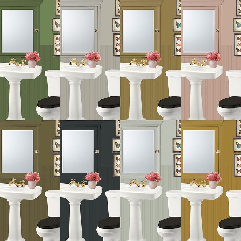
Drawn to “The Ugly Colors”
I've been planning two more big DIY renovations for our home: the laundry room and the second floor bathroom. The…April 10, 2018
Testing Paint Colors for the Bedroom
The walls in our home (the ones that don't have wallpaper, that is) were all painted creamy white before the…October 30, 2013
Orange You Glad
This post is in partnership with Glidden. I've used orange a lot in my home (like in August's nursery and…October 9, 2012
My Colortopia
One of my favorite things to do is to choose paint colors. One of my other favorite things to do…December 2, 2011
Patterned Pillows to be Mixed & Matched with Wild Abandon
Any and all of these throw pillows work together, but for the pattern shy, may I suggest choosing just two?…September 27, 2011
Patterned Pillows for the Color-Shy
Here's a nice way to add a little pattern without going all boom boom pow. • stripes • polka dots…September 27, 2011
Drawn to “The Ugly Colors”
I’ve been planning two more big DIY renovations for our home: the laundry room and the second floor bathroom. The laundry room in the basement…
Testing Paint Colors for the Bedroom
The walls in our home (the ones that don’t have wallpaper, that is) were all painted creamy white before the house was put on the…
Orange You Glad
This post is in partnership with Glidden. I’ve used orange a lot in my home (like in August’s nursery and the original dining/living room setup),…
My Colortopia
One of my favorite things to do is to choose paint colors. One of my other favorite things to do is to talk about do…
Patterned Pillows to be Mixed & Matched with Wild Abandon
Any and all of these throw pillows work together, but for the pattern shy, may I suggest choosing just two? • stripes • polka dots…
Patterned Pillows for the Color-Shy
Here’s a nice way to add a little pattern without going all boom boom pow. • stripes • polka dots • floral • texture •…