

My Pink Dining Room with the Red Ceiling
Oh hey, remember when I was going to make over my dining room because I was inspired by a moth?…December 16, 2020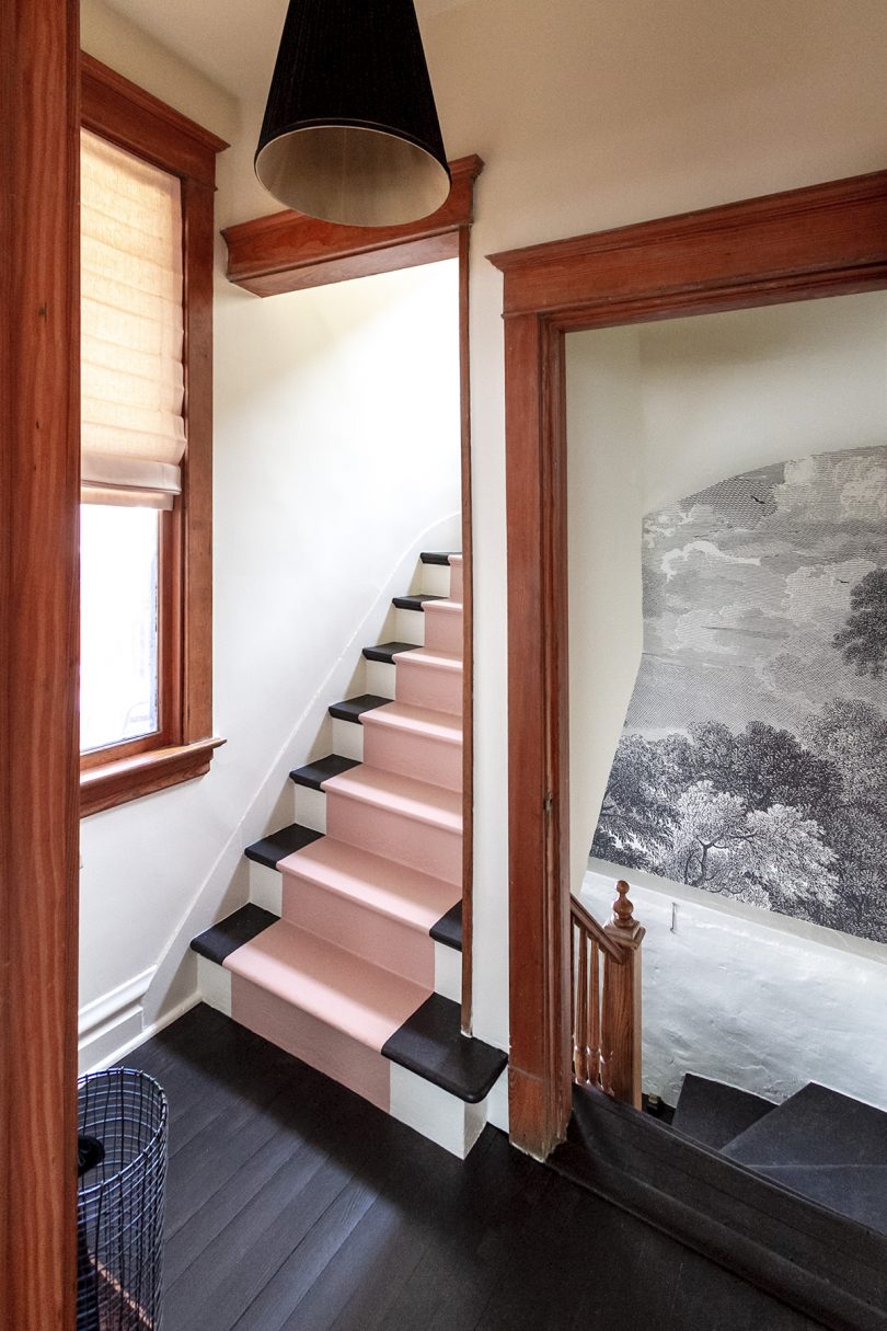
Painted Stairs and Entryway Makeover
This is a sponsored conversation written by me on behalf of Dutch Boy. The opinions and text are all mine.…March 6, 2019
I’m So Handy
There was snow on the ground 10 days ago, but since then I've been out in the garden every day,…April 27, 2018
Drawn to “The Ugly Colors”
I've been planning two more big DIY renovations for our home: the laundry room and the second floor bathroom. The…April 10, 2018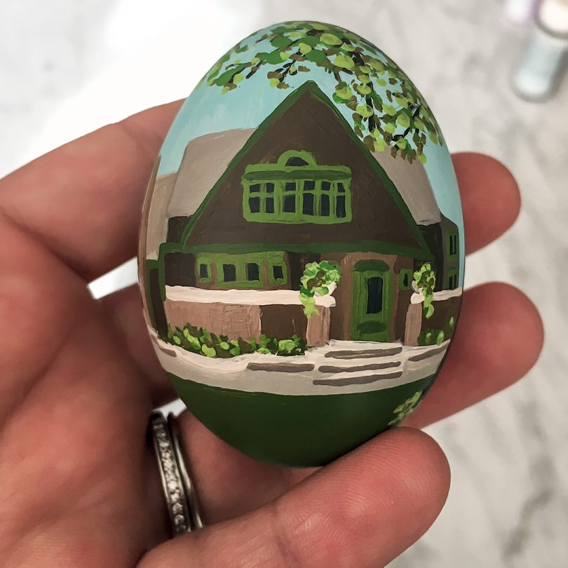
A Frank Lloyd Wright Easter Egg for Illinois
Food Network Magazine reached out a few months ago, asking if I was interested in decorating an Easter egg to…March 21, 2018
My Son’s Finished Room
This post is sponsored by Dutch Boy® Paints. Red and light blue — those were the only parameters I was…August 22, 2017
My Pink Dining Room with the Red Ceiling
Oh hey, remember when I was going to make over my dining room because I was inspired by a moth? I did it! I need…
Painted Stairs and Entryway Makeover
This is a sponsored conversation written by me on behalf of Dutch Boy. The opinions and text are all mine. Our back entryway got a…
I’m So Handy
There was snow on the ground 10 days ago, but since then I’ve been out in the garden every day, all day. It’s looking good!…
Drawn to “The Ugly Colors”
I’ve been planning two more big DIY renovations for our home: the laundry room and the second floor bathroom. The laundry room in the basement…
A Frank Lloyd Wright Easter Egg for Illinois
Food Network Magazine reached out a few months ago, asking if I was interested in decorating an Easter egg to represent Illinois, my home state.…
My Son’s Finished Room
This post is sponsored by Dutch Boy® Paints. Red and light blue — those were the only parameters I was given by my six-year-old. You…