
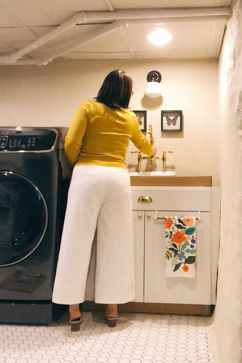
Laundry Room Mockups and Floor Plan
Imagine the cardboard box is a wooden counter. Imagine I've installed the sink and faucet, caulked the gaps along the…September 26, 2018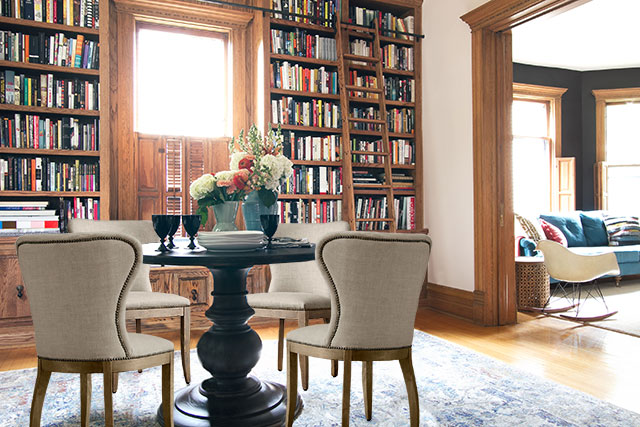
Coulda Woulda Shoulda
Alternate title: Photoshop is Fun! You saw the library last week, yes? The rug was on loan for a styling…October 7, 2015
Tinsel Photoshop Brush
Pugly Pixel always has fun graphic design tips and goodies, but the tinsel Photoshop brush may be my favorite yet!…December 19, 2011
Five Important Tips for Photographing Your Home
This post on photography tips is brought to you by your fellow photo lovers at Shutterfly. They encourage you to…May 31, 2011
Working With Digital Paint Swatches
Here's a question from my recent FAQ post. Nicole wrote: Maybe this is a silly question, but how did you…July 23, 2009
The Bedroom… Lightened and Brightened
Our bedroom is fine. Lovely in fact. I really shouldn't go mucking about. It looks like this: Which, when broken…January 28, 2009
Laundry Room Mockups and Floor Plan
Imagine the cardboard box is a wooden counter. Imagine I’ve installed the sink and faucet, caulked the gaps along the foundation wall, and faced the…
Coulda Woulda Shoulda
Alternate title: Photoshop is Fun! You saw the library last week, yes? The rug was on loan for a styling competition and it’s already on…
Tinsel Photoshop Brush
Pugly Pixel always has fun graphic design tips and goodies, but the tinsel Photoshop brush may be my favorite yet! You can grab it by…
Five Important Tips for Photographing Your Home
This post on photography tips is brought to you by your fellow photo lovers at Shutterfly. They encourage you to capture your memories and share…
Working With Digital Paint Swatches
Here’s a question from my recent FAQ post. Nicole wrote: Maybe this is a silly question, but how did you get the paint colors off…
The Bedroom… Lightened and Brightened
Our bedroom is fine. Lovely in fact. I really shouldn’t go mucking about. It looks like this: Which, when broken down, looks like this: I…