I’m trying to plan the colors for the new house so there’s a nice continuity throughout the home. I probably won’t do it all at once and I’m sure I’ll change my mind, but it’s worth a try!
Here’s what I’m thinking (as of tonight):
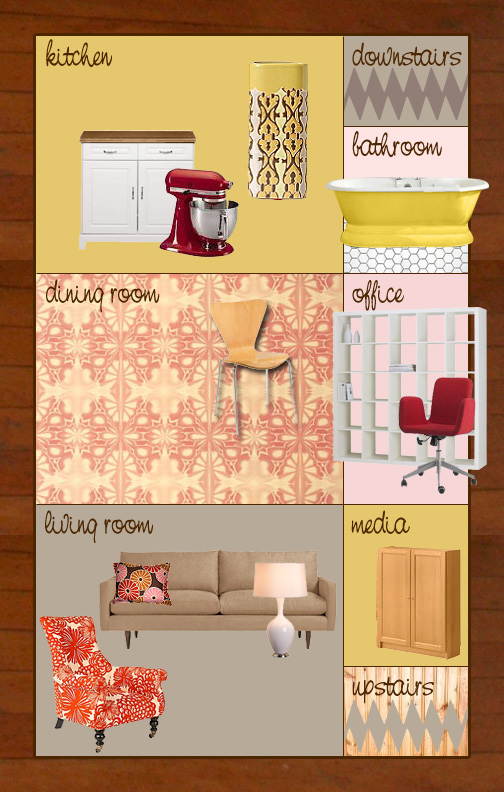
It’s not bad, but it’s not quite right. I’ll go through it, room by room, and explain…
- The wood in the background is meant to be the wood trim in the house (and there are wood floors throughout too).
- kitchen: This is the room I’m most sure about! I picked up that little patterned vase at Anthropologie recently, and I adore the ochre/green color in it. The cabinets are old and worn, so I’ll prolong their life by painting them white and getting new hinges and knobs. The countertops are worn out too, so I think I’ll put in an inexpensive dark brown laminate. I kind of like the ones that look like wood. Is that too cheesy?
- downstairs: The stairs lead to the unfinished basement. We won’t do anything there, so they can stay as-is.
- bathroom: There are hex tiles (not in great shape, but they’re OK) and a cool freestanding tub. Unfortunately, the outside of the tub has been painted forest green, and I don’t like it. I wouldn’t normally choose to paint a tub, but since it’s already been done I’ll just be painting over the existing color. At least it’s not on the inside! I’m thinking a butter yellow – something to compliment the kitchen, but not match exactly. Maybe pink walls? That could be cute.
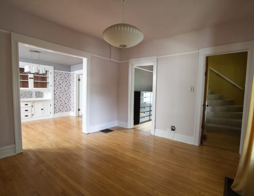
- dining room: I want wallpaper! I haven’t decided yet which wallpaper, but I know I would love to have some pattern in there. There’s a great built-in buffet and nice windows in there, plus several doors, so maybe there wouldn’t be too much surface to cover? Wallpaper can be prohibitively expensive. :(
- office: My office is pink right now and I like it, but do I want the same color again? Maybe it’s time for a change, but to what?
- media: There is a tiny little room off of the living room. We’re not sure, but we’ll probably line it with the bookcases we have and store DVDs and CDs in there (and maybe a little chair to sit). All of our books will be going upstairs (more about that another day). This is the only room with the wood trim painted white. I actually like white moulding, but the rest of the house has such beautiful wood – it’s unfortunate that it was painted. However, I figure I can go a little darker with the paint in here because of the white. So mustard? The same color as the kitchen? Maybe even a chocolate brown…
- upstairs: The walls are clad in knotty wood paneling and the stairs have beige carpeting. Not my taste but this is probably not changing anytime soon.
- living room: OK, I have no idea. White? Cream? Mustard? Gray? Taupe? I don’t know! I don’t want to use the same purple we have in our apartment now. My husband wouldn’t mind if we did, but we’ve had it for five or six years now and I don’t want it again. I think it would be nice to have something a little more subtle in there, since the rest of the house will be fairly colorful. Plus, if we put wallpaper up in the dining room, I’d love for that to draw your eye and not have the living room walls clashing or competing. Maybe we should wait until we choose a wallpaper (if we do)? Also to keep in mind: we have a tan/taupe couch, pale pink lamps, and that orange and white/cream chair. The chair could maybe go upstairs and I could bring in the Eames LCW instead, but I don’t know. I’m stuck!
I don’t have to decide on any of it now, of course. I just like thinking about these kinds of things! As I mentioned, I’m sure things will change…


Kari
January 17, 2007 at 5:46 amI think a yellow tub would be beautiful. I used to have an old clawfoot that had been painted light blue with clouds all over it, and it was a big hit when people would come over. It came in my apartment like that – but it was a nice touch.
Jennicakes
January 17, 2007 at 11:03 amI think pink would be a lovely wall color for the bathroom. It’s tough to decorate a bathroom without it looking a bit ridiculous, so a really cute wall color might be just what it needs to make it special.
kiminottawa
January 18, 2007 at 3:48 pmI just heard on Victoria’s blog that you started this blog…YAY!!! Can’t wait to see pics and hear tales of the progress on your house. Your ideas are great…yellow for the tub sounds pretty. Definitively try some wallpaper. I’m too chicken/cheap/lazy to. Kitchen counters – I’m anxious to see you try the woodgrain. Sad to hear you’re giving up the purple, but you need to change things up every once in a while.
Nicole
January 19, 2007 at 1:33 amSounds like the pink and yellow bathtub idea is a hit!
Kim, I think a few people are wondering why I’m not using the purple again. I’ve just had it for so long though.
Leslie
January 19, 2007 at 9:04 amhey nicole! in regards to redoing the kitchen counters, IKEA offers butcher block counter tops for super cheap! check ’em out! :)
and i love this vignette of your colors and design scheme. very retro modern! hey! i’m sure you could make this another one of your careers! as if you didn’t have enough on your plate!
One Little Monkey
January 19, 2007 at 2:25 pmDoes your new dining room have a main focal wall? Maybe you could just paper that wall for some drama. Especially if you are choosing a pricey wallpaper.
I love the color schemes, patterns and textures you have going on. Are you sure you don’t secretly wish to be an interior designer? =)
Tonia Conger
January 19, 2007 at 5:21 pmmy husband and i are about 30 days from moving into our new home. We picked a grey blue color, a celery color, grey/green, and basic beige. Our greatroom is blue with white trim and I hope I’ll like it–lots of blue.
Your color picks look good. Very warm. I noticed that my colors are all pretty cool so I’m going to warm things up with the furniture.
Happy decorating!
Porcelain
January 23, 2007 at 2:53 pmI just stumbled onto your blog, congrats on the new house! It’s totally adorable!!! I love the idea of painting the tub a butter yellow. Great idea.
And one way around the expensive wallpaper in the dining room would be to only wall paper one wall. Having all of the walls papered might be a bit much (depends on the pattern) and it would save some money too!
And Ikea is a great place for counter tops. They’re rather inexpensive and environmentally friendly. A friend stopped by there a couple weeks ago and told me about a neat faux-slate counter. Definitely go check them out!
Good luck with the move and decorating! Can’t wait to see more photos and posts.
Anonymous
February 7, 2007 at 1:15 pmCongrats on your first house!! The orange and white chair is lovely…but if it doesn’t fit in with your new color scheme, you could always consider upholstering it!
Kalei
July 18, 2011 at 3:39 pmI agree with everyone else, lovely plan!
deneise b
March 30, 2012 at 10:06 pmlovely ideas… I’m going to miss your old place and you just finished the basement…but I know how fun it is with a new project, good luck and I love all of the new design ponders so far!
Making it Lovely
March 30, 2012 at 11:38 pmWe’re not moving right now! You found your way to the very first post here, when we had just gotten our house.
Erika
July 16, 2013 at 11:20 amI have a questions about the moulding in the Living Room. What kind is it and where did you get the hangers for it? I am in LOVE!!
Making it Lovely
July 16, 2013 at 12:06 pmIt’s picture rail! Rejuvenation sells hooks for them.
Erika
July 16, 2013 at 3:40 pmThank you!!