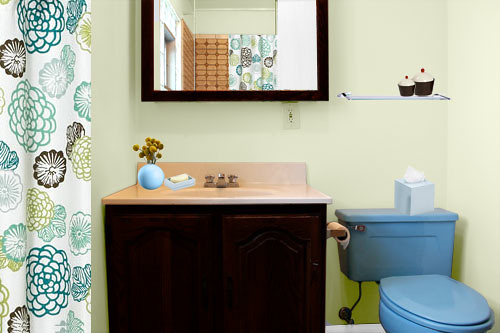
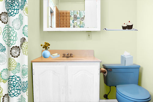
I think I’m down to two options for the bathroom redo: #2 and #6.
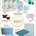
I actually like the Zinnia Shower Curtain more than the Graphic Fabric Shower Curtain, but I think the latter works better in my bathroom.
Have I mentioned that I’m not a big fan of blue? Well, I’m not. I don’t hate it, but I wouldn’t normally choose it.
Now, do I go dark brown or white with the sink and mirror? Overwhelmingly, you all prefered white (#6). I’m leaning towards dark brown (#2), which was also popular.
The hallway directly outside of the bathroom is dark brown (the color of the library), so I think it would look nice if continued into the bathroom. I had originally intended to paint all of the trim on the second floor white (I’ve already done the library and our bedroom). Would the bathroom look funny if I paint the trim and the door white, but paint the sink and cabinet dark brown? Do they need to match in such a small space?
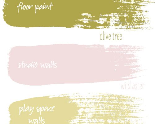
My plan is to paint the walls, add a shelf, switch to the new shower curtain, and then figure it out from there.




katiedid
July 16, 2007 at 9:27 amI vote for the brown, especially since the hall is brown. I think it looks great with the green paint!
jenni
July 16, 2007 at 9:43 am#2 sink and mirror stand out. #6 sink and mirror recede into the wall. So if you like the pop of bold dark color (and the bleed from the hall), #2 is the way to go. If you think the dark is too bold in the small space and want to open it up, maybe #6 is your choice.
I like both. If you went with #6 (white), the change to dark color would be easier than dark to light at some near future date, I’d think.
goosefairy
July 16, 2007 at 9:44 amI would vote for the brown, if for no other reason than you seem to be trying to talk yourself into it. Sounds like brown is really where YOU want to go.
I think the best way to go with the trim would be to *try* the white. If you decide you don’t like it – repaint!
Alissa
July 16, 2007 at 10:20 amWhite wood in the bathroom is airy and clean, but it’s everywhere you turn — I vote for doing something different, especially if it coordinates with another room/space.
deerseason87
July 16, 2007 at 10:30 ambrown! whitewashed wood seems to cottage-shabby for your house.
Twospace
July 16, 2007 at 10:51 ami absolutely like the white. the sink just looks fresh with the white, and it looks old and dingy with the brown. when i look at the rendering of the brown one, the first thing i see is the sink. it just jumps out in a not so great way to me. but, this is your bathroom! which do you think you can live with everyday?
Anonymous
July 16, 2007 at 10:58 amI vote for brown! I love the idea of continuing the feel from the library and I also think it blends better with the tile, the blue and the curtain!
Anonymous
July 16, 2007 at 11:08 am#2. The dark wood is modern and bold, taking precedence over the blue. With the white fixtures, the toilet sticks out like big blue sore thumb.
Also, I can’t say I’ve ever seen someone match fixtures to trim in a bathroom.
Anonymous
July 16, 2007 at 11:23 ambrown is the one!
Julieta
July 16, 2007 at 11:27 amBrown. I can’t tell from a picture the undertones of the counter top, but thinking that it’s from the 70s I imagine its a creamy dark beige. A bright white against that could make it look dingy, over even worse, [shudder] make it look peachy beige.
jm
July 16, 2007 at 12:08 pmI’ve got to vote for the brown. It just makes everything POP somehow.
angorian
July 16, 2007 at 12:14 pmI definitely prefer the white to the dark brown. With the dark brown it kind of competes for attention with the blue toilet. The result for me, is that I notice the blue toilet more. When there’s white, it recedes, and the blue becomes just an accent colour, and the blue of the toilet leaps out less. However, this might work differently in person when taken in context with your hallway/library.
Meg
July 16, 2007 at 12:56 pmI say brown because it makes the tile look as if you meant it to match something. And though you ruled it out, I think blue walls look a bit better. The toilet blends in (as much as it can!) just a little more. Good on you for making do with a crazy bathroom!
nadine
July 16, 2007 at 1:34 pmgo with #2!
Ambrewskins
July 16, 2007 at 1:57 pmI vote brown. It ties everything together nicely.
Sara
July 16, 2007 at 1:58 pmI like the white, but I can see leaning towards brown though if the walls/trim right outside the bathroom are dark. It just makes for better continuity.
(I like the Zinnia shower curtain best, too… I posted about it last summer– but I agree with you the Graphic Fabric looks better with the coloring of your bathroom.)
Ana
July 16, 2007 at 2:38 pmIntially I liked the brown but the white goes better with the tile and makes the toilet pop, and face it a blue toliet needs to pop.
I also think the white makes the sink color recede.
Anonymous
July 16, 2007 at 3:33 pmi love brown.
Anonymous
July 16, 2007 at 5:35 pmI have vintage tile/sinks in my bathroom as well. To paint things white might not cover the flaws as well. I just think it commands a more sophisticated look with the brown. I think you should do what your heart tells you.
Anonymous
July 16, 2007 at 6:54 pmDefinitely the brown, love your site. (I like the way you painted the syroco pieces. I also bought some on e-bay and I think a solid color paint would look great!)
Nicole Welch
July 16, 2007 at 7:19 pmI am for the brown. It just looks better imo.
Donna Vitan
July 16, 2007 at 8:18 pmI think #6 looks much better. I do love chocolate brown/black but in this setting, it stands out too much and instead of being a feature, it acts more like black hole.
In the space you have, I think white works much better. Either way, go with what you like most. Cheerios,
Anonymous
July 16, 2007 at 8:22 pmI’m voting for #2. I like the limited pallet of it.
Brandie
July 16, 2007 at 10:15 pmI personally like the white because it competes less with the other elements and blends best with that vanity top. That said, I don’t think you can really go wrong. You obviously have good instincts so if you’re feeling brown, go brown.
paola
July 16, 2007 at 11:33 pmBROWN. You know it makes sense.
kiona
July 17, 2007 at 5:44 amthose were my two favorites as well, and initially I liked the white the best, but I am preferring the brown now I think. The white looks more ‘clean and crisp’ to me, the brown looks more modern/design-y to me.
Mary Beth
July 17, 2007 at 5:52 amBrown, as it doesn’t make the vanity top and shower tiles stick out so much.
jjzach
July 17, 2007 at 7:04 amBrown seems to downplay the blue and the white makes the blue pop. If you aren’t a fan of blue I would definitely go with the brown.
lsaspacey
July 17, 2007 at 8:03 amI agree that doing the rest and waiting on the mirror and cabinet is the way to go. At that time, it will probably be a really easy decision.
My choice is #2, by the way.
dai
July 17, 2007 at 1:05 pmI prefer #2. It’s my top choice.
I think dark brown anchors this space with so much other things going on, like the big pattern of the curtain and a strong blue toilet.
Lakshmi
July 17, 2007 at 3:43 pmI’d go with brown. Nice choice of shower curtain!
Donna Vitan
July 17, 2007 at 10:00 pmBah, besides the argument of how the brown will down play the blue, I think it would make sense to keep the entire room in perspective. It doesn’t look like a big room, and overall colours are light, so why make your biggest pieces in the room darker? Especially when you’re going by the shower curtain, white is much more prominent and keeps it all feeling very light and open.
Or I could be sputtering late into the night. I hope it all works out for Nicole! Good night all.
sherri
July 18, 2007 at 6:18 am#2. Much more dramatic. You can always add more white through towels, etc. but the darker wooden pieces will anchor the space much better, IMO.
Arianne
July 19, 2007 at 9:09 amNot only to I think the brown looks best, but I was just thinking that maybe someday you’d want to replace the toilet. If you do, the white toilet with the white wood might be a bit much, but then again you could paint at that time. The great thing is that you can’t go wrong, they both rock.
Troy
July 19, 2007 at 9:23 amThe brown makes the room look dated to me. The white makes it look fun, fresh and retro.
Anonymous
July 19, 2007 at 2:10 pmI actually prefer the dark brown with the light blue paint…
Your house looks fabulous!
Anonymous
July 23, 2007 at 6:37 am#3 or #4 really look the best, I think the toilet needs to recede into the wall color, otherwise you’re making the toilet an additional focal point of the room which then competes with the vanity and curtains, looking way way way too busy and cluttered
the dark brown looks fantastic with the wall color in 3 and 4, but the other wall color will definitely need white vanity and mirror; but really I think either 3 or 4 are your best choices; you have a great window in that room for natural light so I wouldn’t worry too much about the lack of white
but that’s just me, I say do what your gut says
Alecia
July 23, 2007 at 10:06 amI prefer the white. Like some others have said, it downplays the color of the sink and the toilet. The brown only makes the sink look like a dingy pink. Go with the white — it’s clean, fresh. If you want to make it less cottagey (word?) then add some more modern elements in lime green. Like some Jonathan Adler vases on the shelf or on the sink or something. Use that color to work with the blue to tone it down. In all, if you hate the blue, then tone it down — don’t highlight it.
I’m all for continuity, but I think making the bathroom look good on its own is more important than making it match the hallway.
Just my two cents. :)