“Squeee!!”
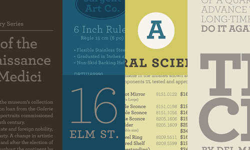
That is the approximate sound I made when I found out that Archer is now available.
The font was created for Martha Stewart Living, but their exclusive license has now expired. It’s a versatile and beautiful font. Pricey, but worth it.
I’ve already purchased my copy.


Lili
January 28, 2008 at 4:05 pmoh dear.
Valérie
January 28, 2008 at 4:27 pmUgh! Such a beautiful font (I’m a font maniac too), but the price made me feel close to desesperation… I’d rather buy a new flat screen! ;)
Christine
January 28, 2008 at 8:49 pmOh, I love that font too! Probably won’t buy it unless I can talk a client into purchasing it. :-)
Courtney Baker
January 28, 2008 at 9:12 pmI must, must, must have this font… I’ve loved it from the first time I saw it. :) I knew it was going to be released but am so glad for the reminder!
nikkirose
January 29, 2008 at 4:40 pmWOW. Great font! It’s studious… with soft ends to balance it.
kristen
January 29, 2008 at 9:15 pmamazingly beautiful typeface..i’m in awe
mary.c
January 29, 2008 at 10:47 pmOoh, what wonderful news! I’ve been saving for so many fonts… I need to finally buy them!
Sommer
January 31, 2008 at 2:51 pmIt’s a very gentle font and that’s always nice. It’s really quite beautiful and clean, but the price tag? A little high for me.
Julie
February 1, 2008 at 9:01 pmGah! I still haven’t bought Gotham and Numbers yet!
Jason
February 15, 2008 at 1:20 amI finally got around to posting my gush about this ultra-sexy font family. This is easily one of the most versatile slab serifs you could buy. On the price of admission, I do like that you can get a base set of 10 (of the 40! total) for $199. Not too shabby.
I don’t care that I have to eat a little less this week to offset the cash I threw down for Archer. I’m in love.
BTW Nicole, I found you because of this post. Very nice. We’ll be keeping an eye on you.
Isadore
November 6, 2008 at 4:51 pmHave you had any problems with the restrictions of the licensing and getting things printed? I haven’t bought a font quite like this before.
Jazmin
February 7, 2009 at 3:14 pmCan we use these on websites and blogs or is it just for graphic designers?
Bilgola
February 10, 2009 at 1:11 pmHow would you guys feel if I told you that Wells Fargo is changing its corporate typeface from Myriad and Sabon to Archer?
Angelie
August 14, 2012 at 1:20 pmWretched!
Laura Kent
December 3, 2009 at 8:27 pmdo you know the name of the font that is on the packages that are on the front cover of Martha Stewart living? Thanks Laura
Tami
March 17, 2010 at 9:46 amDoes anyone know of a similar font? I’ve already had my company throwdown for the Gotham, and can’t really make the argument that we need Archer too, but I love the look!
Erin
March 18, 2010 at 4:21 pmA really close font to Archer is Museo, and its free here:
http://new.myfonts.com/fonts/exljbris/museo/
It’s not the same, but pretty close, and the price is right. I’ve been using it for the last few months, while trying to decide whether or not to shell out for Archer, and I finally just purchased it yesterday. I’m over the moon, and will have to work very hard to not use it on everything from now on!
Bryan
April 12, 2011 at 5:57 pmThis is, truly, on of the best new fonts in the last 5 years.
Amanda
May 26, 2011 at 11:26 pmI have found a font called Beton which seems quite similar to Archer but is a much more affordable price.
http://new.myfonts.com/fonts/urw/beton/
Schnörkellos. Fast. | formschub.de | blog
July 30, 2011 at 8:05 am[…] Auszeichnungsschrift „Archer” des Schriftbüros Hoefler & Frere-Jones identifizieren; offenbar einst exklusiv für die Zeitschrift „Martha Stewart Living” der US-amerikanischen […]