One of the most frequently asked questions is “How does Brandon like pink?”. It’s often accompanied with statements like “I wish I could put pink in my house but my husband would kill me”.
Luckily for me, Brandon doesn’t mind it. I started imagining what our living room would look like with a very different color scheme though…
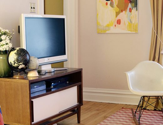
First, we have the room as it is now:
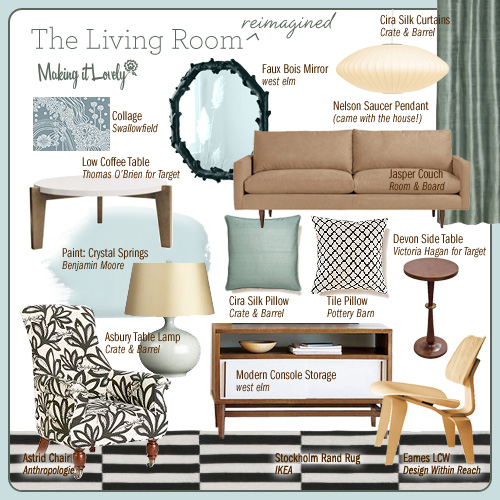
I kept a lot of the items the same for the new design. The Nelson light, the Jasper couch, Eames LCW, and west elm media console stay. The side table and coffee table (both from Target) are sticking around too. Those are all neutrals (and pieces that I like a lot), so they’d work with just about anything I add to the mix.
Here we have different paint, pillows, lamps, fabrics, and art:
Look, I get to bring back the black and white rug I loved so much! I like mixing patterns, and I think the Astrid chair in black and white would be nice and punchy. All of the color is brought in through the paint, curtains, pillows, and lamps. So easy to switch out when you tire of the color…
Is it terrible that I want the reimagined version now? I can’t swap everything out, but DAMN it would be fun.


Christina
June 3, 2008 at 3:18 amHiya…
This is awesome. I love the way you put these ‘sketches’ together. As well as you fashion ones too… I went into your archive to see more of the same, only found about 3, so, YES – make it a monthly feature … you’ve got such a great eye, and I adore the outfits you put together. Unfortunately, I live in the UK, so no access to all the stores.
I also found mention of you at the show on OrangeBeautiful’s blog. FYI
So would the zig zag rug be going to the dining room? Actually, it would look great w/ the wallpaper and fabric… I think, but I’m not a designer.
Hey if you are bored, you can always come do my house!!!! It really needs some TLC and I don’t know what to do w/ it :P hehe.
Thanks for a great blog, Nicole
(PS, if I were you, I would take these sketch ideas and create a book…. you totally could write a great book on design.)
Cheers,
Christina
Mim
June 3, 2008 at 5:52 amI love the new vision too. That’s a double-edged sword of a skill you have there! I’d want to start changing things up now too.
Thanks for always sharing with us :)
Kylie
June 3, 2008 at 6:12 amOOoh, I love the new design, but I also really like the pink of the current living room.
If you ‘did’ go for the new design, would it match with the wallpaper in the dining room?
Max
June 3, 2008 at 7:08 amNicole !..the blue looks so pretty and calm. What is this software/tool with which u seem to bring the different elements of a room onto a picture ?
megan
June 3, 2008 at 7:55 amIsn’t it so amazing how you can keep the same bones of the room (sofa, chair, tables) but just changing the color and accessories – it looks totally different?? I really like the blue/cream/brown. So pretty. (not that I don’t like your actual room too!)
Anna @ D16
June 3, 2008 at 8:18 amUm, so if that means you’re going to need to find a new home for that Weinrib rug, just let me know. I’ll even buy you the IKEA rug in exchange! ;)
Kristen
June 3, 2008 at 9:05 amWow. I really love the new design. That’s pretty cool Brandon doesn’t mind what you do with the interior design of your home. My husband is the same way. When we find our perfect house he’s leaving the design work up to me. Your blog is awesome and you have such fabulous ideas. I’m storing them away in this brain of mine. Thanks so much for sharing all of this with us! Heart, heart, heart it!!!
P.S. How do you put all those items together as one picture on your blog? Is it all photoshop???
jen j-m
June 3, 2008 at 9:35 amthanks for including my art in the real AND virtual versions! it all looks so great together.
Tatyana
June 3, 2008 at 10:04 amI guess your blog is my daily routine, now. :)
I love the blue design. I would keep the same lamps, I think they work. (BTY, thanks for answering where they were from.) I would make a slipcover for the original chair in a black and white fabric, instead of having a new chair… the rest, except the paint of course, can be interchangeable. It would be cool if there was a way to go back and forth… maybe different seasons between the pink and the blue…
Do you feel like painting the walls pink and blue all the time? :)
I agree about the design book, by the way. I think it’s an excellent idea.
The Lil Bee
June 3, 2008 at 10:35 amI love both designs, I do…but your pink version is pretty fantastic. Plus, your husband likes pink? That, my friend, is a gift. I’m STILL battling old bachelor-pad relics in shades/materials I’m not so fond of!
erin
June 3, 2008 at 10:41 amwhile the blue is very pretty and calming… the pink with red/orange/yellow is so much more fun!
lol. everytime i see your living room i love that thomas o’brien table even more, i wish i snatched it up while it was at target.
Elena
June 3, 2008 at 10:46 amI love these sketches you put together! I’d love to make my own for my planned rooms…how do you do it? Thanks!!!
Jen
June 3, 2008 at 10:56 amI love this post and I am swooning over your new rug. I’ve been trying to decide on a new rug for my room for months. I am finding it terribly hard because I want something lovely that doesn’t cost as much as a mortgage payment.
Happy Tuesday!
Jen
Making it Lovely
June 3, 2008 at 11:11 amFor the record, I am NOT switching everything out! It’s just a lot of fun to imagine what could be done IF we were redoing the room. Sorry I won’t be able to take up your offer, Anna. ;)
Max, Kristin, and Elena, I create my styleboards with Photoshop.
Jules
June 3, 2008 at 11:24 amI see the current room as a reflection of where your are in life now. It’s young, hip, and vibrant. It’s lovely and just you. The reimagined room is timeless, serene, and elegant, and still has your knack for mixing pattern. It’s just as lovely and just as “you,” but in 5-10 years. ;)
Jane
June 3, 2008 at 11:44 amI like the new one a lot, but I’m definitely a blue gal… I would keep the zig-zag rug, just switch it to the B&W one. That would mean another trip to NYC too!! (WAY better than a trip to IKEA;)
Wendy
June 3, 2008 at 12:14 pmSee really all you need to do is get a R/G color blind husband and then everything is blue :) My DH thought for the longest time my kitchen (now ours) was blue, but it has always been a purple-grey feather color. I asked him what color it was and he said blue, I laughed and said nope it is purple. It is a fun game we play. He is generally good at getting the color of things even if he doesn’t see it the same was as “us color seeing people” as he calls the vast majority of the population.
Rebecca
June 3, 2008 at 2:19 pmI LOVE the blue..
it is gentle and calming and very easy on the eyes!
Way better for living and relaxation.
Lili
June 3, 2008 at 2:56 pmLets pretend you decide to switch to the blue… and pretend that you cant find a spot for the anthro chair anywhere else in the house. Can we also pretend that Lili gets first dibs if you decide to sell it?
I love that chair. I’d pull a Poppy if I could. ;)
Stephenie
June 3, 2008 at 3:10 pmI’ve just started reading your blog and I’m so curious about how you hang your pictures. Can you explain?
Laura
June 3, 2008 at 3:33 pmI need to get pink in my house!
Lovely blog Nicole. I wanted a rug from ABC Carpet at Christmas however my husband wouldn’t let me ship it home :(
Kassie
June 3, 2008 at 6:58 pmI love the new version. I think I will use it as my inspiration! Thank you.
jenny
June 3, 2008 at 8:55 pmi love the story board effect too! yum! Can I ask where you got the side tables next to your lovely couch? I like them. They would be good both as couch tables, and besdide my bed, so I want FOUR of them!
love your blog
janet
June 3, 2008 at 9:20 pmha…yes I am guilty of asking that question. I like your husband though! Mine is coming around to my style…sorta…slowly. I love the blue look too!
Capree Kimball
June 3, 2008 at 9:38 pmWow! You’ve got mad skills! :) Love your style! Any idea if that Thomas O’Brien coffee table is still around anywhere?
natalie
June 3, 2008 at 11:40 pmBoth versions are lovely! I guess you will always have a plan B.
alis
June 4, 2008 at 1:15 amI’m killing myself here to come up with re-vamping ideas for my apartment, and you managed to come up with 2 brilliant versions? I like them both equally. Also, a lot of us use photoshop but your collages look so professional, they could be printed in a magazine the way they are.
I’m not married but my boyfriend and I are both designers & stubborn with completely different taste in decorating. The only solution we could come up with so far is to rent 2 apartments next to each other and have our own space, then spend the night in each other’s flat!
jaime
June 5, 2008 at 10:41 amWOW i love both of them.
Peggy
June 6, 2008 at 3:10 pmI need a photoshop class! I would reimagine my rooms over and over if I had your skills. Love the way you do this.
Jennae @ Green Your Decor
June 19, 2008 at 5:03 pmYou have an awesome sense of style. This post alone has made me a subscriber. And you’ve given me a great, great idea for a post on my own blog. If you don’t mind me stealing your idea for a styleboard, I think I’m going to put together some eco-friendly rooms via styleboard. Thank you, thank you for the inspiration!
Cindy
June 26, 2008 at 2:51 pmI love the blue room. But I’m a blue girl myself. I think the room you have right now certainly suits you and the rest of your home.
I would like to know what program you use to create these little inspiration pages. I need to start making these..so that the BF can envision what I have planned and give his opinion (despite the fact that I will usually do what I want anyhow ;) )
http://www.sauna-talk.com (Kevin)
August 16, 2008 at 7:02 pmThe top color combination is definitely my choice!
livable design « This Girl & That Guy
February 13, 2010 at 10:56 am[…] wouldn’t be able to deal with the color – but take this living room and make it blue (like she did here) and I think I would have a happy […]