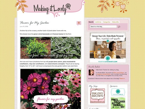
I’ve made two changes to the blog that you may or may not have noticed…
I’ve been wanting to overhaul the blogroll in the sidebar for some time, but I hadn’t gotten around to it. I thought it would be nice to actually link to all of the blogs that I read (all 100 or so of them), but the list would be waaay too long to fit! I’ve seen some blogs that use Blogline’s exported list, but I switched to Google Reader a few months ago. I wasn’t aware of a way to export my list from the Reader, but I found out that it is possible. If you want to try it, look for “Settings”, then “Tags”, make the list(s) you want to share public, and then get the code from “add a blogroll to your site”.
The new and improved blogroll can be found here.
Now, about that “nice font”. At first, I only wanted to change the font headers for the sidebar sections. I figured I could just make an image for each section, set the h2 to “display, none” in the css, and be done. I started working on it and I realized that it wouldn’t be quite so easy. There are several widgets that don’t work that way (no easy way to add html), and they would have to be edited individually. OK, that would be a lot of work, but it would be manageable. Oh, except updating plugins would overwrite the changes. It just started to seem like one big headache.
I went off in search of an image replacement script and I found a great one at A List Apart. There were a few adjustments that had to be made to my css files (my images are set to have a border, which had to be removed for h1 and h2 elements), but it was fairly easy.
The blog now looks like this:
The font is Natural Script and I love the look, but I’m not 100% sure if I’m keeping it for the blog post titles. The script loads last, so there’s a delay before you see the prettier version. More troubling than that though is the loss of linking. You used to be able to click on the post title to be taken to that page, but now you have to click on the comments count instead. I’m not sure if that’s something that will bother me or not. I could make the date beneath the post title into a link, so maybe that would be an acceptable alternative.
Working on the blog is like working on the house… there’s always more work that can be done.


Lili
June 17, 2008 at 1:17 pmI just switched from bloglines to google reader last night. I’m head over heels in love with it already.
Paul
June 17, 2008 at 1:55 pmGirl, I liked the old font better. But I get attached easy.
LeeAnn
June 17, 2008 at 2:25 pmI am addicted to Google reader. Love it! I think later tonight I might snoop around your blog roll and find some new reads. Thats always a fun thing to do after midnight!
Stefanie
June 17, 2008 at 2:52 pmThank you so much for posting instructions to load a blogroll from google reader. You are my hero!
amy purple
June 17, 2008 at 4:58 pmI like the new font, but I feel like it needs to be darker.
ps. I’m not on your blogroll now. :(
Making it Lovely
June 17, 2008 at 5:04 pmYour blog stopped working for me (in the reader and if I go to your site)! I meant to email you sooner to check if it was still up or if you decided to close it. It’s still up then?
amy purple
June 17, 2008 at 5:18 pmyeah, it’s up, that’s so strange! i am starting to think the internet hates me. First, i couldn’t post comments on wordpress blogs (which is fixed) and now you can’t see my site! ho hum.
Cathe
June 17, 2008 at 5:40 pmThanks so much for adding my little blog to your blogroll, Nicole! I like the new script font, but it”s a bit light compared to the previous one and hard to read in smaller size. But, I love it!
Kylie
June 17, 2008 at 5:50 pmI’m so glad you wrote about this! I noticed your new blogroll and lovely font for headings, and wondered how you did it. I was thinking of doing the same with my blog and using the picture option, but perhaps it won’t work for me either. Hmmm, totally not good at CSS so I might have to live without. :(
Of all the blogs I read though, yours is absolutely the most gorgeous, I love the layout, background, colours everything! (Gosh I sound like a suck up!)
Had
June 17, 2008 at 6:06 pmI noticed! And personally I’m not too sure about the font change, I love a good serif header font. (And this one, though nice is too close yet not close enough to your banner font. I’m all for choosing two good font families and using them throughout for consistency.)
& Sorry, this is only my first comment but I found your blog from Apartment Therapy a week or so ago and I love it!
alivicwil
June 17, 2008 at 6:30 pmI’ve just downloaded the new Firefox 3.
When your font loads, I can actually see a grey border (1px) around each word – I take it they’re images? Because the ‘a’ is only lowercase, it’s grey border is shorter than the others.
Just thought you may like to know :)
ellen crimi-trent
June 18, 2008 at 12:05 amhey I am impressed by anyone who can change their blog and make it great! I barely have time to do my design work never mind fix my header which it needs plus upgrade the blog. Good for you!
casacaudill
June 18, 2008 at 12:32 amI always decide I want a new look for our blog and then when I try to do it I’m never happy so I end up sticking with that we’ve had for months. I definitely feel a change and I’d love to do something with a fun font (LOVE fonts!), but I just don’t have the patience. I yell and swear a lot when I have to work with HTML or design when I’m not entirely in control.
Silvia
June 18, 2008 at 1:01 amWow I just adore the new look of your blog! very nice like you dear!
Thanks for the improvement! great
Silvia
Caitlin @ C³
June 18, 2008 at 11:06 amThe new title font works slowly for me – it loads the normal title text, then that disappears and it slowly fills in the new font (image) as the tile.
Looks pretty, though.
Clever idea about the blogroll! I need to update mine again, but I have a bunch I’d like to add that really have nothing to do with my blog topic. I’ve been toying with the idea of using a sidebar tabs widget to make a tabbed blogroll, so the default display would be relevant blogs, but people could still see my “personal” blogroll as well. ^_^
Ashley
June 18, 2008 at 11:19 amNice new design. I love the orange flower flourishes. I just started my blog http://decorology.blogspot.com/, and now I realize what a difference a more thought out design makes
Jules
June 18, 2008 at 12:07 pmI love it! It’s a fresh and original design–for my redesign on my one year anniversary I’m just going to point to your blog and say, “I want that.” :)
Making it Lovely
June 18, 2008 at 12:35 pmOK, I switched the font to the ‘bold’ version of Natural Script. I love the idea in concept, but as I said, I’m not sure I’m keeping it. I don’t care for the way it looks with my logo, since the logo actually leans to the left a bit, and the script leans heavily toward the right. It looks a little funny (Had, you’re exactly right).
Alivicwil, I’m on Firefox 3 too, but I don’t see a border. I wonder why it’s showing up for you.
Hmmm. Right now, I’m leaning toward removing it. Or replacing it with another font? Not sure…
Gidget
June 18, 2008 at 12:41 pmYou might try doing the image replace on the link itself, for example h1 a, rather than h1 and you will get your links back!
Making it Lovely
June 18, 2008 at 12:46 pmAh, why didn’t I think of that!? Thanks!
hsp
June 18, 2008 at 12:58 pmStick with the serif, it’s a much nicer contrast to your header typeface and the other textural elements on the page.
alivicwil
June 18, 2008 at 4:19 pmIt’s borderless for me now :)
(I was viewing it at work yesterday? could it be that our proxy or firewall is doing something to it? I have no idea.)
It’s a very nice font.
Benita
June 19, 2008 at 2:02 amI had no idea you read my blog until I was getting readers over from your site and realised I was on your blogroll! Thank you so much, I’m honored :) Your’s is a fave of mine, I read it daily, so it was an extra special nice surprize!
danielle
June 19, 2008 at 10:26 amThank you so much for including me, that is so sweet. I’ve tagged you for a little game called meme. If you would like to join in, you can check out my post here for details:
http://midwestmoderngirl.typepad.com/my_weblog/2008/06/i-have-been-memed.html
katelynjane
June 19, 2008 at 2:51 pmInteresting! I love the new look, it would be interesting to see if I can do this on my blog! I’ll have to work on it and see…
Jennae @ Green Your Decor
June 19, 2008 at 5:18 pmLove the font, but I think it’s a bit too much of a contrast from your logo. A nice clean serif would probably work better. Overall though, your blog is by far the most gorgeous I have ever seen. You’re my design hero! lol….that’s sad since I’m a designer myself: http://www.jennaesignaturedesign.com
Making it Lovely
June 19, 2008 at 10:33 pmWell… I just got rid of the font and put it back to the serif I had before (plain ol’ Georgia).
tom
June 21, 2008 at 9:45 pmI’m not too sure about the font change, I love a good serif header font.
Christin Kreml
July 22, 2009 at 8:36 pmThere is a wordpress plugin for this. It allows for permalinks(links to the post page)! http://wordpress.org/extend/plugins/ttftitles/ You do need to put the code in your template file but, you can use it for just about any type on the page.