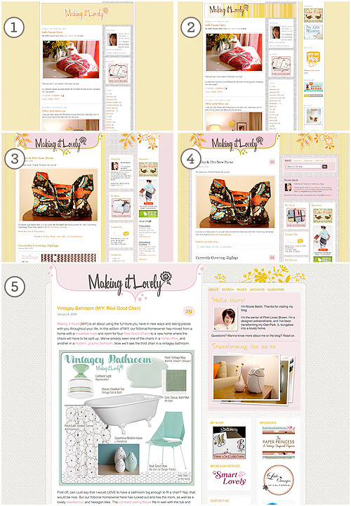
Today the blog is two years old!
To celebrate, I’ve freshened up the design a bit. Yes that’s right, I celebrated by creating work for myself. ;) Nothing drastic, but I’ve cleaned up the layout a bit, changed the proportions, and quieted the color scheme. This is the fifth design I’ve done for Making it Lovely.
I still have some refining to do and a few bells and whistles to add, but the new look is nearly done. Let me know if you notice anything odd (I’ve been working on this very late at night while very sleepy). Oh, and I’ve added support for twitter avatars as well as gravatars, so if you have one or the other your picture should show up when you comment.
Thank you all for reading and commenting, for your friendship and support, and just for all around making my day!


amy purple
January 9, 2009 at 4:45 pmLooks super sharp – as always! Two years already?
Erica
January 9, 2009 at 4:45 pmi love seeing your creative process! the layouts keep getting better and better ;)
Jessica
January 9, 2009 at 4:50 pmCongrats! And I am liking the new layout/colors…
Jessica
http://blackwhiteyellow.blogspot.com/
megan
January 9, 2009 at 4:54 pmLooks great!
ileana
January 9, 2009 at 4:56 pmLooks great, Nicole!
Desiree Fawn
January 9, 2009 at 5:08 pmLovely! I just did a revamp on my blog too — http://desireefawn.blogspot.com
It’s so nice to have a new look!
Sherry
January 9, 2009 at 5:10 pmOf course it looks flawless. Loving it.
xo,
s
Miss B.
January 9, 2009 at 5:10 pmAs always, just lovely! Happy B day!!!
Holly
January 9, 2009 at 5:16 pmWow! Only two years? I’m super impressed. I’ve been blogging for almost 3 and my site still looks MUCHO GENERICO!
You are talented!
Renate
January 9, 2009 at 5:17 pmAbsolutely perfect layout. :) Congratulations on the two years!
Michelle @Everyday Celebrating
January 9, 2009 at 5:23 pmI heart your blog. I just gotta tell you that when I come here.. I just sigh and relax. I love the colors and the layout. It’s just… relaxing to read. Thanks and happy 2 years!
lori
January 9, 2009 at 5:25 pmso lovely!
Bernadette
January 9, 2009 at 5:26 pmLove it!
You have indeed made it lovelier!
Casey
January 9, 2009 at 5:31 pmThis is my favorite so far! What plugin are you using to display Twitter icons? Very cool.
cherilyn
January 9, 2009 at 5:33 pmNicole – Happy 2 years! The new design looks great, very fresh, I like it a lot!
rachel best
January 9, 2009 at 5:37 pmOooh, I love the new the layout! Seems perfect!
Jessica
January 9, 2009 at 5:40 pmThis looks great. I love the pictures you added to the sidebar.
flights of fancy
January 9, 2009 at 5:46 pmLoving the new layout…very pretty.
Making it Lovely
January 9, 2009 at 5:46 pmThe pictures are part of the planned bells and whistles… each time the blog is reloaded they’ll change (and possibly link to the post that the photo came from – I’m not sure yet).
Casey, the plugin is brand new from Smashing Magazine: twittar.
Dara
January 9, 2009 at 6:00 pmOh! It is VERY lovely. I can’t believe its been two years! I love watching your progress. You are super-talented.
Jules
January 9, 2009 at 6:05 pmHappy 2 years! I love the new look.
Birdie
January 9, 2009 at 6:14 pmIt’s like a cute bathroom floor in here. Nice!
nichole
January 9, 2009 at 6:24 pmLove it!
Carrie
January 9, 2009 at 6:26 pmGorgeous, as usual!
Sarah
January 9, 2009 at 6:33 pmWow, I just stumbled upon your blog via retroaudrey and i think i’m in love! Can’t wait to look around endlessly!
Amy
January 9, 2009 at 6:36 pmhappy 2 year! love the redesign too, very classy :)
John
January 9, 2009 at 6:38 pmInspiring as usual, Nicole!
Must resist urge… to… redesign… our… blog..
decor8
January 9, 2009 at 6:51 pmYou are so talented and this is gorgeous. The new color scheme is very neutral and so it gives your photos a chance to really stand out. Fantastic job. I love the background grid paper and the hive pattern as well. It’s there but it’s not THERE. Excellent work.
Do you still have a Amazon store?
Allison aka HaselBride
January 9, 2009 at 6:51 pmI am so dying to redesign… Love the new look as always!
Making it Lovely
January 9, 2009 at 7:04 pmHolly, the Amazon store’s still here, I just took down the sidebar link. I’m not sure if I’ll add it back up or not (the link is also listed under the ‘pages’ section up top).
Kylie
January 9, 2009 at 7:08 pmIt looks gorgeous!! I love the softer colours. :)
I don’t know if it’s just me, but on the main part of the blog your wishlist doesn’t show, but then now that I’m commenting I can see it.
MMW
January 9, 2009 at 7:26 pmLooks lovely Nicole. I hope I can look as great at my next birthday.
Caitlin @ C³
January 9, 2009 at 7:37 pmWow, two years already?!
Was this redesign finished (or at least partially finished) yesterday? I swear I saw it then…
Looks GREAT! ^_^
Krissy
January 9, 2009 at 7:54 pmThe redesign looks lovely! Well done.
Michele
January 9, 2009 at 8:27 pmAs usual, amazing design!
Pen & Ink
January 9, 2009 at 8:59 pmCongratulations on two lovely years! The redesign is gorgeous!
– Lisa
marcy wacker
January 9, 2009 at 9:10 pmthe sites looks great! simpler, calmer, i love it. i really like your new photo, too!
Had
January 9, 2009 at 9:47 pmLove the new flowers — more sophisticated.
catherine
January 9, 2009 at 9:52 pmi love the redesign. but now that the really cute ceramic owl is front and center, i want to know where it’s from! or at least a link to the post that tells me more about it.
Design Lovely
January 9, 2009 at 10:37 pmLooks gorgeous! I like this cleaner look but of course they are all lovely!
Tracy
January 9, 2009 at 10:49 pmHappy B’day to your blog! I’ve been reading for a couple of months now and really love your style. (Especially love your idea boards and would like to know what kind of magic you use to create them!) Your new layout looks great!
Taylor
January 9, 2009 at 11:23 pmI noticed earlier today and it looks great!
Happy 2nd b’day!
alivicwil
January 9, 2009 at 11:46 pmIt’s lovely (of course)!
I’m having a little trouble with the ‘hex tiles’ though – the resolution seems a bit screwy. I’ve tried playing with my resolution, but it’s not making much difference,
gabbi
January 10, 2009 at 1:45 amLoved the look before, but this is even more fabulous!
dv
January 10, 2009 at 2:15 amsmashing job =) i love your blog and all your ideas – i wish you had a tv show!
Danielle Melnyczenko
January 10, 2009 at 6:21 amHappy 2nd Bday
Shannon
January 10, 2009 at 9:14 amBeautiful! You have impeccable taste and SUCH style! Of all the blogs I read (and there are lots), yours is my favorite. I wish I could hire you to decorate my house!
Manda
January 10, 2009 at 10:50 amFantastic job, love the new design. Congrats on two years, can’t wait to see how it evolves over the next two!
Valerie from Studio Rose Flash
January 10, 2009 at 11:05 amVery streamline, yet cosy at the same time. I love your new design! Sometime a dab of paint here and there just refreshes the room,… err, blog :) Nice job, and Happy 2nd bloganniversary! Cheers!
At Home with Kim Vallee
January 10, 2009 at 4:18 pmYour latest blog design kept its personality but your refinement better highlights the content. I like it! Your new picture is adorable.
Happy 2nd Anniversary! I wish you many more years because I enjoy what you are doing.
Julie Anne
January 11, 2009 at 2:42 amAnd thanks for all of your hard work bringing us your blog!
I stumbled upon you one night when I couldn’t sleep and was looking for storage ideas, and one link led me to another, which led me to you.
Now, you are one of four web sites I must visit before I leave the house for the day (and the others include my two local major dailies and the New York Times.)
Making it Lovely just makes me happy.
lace&tea
January 11, 2009 at 10:40 amWow, gorgeous.
Keren @ ChicTip
January 11, 2009 at 12:39 pmCongratulations !! 2 years old!! very impressive..
And the site looks great!
coral
January 11, 2009 at 7:14 pmLooks great!
I just wanted to thank you for the time and effort you have put into your blog. Having these places I can come to everyday to keep myself fresh and inspired has really changed my outlook on design, and keeps me in the loop even when I live in a rural area. And all the more personal posts you put up here just make you seem more real, and your blog about more than just buying products and commercialism, but about creating a home.
kristy
January 11, 2009 at 8:09 pmlove it – very subtle and lovely!
I do want to ask about the bag/purse featured in redesigns 3 and 4 – I LOVE it – and am curious if it might still be available somewhere. Can you give me more information?
Thanks!
Melissa Lewis - Off The Wall
January 11, 2009 at 8:58 pmCongrats on the two years! Your blog looks great, and is as always, very inspiring!
Making it Lovely
January 12, 2009 at 12:06 amOK, I’ve updated the photos in the sidebar so that they refresh each time the page is loaded, and now they link to the post they originally appeared in.
Catherine, the owl is a vintage cookie jar.
Tracy, I use Photoshop to create the boards.
Re: the “hex tiles”… it’s funny that everyone sees them that way! They’re actually imperfect polka dots – the same ones I designed for the shop, just scaled down.
Kristy, I helped my sister make that purse! Then she promptly “lost” it – I’m not sure how much she really liked it.
Ami @ Elizabeth Anne Designs
January 12, 2009 at 9:15 pmhappy blogoversary!
Shashi
January 13, 2009 at 9:37 amBeautiful!
kandice
January 13, 2009 at 3:16 pmi like the new blog. its very light. aaaaaand i just requested to be your friend on myspace! yaaaay!!!!!!!! (hopefully i will be added, hahaha)
{this is glamorous}
January 13, 2009 at 8:50 pmHappy second blog birthday! The changes look fantastic.
alivicwl
January 15, 2009 at 1:32 amI can see the polka dots now :)
You must have put hex tiles on all our minds with your vintage bathroom post, Nicole!
puglyfeet
January 18, 2009 at 12:41 amI’ve combed through Smart & Lovely — I’m taken by all your designs.. What software do you use to layout your page (ie. photoshop, illustrator… dreamweaver)?
Kimora
January 19, 2009 at 1:24 amNice layout…love it
candace
January 22, 2009 at 10:34 amNicole – Your site is LOVELY!!! A true inspiration. I am in the process of decorating our house. Its a fantastic house but it does not feel like home yet. Your home seems like a place i would never want to leave. Thank you for sharing and look forward to reading more.
Many Blessings!!
A Sneak Peek at the Site Redesign! | Making it Lovely
January 5, 2012 at 1:34 pm[…] colors, and maybe even some patterns thrown in for good measure.I haven’t redesigned the site since 2009. I used to do it every year, or even more often than that! This feels really […]