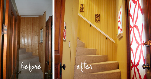
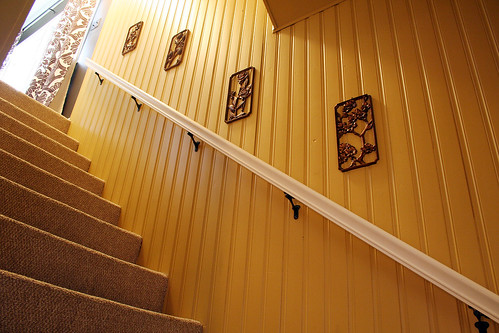
The walls of our front entry and stairway were clad in knotty pine when we moved in. We weren’t fans, to say the least. I wrote about priming the wood back in August of 2007, but I realized recently that I neglected to follow up with the finished look. Our baby gates went up this weekend, but I took photos before I installed them.
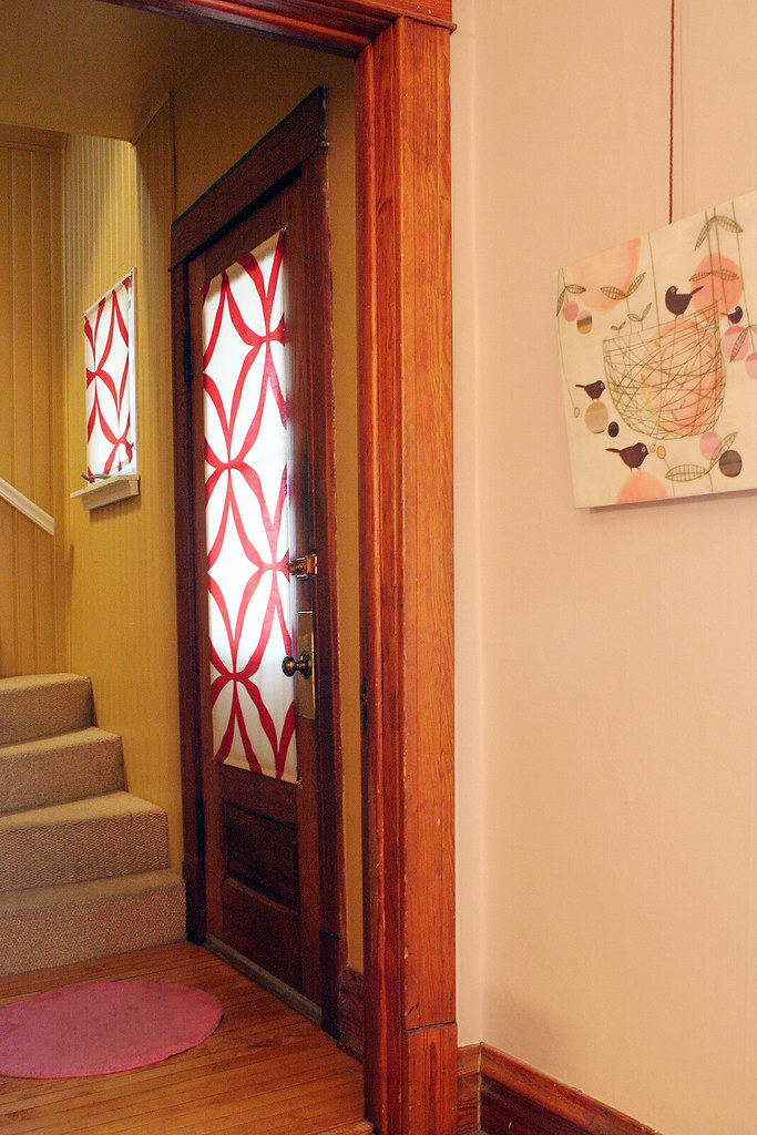
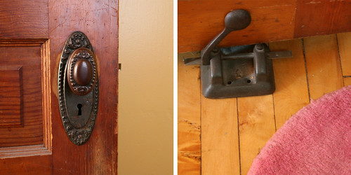
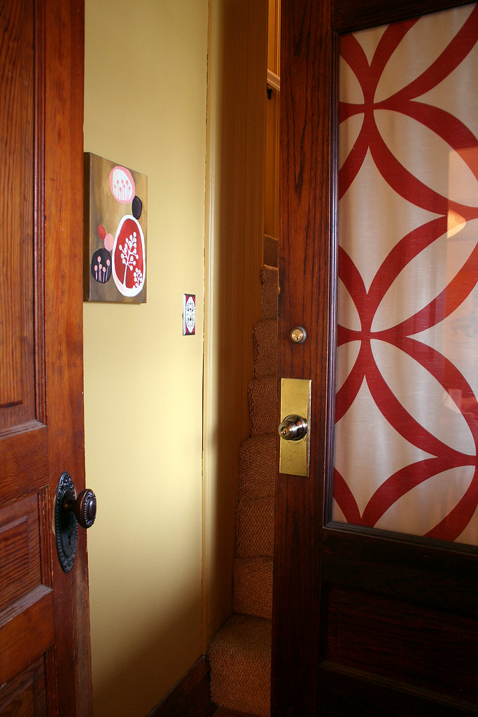
The paint color is Campground by Behr, and the fabric on the door and window was from IKEA, as was the little pink rug. I love the beautiful doorknob on the door to the living room, and I’m pretty fond of the vintage paper punch we use as a doorstop.
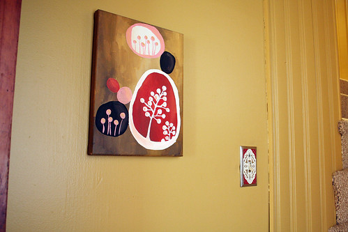
I hung a small painting that I made and put up a cute switchplate from Anthropologie. Above the railing that we installed, I hung four Syroco panels scored on eBay.
And here, a lovely shot of just how crowded this little area gets when you actually open the front door. Now imagine a baby gate on the bottom stair that swings out into the space. Nice.



Allison
January 12, 2010 at 11:42 amLove the paper punch as a doorstop! Looks like it was made for that purpose, clever!
Kristy
January 12, 2010 at 11:53 amThanks for sharing the staircase, many people forgot about that part of the home. It looks great. You got to love the old hardware. I’ve been collecting pieces here and there over the past few years so when I replace the cheap hollow-core doors with old solid wood ones found at salvage yards, I can give them life with old hardware.
Tami
January 12, 2010 at 11:56 amLove it!! When are you going to start offering design services? I have been anxiously searching your sites. Not that you don’t have enough to do already =)
Making it Lovely
January 20, 2010 at 12:58 pmYou have no idea how badly I want to! Alas, I’m finding it difficult to fit it in so far. Soon though… I hope!
Alana
January 12, 2010 at 12:05 pmThe doorstop is a fabulous feature. I love how you worked with the wood instead of fighting against it. Very cute area, a nice welcome to your home.
-Alana
http://www.waterspiper.com
Reba
January 12, 2010 at 12:38 pmThis is so pretty! And well timed too –this weekend’s project is painting our foyer/entryway. I’m curious, did you paint the hallway ceiling the same color as the walls?
Making it Lovely
January 20, 2010 at 12:58 pmYes. I usually paint the ceiling the same color, unless the wall color is very dark (like in the library).
micaela @ hishouse;herhelp.
January 12, 2010 at 1:13 pmi really love how you are always combining red and pink in every space! here w/ the window fabric and floor mat. that doorstop is such a great idea! you know i’ll be on the lookout for something similar!
Nuit
January 12, 2010 at 1:32 pmI love the door screen, it’s pretty perfect =D
Nancy
January 12, 2010 at 1:32 pmLove your painting!
Danielle
January 12, 2010 at 1:33 pmMuch better painted! Now it doesn’t look like an old hunting lodge. :-P Also, love the vintage details!
Emily
January 12, 2010 at 1:54 pmDid you make your door screen/window covering? I have a similar door (3/4 lite) on order and will need a similar covering. If you bought it can you share where? If you made it can you share how?
Making it Lovely
January 20, 2010 at 1:01 pmThe fabric panel from IKEA was the perfect width, so I just hemmed the top and bottom with a pole pocket and hung it on little café curtain rods from Target.
Mary
January 12, 2010 at 2:04 pmDitto on the door screen. Love it! Is the print on both sides or is there a solid that faces out? I need to make a few of these!
Making it Lovely
January 20, 2010 at 1:01 pmThe print is sheer and shows up on both sides.
Enhanced Tobi
January 12, 2010 at 3:05 pmI LOVE the the colors of your wall and stairs next to each other. You really know your designing stuff. :)
Catherine
January 12, 2010 at 3:07 pmAbout the babygate: I have one that is retractable and I *believe* is rated for the bottom of stairs. It’s been years but I think it came from one step ahead. It’s a total space saver. And nearly unclimbable since it’s mesh (my then 3 year old gave it his best try repeatedly).
Laura
January 12, 2010 at 3:17 pmI have a 1955 ranch and one of the bedrooms is knotty pine walls and ceiling with wood shutter double door closets. I couldn’t take it so I painted it too! Hard, hard work and very time consuming to sand, prim and paint due to the groves but so worth it at the end. I’m still working on it but when it’s done it will be great. Thank you for supporting painting wood!! Wonderful!
laura trevey
January 12, 2010 at 3:38 pmlove the yellow…
so bright and cheerful ~~
Kim @ Yellow Brick Home
January 12, 2010 at 3:42 pmCheery yellow! Must make you smile on your way to bed.
Natalie
January 12, 2010 at 4:03 pmLove the painted pine! Would you mind sharing how you managed to hang that Ikea fabric? I have some that is similar and have NO IDEA how to hang it on our patio door! :/
Gabie
January 12, 2010 at 4:20 pmWhat Emily said please! I need someting for my kitchen window and door and have no idea what to do, but your idea seems perfect. Please share how you made your coverings!
Making it Lovely
January 20, 2010 at 1:04 pmI hung the panels with café curtain rods, similar to these (which are lovely, but I picked mine up at Target for much less).
Stephanie Fizer
January 12, 2010 at 4:47 pmWow, thanks so much for posting this! We just bought our first house 6 months ago and the lower half of our bedroom and my studio is knotty pine. I hate it and have wanted to paint it, but everyone acts like I am a crazy person when I talk about it! I’m so glad to see yours came out so well and am now off to make my own painting plans!
jules @the diversion project
January 12, 2010 at 4:58 pmWhat a huge difference – looks fab!
jules :)
here be dragons
January 12, 2010 at 5:26 pmHow fun! Great shapes.
Victoria Rosas
January 12, 2010 at 5:42 pmOh that is a lovely change, congrats!
adrianne
January 12, 2010 at 6:14 pmWhat kind of baby gates are you getting? We are at the same stage (little boy is the same age as your little lady) and I hoping I can find something not too ugly. Maybe I just need to suck it up, since we’ll only need them for a little while. But I figure that you are design-conscious, so you {maybe?} agonized over this, too. :)
Making it Lovely
January 20, 2010 at 1:06 pmOh, ours are nothing beautiful. Function over form in this case. We bought this one.
Melissa
January 12, 2010 at 6:17 pmThat color looks great with the wood on the doors – what’s the color name?
My kitchen has knotty pine cabinets and I like them, but the wall below has this strange wallboard with brick faces on it – it looks like a brick wall but the bricks are about 1/4″ thick. I think it would be a hassle to remove the brickboard from the plaster behind it, so I’d like to paint it in a color that will go well with the cabinets. They are the traditional aged knotty pine color, clear lacquer over amber varnish.
young c-m
January 12, 2010 at 6:47 pmHi, I’m curious about the painting in the 2nd pic. Is that an etsy find?
cindi
January 12, 2010 at 6:56 pmGreat colors! I love that doorstop.
A Jill of All Trades
January 12, 2010 at 11:34 pmYou inspire me to redo my house….again. :)
First I am going to finish up what I have started and take photos.
I still have a lot of work today. I know once I get the bathroom done, I will be the happiest girl!
Lesley @ TheDesignFile
January 12, 2010 at 11:39 pmLove the color on the walls. It looks great!
Christie
January 13, 2010 at 12:33 amSo bright and sunny! Nice work. I was wondering, did you have to peel back the carpet when you painted the edges? Or did blue tape do the job? (Or were you just crazy careful?)
Making it Lovely
January 20, 2010 at 1:08 pmI used a tool for painting baseboard against carpet. I don’t know what it’s called, but I picked it up at the paint store. It’s just a slightly curved (to hold the carpet back away from the wall) metal shield kind of thing with a handle.
Erika@BluLabel Bungalow
January 13, 2010 at 8:35 amWow, this makes your staircase much more fresh and lively! You home is beautiful. Little Eleanor has lots of eye candy surrounding her.
Jennifer
January 13, 2010 at 8:48 amAh, I adore those dark panels against that buttery color. Beautiful!
liz
January 13, 2010 at 9:12 amOK – I’m usually not a fan of yellow in any part of a house, but it TOTALLY works there and looks great!
Thanks for sharing your redos on your house. It’s awesome inspiration for those of us about to embark on the same process. :)
Chasity
January 13, 2010 at 9:29 amNicole,
We have a ceiling like that in the bedroom of our house. It is awful and I want to paint over it so badly but my boyfriend thinks that the knots in the wood will bleed through.
Did you use a special primer or paint to cover up the wood? This hallway looks great and I think I can show this to my boyfriend to prove that painting over the wood isn’t a bad thing!
Thanks!
Chasity
Making it Lovely
January 20, 2010 at 1:08 pmZinsser primer to the rescue! One coat of primer plus two coats of paint, and none of the knots have bled through.
Ana
January 13, 2010 at 11:06 amI looks gorgeous!!!
xx,
A.
In Honor Of Design
January 13, 2010 at 1:28 pmI don’t know how you do it…you make every nook and cranny of your house cute!
adhocmom
January 13, 2010 at 1:31 pmYellow is the best.
x,
http://www.adhocmom.com
Erika-2bydesign
January 13, 2010 at 2:38 pmWhat a transformation! Not only does it brighten up the stairway, but really opens up the space by beautifully reflecting the light. Great color choice, especially next to the bright Ikea textile!
Kristen
January 13, 2010 at 7:15 pmLooks so good! I love the color and love the hole punch. It lloks exactly like the ones that were used in pharmacies. Many pharmacies used a two hole punch on the side of the prescription and then file the script on a wire rack. I have had my eyes on the lookout for one of those. Great repurposing!
Design Mom
January 13, 2010 at 7:44 pmSo many fun details. I love it!
Desiree Fawn
January 13, 2010 at 7:54 pmWhat a transformation — I’m always wearing about the whole painting wood thing — but this is fantastic :)
Franziska
January 14, 2010 at 7:00 amI like the idea using the fabric. This could be something for us (especially for a shelf), too.
Wendy D
January 14, 2010 at 2:50 pmWow. What a difference paint makes. Even if you had solely done that, it still would’ve been a major difference. I also like when people salvage outdated stuff and make it new. Some people would have considered ripping that paneling out. Now your walls are pretty and have texture. Double bonus!
Kristi
January 17, 2010 at 9:38 amLove your entryway…glad you painted the knotty pine…looks so much better! Oh, and I love your creativity too.
Heather
January 17, 2010 at 1:07 pmgorgeous! any chance you’ll come style my house too?
becca @ birthday girl
January 17, 2010 at 11:39 pmoh it’s only about a thousand times better! the yellow color alone makes everything so much more cheery and bright. sure wish i had your eye for home design.
Molly
January 19, 2010 at 9:00 pmLove it!
peggy
January 20, 2010 at 3:34 amI love your painting!
Leanne
January 20, 2010 at 6:33 amWow it looks wonderful!
I love the bird/nest canvas you have on the wall in your living room and would love to know where you got it from? Like another person commented, was it an etsy find? Its just what I have been after!!
Making it Lovely
January 20, 2010 at 1:10 pmThat’s an encaustic (wax) painting by Amy Ruppel.
Come on, make it lovely. « Maundering Me
January 21, 2010 at 8:28 am[…] website that highlights just that; “Transforming the so-so.” The website often covers home decor, but also discusses fashion, art, photography, crafts, and […]
Kristie Barnett
January 21, 2010 at 6:50 pmVery well done! And the doorstop is brilliant – kudos!
Kristie Barnett
January 21, 2010 at 6:51 pmgreat job – the doorstop is brilliant – kudos!!!!
Spotlight On: Nicole’s Hallway Upgrade | PROMOVE's Apartment Blog
January 22, 2010 at 2:15 pm[…] out the rest of the details at Making it Lovely. Share and […]
Amber Evans
January 22, 2010 at 2:17 pmI absolutely love your transformation. I did a little “Spotlight On” piece for my blog with it featured. I love the fabric on the door and window from IKEA. It’s so fresh and fun!
Natalie
January 23, 2010 at 1:24 pmI’ve never hung cafe rods before…do you screw them right into your door? We rent, so that really isn’t an option…any other ideas?
sunny
February 2, 2010 at 10:35 pmlovely fabric in the window…the whole entryway is great!
Making it Lovely | Transforming the so-so. » Blog Archive » Quick New Curtains
October 15, 2010 at 9:49 am[…] whipped up a couple of new curtains yesterday for the front door and window using an ANNO LJUV sheer panel from IKEA. The fabric was a little tricky because the flower petals […]
2010 Recap: The Home | Making it Lovely
January 5, 2011 at 9:30 am[…] The front entryway got a makeover. I later made airy new curtains to let more light in to the space. […]