I’ve shown you how I’ve rearranged my dining room hutch full of white ceramics before, but I hadn’t ever shown my process. So here’s how I do it… I start with the big items first. You can’t shoehorn them in at the end anyway, and if you start with a pleasing arrangement the rest will fall into place.
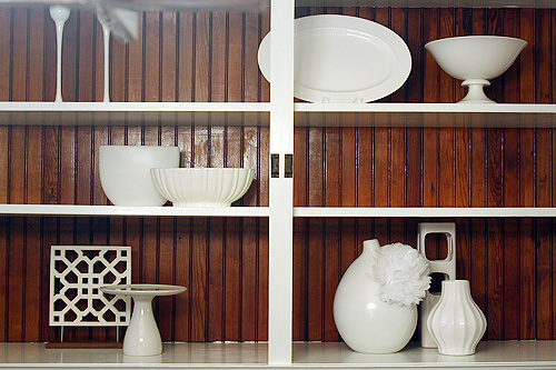
Obviously I have such a hodgepodge of items that a symmetrical layout isn’t an option for me (though I do love symmetry). I work around that by making sure that the overall layout is visually balanced. For example, see that open lattice-work square in the bottom left? That gets balanced out by the votive holders on the right middle shelf and the scallops of the vintage cake stand on the top left.
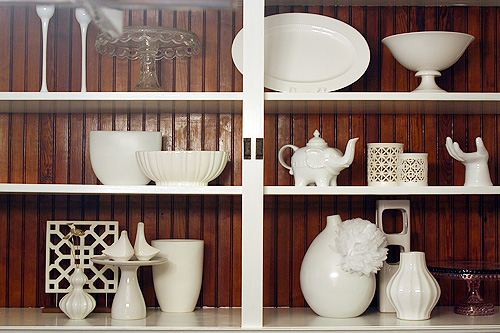
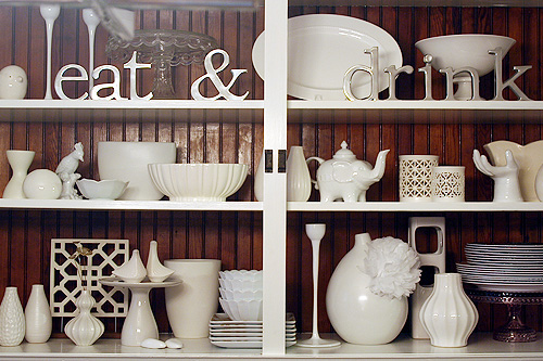
I add all the little bits and bobbins that I love at the end. Admittedly they can make the arrangement a little cluttered, so I do edit them down some. Not all of my pieces made it back in, but I tend to rearrange things often so they’ll be back next time.
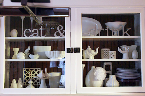
I love having the built-in hutch to display everything. I wasn’t so sure about it when we moved in, but I’ve since embraced it. I’m still undecided about the beadboard (paint it or leave it natural?), but I’m going to live with it for a while before I choose. It ties in the wood floors and our wood dining set, and the contrast is nice with all of the white. I’ve pinned fabric to the back many times before, so that’s always an option as well. Besides, closing the doors gives the whole thing a bit more polish. Doesn’t everything always look better behind glass?



Jessica
October 13, 2010 at 12:17 pmI love this!! Any tips with a built in CORNER cabinet? I really need help with mine! I love the all white collection, with the wood background!
Making it Lovely
October 13, 2010 at 12:26 pmThe same principles would apply, but you may want to group taller items toward the center. Or if you have three shelves, something tall in the middle on the top and bottom shelves, and then taller items on the left and right of the middle.
Kariane
October 13, 2010 at 12:21 pmLooks so good! I think the bead board looks great without the paint and really showcasing all your white collectables. Plus, I love the contrast of the white trim (great job, by the way!!) and the dark wood. Very nice. I’m sure it feels wonderful to be done with that project! Painting just doesn’t go as fast as it used to once you get the “helpers”, right?!
Making it Lovely
October 13, 2010 at 12:25 pmOh, definitely. I feel like this project has taken forever!
heather
October 13, 2010 at 12:23 pmI always want to ask you this but never had- where did you get those silver eat & drink letters? They are just what I am looking for!
And what about that awesome white vase with the little flower on it?! Too cute!
Making it Lovely
October 13, 2010 at 12:25 pmEveryone always asks about those letters! They were a gift from my mother in law, and she picked them up in some little shop in Des Moines.
And that flower on the vase is a tissue paper pompom that I made and looped around the neck of the vase with fishing line. :)
pam
October 13, 2010 at 12:32 pmThey’re great! Are they individual letters, or the actual words?
Making it Lovely
October 13, 2010 at 12:33 pmThey’re individual letters.
Christine
October 13, 2010 at 12:41 pmThis turned out great! I love the how the white collection ties in with the nice white shelves now!!
Style to perfection :)
Wendy
October 13, 2010 at 12:46 pmlooks fabulous! (as always!!)
Donna
October 13, 2010 at 12:48 pmI was going to ask about the vase with the flower on it too. What a cute idea! Love the contrast against the wood.
Wendy
October 13, 2010 at 12:52 pmfunny… just found this etsy shop today & thought of you –
http://www.etsy.com/listing/57771082/bird-cupcake-ceramic-stand-in-white
Ana
October 13, 2010 at 1:03 pmHow about pinning a solid color fabric back there? So it’s like painting but no commitment or damage to the wood.
I can totally see a bright pink back there.
Katrina Babic
October 13, 2010 at 1:11 pmdefinitely do NOT paint it.. with all your white stuff it just wouldn’t look right.
nikki
October 13, 2010 at 1:38 pmI really like the beadboard as is…it looks so nice against the white. I agree with a previous poster…a fabric or even pretty vintage wallpaper would be cool and it wouldn’t be permanent so you could switch it up as you felt like it.
annie
October 13, 2010 at 2:23 pmOkay, I’m changing my vote. Before I said to paint the beadboard, but now that I see it with the doors closed I’m all for you leaving it as is. It looks great. Also, thanks for the guide to arranging stuff. Very helpful.
Elaine
October 13, 2010 at 3:02 pmLooks great and thanks for sharing your process. I vote for keeping the wood natural for contrast or some pretty patterned paper or fabric in the back.
Lisa
October 13, 2010 at 3:12 pmI say paint the wood, but not white. I also like the idea of adding fabric or a beautiful paper to the back so you don’t have to commit to a color. Love the hutch! Looks fab!
LeAnn
October 13, 2010 at 4:02 pmI think rearranging a built-in or hutch can be one of the trickiest decorating things to do. I have a huge built-in in my dining room and this past spring, I got brave and painted it turquoise but I am always messing with it. Your hutch looks beautiful.
Jenae
October 13, 2010 at 4:45 pmArranging shelves can be maddening. Just when I think I’ve got it perfect, I walk by it and start moving things again. You’ve done an awesome job though!
liz @ bon temps beignet
October 13, 2010 at 4:57 pmI like the natural beadboard, but what about a grey color? Like a Martha grey… More Greige-y as opposed to a ‘thunder cloud’ grey.
Just an idea-r ; )
Oh… and more baby bump pics!
maggie
October 13, 2010 at 5:07 pmthis is LOVELY! i’m a follower now and i can’t wait to read more!
Design Elements
October 13, 2010 at 6:02 pmlove this!
Chrystal
October 13, 2010 at 6:21 pmThis is beautiful. :) I always love to see how people arrange things. I just go by eye and am constantly rearranging things when I accumulate new pieces. Nothing is every the same for very long at my place. :)
Great collection by the way.
Kristen
October 13, 2010 at 6:47 pmDelurking to say that I LOVE THIS! I have a collection of white objects too and even though we live in an apartment with little to no room for storage, I’m itching to display them!
EmmmyLizzzy
October 13, 2010 at 9:28 pmThis looks great! Now that you mention tacking fabric up to the beadboard, I’m really loving that idea!
Kristen
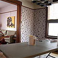
October 13, 2010 at 11:06 pmThis looks great! I’d love to see a photo of the whole dining room to see it in context, especially with that awesome wallpaper.
Making it Lovely | Transforming the so-so. » Blog Archive » Astro Ornaments
October 14, 2010 at 12:09 am[…] « Arranging a Collection […]
K
October 14, 2010 at 1:31 amIf you paint the bead board, you will have to find a new location for your lovely white collection. It just won’t look the same against a while background.
Jen K
October 14, 2010 at 10:17 amLooks great! Can we see a shot of the whole dining room now?
Janice
October 14, 2010 at 12:40 pmHi, love your works. where did u get the Eat & drink display?
jbhat
October 14, 2010 at 12:50 pmI am glad you answered the question about the vase that has the cute corsage. Love that idea. Thanks for sharing this process, Nicole, and I second the vote for photos of the whole space. Thanks!
jbhat
Michele
October 14, 2010 at 5:55 pmThat open lattice work piece is awesome!
Katie @ goodLife {eats}
October 15, 2010 at 10:28 amThanks for this! I have a hard time buying the smaller decor items (pictures, furniture, lamps – big stuff – are easier for me) because I have such a hard time figuring out where they would go and how to arrange them.
Kate @ lthislife.blogspot.com
October 15, 2010 at 11:56 amI’ve bookmarked this for future inspiration; thank you!
I’m struggling lately with sadness over having to sell the home I shared with my husband. One thing that helps me look positively to the future is having ideas like this to plan new home decorating!
Thanks for sharing – and helping me! :)
Nina
October 18, 2010 at 10:00 amLooks great!Like that you didn’t paint the bead board, the white really pops against the wood color.
karyn
October 19, 2010 at 7:37 amI love collections especially all in the same color like your white ceramics. Great tip on putting the large things in first!
Pamela
January 12, 2011 at 11:52 amI absolutely love this! You’ve done a fantastic job!
Where did you get the Elephant? Is that Jonathan Adler? I think those shakers are right? Love it!
Making it Lovely
January 13, 2011 at 3:21 pmThe salt & pepper shakers are Jonathan Adler, but the elephant is a $10 teapot from Cost Plus!
» All good things (& some new beginnings)… new england noir
May 1, 2011 at 8:22 pm[…] …Are worth waiting for. The snow is (mostly) gone, the temperatures are consistently pleasant, and we can finally trade sweaters for skirts. I had it all packed up practically before we could even wear the warm-weather clothes that came out the same day. Winter took particularly long to break this year; I think it’s partially since time droned on so that we were surprised this year by the sun. This time of year makes me crave nautical blue and white, hot coffee on the porch before the sun is fully up, and writing stories in the shade with a cat at my feet. (I couldn’t find the right elephant teapot, though. Mine is much more like the one in this post.) […]
5 Sites for Summer Design Inspiration « Emilia Ceramics
June 28, 2011 at 11:30 am[…] Making it Lovely. Slowly transforming a house is a time-consuming process, yet this blog has inspiring tips, photos, and suggestions for every room as the author does it herself. Because I’m a sucker for ceramics and have a little collection myself (cough, cough) I enjoyed her post about how to best arrange a ceramics collection. […]
De-Clutter Your Living Room-Tips from Life Storage
July 6, 2011 at 11:43 am[…] on a shelf – but only feature one item from each collection, and arrange them artfully! Go to MakingItLovely.com to see what we mean. Send the rest to storage or down to the basement. We promise you won’t […]
trend to try: white ceramics » shoppingsmycardio
January 27, 2012 at 10:45 am[…] The Decorista / Graham & Green (via Pinterest) / Making It Lovely […]
101 in 1001 Update | My Dear Darling
July 23, 2012 at 11:24 pm[…] decor blogs and I’ve been wanting to make my media area a little nicer like this and this. I want to note that I’ve tried it a few times but for some reason I don’t achieve a […]
New Marais Chairs in the Dining Room | Making it Lovely
November 28, 2012 at 3:32 pm[…] room has new chairs. Woot! I switched out some of the pieces in my built-in hutch too. So long, all white; hello, pink and coral.I still have the other chairs down in the basement because it feels wrong to […]