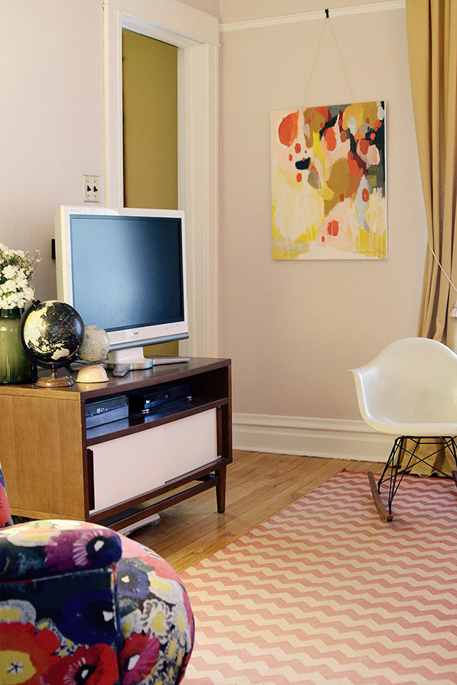
This new painting by Emily Rickard is making me all kinds of happy. (She sells prints and other products featuring this painting too.)
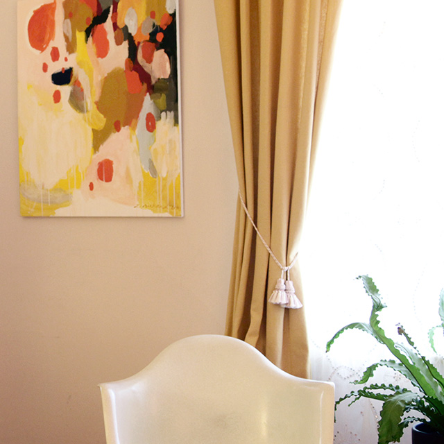
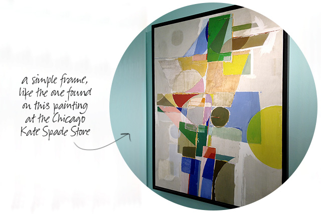
When I mentioned wanting to “frame the new painting in the living room”, this is the one I was talking about. It looks fine with its white edges, but I’m thinking it needs a simple frame in a medium-toned wood, or maybe plain black.
I’ve tried a few things in that corner of the living room over the years. Here’s an old shot from the same angle.
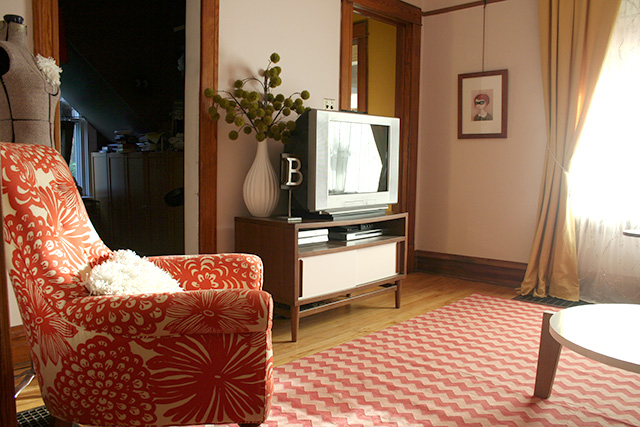
Sigh. I really don’t miss all that unpainted wood because it didn’t look good in person, but it was mighty pretty in photos. Anyway, I liked that print by The Black Apple for a long time, but I was ready for something different. I hung my Amy Ruppel painting there for a while too.
It’s now on the opposite wall, above the floral chair. I briefly tried this giant botanical print in that corner next.
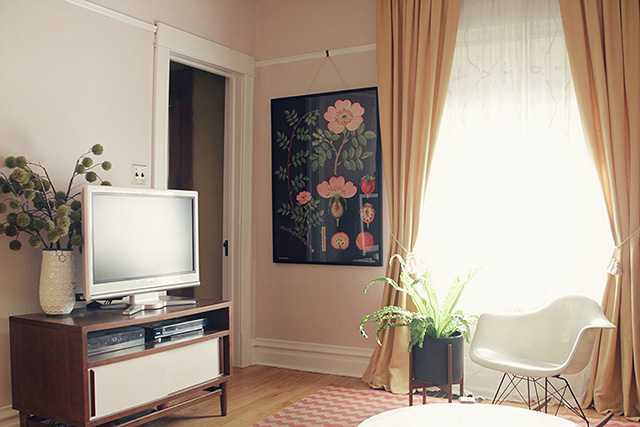
It was way too big for the space, and it looks so much better in my bedroom. The new painting is the right size, the right colors, and I love its movement and design.
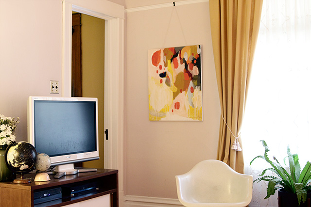
And are you digging the tiny fingerprints all over the TV? Me too.


PAppel
October 11, 2012 at 1:10 amWhere is your tv cabinet from? Love it.
Making it Lovely
October 11, 2012 at 9:47 amIt’s from west elm, but probably six years ago.
Nicoletta
October 11, 2012 at 1:35 amha! Glad mine isn’t the only TV covered in fingerprints! lol Okay.. never thought to look for a white tv… genius! Was that hard to find?
Making it Lovely
October 11, 2012 at 9:50 amIt showed up in a surprise delivery one day, about four years ago. Brandon wanted a flat screen and thought his best chances for me not getting mad about it was to buy a pretty white one.
Yelle
October 11, 2012 at 7:07 amI agree! This painting has colors and a texture so well suited for the space! I think it looks great even without a frame! I do love how you constantly change up the plants/vases/decor next to the TV :)
holly o
October 11, 2012 at 7:19 amI’m in love with the painting. We might get married. And once again, inspired by your blog!
Jorge
October 11, 2012 at 7:44 amHi Nicole,
What size is your current TV? Thank you!
Making it Lovely
October 11, 2012 at 9:52 amTVs are measured diagonally, across just the screen part, right? If so, it’s 32″. The overall size is 31″x24″ including the base.
Jorge
October 12, 2012 at 10:32 amThank you! And congratulations on your blog. I’ve been following it for some years already but this is the first time I comment. Greetings from Spain.
RobinD.
October 11, 2012 at 7:51 amI’ve appreciated every piece of art in that space over time, but this one is my favorite!
Making it Lovely
October 11, 2012 at 9:53 amMine too.
Lindsey
October 11, 2012 at 7:56 amI love Emily’s work AND she’s a lovely person! Great choice for your living room!
Andrea
October 11, 2012 at 8:35 amPerfect fit!
What kind of hanging hardware did you use?
Making it Lovely
October 11, 2012 at 9:54 amIt’s hanging from a picture hook. The string is doubled-up baker’s twine though, which is stupid and precarious. I need to get some picture hanging wire.
Giulia
October 11, 2012 at 9:06 amLove it – perfect colours and perfect size. I gave up putting things on my TV unit, it just kept being moved around and tipped over…but we have the same fingerprints on our TV.
Kate {domestikatedlife}
October 11, 2012 at 10:23 amreally pretty, I love the colors!
Jessica
October 11, 2012 at 10:24 amIt looks fantastic, Nicole! The palette and the texture and, and, and… Great choice and definitely the best of the bunch for that spot!
Megan F
October 11, 2012 at 11:23 amI know monitors make all the difference, but what looks like a fiery red on Society 6’s site looks more orange-y in your photos. Would you say it’s more of an orange in person than red? Thank you!
Crystal
October 11, 2012 at 11:27 amLove, love, love the new art piece. Perfect fit and in time for fall :)
Erica
October 11, 2012 at 11:32 amIt is a happy painting. Made me smile too. Such fun shapes and colors. I’m looking for something like that for my dining room.
And forget fingerprints… my TV is covered with dust… not nearly as cute… lol! ;)
Mari
October 11, 2012 at 11:46 amBeautiful! I just love that print. I liked the botanicals this is just so happy. That third shot of where you can see into your office is just divine!
We’ve painted all of our trim, ceiling beams and doors decorator white. It took ages but it so worth it! I just love it!
Christina W.
October 11, 2012 at 12:13 pmReally love this painting! I had a look at Emily’s Etsy shop and I think this is my favorite of all the ones she’s sold on there!
Veronica Roth
October 11, 2012 at 12:51 pmLol, Oh, so very familiar! I don’t even notice the fingerprints any more and then I go to do some photography work and have to re-shoot everything when I process the shots. Nice painting. I think it really suits your style.
the domestic fringe
October 11, 2012 at 1:46 pmLove your new painting. The colors work wonderfully in your home. I like it unframed too, but of course, you look at every single day, so you need to be happy.
Your home is lovely.
~FringeGirl
Justine
October 11, 2012 at 1:56 pmI love all of Emily’s work! She’s so talented, great addition to your beautiful space!
Jessica
October 11, 2012 at 2:13 pmLove your mid-century look! Where is the white vase in the fouth picture with the Astrid chair from? I like it a lot!
Thanks!
Gloria
October 11, 2012 at 2:19 pmI absolutely love this piece!! What size is it? I noticed that there are three sizes, mini, small and medium.
Thanks!!
Gloria
October 11, 2012 at 2:23 pmI was looking at the art prints not the canvases.
Caroline
October 11, 2012 at 2:19 pmLove the art, but love so much more that you chose to post the picture with all the tiny fingerprints. My tv is constantly like this, I’ve given up trying to get them off, the baby will stop touching it eventually right? Thanks for keeping it real.
Helen
October 11, 2012 at 2:26 pmLove it! At first glance I thought perhaps Eleanor had panted it. As a preschool teacher, I have seen
some breath taking art produced by little ones. Infact I still have a collection of paintings from my
students over the years. They feel happy, just like this piece. :-)
Bridget Stachowski
October 11, 2012 at 4:13 pmThank you. I’ve been looking for an iPhone case and noticed the artist offered them. Can’t wait for it to arrive and wouldn’t have found it without this post. Hope to buy a print when we move in a few months.
Sarah
October 11, 2012 at 4:17 pmgorgeous, gorgeous painting.
Dana @ This Silly Girl's Life
October 11, 2012 at 4:48 pmReally loving that chevron rug and upholstered chair
Heather B
October 11, 2012 at 5:49 pmThe new painting is great! I love the white woodwork too, it just bounces the light around the room.
Evelyn W
October 11, 2012 at 5:50 pmSo much lighter in the living room now with the trim, looks like a different room. The kate spade frame is a great choice.
Katherine
October 11, 2012 at 6:56 pmWhat a great choice! And I love the globes by the TV. So charming!
Rhiannon
October 11, 2012 at 10:59 pmDefinitely the right choice! Makes the room really come together!
RebeccaNYC
October 11, 2012 at 11:07 pmLovely painting, and I love it as is. Since you might want to frame it, Is it possible to ask the Painter for suggestions? She might have some opinions about it that you might find helpful. I used to have a painter boyfriend, and boy oh boy did he have opinions about how his art should be framed. I hate to admit it, but he was usually right.
Making it Lovely
October 11, 2012 at 11:11 pmYes! I realized that that was exactly what I should do. Luckily, she recommended the same type of frame I was considering.
Evii
October 12, 2012 at 12:25 pmI like the new painting; really compliments the surrounding items.
And a microfiber towel will fix that! ^.^
HelloDoorSeven
October 13, 2012 at 2:34 amIt is very nice, it recalls all the other colors and tones of the room and tides everything! Very good choise! :)
» Weekend Links // 10.13.12 Lost & Fawned
October 13, 2012 at 9:23 am[…] friend Emily sold one of her pieces to Nicole of Making it Lovely and this week she featured it in her living room! How […]
Joy | Frock Files
October 13, 2012 at 6:19 pmOoh, I love the way it pulls everything together. I’m on a vintage botanical kick, so I love that oversized one that you moved to your bedroom, too. We’re having a problem with a too-small painting in the hallway right now, hopefully to soon be remedied by a collection of other small watercolors.
Ashley
October 16, 2012 at 12:47 amThis might be our next purchase!
Home + Design
October 16, 2012 at 1:20 amHi! It really does brighten up the room! Definitely checking Emily Rickard artworks =)
CarrieLea
October 18, 2012 at 4:28 pmOh I love it! What a beautiful painting!
p.s. I too love your tv cabinet too. It is exactly what I want!
Michaela
October 26, 2012 at 11:53 amIt really is perfect for the room! Very pretty!
Let’s Go! | Making it Lovely
May 22, 2013 at 12:54 pm[…] I’d like an expert’s opinion), and we’ll start preparing to sell. I mean, I love pink paint in my living room, but I’m pretty sure that’s only going to appeal to a very small segment of the market. […]
Tips for Furnishing with Floor Models | Making it Lovely
June 13, 2013 at 3:16 pm[…] do, indeed! The media stand in our living room was a floor sample that I bought in 2006 from west elm. It had a big scratch across the top, which […]