I painted the door to the bathroom white this weekend, along with the door between the kitchen and dining room. I cleaned the bare wood, did a little sanding (and broke out my “retro safety glasses”), then primed and put two coats of paint on. I also got rid of the high chair.

I was looking through some of my decorating books, and I saw a kitchen I liked with an old industrial stool in it. I realized I had something similar from when I bought my dining room chairs, and I got excited. I also thought that maybe an old print we’ve had sitting in the basement (um, there are a lot of things “sitting” in the basement right now) would work on the wall where the high chair was. When I brought the two up, I got really excited. I may have fallen for my white kitchen.
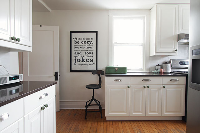
It looked like this before.
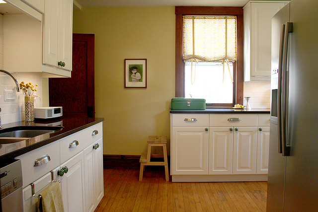
Not bad (and maybe preferred by some), but I do like the current look more. Brandon and I worked so hard on that kitchen (we demolished and replaced everything except the flooring when we moved in), but five years of yellow paint and shabby wood was enough.
Here’s the ‘get your bearings’ shot (taken from the dining room), complete with crazy lady scrawl to highlight all of my kitchen’s flaws. Yay!
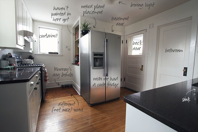
The wide-angle lens makes it look huge. It is not. The size doesn’t bother me, but all that white is a little boring. Maybe painting the back door would help? Or a colorful refrigerator! OK, the door is more doable, but I’ve been dreaming about having a cute fridge for years. I mean, COME ON. I could totally pull that look off in my kitchen.
Moving on.
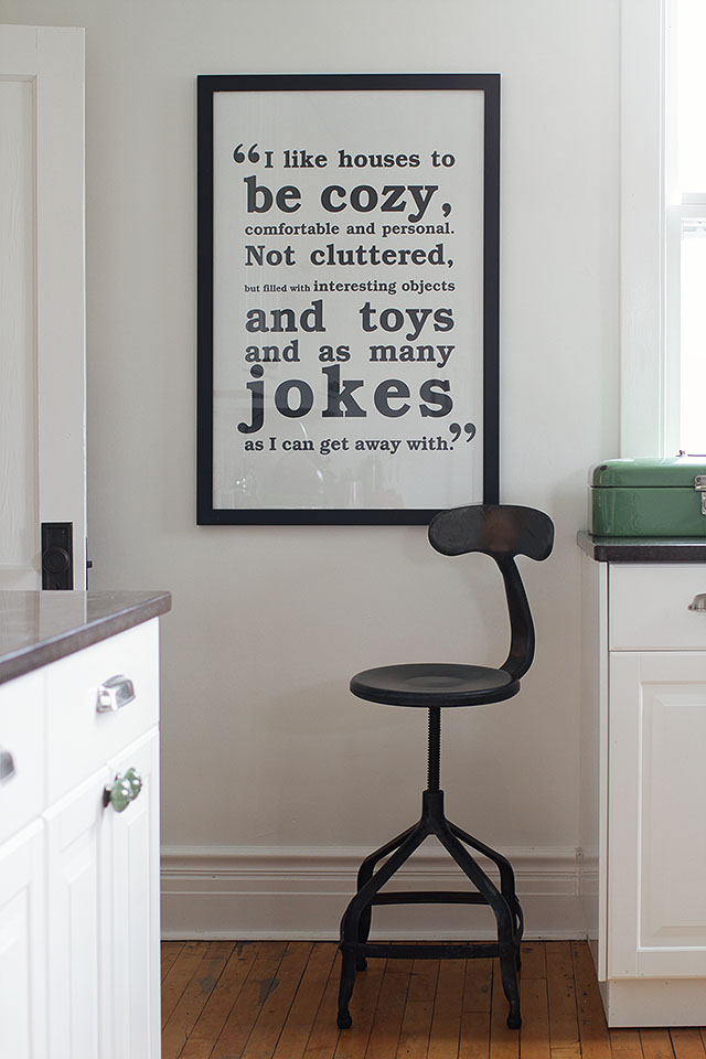
The print belonged to Brandon’s grandmother. My mother-in-law said that her mom talked a shop owner into selling it to her, though it wasn’t actually for sale. I was able to attribute the quote to Candice Bergen. I don’t know anything more about it, but I do like it a whole lot.
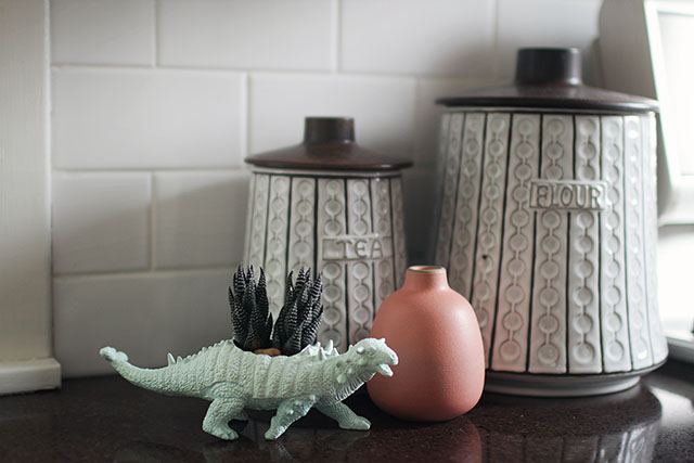
That little dino guy used to be lime green. He stays because August likes him so much, but I did give him a more subtle paint job. He and the vintage canisters were picked up at The Vintage Bazaar, and the Heath Ceramics vase was a San Francisco souvenir.
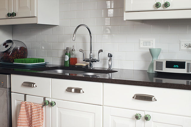
The sink side of the kitchen looks like it has all along. Some flowers would be nice in that vase, but alas, none on hand.
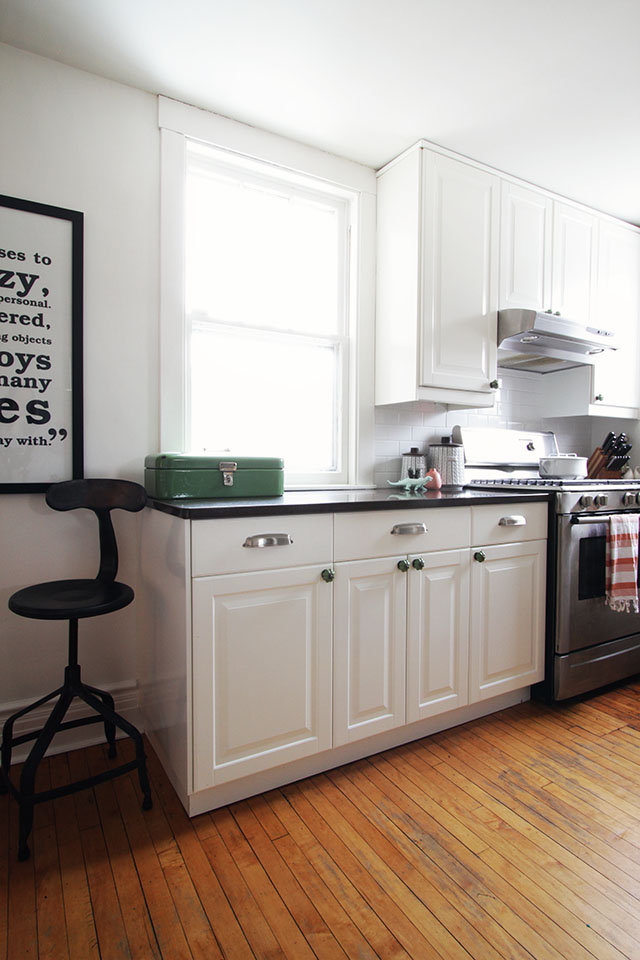
Just like last time, the window treatments are coming in last. I’m second guessing my decision to use the Rifle Paper backdrop fabric because the windows actually look good bare. Although maybe they could go from good to great with curtains? Roman shades? Roller shades? Or the fabric from the curtains I just tried in the office? (Those are likely being returned soon.)
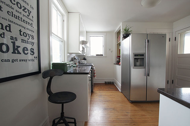
I was going to paint the lower cabinets. Again, now I’m not so sure. I think I should paint the back door, and maybe bring in a rug. New light? Keep the white paint? I don’t know anymore. I like the white a lot more than I did though, that’s for sure. Not bad for a DIY IKEA kitchen in a hundred-year-old bungalow.



Ashley @ The Houston House
February 11, 2013 at 9:35 amLove the backsplash!
Kelsey
February 11, 2013 at 9:35 amThe print really speaks to the “whiteness” of the kitchen! Also, would there be any way to hang art on the left side of the fridge? That could be fun…
Making it Lovely
February 11, 2013 at 4:23 pmI was thinking about hanging a banner, maybe. Like a dish towel, hung on a rod? Hmmm. Sounds weird now that I’m typing it out, ha!
Kait
February 12, 2013 at 1:07 amIf you’re thinking about breaking up the bulk of the fridge, this might be a good idea – maybe you could take it a step further?
A panel of fabric the same width of the fridge’s side, with 6 inches (or so) excess at the top and bottom to wrap over(and under) the fridge where it could be secured taut with strong magnets..
It does sound a little weird(!) but if you were to use a white fabric, you could ‘visually extend’ the white wall next to the fridge, OR use a nice colour or pattern and make a changeable feature out of it.. and throw it in the washing machine if mini maple-syrup-handprints appear.. :-)
CT
February 11, 2013 at 9:35 amI think your kitchen looks so great – fresh and updated. Now all it needs is a little lipstick, which is your conundrum about color. Maybe a colorful runner (Flor?) in that long narrow space back to the dog bowls and then some pattern/color in the shape of fabric at the windows? I like that you take your time and consider the space. By living with the white kitchen you have grown to appreciate it and what it might need to feel more like you. Cheers – CT
Making it Lovely
February 11, 2013 at 4:23 pmI like the lipstick analogy.
Kathryn
February 11, 2013 at 9:36 amI thought I’d be all for lower cabinet painting, but I like the bright. And I love the the door painting. What about removing the doors to the upper cabinets and painting the inside a bright color? I’m too messy for such an option, but I’m willing to volunteer you for neatness :) That + door + curtains + rug could get you a lot of color and pattern. Also, I no longer think my kitchen is so weird for having stairs that run into the stove. That is one crazy OP layout.
Making it Lovely
February 11, 2013 at 4:39 pmOh, thanks for volunteering me! ;) We have far too much ugly stuff behind those cabinet doors.
And yeah, what is up with the layout in this kitchen? So weird. There isn’t really a better option though, short of full-scale remodeling and moving the stairs to the basement. We worked with what we had when we redid it.
christine e-e
February 11, 2013 at 9:44 amohhh… keep it white. Oh, I was hoping for the Rifle Paper roller shade… then a schoolhouse pendant lamp & a Smeg mint green fridge.
I don’t know where you get your fabric sources, but I seem to fall in love with everything you’ve shared here recently.
Maria
February 11, 2013 at 9:45 amWow! I LOVE it! I wasn’t sure when you mentioned painting it white, but it turned out great. Now I want to paint my kitchen white :)
Helen
February 11, 2013 at 9:48 amDUDE – that smeg fridge is to die for. I think it would look amazing in that space. The white feels so clean! It looks great.
Alison
February 11, 2013 at 9:55 amPaint the back door. yes! I love that idea. how about the window frames too? I have seen that pulled off very nicely as well. fun colored school house light sounds awesome too
It looks very cute!
Making it Lovely
February 11, 2013 at 4:40 pmI like the look of windows that are black on the inner portions with white outer trim, but it wouldn’t work for ours. The windows are too different in style, and that would only call attention to it.
Alex
February 11, 2013 at 9:59 amKeep it white! I love white spaces.
You did a great job with the door, I’m thinking about painting mine too, was it too hard ? I mean about sanding first… If it was just painting over the wood, but the sanding makes me step back!
Making it Lovely
February 11, 2013 at 4:41 pmI didn’t sand the whole door, just the edges where they became splintery over time. I cleaned the door with mild wood soap and a scrubby sponge, dried them off, then primed.
Kait
February 11, 2013 at 10:01 amA two-thumbs-up vote for embracing the white. It’s undeniably fresh and tasty.
Maybe you could add some interest (and possibly distract from the floor differences) with a patterned runner? Something like this plastic woven rug http://shop.britasweden.se/en/rugs/gerda-seagreen-new.html – the pattern would pick up on your drawer handles nicely!
Sarah
February 11, 2013 at 10:36 amOh! I like this suggestion! I have an all white kitchen (with shiny laquered ikea cabinets) and I find it veery hard to keep those upper cabinets clean. I think the black/white/chrome thing you’ve got going on looks really pristine. I like the touches of sea foam green. I’d play around a bit with some patterns (like Kait’s runner suggestion above) and leave the walls and cabinets alone. Maybe a pop of seafoam in that shelving area you haven’t painted yet?
Making it Lovely
February 11, 2013 at 4:43 pmSarah, I think some color in the shelving area is called for.
Making it Lovely
February 11, 2013 at 4:42 pmKait, I was actually looking at that very runner! I have a pink and white one by them for the basement already, and I like it a lot.
Leanne
February 11, 2013 at 10:08 amIt looks so lovely!
Yadira Batres
February 11, 2013 at 10:09 amOh wow!!!!
It looks like a whole new kitchen, it looks a lot more put together, not that it didn’t before but I think the dark wood trim did make it look so much more darker than what it is. and everything just pops so much more.
Love it are you still using the floral print fabric for your curtains, I love the fabric.
Celeste
February 11, 2013 at 10:10 amWhat if you paint the inside of your book nook (where you said you haven’t painted yet), instead of being white pick an accent colour (maybe something from your rug or curtain that you will place), won’t be too crazy, but a nice addition of colour.
Making it Lovely
February 11, 2013 at 9:34 pmYes, I think that’s what I might do.
Amie
February 11, 2013 at 10:20 amSee, all it took was putting a little more of your family’s personality into the space to make you fall back in love with your original choice of white.
Curtains, or valances in the windows will add a lot more colour and character.
As for the door, do it. A pale yellow would be awesome.
Haley J.
February 11, 2013 at 10:21 amI love it! I think you should paint the backdoor, add a rug, and bring in some roman shades or fabric roller blinds. I’m thinking, based on years of reading, that adding a little color and pattern will make you more satisfied in the long run. ;)
Making it Lovely
February 11, 2013 at 9:34 pm(I think you’re right.)
Kathleen
February 13, 2013 at 3:36 pmI was gonna say exactly this. I adore the freshness of the white, but the kitchen doesn’t quite feel like you yet. I still love the idea of the Rifle Paper. Add a rug and a painted back door, and the room will sing!
Lindy
February 11, 2013 at 10:23 amI just watched The Five Year Engagement and went bananas for the color on Emily Blunt’s front door. It’s a turquoise blue that no adjectives can do justice. It would look pretty sweet on your back door.
Kristina
February 11, 2013 at 10:30 amI like that print with the stool in front of it, it looks very modern.
gemma@thesweetestdigs
February 11, 2013 at 10:33 amIt looks so great – fresh and fun! I think a rug and colour on the back door would really make it pop.
Meredith
February 11, 2013 at 10:35 amSold. You’ve inspired me to paint my creamy/yellowy living room white.
Bryony
February 11, 2013 at 10:40 amI think the Rifle Paper fabric would still look great in there! Then you can have a few pops of colour in the otherwise white kitchen. And a coloured door would be neat. Maybe a nice pink, or a light blue, or something pulled from that fabric. That’d be neat with a fun doorknob like the ones on your bottom cabinets. I wish I could do this sort of stuff to my kitchen!
lisa
February 11, 2013 at 10:46 amLooks wonderful! How about repainting the window sashes black, just for a bit of balance and pop?
Making it Lovely
February 11, 2013 at 9:36 pmI love that look, but only one window is double-hung. The other is a casement style and there’s nothing in there to paint.
Elizabeth
February 11, 2013 at 10:47 amLooks fantastic! I am also thinking of painting our doors white, but am a little hesitant because I’m unsure of the best procedure. I’m curious about what you do- after sanding, do you paint the door with a brush? Spray it? Any advice would be greatly appreciated!
Making it Lovely
February 11, 2013 at 9:37 pmI use a brush to cut in the panels, then a small roller everywhere I can. I’ve done it before with just a brush, but the roller did such a nice job and was much faster!
katie
February 11, 2013 at 10:47 ami absolutely love that print…such a wonderful quote! I love white everything and think your kitchen is looking great, but I agree with others, bring in a floor mat and some curtains and see what you think :)
Jane
February 11, 2013 at 10:59 amLove it – looks great. Maybe you’ve already mentioned it but I couldn’t find but what are your countertops? They look good and simple.
Making it Lovely
February 11, 2013 at 9:38 pmThey’re dark brown Zodiaq quartz.
Jeanette
February 11, 2013 at 11:03 amI think painting the back door a fun color is a great idea!!
jbhat
February 11, 2013 at 11:05 amI don’t think I will cast a vote for painting the back door. But I do think that all the white is super fresh and pretty, and I love the stuff you brought up from downstairs.
jbhat
Megan @ Rappsody in Rooms
February 11, 2013 at 11:11 amOh, you made me fall in love with the white kitchen too. I was kind of on the fence when you first painted it, but for some reason bringing in more black and white really seemed to help. I vote for keeping the cabinets all white and doing a roman shade for the window. And I vote for a pretty pop of color on the back door. I think it’s a great idea!
Amanda
February 11, 2013 at 11:11 amMaybe paint the back of the door with chalk board paint?
Making it Lovely
February 11, 2013 at 9:41 pmI’m sure I’m in the minority, but I don’t think I’d like a chalkboard in my kitchen. I only like them when they’re beautifully written on, like when they’re styled for a photo shoot.
Chelsey
February 11, 2013 at 11:14 amI love the all white… BUT, I tend to go overboard and put color on EVERYthing. Also: we have a bathroom in our kitchen. Oooooooh, old houses have character. ;)
Making it Lovely
February 11, 2013 at 9:39 pmIn the kitchen or off the kitchen (like ours)? Because IN the kitchen is a whole lot of character!
Melissa // The Fauxmartha
February 11, 2013 at 11:16 amLove, love, love it. Makes me miss living in Oak Park. So much charm in the architecture.
Sarah
February 11, 2013 at 11:25 amI REALLY like the white kitchen – it’s amazing what a few good pieces can do! I am all for a colorful rug and some Roman Shades – I like the white so much I don’t know if I would paint the door.
Monica
February 11, 2013 at 11:27 amit looks beautiful! I don’t think you need curtains or to paint the back door–how about painting the ceiling a light color or getting a colorful rug to put in the area in front of the ‘fridge?
Making it Lovely
February 11, 2013 at 9:43 pmOh, I hadn’t considered changing the ceiling! That’s a nice idea.
Federica
February 11, 2013 at 11:27 amgreat job!! I love white! you’re right: you can add more fun with a coloured door (I think the bathroom door better than the back door. the only reason is cause it’s nearer the entry)
jane
February 11, 2013 at 11:34 amPainting all the wood white and bringing in the stool and print made such a big difference! I love the idea of brightly-colored striped rugs (and a pink smeg). Still dying to see the bottom cupboards painted, but clearly you would have to do that first in photoshop and live with it for awhile that way. The kitchen is really looking good!
Heather B
February 11, 2013 at 11:36 amI really like the graphic simplicity of the white and the black. I think that if you wanted color, adding the color through an ever-changing assortment of accessories would be lovely. But I do like the cleanness and the spareness of the space. Very nice.
Ashlea Walter
February 11, 2013 at 11:37 amAre you kidding me?! I would die for this kitchen! I call my kitchen a “war zone” kitchen because, while it has SOME potential, it’s got a long ways to go. Love all the white, love the bit of industrial, the plants, the mix of new and old. Bring a punch of color in with fresh flowers, maybe a rug, some hand towels, voila!
Kayleigh
February 11, 2013 at 11:39 amI really hope you make the rifle paper co backdrop into curtains and use them in the kitchen. I think they will be fantastic in there. I also think once you put some colorful curtains up you may find the white walls to be more awesome. I wouldn’t change your mind about the white until you hang curtains. Good luck!
liz @ bon temps beignet
February 11, 2013 at 11:45 amGORGEOUS! And I totally love the print and chair in there.
mary
February 11, 2013 at 11:58 amI love how your kitchen looks! Very fresh and calm. I think window treatments would be great. This fabric is finally on sale at Joann (it’s a special order in store) and could be pretty. Used this in my friend’s Savannah house–same age as your house. Linked Circa Eclipse http://pinterest.com/pin/279082508128129364/
jenn
February 11, 2013 at 12:15 pmI love it!!! You have the best style. What about a pop of color in the “to be painted” shelving area, a rug, and roller shades in the rifle paper fabric?? You’ll come up with something perfectly “lovely”, of that I’m sure!
harlie
February 11, 2013 at 12:16 pmI think a bold, colorful rug is a must in this room! I love the idea of brightly painted doors, but if you ever get a pretty color fridge, you might want to leave it white. I think some tailored valances or roman shades in a bright color would really be balance out any color on the floor.
Christina W.
February 11, 2013 at 12:16 pmI think it looks beautiful. Love that print/stool combo. Here are my peanut gallery observations! 1) You said the inside of the bookshelf isn’t painted (yet) but I think the little bit of color there is a nice surprise in so much white. 2) I definitely think you should use a window treatment of some kind, because white walls + no window treatments can seem a bit Renter With Crappy Landlord-y instead of like a deliberate choice. 3) Painting the door is a great idea and I’m throwing in my vote for black! As always, I can’t wait to see what you do and your rooms are an inspiration!
Making it Lovely
February 11, 2013 at 10:20 pm1) I think I’m going to add color. 2) Good point! 3)I think color is the way to go, not black. I’m going to paint the bathtub black, which will be visible when the bathroom door is open, and I think some color would be better.
Kim @ Yellow Brick Home
February 11, 2013 at 12:28 pmThe white looks AWESOME. Now that you’ve added the stool and print, I wonder how the trim around the windows would look if painted black? Lately I’ve been daydreaming of black trim and white walls – and I noticed a lot of my pins have this element in them, too.
I vote for still painting the bottom cabinets!
Making it Lovely
February 11, 2013 at 10:54 pmI don’t think I can do black trim. I love it in the right house, but I don’t think my little ol’ bungalow is it!
Tiffany
February 11, 2013 at 12:29 pmNicole I love what you have done. It looks great so far. I think now you just need to focus on accessories. Maybe decorate with a pop of color. I love the idea of painting the door black. You could even do color. You did a great job with your laundry door. Also what about a cute rug? Rugs always bring a room together.
Making it Lovely
February 11, 2013 at 10:55 pmI do love that happy blue door in the laundry room a lot…
sue
February 11, 2013 at 12:41 pmi think this looks fab! a lot fresher! have you heard of neisha crosland? she does some lovely fabrics which would work beautifully in here too!
Making it Lovely
February 11, 2013 at 10:56 pmOh, I always think of Neisha Crosland as a wallpaper designer, but it makes sense that there would be fabrics as well.
Pat
February 11, 2013 at 12:47 pmThe white looks great! Much better than before. Some natural bamboo blinds/roman shades would like on the windows. They would bring in some texture and tie in nicely to the wood floors while still allowing plenty of light in.
Catherine
February 11, 2013 at 12:55 pmI think your kitchen has great bones! Those pink curtains could really work, but so could the Rifle Paper Co. pattern. And I vote for a pink SMEG fridge! It’s definitely you. :)
Making it Lovely
February 11, 2013 at 10:57 pmIt’s TOTALLY me.
Kristín
February 11, 2013 at 1:09 pmAWESOME! Love it. :)
I say a rug and that fridge you’ve been dreaming of.
Love from white northern Europe ;)
Elle
February 11, 2013 at 1:12 pmCurtains, curtains, curtains!
Kate
February 11, 2013 at 1:27 pmThe white is awesome!! I think a simple curtain (the just skims the top of the window-doesn’t cover it) with bold colored contemporary fabric would be great, maybe even consider hanging those close to the ceiling to give more illusion of height. The idea to paint your door is also a good one, like turquoise something. And yes a rug would look incredible.
Kate
February 11, 2013 at 1:28 pmAnother idea, paint the inside of your shelves the same color as the back of the door!
Making it Lovely
February 11, 2013 at 3:26 pmYes, I think I may paint the shelves a fun color! Maybe something to work with, but not match exactly the back door.
Alison @ Deuce Cities Henhouse
February 11, 2013 at 1:29 pmIt looks so great! When you first posted about the white I wasn’t sure it was going to be the best choice, but with the white window trim and the white door and the oil rubbed bronze door hardware it looks so amazing! That stool is totally the best too.
I’m glad you posted a wide angle photo of your entire kitchen, it’s very similar in layout to mine. My fridge also sticks out like a sore thumb and I have no idea what to do with it. I’m curious to see how you handle it. Is the flooring area with the “different (not nice) wood” where a pantry used to be? We have a pantry that’s now part of our “kitchen area” and it’s such a weird space.
Making it Lovely
February 11, 2013 at 3:28 pmI wasn’t sure white would be the best choice either, but I’m glad I tried it.
The layout must have been different at some point in the kitchen, because that patched wood area is weird. The window there is also a later addition that doesn’t match the style of the others.
Dana @ House*Tweaking
February 11, 2013 at 1:40 pmI’m pretty sure I just fell for your all-white kitchen, too.
Judy Miller
February 11, 2013 at 1:44 pmLOVE the white….the stool and the print sealed the deal! Add a rug, new light fixture, and maybe paint one of the doors or a wall with chalkboard paint. You can bring in print/color with towels and other decor. I love the simplicity of it!
Molly
February 11, 2013 at 1:47 pmMaybe paint the doors black and add a colorful rug or two? I like the white more than the green/yellow, but def think you should paint the door(s)..
:)
Jen Walter
February 11, 2013 at 1:55 pmDo nothing! The all white looks amazing. You have such good taste in accessories, that those pops of color really complete the room. I just love all white kitchens. I always want to put dark gray in somewhere, but whenever I see the all white, I fall in love all over again every time.
Mary Ann
February 11, 2013 at 2:13 pmLOVE that Rifle Paper pattern – it would make a great fabric-covered roller shade.
Or… Maybe a small (changeable!) art gallery in lieu of the black & white poster? (I know that you collect great art prints.) I’d be thrilled to pass on a batch of Matte Black frames… I can just picture them near that cool stool. They’re made right here in Chicago!
Elizabeth
February 11, 2013 at 2:40 pmWow Nicole!
I can’t believe you could make your kitchen any more lovely! Nice job. I am in the planning process of our 90 year old kitchen remodel and I am wavering over my choices everyday.
http://lovesrobots.blogspot.com/2013/01/a-kitchsy-kitchen.html
I too, am lusting after a colorful Smeg fridge and now that West Elm stocks them, I’m even more motivated to get rid of our giant white 6 year old Samsung *which needs repairing often* My biggest concern is losing the cubic footage inside. I’m smitten with the Exeter 5 Jar pendant at Pottery Barn for my light fixture. We’re installing Ikea cabinets and wood countertops which has me nervous since I’m a self proclaimed klutz and I’m sure I’ll ruin them. I am trying to convince my husband we NEED the Machinist stools from Industry West in blue.
Nicole, do you have any suggestions for installing subway tile backsplash? We’re going to try to tackle it ourselves.
Thanks!
Making it Lovely
February 11, 2013 at 4:02 pmNot that you need the temptation any more than I do, but Northstar and Big Chill both make fridges in the same types of colors as Smeg, but they are larger, modern appliances that just look cute and retro.
Tiling is a pretty easy DIY job. I searched for instructions online, talked to the people at the tile shop, and then went for it.
And yo totally need those blue stools!
Susie
February 11, 2013 at 2:55 pmI rarely comment, but I have to tell you — I LOVE the white! The whole kitchen looks incredible and I think adding a few colorful accessories (like the Rifle Paper curtains) will add just the right amount of color.
Megan
February 11, 2013 at 3:17 pmLooks great – really bright! I think the rifle fabric curtains will bring a nice touch of color as well. I would LOVE a colorful Smeg fridge – it’s on my wishlist for when I have an endless budget.
Angeline
February 11, 2013 at 3:18 pmI painted my kitchen all white, then added a black wall, my grandparents beat up (loved) table and a rug with lots of red – I love it now (more than when it was all white – my kitchen is the most beat up space in my house (needs new flooring, trim, cabinets – but I love changing it – You’re doing great with yours, I think you’re going to love all the layers you plan on adding!
Artsy Forager
February 11, 2013 at 3:20 pmThe white looks so much more fresh and sophisticated, it fits your aesthetic perfectly! Just those few subtle shots of color make all the difference. I think a colored fridge might be a bit much, but LOVE the idea of a painted back door and rugs to bring in a bit more warmth. And I agree with Kate above, the inside of those shelves would be fabulous painted, perhaps a compliment rather than match to the back door.
I’ve been enjoying seeing it all come together!
Lane
February 11, 2013 at 3:28 pmI really did like the look of your kitchen before, but the white is beautiful and looks so polished.
Nicola
February 11, 2013 at 3:47 pmIt looks great! Would you consider painting the back door the same shade of green as the medicine box on your countertop?
Making it Lovely
February 11, 2013 at 4:07 pmIt’s in the running.
Katie Stephenson
February 11, 2013 at 3:58 pmI like it white! If I could change one thing it would adding the colorful fridge. I would like one for myself too but I wondered about the function of Smeg. They look pretty small and the freezer situation I’m not sure would work for my family. What about painting those floors grey to hide the mis-matched floors? I’ve always wanted to do that but have continued to be too chicken/lazy.
My vote is for a real roman shade. I’ve made them before. They’re hard but I believe you can do it.
Making it Lovely
February 11, 2013 at 4:09 pmSmeg fridges are tiny, but there are others out there that are cute and colorful and normal-sized.
I’d thought about painting the floor before, but chickened out. I guess I’ve gotten used to the mismatched section because it doesn’t bother me quite as much as it used to.
And I’ve heard that those shades are hard to make! I’m not the best seamstress.
Katie Stephenson
February 11, 2013 at 4:01 pmJust read a comment about black doors. LIKE!
Mamasass
February 11, 2013 at 4:08 pmPaint the floor!!!
Ashley @ Spite or Flight
February 11, 2013 at 4:10 pmI can’t recommend a chalkboard door enough — I just did mine a few months ago, and we use it all the time either for shopping lists, or just drawing pictures with friends. And now that you can make your own in any color, why wouldn’t you make your door something you can draw on?!! My husband was afraid an all black door would be too much, so we taped off a frame to give it the appearance of a paneled door.
You can see it here: http://spiteorflight.com/2012/11/28/all-i-wanted-was-a-chalkboard/
Can’t wait to see the final touches!
Cathy Wolfram from Adore Your Place
February 11, 2013 at 4:12 pmLove what you have done in the kitchen. I am still tuscan yuck and need to paint more white. Clean and simple, just right :)
Monika / MB Captured
February 11, 2013 at 4:21 pmI love this area and the design of your kitchen, I like that it is not the standard shape, makes it interesting. Loving the new additions too, that frame on the wall is the cutest quote (might just steal it) – We too are undergoing a full kitchen overhaul, just waiting on some benchtops. Feels nice to make the home over. :)
Emily
February 11, 2013 at 4:34 pmI think it looks 1,001 times better. Brave to you. Please oh please paint the back door to bring some color, I’m dying to know if and what color you’ll pick. I think adding a rug is a brilliant idea, too!
Katy
February 11, 2013 at 5:05 pmOh I LOVE the new white kitchen, it’s just gorgeous! But then again I’m a sucker for white kitchens, we have an all white IKEA layout currently and I just fall for the brightness on a daily basis. I like the windows bare but maybe a colorful kitchen towel hung somewhere or a runner rug under the sink? Those are the tiny pops of color that we’ve added that make the kitchen feel slightly less sterile, you know?
Chloe Moon
February 11, 2013 at 5:11 pmNot bad? Seriously your kitchen is beautiful!! You have so much counter space and the white walls I think are really clean and pretty! I imagine it really opened up the space! =)
Your lil dinosaur planter is really cute! =)
Anna
February 11, 2013 at 5:17 pmI like it! The larger scale print looks terrific and I love the stool. But it does give it kind of an optometrist feel – which will totally warm up once your curtains come, I think. But it’s great!
lori
February 11, 2013 at 5:25 pmI’m a sucker for black doors in all white rooms. Or yellow. Loving the new kitchen btw.
Jackie
February 11, 2013 at 5:40 pmI am falling for your white kitchen, too! I love the print and stool. Off to daydream about painting my kitchen cabinets white…
PAppel
February 11, 2013 at 6:14 pmYou’ve just nailed my dream kitchen. Only change I would have is stainless steel countertops. Sigh. Drool.
Corrin
February 11, 2013 at 6:29 pmI love the white. Paint the back door and maybe the shelves a creamy green and done.
Heather
February 11, 2013 at 6:30 pmBamboo blinds, just add texture, not much for blocking out light.
Nicole RJ
February 11, 2013 at 6:35 pmLove the all-white! I have a white kitchen (with very minor blue accents) and a bare main window – and love how bright it is. I’m all for bare windows, or a simple sheer, if privacy isn’t an issue.
wendy
February 11, 2013 at 7:20 pmYour kitchen looks awesome! I love it! I love white kitchens and hardwood floors.
wendy
February 11, 2013 at 7:22 pmoh and ps I love that print from brandon’s grandma! I want one!
Jenn
February 11, 2013 at 7:37 pmI thought I like the kitchen before, but after today’s pictures I am hooked on the white! Just starting a kitchen renovation myself, and am definitely going with white (and a bare window).
dyna
February 11, 2013 at 8:51 pmClean and bright! I like it, it’s like a blank canvas. Can’t wait to see what colors you’ll incorporate into the space.
kristi@SimplePrettyThings
February 11, 2013 at 9:49 pmLove the white kitchen. Glad you stuck it out because it’s coming together nicely! I just posted about our kitchen painting adventure a few weekends ago but don’t look… my photos are terrible. We are going to be getting a new camera to remedy the situation!
Laura
February 11, 2013 at 10:20 pmLove your kitchen! You will enjoy the white since you are so creative. I like to have spaces in my home that stay neutral palettes because I can never marry a favorite color – I love them all! If I were you, I would keep the beautiful white and add those great curtains you were holding up in the other post. Then add pops of orange and aqua on the counter tops. Your fridge is just fine as is. It has just become center-stage with all of the white. Once you add some color distractions, your fridge will not ‘bother’ you as much. Have fun!
Alissa
February 12, 2013 at 12:20 amadd in my two cents: go for the rug and the curtains to add the color (easiest to undo/change) then go for the color inside the shelves and then finally add color to the door if you still long for more color… no matter what, the change is looking good. it was pretty before, but always nice to keep homes changing as the people who live in them do :)
Cara
February 12, 2013 at 2:34 amMuch improvement! I would stick with the cabinets the way they are, and add interest to the room by painting the door a fun, vibrant color, incorporating a run and hanging curtains. The all white is beautiful, but you are much too lively to have a plain color-free kitchen.
Emily
February 12, 2013 at 4:30 amLooks so fresh. I love it.
With the shelves, is there anyway they could be removed and the fridge could fit in there? A bit dramatic but then the fridge might not stick out like you think it currently does.
Regardless, it looks really beautiful.
Thanks for sharing
Julia smith
February 12, 2013 at 6:24 amIt looks fabulous,Thank you for sharing these photos.
Jessie {My Mod Style}
February 12, 2013 at 6:46 amI think the white is beautiful. (but white kitchens are kinda an obsession of mine.) I think if you painted the door a bright unexpected color and add some color with a rug it would be perfect. I love it. I plan to paint our old kitchen cabinets white in the future and I may just paint my kitchen all white as well. Our kitchen is in the back of the house and gets hardly any natural light. I think a white kitchen is always a great choice. I love this RUG from CB2.
Jessica
February 12, 2013 at 8:47 amI love it- very clean and fresh. Would you mind sharing what kind of countertops you have? We have similar white cabinets and are looking for new countertops.
Lisa
February 12, 2013 at 9:01 amLove the white! I look forward to seeing all your house updates, you have great style!
Ellen McHale
February 12, 2013 at 9:32 amI just love it all. A rug and a little hint of a window treatment and it is divine. Great job – love the industrial stool and the print.
Sara
February 12, 2013 at 10:32 amWhat a perfectly clean and crisp kitchen! My kitchen is all white and light gray and needed a pop – inspired by your office I added a 4×6 Dash zig zag rug. The pinks were just the pop it needed!
Madison
February 12, 2013 at 12:04 pmI love the all white look! And that print! Gorgeous!
I’d paint the back door black. I totally have a thing for white and black kitchens these days!
Natalie
February 12, 2013 at 1:02 pmI think it looks great! I’ll echo what Madison said about painting the door black, I think that the kitchen would look great with dark trim on the windows, floor boards, etc. Just a thought :)
Jen @ RamblingRenovators
February 12, 2013 at 1:05 pmThat is looking lovely. I like the white. It minimizes all the angles and doors. How about painting the bathroom door? The room is calling out for some colour and I think that door is saying “notice me!” more than the tucked away back door. You could also do chalkboard paint or a cork board in the inset in the panel if you like that look.
Alicia
February 12, 2013 at 2:32 pmWhat about painting the trim around the windows black? Would that be totally crazy? It just seems like it would compliment the countertops and the framed print.
Gillian
February 12, 2013 at 3:28 pmI love the white kitchen it looks fantastic! Your fridge really sticks out though, how about moving it down to the basement and installing an integrated fridge +/- freezer with work surface on top I think it would open up the room a lot and let more light in from the back door. Apologies for the unsolicited advice!