Maybe? It’s still very likely to change, but I’m thinking black (or nearly so), pale peachy pink, and olive green for the walls downstairs. I love when other people do the whole monochromatic thing, but I’m too into color.
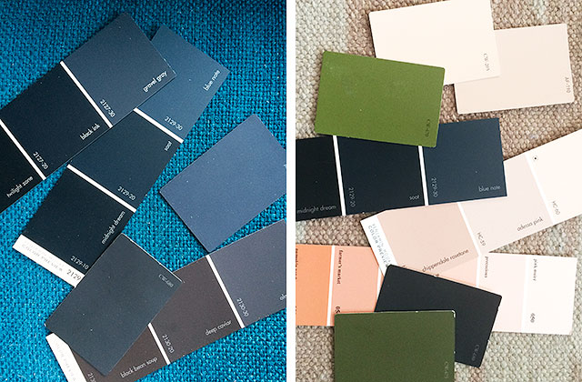
I forever love pink, and as I was looking at black and pale pink swatches, I thought green would be a nice addition. Then I realized, oh right. I’ve seen this before.
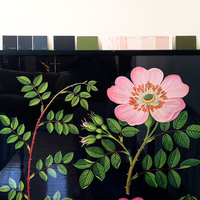
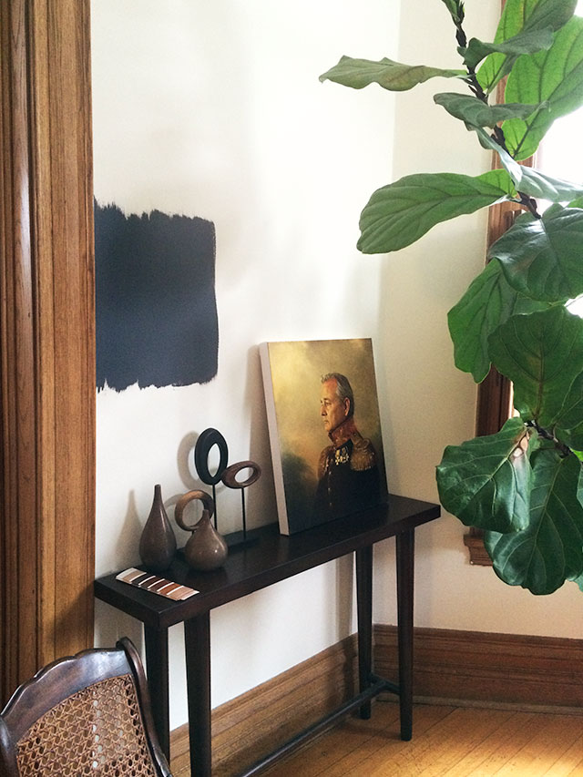
I’m set on a dark color for the second parlor, so that will get painted first. We should be starting on the library soon, and I’ll paint in there (olive?) after the shelves have been built. Then pink for the dining room? The entryway? Like I said… still very likely to change.





thelady
February 17, 2014 at 11:25 amCurrently picking out paint colors for my row home and all the colors that looked great online are too dark in person. Going to need to buy more test paints. Looking for something that looks light and luminous while still reading as a color and not white. Pale gray and pale turquoise. The home was painted BM Navajo white by the previous owner, reads too yellow for my taste.
Rebecca | Seven2Seven8
February 17, 2014 at 1:02 pmHi The Lady – might I direct you to:
Quiet Moments
China White
Collingwood
All Benjamin Moore.
Making it Lovely
February 17, 2014 at 1:05 pmNice recommendations. Quiet Moments is especially pretty.
Laura @ Rather Square
February 17, 2014 at 11:26 amMoody-yet-fresh-yet-Victorian. I think it will look stellar once it’s all painted. An unexpected but nice flow of color throughout the rooms.
Making it Lovely
February 17, 2014 at 1:07 pmOne of the pinks is named Queen Anne Pink. I know one shouldn’t pick a color based on the name, but I live in a Queen Anne. ;)
Jessica
February 17, 2014 at 11:36 amI cannot wait to see how this develops. Your sense of style is so much bolder than mine, that while I don’t always agree with your choices I always enjoy seeing how you pull it all together.
Jen
February 17, 2014 at 11:38 amI lovelovelove the Bill Murray portrait! I’m seriously thinking about purchasing the Dave Grohl. Or the David Bowie. Or…any of them!
Making it Lovely
February 17, 2014 at 1:07 pmYou can’t go wrong, really.
Aliss
February 17, 2014 at 11:49 pmI have a thing against Bill Murray. Mainly because he used to visit our town often and treat service staff cruely. But a Bowie print, now that I can get behind.
Sarah
February 17, 2014 at 11:59 amI guess I’m too much of a wimp to consider anything like that dark blue/black color you’re considering, but I also don’t have the luxury of big, open spaces either. I trust your eye and am excited to see what you go with!
Tracy
February 17, 2014 at 12:47 pmI painted my very small spare room in black with the woodwork and cornicing white. The black actually made the room look bigger than it did when it was painted light blue. I read that with black walls the corners disappear which makes the space sem endless.
Jules
February 18, 2014 at 9:57 amThis is true. I did the same thing in my kitchen.
Jules
February 18, 2014 at 10:01 amThe fiddle leaf fig is looking good! Naturally the first thing I noticed. :)
Karen Combs
February 17, 2014 at 12:33 pmI used Sherwin Williams Peppercorn in our master bedroom- nice and dark but not quite black. People freaked when they saw the swatch but were in awe of how well it came out! Still love it a year later!!
Making it Lovely
February 17, 2014 at 1:08 pmThat’s a gorgeous color!
Wendy A
February 17, 2014 at 8:43 pmWe used SW Peppercorn in our den and LOVE it!
Katie
February 17, 2014 at 12:34 pmSounds completely gorgeous. I can’t wait to see how this turns out.
Joanna
February 17, 2014 at 1:24 pmI wasn’t so sure about the dark wall colors until I spied the swatch you painted next to your trim work. Your choices are going to make that wood look AMAZING! Everything is going to look contemporary but appropriate for the house, all at the same time. Can’t wait to see it come together.
Brandyn | Southern Distinctions
February 17, 2014 at 1:29 pmI have been loving deep navy for a wall color. I’ve used Benjamin Moore’s Polo Blue in the past and been impressed with its depth. A dark navy with that wood trim is going to be wonderful! Can’t wait to see the finished room!
Making it Lovely
February 17, 2014 at 3:35 pmI’ve been eying that color, too!
Sava
February 17, 2014 at 1:43 pmI’m being learning to play around with white. I think of myself as part of the Trading Spaces generation. From watching that show, I learned that color was a good way to bring in style. Our living room/dining room is Van Drusen blue, but I decided to go with pure white in our family room, which is open to our living room. We kept the blue in the area rug for the family room. I love how the spaces are connected, but yet separated by the wall color. Also, we have so many (colorful) toys in the family room, it is nice to have white walls there. But I haven’t given up on color, I just painted our bathroom Van Drusen blue too!
Making it Lovely
February 17, 2014 at 4:32 pmThe Trading Spaces generation — so true. Though I used to make my grandfather put on Lynn something or other when I was about 10. I remember she was always spray-painting something with textured granite spray. So dated! (I wish I could remember the lady’s name.) Then there was some cheesy show with Matt and Shari? I didn’t even like their style, but it was slim-pickings back then.
And white walls can be beautiful when chosen intentionally! I loved painting out my kitchen from yellow to white in the last house. Here though, with all the wood, I feel like the house calls for color.
Marcee ... ILLINOIS
February 18, 2014 at 11:12 amYep. That’s definitely me with all white walls, everywhere. Wallpaper was never my thing. Although at one time I did long to do the entrance hallways + bathroom with banana leaves wallpaper. The white, light cream and greens. That wp sure makes things go pop! Still entranced with the pattern. In the end, it always comes down to white walls. Color from decor, etc.
Steph
February 18, 2014 at 3:25 pmLynette Jennings? I used to watch her, and Christopher Lowell.
Making it Lovely
February 18, 2014 at 5:41 pmAh, I loved Christopher Lowell, too! How could I forget him?
Ashley
February 17, 2014 at 1:56 pmI’m so inspired by the blue, green and tan. I’m going to be painting our door from the garage to the house a deep navy and I’m a little nervous about how it will pull together with the rest of the house, so this is timely inspiration for me!
Making it Lovely
February 17, 2014 at 4:32 pmI’m glad it’s helpful!
Andrew
February 17, 2014 at 2:05 pmLooking very promising! I love the combination, though I bet finding the perfect pink tone will be a challenge. I did Benjamin Moore’s Polo Blue in my new dining room and love it. “Soot” was also a contender. We’re planning a shade of kelly green for an adjacent room, and “Sterling” through the rest of the common areas.
http://instagram.com/p/hGnFk2ouIY/
Making it Lovely
February 17, 2014 at 4:33 pmI love that. But I adore your taste in general. :)
Meg@sparrowhaunt.com
February 17, 2014 at 2:09 pmThese colors will look wonderful together, and suit the house brilliantly (and you can never go wrong with library/billiards room green, it’s in our library too). Right now we’re matching colors to the original 1880’s wallpapers, just to make sure we love the colors when it comes time to wallpaper (likely decades from now given the $$$$).
Making it Lovely
February 17, 2014 at 4:35 pmThat’s a clever thing to do.
Kimm at REINVENTED
February 17, 2014 at 2:22 pmI loooove your choices and can’t wait to see how it all comes together in your home. I have been toying with the idea of using an “almost black” in a spot or two and am liking Behr’s “Cracked Pepper.” I want the shade of a chalkboard after it has been drawn all over and then erased. :). How crazy is that for a request. The guy at the paint counter was incredulous. :)
Making it Lovely
February 17, 2014 at 4:38 pmMakes perfect sense to me!
Casey
February 17, 2014 at 2:26 pmI have a wall of black (Beluga from Behr) in my living room and love it! It’s a nice, unsuspected surprise. I think your paint palette of the black, light pink, and olive would look great! Good luck!
Dionne
February 17, 2014 at 3:14 pmLove your style! This post reminds me of our visit to the renovated Rijks Museum in Amsterdam( where a lot of Rembrand & Vermeer paintings are). They have put a lot of effort in choosing the right color for the walls in this monumental building. I think the grey they choosed works so well! Have a look here, it might work for your wonderfull home, http://www.theguardian.com/culture/2013/apr/05/rijksmuseum-reopens-long-refurbishment-rethink
Regards from the Netherlands, Dionne
Making it Lovely
February 17, 2014 at 4:36 pmThat’s beautiful. Thank you for sharing! I’m not sure yet if I’m going flat black, nuanced gray, or deep blue. Those walls have me leaning toward my original “Almost Black” color.
Cassidy
February 17, 2014 at 3:32 pmAren’t those colors close to the palette for your blog, too? :)
Making it Lovely
February 17, 2014 at 4:35 pmYes! I’m on-brand, I suppose. ;)
carrie
February 17, 2014 at 4:42 pmThose colors are absolutely gorgeous, especially together! I love watching your house come together. And I’m also drooling over that medium olive green – do you mind me asking where it’s from?
Ali Burtt
February 17, 2014 at 5:18 pmWe painted our home office Old Navy from Benjamin Moore. I remember that getting the right navy was quite tricky as many were too dusty or gray and I wanted a brighter color. Here’s a good example of the final color inba room with limited light. http://www.piesandpuggles.com/2014/02/serendipitous-for-sure-more-mystery-art.html?m=1
Making it Lovely
February 17, 2014 at 6:07 pmBeautiful. I love that sideboard and painting, too!
judy
February 17, 2014 at 5:22 pmWas it Lynette Jennings? I think she is Canadian and the first person I saw on TV that gave some simple and( for me) affordable ways to perk up our house.
Making it Lovely
February 17, 2014 at 6:05 pmYes! She was my favorite when I was young! I wanted her job.
Sarah
February 17, 2014 at 7:25 pmI can’t wait to see what you choose!! I’m in a rental I can’t paint so I am totally living vicariously through this blog!
Sarah W
February 18, 2014 at 12:47 amI love all of the colors you’re considering! I’m especially drawn to the black, pink, olive green combo. I can’t wait to see how it tuns out! Like the Sarah above me, I’m renting and can’t paint, so I’m loving seeing all that you’re doing!
Erin
February 18, 2014 at 6:02 amOooh, I really love that palette. And the little bit of the black you’ve tested looks so great next to the wood! I really want to go very dark for our library/dining room but my husband won’t have it. :(
Meg
February 18, 2014 at 9:18 amI am so excited to see how the dark color turns out! I have been wanting to paint a room dark navy or charcoal for a while now and it seems like inspiration is popping up everywhere! I really enjoy your blog and the fact that you don’t paint everything white like so many others seem to do!
Celeste
February 18, 2014 at 10:22 amI just painted my friend’s desk area a similar color to that blue. It’s an accent wall (which I’m normally not into, but it is behind shelving, so I think it sets it apart) and with all the white in her room, it makes her room so much cozier! I love it.
Christine@DecorumDIYer
February 18, 2014 at 11:22 amI am currently repainting my 7 year-old son’s room. The old palette was a dark, chocolate brown and a mid-tone , watery blue. I just painted his ceiling and upper fifth of the walls SW’s ‘Cyberspace’. I am in love. I am pairing it with crisp white trim/shelving (we don’t have lovely wood trim, unlike you :D ) and a soft gray/green by SW, ‘Escape Gray’. I am getting so excited for my son to see the finished product.
I love that you go with your taste and instincts as to color. It is so refreshing to see real color in a real home. Barely there whites and pastels are not for everyone, nor every home. Have fun! I can’t wait to see!
NET-A-DRESSER
February 18, 2014 at 2:36 pmHi, I have had such a good little tour around your blog I feel like I know you already! I love what you are doing with this beautiful Victorian house. Many years ago we did the same with a Georgian beauty in the UK…..It’s a labour of love but so worth it, especially the memories the children will have growing up (apart from the rows over DIY etc!!) Enjoy, and can’t wait to see the progress! xx
kate
February 18, 2014 at 4:27 pmI’m a white woodwork kind of girl but I love the look of those dark colors with the natural woodwork.
Ah, thanks for the memories of Lynette Jennings, Mat and Sherry and Christopher Lowell :)
Jane
February 18, 2014 at 10:21 pmI love pink and green.
I think a clear green (less olive) could be very pretty
“Four Leaf Clover” by Valspar
http://stylebyemilyhenderson.com/blog/category/makeovers/page/15/
And check out this bedroom in a dusty pink that’s kind of transcendant.
http://www.valsparpaint.com/en/explore-colors/find-ideas/national-trust-historic-colors/victorian.html?index=3
Blair
February 19, 2014 at 10:41 amWhere are your botanical prints from? I know there is a post somewhere, but I can’t seem to find it….
Making it Lovely
February 19, 2014 at 10:46 amI bought mine from Fab when they had them briefly, but The Evolution Store carries them. IKEA also has a version, though the art isn’t as nice.
Lisa
February 20, 2014 at 3:37 pmI am a reformed repeat color offender. I once paired an orange accent wall in my kitchen with the green bedroom that lead right off of said kitchen. It was a “Home Depot” logo meets Easter basket grass disaster! I have since found my groove by thoughfully pouring over well-curated blogs like yours. Thanks for the continued (free) tutoring!
PS – I thought about an BM inky dark blue “neutral” on my gallery wall in the living room. Went with SW “Peppercorn” instead (like one of your previous commentors). I’ve never had a second thought – the color is amazing.
Iquo
March 3, 2014 at 6:36 pmIs that a picture of Bill Murray?! I love it!!!
Trending Color in Home Design – Making it Lovely
December 19, 2016 at 12:57 pm[…] it all goes back to my earliest thoughts on a color palette for this house three years ago, pulling in the blue along with choices inspired by a vintage botanical […]
El truco para escoger el color perfecto | Mil Ideas de Decoración
October 3, 2018 at 1:48 pm[…] Linda Holt, Making It Lovely, Extreme How To, Revista […]