Where everything is a lovely shade of brown! Or cream! This room is very much in progress, and it has a long way to go still.
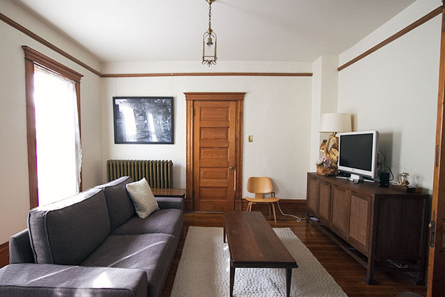
The couch is super-comfy, so no regrets there on choosing the IKEA Kivik, though it could use a throw and more than a single, sad pillow. The room is open to our bedroom, so I picked a brown that would work well with our brown upholstered bed. I wasn’t feeling the gray options, didn’t want white, and the only other colors at IKEA were red and purple.
Add a bunch of wood trim and wooden furniture though, and YAWN.
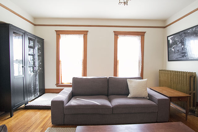
I like the Hemnes bookshelves in the room, and the Blake media console (that I picked up at the C&B outlet for half off) looks great. The Eames chair looks kind of lonely and out of scale against the wall right now, but I think it will look good in the room once everything comes together a bit more.
Everything else though? It’s just kind of there. The sofa is floating in the middle of the room because I’m playing with the idea of putting a console or low bookshelf behind it for the kids’ toys. The rug was in the nursery, in the last house, and it’s a little small here. The coffee and end tables are OK, but only OK. The brown glider (also formerly in the nursery) is definitely not staying there, and it’s blocking a toy table which is weirdly shoved in a corner of the room.
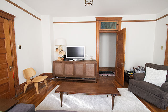
The room definitely needs paint, and curtains. That, plus art, will go a long way toward helping the room look better, but they won’t fix everything.
Hello, embarrassment! Brandon informed me that I originally titled this post with a gross sexual term. Awesome. So yeah, I edited that out. WHOOPS.



mudslide cookie
February 26, 2014 at 11:51 amOooh…but it’s also such a great blank canvas!!!
Making it Lovely
February 26, 2014 at 12:43 pmIt is!
Lisa
February 26, 2014 at 11:52 amWe live in Brown Town too :).. our living room has a light wood floor, chocolate brown couch & chair, khaki walls, cream/taupe colored rug, with IKEA Stockholm Blad curtains in brown.. oh and our coffee table & end tables are a dark wood top with a white painted bottom. Neutrals ‘R Us!
Making it Lovely
February 26, 2014 at 12:39 pmHeh. Brandon just walked in and saw that term, and he told me I ought to think about changing it because “I don’t think that means what you think it means.” So, yeah. It’s a brown room. *blushing*
But yes, Neutrals ‘R Us!
kristine
February 26, 2014 at 11:54 amhow do you find the height of the couch? i always feel that ikea couches are low to the ground, but this one looks higher. there may be on of these in our future (but our city does not have an ikea so i can’t try it out :( )
Making it Lovely
February 26, 2014 at 12:44 pmIt’s somewhat low, but I don’t find it to be a problem. The seat height is about the same (or exactly the same, maybe?) as the Karlstad, but the proportions make it look different.
Celeste
February 26, 2014 at 12:07 pmLove that console! And that couch does look comfy.
I love when you share the before photos and your in-progress pictures. As a person who doesn’t have a ton to drop all at once on a whole new room, it’s refreshing to see how a designer’s rooms come together.
Thanks for sharing your creative process! Can’t wait to see where this goes (and how long it takes).
Making it Lovely
February 26, 2014 at 3:14 pmThanks. It can feel a little weird sharing photos of rooms that I KNOW don’t look very good yet, but I like documenting the process. I’m glad it’s helpful!
Laura
February 26, 2014 at 12:38 pmI think some of us have a Brown Town somewhere in our homes where furniture is comfy and possibly handed down or second-hand, where the decorating budget hasn’t stretched, or where attention must be given elsewhere. Real life!
Peaches
February 26, 2014 at 12:57 pmfyi, i totally just googled brown town.
Making it Lovely
February 26, 2014 at 3:15 pmI think a lot of us have expanded our vocabulary today. ;)
Diane
February 26, 2014 at 10:41 pmThere’s a sports bar called Brown’s Town a few miles from my house. I’ll never look at it the same again.
Lydia
February 27, 2014 at 4:07 amJust did the same thing! LOL!
Sarah
February 26, 2014 at 1:02 pmI also had to google it, and now I’m blushing too (but also laughing)!
Making it Lovely
February 26, 2014 at 4:30 pmIt’s a little embarrassing, but I have to admit, pretty funny. Brandon told me, and I shrugged it off like “Oh well!” …then figured I ought to change it. ;)
Jessica @ SundayLoves.com
February 26, 2014 at 1:13 pmWe have a lot of brown as well and we’re about to install espresso stained wood floors in the entire first floor. Neutrals are us. :)
That room would look nice with the pink you had in the old house!
So much potential!
Making it Lovely
February 26, 2014 at 3:17 pmThis house has very little pink so far — it’s something I need to remedy! I don’t know about it in this room, but definitely when I get to designing my office. I’m in love with this pink Hygge and West wallpaper.
Heidi
February 26, 2014 at 1:16 pmYou’re completely fine! So the room is a little on the brown side. You’re making it work for now and I’m sure you’ll come up with something fabulous down the road when you’re good and ready.
Anne At Large
February 26, 2014 at 1:16 pmIn my heart I feel like all the browns would be fine together if you had a big wild colorful rug under everything. You know, to tie the room together ;)
Making it Lovely
February 26, 2014 at 3:19 pmYes! It’s adjoining the bedroom, which has a patterned rug already, so whatever I put in this room has to work with that.
emily
February 26, 2014 at 1:43 pmlove seeing just your OK spaces…you’re not alone in having those. but the possibilites! you have such a great base and every small addition will make a huge difference. plus, i think brown is making a comeback (or maybe its just wishful thinking!)
Making it Lovely
February 26, 2014 at 3:19 pmI think it is, too. We’ve all seen so much gray that I think the pendulum is swinging back to warmer neutrals soon.
Jenny Høgberg
February 26, 2014 at 2:30 pmI´m exited to follow the changes to come, – because this looks like parts of my home. And I have color cravings but little idea of where to start ;) being foreign (Norway) I had no idea about the term “brown town”. now I sort of wish I hadn’t googled it. My vocabulary needs broadening but not like that haha
and I always loved brown so wether its in or out makes no difference to me. brown is always welcome here ;)
Making it Lovely
February 26, 2014 at 4:33 pmHa! We’ve learned something today. 0_O
I have color cravings too — I like the way you phrased that.
Clever Girl Reviews
February 26, 2014 at 2:44 pmOk I’ve got a few ideas:
1. Wrap the cushions of the sofa with a Kantha or muted Suzani. Tuck it well for a tailored look.
2. Pillows
3. A colored throw for the comfy chair
4. A single small terrarium with a succulent in it
5. Very basic table styling. Just like a pop color tray for remotes or magazines!
Rachel
February 26, 2014 at 3:08 pmWhat’s going on with that lamp on the credenza? It looks interesting! Maybe you’ve posted about it previously, but I’m so curious!
Making it Lovely
February 26, 2014 at 3:11 pmI love that goofy lamp! It’s the crazy owl lamp I picked up at Perennial Antiques, up in northern Wisconsin, but with a nicer lamp shade now than the one it came with.
Marcee ... ILLINOIS
February 28, 2014 at 5:42 pmWhoa …. nice place to get lost. Never noticed your crazy owl lamp. Old white hutch (@PA) looks like my style. Those items rarely last long in any resale shop. Ohmy, thankfully, you didn’t buy the deer head. Yikes, those (dead) things scare me. If you decide on the pale pink wallpaper, this is a nice touch to the space. There are so many wonderful shades of pink that could help!
P.S. N, I’ll bet you love the Kohl’s TV commercial …. “Get Your Pink On!” Great pr.
Pat
February 26, 2014 at 4:31 pmIt’s a little brown, but I want to see where you take it next! What’s going on over by the bookshelves though? What is that on the floor?
Making it Lovely
February 26, 2014 at 4:33 pmOh, it’s the dog’s bed! I probably should have pointed that out in the post — it looks a little strange.
Jamie
February 26, 2014 at 7:36 pmHi! Which color did you settle on for the couch? I’m considering the Tullinge gray-brown, but I’m not sure how it reads in person. Did you go with one of the true browns or gray-brown?
Making it Lovely
February 26, 2014 at 10:26 pmIt’s Isunda Brown. I considered the gray-brown too, but went with the one that would look better with the upholstered bed in the room over.
Jamie
February 27, 2014 at 11:14 amGotcha. Thanks for answering!
sava
February 26, 2014 at 11:33 pmDo you need both a coffee table and a kids table or could they be the same table?
Making it Lovely
February 27, 2014 at 11:20 amCould be the same.
mudslide cookie
February 27, 2014 at 8:57 amYou know what I was thinking might be fun? Posts about your rooms that aren’t done yet and then us readers can vicariously decorate them with suggestions! Kinda like paper dolls:)
Marcee ... ILLINOIS
February 28, 2014 at 5:45 pmHaa. How fun. Seems as if lots of us are doing it already! Just helping along.
Janine
February 27, 2014 at 9:14 amI love before shots!
^ blog nerd
How about blue on the walls, like a robin’s egg blue?
Carrie Lea
February 27, 2014 at 10:07 amIs it open to your bedroom with a door that can be shut? Just curious how the layout works and how paint color will need to compliment. Did you go Comfort Gray in the bedroom? I like the idea of a pink like you had in your last living room, or a lightish color for that flow.
I had to look at these pictures a few times. The top photo looks like the couch is 12 inches or so away from the wall and the second picture shows that it obviously is not. It messed with my head. I need more coffee. :)
It’s funny- seeing the dog bed reminded me of a weird dream I had this weekend. In the dream we were friends and you got rid of your dog and I was SO MAD. Also, in the dream Murray was a girl. Of course, the dream wasn’t weird when I was having it, it was super strange when I woke up super ticked at you. I suppose that’s the result of blog reading before bed. :)
Claire
February 27, 2014 at 10:11 amI really like this post where you comment on what’s wrong with the room and its arrangements. When you say, “the chair is out of scale” I can look at it and say, “Wow, that’s right. I wouldn’t have thought to think of that.” It helps me diagnose my own rooms better…rather than just trying to copy cool ideas from magazines and blogs and getting frustrated that for some reason it doesn’t work. Give a man to fish…teach a man to fish. Thanks for teaching us a little with this post! And I am afraid to now google brown town at work…
kara
February 27, 2014 at 12:52 pmlooks like you have picture rails in there! have you made use of them in this house? we live in a 1905 Craftsman in Chicago, and have really learned to love the depth and flexibility they allow.
The Second Parlor, Painted Black | Making it Lovely
March 5, 2014 at 3:03 pm[…] a big, empty house to fill!” approach. You like?) The coffee table that was here is currently upstairs, and the rugs (two that were lined up end to end to seem larger) are rolled up temporarily. I think […]
Where to Put the Nursery | Making it Lovely
March 26, 2014 at 7:51 am[…] in this big old Victorian for each child to have their own. Another option would be closing off the room that’s adjacent to our bedroom, but we’ve come to really enjoy that as a family space. So I came up with a brilliant solution […]
One Room Challenge: Week 1 – Making it Lovely
April 6, 2016 at 8:49 am[…] Moving on the other side of the french doors, we have the adjoining room. The Victorian has some quirks to it and a name hasn’t really stuck for the space (sitting room / den / TV room / family room), but I suppose “den” is appropriate enough. This is the part that really needs to most help during the One Room Challenge. It hasn’t changed much since we threw all of our mismatched furniture in there. […]