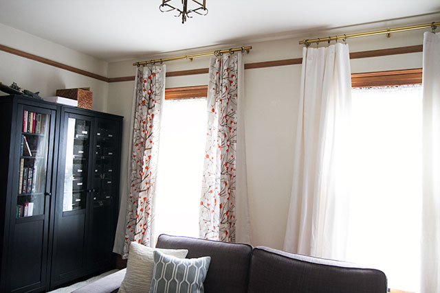
I’d ordered curtain rods for the bedroom and its adjacent room a while back, and I finally got those up a few days ago. Brandon and the kids were having problems with glare on the TV at certain times, so we needed to be able to block some light during the day. I don’t have curtains for the room yet though (because its future is uncertain while we plan the nursery’s location), so I hung a couple of mismatched, too-short curtains.
Were you wondering if this room could look any worse? Ta da! I did it!

The rods look stupid-high in the picture (I’m aware), but they do look all right in context. Or at least I think they will, with matching curtains in the right length, and some paint on the walls. I’m considering painting out that picture rail too, though I haven’t decided yet. It’s in a weird place, it doesn’t align with the others, and it isn’t original. And something is wrong with either those rods or the finials. They’re from the same line but the screw posts are not long enough for the threads to catch. I had the same problem with one of the finials in Eleanor’s room, but I thought it was a fluke (because 3 out of 4 were fine).
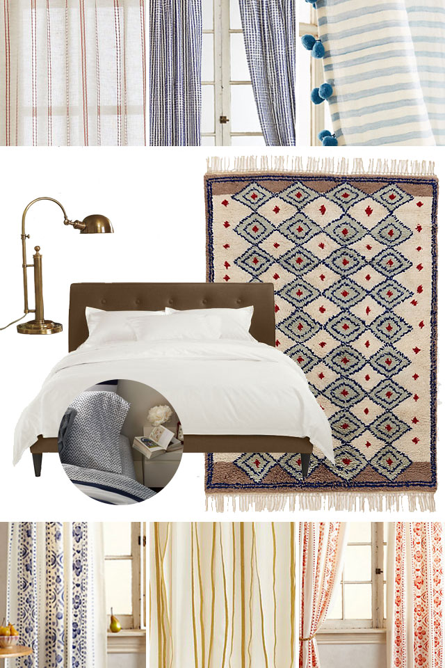
Anyway! The reason I haven’t committed to curtains yet is that if we are keeping that room open to the master bedroom, the curtains should match or compliment each other between the two spaces. A solid color in a slubby, textured fabric could be nice, but then I do love the opportunity to use a good pattern. Here are a few options that would work with the rug and bedding we already have.

top row: 1 • 2 • 3 // center: lamp • bed • bedding • rug // bottom row: 1 • 2 • 3
I may do a pattern in the adjoining room and a solid in the bedroom to keep things from looking too busy, or just go all out with print. What do you think?


Kristen
April 7, 2014 at 1:37 pmWell – the picture rail is what’s killing it for me. I would paint it out for sure. I prefer the solid, light curtain in this room. For whatever reason the decorator’s trick of taking the rods nearly to the ceiling doesn’t seem to work for me in this room. Good luck!
Making it Lovely
April 7, 2014 at 1:46 pmYeah, they aren’t looking so great to me here either. They do look better in the room (versus in the photo), but I’m open to lowering them.
Kerri
April 7, 2014 at 1:40 pmI have to agree with Kristen, the picture rail really blocks up the room, if it matched the wall color, it wouldn’t stick out as much. But, I’m always a sucker for crisp white curtains! :)
Ashley
April 7, 2014 at 1:40 pmI love the curtain rods! Where did you find them?
Making it Lovely
April 7, 2014 at 1:45 pmThey’re the Becket line from Country Curtains. The glass finials aren’t attaching though, so be aware of that issue.
Brooke
April 7, 2014 at 1:43 pmPaint the picture rail up to the ceiling white. Or add crown moulding and paint the picture rail up to the crown moulding white. We have it in our home and it looks awesome. Like an extra large crown moulding. Good luck!
Deb
April 9, 2014 at 9:04 pmYes, paint the walls a solid color, then do the picture rails up to the ceiling white to match the ceiling, then install the curtain rods just below the picture rail. That would look striking!
OR, remove the picture rail. Not sure I’d even paint it if it’s not original and doesn’t add much architectural value, just remove it. Because your furniture style isn’t “picture rail-ish.” If that makes sense.
Marcia
April 7, 2014 at 1:47 pmI agree that the picture rail is visually distracting. Maybe it should math the wall so it would blend in. Patterned curtains would be nice.
Laura
April 7, 2014 at 2:09 pmI love the idea mentioned by Brooke! Creating a crown moulding would look classy!
Charity
April 7, 2014 at 2:51 pmNicole, I keep meaning to tell you CONGRATS on the impending bambino! So, we were BOTH early expecting at Alt this past January…if we only chatted about that we could have drank mocktails together…and downed a pint of ice cream to celebrate. Congrats and keep up the great daily inspiration!
Making it Lovely
April 7, 2014 at 2:56 pmAnd congrats to you, too! Although I was way more into eggs while I was at Alt than ice cream. I ordered big breakfasts every day I was there!
Celeste
April 7, 2014 at 2:54 pmLoving both the red options, though that orange organic stripe would be beautiful, as well.
You’re right about that picture rail… what an awkward placement.
Celeste
April 7, 2014 at 2:55 pmAnd by orange I meant yellow!
jbhat
April 7, 2014 at 3:57 pmWhat if you removed the picture rail? Just a thought. I will defer to your judgment about the curtain selection, but will say that I love seeing the ones you used to have up in the old home’s guest room. I have always thought that that print was perfect. Graphic, cheerful, great colors.
jbhat
becky
April 7, 2014 at 5:24 pmI second removing the picture rail. We had a similar situation in our dining room and removing it made a world of difference.
etta
April 7, 2014 at 6:39 pmI like the yellow striped ones from crate and barrel – that said, I’m on a yellow draped kick having just gotten these: http://www.target.com/p/threshold-tile-window-panel/-/A-14902441#prodSlot=large_1_4
in yellow – they are light and bright and refresh my space!
Leslie @ Oh, the Fun of It
April 8, 2014 at 1:32 pmOh my goodness, so many choices! Excited to see what you choose :)
Emily
April 8, 2014 at 4:02 pmI like the dark blue stripe curtains. They bring the blue upstairs and they’re frilly!
lsaspacey
April 8, 2014 at 6:34 pmFunny, in this instance I think the high curtain rods make the room seem shorter instead of the opposite. Again, it’s because of the picture rail. However, I think the curtain rods should be lowered versus painting over or removing the picture rail. I have a fondness for picture rail as all of my rental apartments would have been better off if the landlords had installed them.
Kathleen
April 9, 2014 at 7:56 pmI love the curtains!!!
xx
http://nikitaandvesper.com/collections/hidden-babe
DawnV
April 11, 2014 at 12:20 pmI like the first curtains in the top row and all of the curtains in the bottom row, although I do think that stripes are better for the bedroom and pattern for the adjacent room. Good luck!
kathryn
April 19, 2014 at 11:33 ampaint the picture rail and use white (or matching) rods. Then they will all disappear. We made rods out of dowels at the hardware store and painted them to match the walls. you can always add decorative finials.