As opposed to the guess I made a couple of months ago. I got so excited when I heard about the Rifle Paper Co. wallpaper collaboration with Hygge & West that it inspired a design plan for the bathroom, but I’ve tweaked it a bit since then and am happier with the new direction it’s heading in.
Before the complete collection launched, only one design was shown: Rosa, in yellow.. After everything became available last week, I ordered samples of some of my favorites and was somewhat surprised when I liked the Rosa pattern in persimmon best. The color is vivid, but it looks great in the room. The plan on the left is the original, and the one on the right is mostly the same, but with a pink bathtub to complement the blooms in the wallpaper.
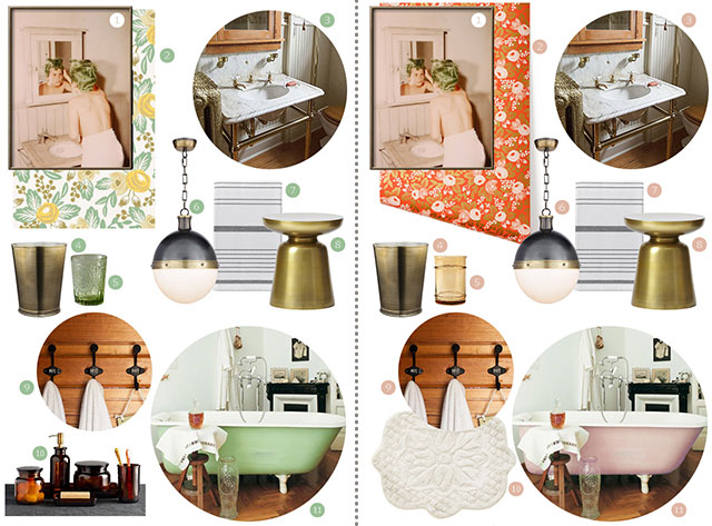
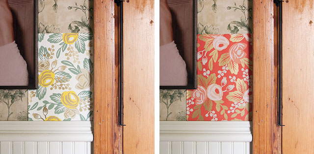
Super cute, but that was the problem. A little too cute. I feel like it would have been a great fit in our first house, but here I feel myself pulled in a different design direction. While at the Merchandise Mart yesterday to pick up a gallon of paint, I stopped in several showrooms to look at wallpaper. After trying out some new pattern samples, here’s where I’m at with the design now.
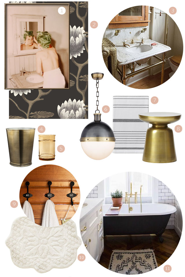
Sources: 1 • 2 • 3 • 4 • 5 • 6 • 7 • 8 • 9 • 10 • 11
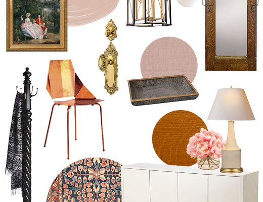
The paper is Summer Lily in black, white, and bronze from Cole & Son. I had the brass stool from the last house, and I’ve already added the trash can, bathmat, art, and two of those striped hand towels to this bathroom. The hooks were added semi-recently too, so the only things I would still need to change are the color of the bathtub, the light, and the wallpaper.
I painted the pedestal tub in the last house dark grey, and here I think black will be fantastic. The Hicks pendant may wait a bit because I’m going to give the old light from Eleanor’s room a try first. It isn’t bad, and it’s free. The biggest expense will be from the wallpaper, and even that will only be a few hundred dollars since we can hang it ourselves. The cost is worth it for such a big impact.
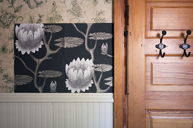
The bathroom could have waited (truly, it didn’t bother me much), but I feel like this is a good area to take on right now because the finish line is easily within sight. Timing though, may get tricky. The wallpaper has to be ordered, and then I’m leaving soon on a trip. When I get back, I’ll be about six months pregnant and while I hung wallpaper at five months along before, that was back when I was a spry young whippersnapper and I’m not sure if I’ll be physically up to it a month from now. Hopefully, but I only started feeling better recently and it may be a short window.
Anyway, I’m curious about how you like the wallpaper. Do you? It’s got that ugly/pretty thing going on that I tend to like, but I have a feeling a lot of you would prefer the cute Rosa pattern (or something else)!



cathyv
June 5, 2014 at 12:32 pmI love the Summer Lily. I think it will look awesome in your bathroom. It definitely brings a bit of “elegance” to the space and your house can handle that look. Good job.
Sarah
June 5, 2014 at 12:33 pmI realllly like the Summer lily! More than the others, actually. I think it feels more sophisticated and grown up. The rifle paper ones are cute, but I think the black and white suits the aesthetic of this house better.
Making it Lovely
June 5, 2014 at 2:10 pmA much better fit for this house.
BLAIR
June 5, 2014 at 12:39 pmanother vote for summer lily! i think it’s beautiful.
Tara
June 5, 2014 at 12:52 pmI like the Summer Lily the best of the 3 mood boards. Looks elegant and classic and I love all the gold/brass accessories with it. I might choose a different bath mat – from the mood board alone, it looks a bit granny. And – have someone wallpaper it for you! A little “push present” if you will. Looks great!
Making it Lovely
June 5, 2014 at 2:12 pmThat’s good justification for hiring the installation out! Though I will disagree on the bathmat. It’s large, plush, and wonderful, and I think it’s pretty cute. ;)
Caroline
June 5, 2014 at 12:54 pmThe Summer Lily is gorgeous. If you use that in the bathroom and the Chiave in the dining room, I am going to have a SERIOUS case of wallpaper envy.
Making it Lovely
June 5, 2014 at 2:14 pmSorry to do that to you, but that’s the plan!
Lyndsey
June 5, 2014 at 12:55 pmI love Summer Lily too, i think it makes the color of the wood pop more than the other wallpapers.
I love that you described yourself as liking ugly/pretty- i’m the same way, but didn’t have a good phrase to describe it until now! Thanks!
mercedes
June 5, 2014 at 12:55 pmIs that your bathroom or the kids’ bathroom? I think it looks great for a grown up bathroom but, in my opinion, it is too dark and formal for little kids…
Making it Lovely
June 5, 2014 at 2:15 pmIt’s the only bathroom on the second floor, so we all use it.
Sarah
June 5, 2014 at 1:00 pmI love it!
Kim
June 5, 2014 at 1:01 pmPretty! It reminds me a lot of the Cupcake and Cashmere powder room! http://cupcakesandcashmere.com/decor/powder-room-makeover
Making it Lovely
June 5, 2014 at 2:21 pmI saw that when it was making the rounds! So pretty. I reread the post with sources and materials, and it’s funny — they were trying to find antique brass fixtures and a marble console, which is what’s in our bathroom. It’s great… except for the seashell-shaped soap dish that’s carved into the marble.
Anya
June 5, 2014 at 1:01 pmI like the Rosa in persimmon, personally. However, I can see that you are moving more into darker colors in the design of this house, like in your living room, so the Summer Lily fits better in with that design. I’m sure it will look lovely once its all put together and the whole house is more cohesive. :) Good luck wallpapering!! :) and safe travels!
Making it Lovely
June 5, 2014 at 2:22 pmDefinitely moving toward darker colors here. Black stands up so well against all of the wood, and I like the drama.
Amber @ Wills Casa
June 5, 2014 at 1:15 pmI loved the Rosa in persimmon, but I didn’t order a sample because I knew it would clash with our rug. It does look great in your bath. Not to be stuck on Rifle…which I kinda am…but what about the peony paper she has? The blue and copper is super pretty. The yellow and green would be similar to the Rosa.
I do like the Summer Lily option too. Obviously I’m a fan of floral wallpaper. Also you are still a young whippersnapper!! It’s just wallpapering while keeping up with both kids AND being pregnant.
http://www.willscasa.com/2014/06/wallpaper-love-rifle-paper-co-hygge-and-west/
Making it Lovely
June 5, 2014 at 2:31 pmI have a couple samples of the Peony design, too. I’m not crazy about it in the bathroom here, but it looks like it will be great in your house!
Katie
June 5, 2014 at 1:20 pmI love the newest wallpaper option. I think I am torn between the first and the last. I can see why persimmon was attractive, but it seemed overpowering. I don’t think there is anything that you’ve ever done that could be described as overpowering. Fun? yes. Classy? yes. Overpowering? no.
It’s going to be one classy baño.
Allison
June 5, 2014 at 1:26 pmThe Summer Lily paper reminds me of illustrations in a classic/wonderful children’s book. I can’t put my finger on which one, but in any case, I love it!
Nichole K
June 5, 2014 at 1:33 pmNow that you mention it, it’s a little “Where the Wild Things Are,” no? I don’t think that’s a bad thing, though!
The black/white/wood/brass thing you have going on in the third mood board will be stunning. I’m too chicken to be so bold. :)
Nikki
June 5, 2014 at 1:35 pmI think any of those options are gorgeous! I do have a question regarding wall paper in a bathroom. Do you foresee any issues with the steam causing the wallpaper to peel? I would love to use wallpaper in our bathroom, but it is a very small room, and I worry that the steam from the shower would cause the wallpaper to fall off over time. Any tricks against that?
Making it Lovely
June 5, 2014 at 2:40 pmThere’s no shower in the room — just a tub. The downstairs bathroom has a large shower though and is also wallpapered, and we’ve had no issues. I know steam is a wallpaper removal option, but that’s really more of a process of holding a steamer directly against the paper, then scraping. As long as the wallpaper won’t be in direct contact with water splashes, I think you’d be fine.
DawnV
June 6, 2014 at 9:38 amThis is actually a problem, in my experience. For instance, in my mom’s house, the wallpaper is peeling (after 15+ years) proportionally to how close it is to the shower. But it may be that some of her lovely children neglected to turn on the venting fan when showering over the years…sorry, Mom.
Anu
June 5, 2014 at 1:35 pmSummer lily somehow fits in really nice as long as there is natural light in the bathroom (which from the pics there seems to be light from a window)! The custom bookcases in the library though look fantastic!
Making it Lovely
June 5, 2014 at 2:32 pmThanks! And yes, the bathroom gets plenty of light from a large window.
Shana
June 5, 2014 at 1:37 pmIt reminds me of Edward Gory illustrations, lovely. There is a trend of large scale, black background, floral wallpaper in bathrooms right now, but I think that the lily wallpaper is not as sweet as what most are doing. I mean that in a good way, no need to do it just like everyone else!
Shana
June 5, 2014 at 1:40 pm*Gorey
Making it Lovely
June 5, 2014 at 2:42 pmIt is a bit reminiscent of Edward Gorey! Love that. I’m less drawn to cute/sweet/twee than I was 5-10 years ago. I’m pretty excited about the way this house is starting to shape up.
stephy
June 5, 2014 at 1:40 pmOh am I SO GLAD you’re going to be redoing the bathroom! We have a folk Victorian house and I want to decorate the downstairs half bath (and eventually do the upstairs full bath) in a style that would fit with a house built in 1903 while still being modern and updated… and I’ve been scratching my head as to what that would entail.. thanks for doing the heavy lifting for me ;)
Making it Lovely
June 5, 2014 at 2:44 pmMost of my favorites (if you’re looking for wallpaper options) are from Cole & Son right now. Glad to be doing the heavy lifting here!
Stephanie
June 5, 2014 at 2:08 pmI love the scale of the one you picked. Can’t wait to see the completed room! I think someone else may have asked…do you foresee any problems with wallpaper in a bathroom with a shower? How do you know it won’t peel/buckle?
Making it Lovely
June 5, 2014 at 2:43 pmI did answer a similar question above, but there’s only a tub in this bathroom — no shower.
Mrs Limestone
June 5, 2014 at 2:51 pmI love the summer lily. Whimsy is great but when it comes to wallpaper, you dont want to be bored of it in a year.
Stefan
June 5, 2014 at 3:17 pmSummer lily! Love where you are starting to go with this house. It is unique and interesting. It is fun to watch it evolving. Never thought I was a wallpaper person but can’t wait to see the wallpapers up. I might reconsider.
Whitney
June 5, 2014 at 3:52 pmI, too, have a lot of natural wood features (trim, doors, stair rail, kitchen cabinets…) in my house. Seeing what you have done with yours, the way you work with it with color, is so inspiring! I love everything you have done. :)
Katie @ Red House West
June 5, 2014 at 4:13 pmThe Cole & Son paper is amazing! I love the large scale of the print and – what’s a word to describe something that falls between whimsy and haunting? – I’m drawing a blank, but it’s in a perfect place on that spectrum. I think your gut is telling you right — the persimmon would be lovely, but with the wood and wainscoting runs the risk of looking sort of country (even though it’s not, in and of itself). Love the black with the wood!
patty blaettler
June 5, 2014 at 4:15 pmI love ugly/pretty!!!
DDU
June 5, 2014 at 4:16 pmCool paper! It looks like something from Maurice Sendak’s bathroom. Best wishes!
kate
June 5, 2014 at 4:31 pmI like the Summer Lily, and it reminds me of Edward Gorey.
Tina
June 5, 2014 at 4:33 pmI am obsessed. I think the “cute” ones you will get tired of. This is very classy, while at the same time still a little whimsical. I love how you pull all of this together and take risks! Very inspiring!
Julie
June 5, 2014 at 5:31 pmI love the summer lily, and I love the black/neutral/brass combo. Love seeing how your tastes have evolved and how you’re putting together something I never would have thought of.
Sarah
June 5, 2014 at 5:41 pmI love the black! The print is fab too. I love the play on waterlilies in the bathroom too. I actually didn’t care for the Rosa print – something about the color scheme in each sample didn’t really do it for me. Can’t wait to see it finished!
emily
June 5, 2014 at 7:45 pmdefinitely a moodier choice, but more grown-up. I think it really modernizes your wood tones in the bathroom.
Samantha
June 5, 2014 at 8:31 pmYou can totally wallpaper at 6 months along. I was about 36-38 weeks when I wallpapered a friend’s wall with my first. Then with my 2nd I was well past 6 months when I papered my bedroom wall.
The wallpaper is amazing. Love the black and the lillys.
julie s
June 5, 2014 at 9:18 pmI don’t see any ugly — only pretty! I love the direction you’ve chosen!
Nancy
June 5, 2014 at 9:28 pmLove the summer lily, so lush and elegant! That white and black rug in #11 would look fantastic!
Clever Girl Reviews
June 6, 2014 at 12:48 amI really love that stool. I’m trying to get my husband on board for the very same one but he hates it! I think it might be grounds for divorce :)
B.Z.
June 6, 2014 at 2:44 amExcellent choice. You should definitely check out the Sanderson wallpaper selection. http://www.sanderson-uk.com
Molly Stone
June 6, 2014 at 3:17 amWhat about gold for the pedestal tub? I think it would give fancy but not pompous look of the the bathroom. And it would fit the gold handles of the commode and the faucet.
Tory
June 6, 2014 at 6:20 amI love the dark, moody look of the wallpaper. I am really drawn to the look of homes with old, wonderful moldings and fixtures but all the decor being really modern. What will you do to the beadboard? Keep it as is or go really dramatic with black?
Peggi
June 6, 2014 at 7:11 amNicole, the Summer Lily is dreamy! I know you don’t need another idea at this late date, but have you seen Trustworth papers? The Bat & Poppy is my definition of ugly/pretty! I keep trying to “see” it in my 1940s Cape!
The bathroom will be glorious. (And if you’re hangin’ wallpaper at 6 months pregnant, you’re a goddess!)
Norma
June 6, 2014 at 7:36 amGlad to see that you already have the bathmat … I clicked on the link and it is now ‘no longer available’.
Amy
June 6, 2014 at 9:04 amI can’t help it, I love the green rosa print. I love the accessories you finalized though! Good luck!
Emily
June 6, 2014 at 9:50 amI really like the design with the mint green bathtub! That is my kind of color palette. But I do like the drama of the black design. And I think you’re right that it will look great with the wood. Good luck getting it done!
Jo
June 6, 2014 at 10:09 amI like it, ESP with the brassy/gold in the room
HollYo
June 6, 2014 at 10:52 amthat persimmon, though….<3 <3 <3
cat
June 6, 2014 at 11:40 ampersonally i would go for rifle’s ebony pineapple in this space.
Judy H.
June 6, 2014 at 11:29 pmI like the Summer Lily, though I think I would tire of it easily, perhaps tire of the darkness. I think the persimmon is lovely.
Jessica Dellow
June 8, 2014 at 8:44 amI love the black wallpaper – I think the Rifle florals would look too twee. What type of flooring do you have in this bath?
Courtney
June 8, 2014 at 10:20 amThe new wallpaper is awesome!! I am loving your new direction!!
Mona
June 9, 2014 at 3:34 pmThe Summer Lily is stunning and it goes so well with the brass. I think it’s elegant and timeless. Go for it!!
Decorators Best
June 10, 2014 at 9:33 amAbsolutely love the Summer Lily, it helps to accentuate all of the brass fixtures you have in the bathroom! That’s a must!