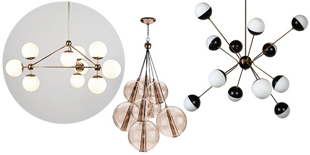
My taste in lighting runs toward the OMG-how-much!?, so finding new fixtures for the double parlor was not a pressing issue. Oh, there are plenty of lights I like — finding those is no problem! Finding lights that I’m crazy about and can afford? Not as easy. I love these…
-
Roll & Hill’s Modo Chandelier, 3-Sided, 10 globes, milk glass and brass finish, $5850.
This one has been on my mind for years. (It’s in the huge lighting roundup I did a few years back.) There are knockoffs for less, and other more affordable options that took pretty liberal inspiration from this design, but it doesn’t feel right to go for those. -
Caviar 8 Light Cluster Pendant, Large, Rose Gold, $4032 (or a mere $3780 for the non-adjustable version). Pink! Rose gold! I can’t spend that much on a light (times two)!
-
Pretty Much Every vintage Stilnovo light on 1st Dibs. Beautiful! Perfect! Price upon request! (Never a good sign.)
-
Roll & Hill’s Modo Chandelier, The Future Perfect ($5850)
So perfect, but I can’t. -
Pelle Chandelier – Gooseneck, West Elm ($799)
Am I being too picky? It is the best option under $1000. -
Bistro Globe Milk Glass Burst Chandelier, RH Modern ($1765)
Very cool. Slightly too fifties for my liking. A little too expensive too, but can be had on sale. -
Modern Globe Pendant, Circa Lighting ($2100)
More classic than I was initially considering, but isn’t it lovely? Not in the budget right now, but I could stretch and save for it. Except it doesn’t play as nicely with the dining room fixture as the others, so then that would need replacing too. -
Medium Glass Balloon Chandelier, Shades of Light ($1590)
I like it a lot but I don’t think I love it. And for that much, I need to love it.
There are certain things that I think are worth the splurge, and lighting is one of them. It’s not in my budget to splurge quite that much when we have rewiring and repairs and other more pressing needs in the house though, so I’ve held off. I’m always watching the new collections in stores, waiting for a light to come out in my price range that I loved enough to buy times two for a matching set, and I figured that maybe my lights-to-be weren’t out there yet.
Then the Gooseneck Pelle Chandelier came along from West Elm. Whoohoo! I thought we may have had a winner! $799, but it was on sale for a while at $639. I love the shape. I prefer polished, unlacquered brass over brushed or satin, but I liked the finish enough to go for it. And no bare bulbs! I’d been hoping to find something with milk glass, but the frosted glass was pretty close.
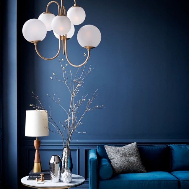
Then when I saw the fixture in person, I didn’t like it as much as I’d hoped I would. There is a texture to the glass that I’m not into (and that I suspect would collect dust), and they had a cool white cast vs. the warm ivory I prefer. So now I’m on the lookout again. I don’t want to put a light in just because it’s better — I want to find something that’s going to be amazing.
And then I went and spent all my extra dollars on a pair of sconces instead anyway! (I bought them with a trade discount, but still.) They should arrive this week, along with some hardware for the doors along the base of the bookshelves.
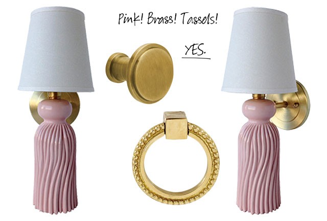
We’re putting so much into this house — time, effort, money — that I’m trying to step back and really think the more permanent things over before I bring in anything else that I’m not completely in love with. Carved wooden tassels, painted pink? They’re probably not for everyone, but I’m so ridiculously excited about them. They’re going to be the awesome necklace to the unadorned outfit that is my oak-oak-oak library.
Now if I could just figure out the chandelier/pendant/whatever situation. Want some mockups? Ahoy! (Ignore the weirdness along the base of the bookshelves. I Photoshopped out four chairs.)
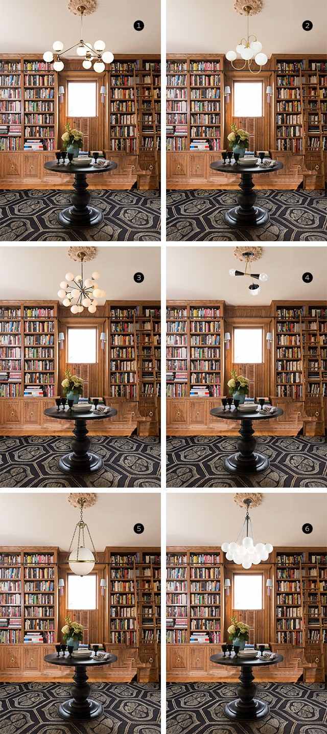
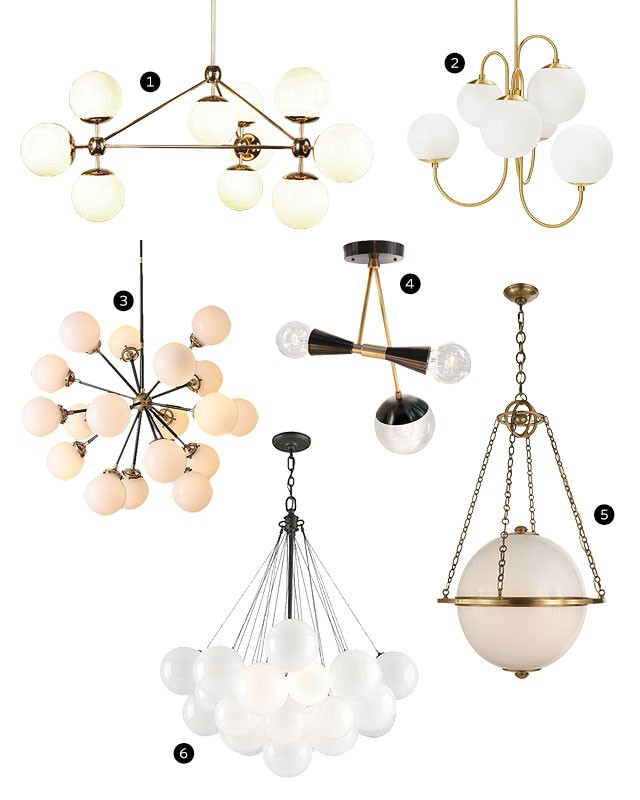
Well, there we go. That’s the vision. Eventually the room will match what I see in my head for it, whether something else comes along or I save up for one of the options above. What do you think? Have a preference? Or better yet, a recommendation for something else that I haven’t seen?
p.s. Here’s the rug in the mockup. Sold out in the larger sizes, but on clearance if you’re looking for a cute small rug.


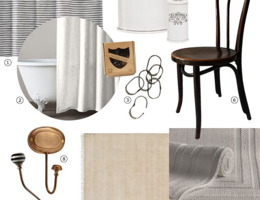

Lisa
November 16, 2015 at 2:59 pmI’m with Brandon on #4. #5 is nice, but in the mock-up it looks a little under-scaled in the room, I think the ones with more volume look more proportional.
Making it Lovely
November 16, 2015 at 10:05 pmThere will be two though, between the two rooms. Which makes me think that maybe the others will be too much and a globe pendant would be the better choice?
sarah
November 16, 2015 at 3:05 pmIt’s so much fun to see these rooms come together :)
At first glance I’m liking mock-ups 3, 5, and 6. The modern feel of both 3 and 6 could be a nice contrast to some of the more traditional elements of the room (but on the other hand, it’s also hard to say whether they might be too modern…?)
Number 5 is lovely, and appears more traditional without going super old-fashioned. The only caveat with that one is the scale–it’s hard to tell if it would be too small for the space.
All beautiful options in the end, though!
Making it Lovely
November 16, 2015 at 4:55 pmWe have a Circa Lighting store in Chicago, so I would go check it out in person, but the size of it is quite large (24″ diameter).
I’m also eyeing the Hood Pendant from Rejuvenation but I have the same reservations about scale. Much more affordable though!
Heather
November 16, 2015 at 6:23 pmI vote for the Hood! It would look simple and classic, yet lovely. You certainly have a lot going on in the first floor of your house and this light would be a nice touch! Buy it!
Rachel
November 16, 2015 at 3:07 pm#s 2, 5, and 6 do a lot to breakup the myriad of horizontal and vertical lines in the room, without adding too much visual symmetry. Of them, I like #2 the best. I wonder if it’d be possible to swap out the globes for a different option. Lighting stores generally have replacement globes, and assume the opening isn’t too terribly out of the ordinary, they might have some on-hand/would be able to order them.
Megan C.
November 16, 2015 at 3:34 pmHave you tried Etsy? I bet a shop like this will make the chandelier to your specifications: https://www.etsy.com/listing/247348834/modern-chandelier-chrome-polished-nickel
Kristina
November 16, 2015 at 3:39 pm5 is my fav for the space!
Kelly
November 16, 2015 at 3:41 pmFun post!
I actually like the West Elm one (#2) the best by a mile in terms of scale and style. I agree that maybe just changing out the globes with a warmer, smoother version may be the best (and cheapest) way to get exactly what you want (or at least close enough).
Kim
November 16, 2015 at 3:41 pm#4 – no way. Looks too modern especially against the built-ins.
I didn’t have much of a reaction to any others UNTIL I saw #5. It seems to be framed by the nook between bookcases perfectly and doesn’t overly obstruct views. Wonder if you could find something similar with a more common spherical globe and have a glass maker swap out for the egg shape in a more budget-friendly manner.
Mary
November 16, 2015 at 3:46 pmI like #1. All of them look good, but that one is my favorite.
Tracy
November 16, 2015 at 4:02 pm#3. Swoon.
Sara Rose
November 16, 2015 at 4:05 pmI had a tough time because none of them have the coziness that I would prefer in a library but for the space – my top picks are 3 or 5. 4 is vile. The others aren’t actually good enough for trying so hard.
Chelsea T
November 16, 2015 at 4:23 pmWell, since #1 is completely out of consideration due to price…I’m really digging 3 or 6. I love the organic, but still symmetrical feel to both of them. Really not into #4 – too bitsy for this space.
Marieke
November 16, 2015 at 4:29 pmhttp://www.fonq.nl/product/zuiver-multishine-hanglamp/143971/
http://www.fonq.nl/product/het-lichtlab-no-3-hanglamp/141270/
Some way cheaper european choicest
kim
November 16, 2015 at 4:34 pm$6 – the scale is good. Its modern without being sputnik-esque. I know the ‘nikies are having a major moment but I fear they are going to look flea market in a few years and everyone will get rid of them (again!). Clean geometry is timeless.
Making it Lovely
November 16, 2015 at 10:11 pmGood point.
Nicole M.
November 16, 2015 at 5:01 pmHave you looked at Rejuvenation? The Hood (http://www.rejuvenation.com/catalog/products/hood/configurations/old-brass-with-12in-opal-shade) reminds me of #5, but a smaller scale … Or Lucent Light shop on Etsy (https://www.etsy.com/shop/LucentLightshop) has some beautiful alternatives to #3!
Making it Lovely
November 16, 2015 at 5:03 pmI just replied to an earlier comment that I was considering the Hood Pendant! Much more affordable. There is an 18″ diameter option that could work. I need to find/make something round with that size and see if the scale would be right. And Lucent — I remember their lights from Little Green Notebook. Jenny had them make a gorgeous Sputnik-inspired piece and a couple of sconces. Thanks for the reminder!
Nicole M
November 18, 2015 at 7:35 pmOMG … Have you seen Restoration Hardware’s new Modern lighting line!!
Jane
November 16, 2015 at 5:52 pmThis is a fun post. But I am not sure that the sputnik style hits quite the right note, for me, with this space.
Kind of in love with this one.
http://www.shopcandelabra.com/broche-chandelier-antique-gold
Although might like it better if it were a color, rather than gold–or even black. I think you may want to consider tying the lighting in with the black secretary or table.
Making it Lovely
November 16, 2015 at 10:11 pmThat’s pretty.
Katie
November 17, 2015 at 6:53 amI love that chandelier! It could be a show stopper in the library.
Out of the choices I love 1 and 6, 1 cause…its just perfect. But as far as scale 6 fills out the space nicely and gives your eye a reason to look horizontally vs. Just vertically (I hope that makes sense)
Rachel
November 16, 2015 at 5:56 pmTough choice. I would go with either #1 or #5. Good luck!
Alison
November 16, 2015 at 6:11 pm#3! For the size and the colour. I wouldn’t get as excited as you about pink tassel sconces (though I’m very pleased someone makes something that so tickles your fancy!) but against the image of the library I totally appreciate that pink blush.
Making it Lovely
November 16, 2015 at 10:13 pmYou know, this may be my favorite response from someone about an item that I like and understand is not to everyone’s taste! Thank you.
Heather
November 16, 2015 at 8:01 pm6 all the way.
manuel navarro
November 16, 2015 at 8:25 pmhave you tried:
http://www.lambertetfils.squarespace.com/
or
http://www.parkstudiola.com/store/
Making it Lovely
November 16, 2015 at 10:14 pmThere are some amazing choices in both of those. I added a few to my lighting board on Pinterest, but I don’t think they’re right for the space.
Lyndsey
November 16, 2015 at 8:45 pmI would do 5 for sure. But they are all very nice.
Wilma
November 16, 2015 at 9:25 pm#3, or #5
Cindy
November 16, 2015 at 9:26 pmOooh! I like 3 or 5… good luck!!
Sue
November 16, 2015 at 9:29 pm#5 is the “only” choice–traditional without being old fashioned and breaks up the bookshelves nicely. If you wanted to use #5 or the Hood Pendant (from your comments) in a series of 3 hanging from various lengths, that would be lovely–especially since you liked the multi-globe look. (Shown on various looks on Rejuvenation link… http://www.rejuvenation.com/catalog/products/hood/configurations/old-brass-with-12in-opal-shade
Making it Lovely
November 16, 2015 at 10:15 pmI do like the cluster of three in their photos, but I want something that will work with the ceiling medallions.
Anna
November 17, 2015 at 12:24 amI love number 1.. but that price, eek! Number 2 or number 5 are my next picks.
Nicole
November 17, 2015 at 1:37 amI really think that number 5 works the best in the space and 6 could also be a contender because the mass of white balances out the other elements in the room. Visually, the books take up a lot of space since there is no open space on the shelves and the colors are a bit chaotic and I think that some of the other lights have a hard time competing with this. The grain in the wood is also a bit distracting and you need the other elements to be simple, in contrast. I think that if you want to make the room more edgy, hang a piece of really modern/ graphic art. As much as I love that first lighting choice, it feels like the wrong space for it.
Making it Lovely
November 18, 2015 at 10:25 amTrue. There’s a lot going on, and a lot of these will only add to it. It may be better to save the big! statement! lighting! for another spot.
Peggi
November 17, 2015 at 5:50 amI bet those pink tassels will make you smile every time you see them- priceless! As to the chandelier sitch, I actually love #4, but maybe not for this room. I do like the black that it adds. What about smoky glass replacement globes for the West Elm light? Maybe a little Lindsey Adelmanesque? So many choices…so much money! No wonder lighting is tough. Your amazing patience and exhaustive research will pay off. Can’t wait to see your ultimate choice.
Making it Lovely
November 18, 2015 at 10:27 amI know — I’m secretly planning on maybe #4 for the closet? Gotta pass that one by Brandon. I don’t think he hates it, he just doesn’t want it for those two rooms.
Sarah @ onesuchlife
November 17, 2015 at 8:51 amI vote #3 if budget isn’t a concern or you can grab it on sale. The price of #4 is amazing, but I don’t think it fits the space well.
Andrea Jane
November 17, 2015 at 9:24 amI’m more a traditionalist so I’m drawn to #5 myself. I agree with the other poster that said the sputnikish ones may look dated in a few years. But then if you love that style who cares. Put up something low cost while you are saving up for the one you really want.
Making it Lovely
November 18, 2015 at 10:28 amThey will likely look dated, and I don’t think I love them enough to commit to the style. #1 may fall to the same fate, but I love it and wouldn’t care.
alice
November 17, 2015 at 9:44 am#5 has my vote. I feel as though when decorating a home, not every piece of furniture/light fixture/art piece/decor item has to be a statement. #5 feels like an updated version of something that could have been an original and doesn’t compete with the overall look of the room. The scones add some whimsy, the carpet has pattern, the books add texture and depending which way you go with additional furniture it could add up to be A LOT of look (and not in a good way). #1 is nice, BUT for a mid-century modern home.
Making it Lovely
November 18, 2015 at 10:32 amI think you may be right (thanks). I’m going more in the direction of #5 now for the two rooms.
tracy
November 17, 2015 at 9:50 amHi Nicole,
CB2 has this option that I ordered — still waiting for it to arrive but it might be fun in your library:
http://www.cb2.com/vega-flush-mount-lamp/s446132
Kirsten
November 17, 2015 at 11:17 amI got this one too! I’m hoping that it looks good when it arrives!
Making it Lovely
November 18, 2015 at 10:22 amThat’s a great light. Too near the ceiling for my needs, but I hope you both like it when it arrives! I’d love to see.
Andrew
November 17, 2015 at 11:14 amSuch great options! I put up a Modo knock off from Lightology up in our condo, and was so sad to leave it. It was still about 1,000 as I recall. In our new kitchen we just put up the small bistro chandelier from Circa (same one as RH, but cheaper with trade pricing from Circa) and we LOVE it. The small or medium one in black/brass/milk glass would look fabulous in that room depending how much height you have, and maybe not so fifties as the burst?
http://www.circalighting.com/details.aspx?pid=5644
Making it Lovely
November 18, 2015 at 10:36 amI saw that one too. I like it, but I don’t think it’s the right choice for me. I had to go find it in your place though because I didn’t remember seeing it, and it’s fantastic!
Tina slocum
November 17, 2015 at 1:56 pm#1 is the cat’s pajamas! It’s not symmetrical on each side, which makes it interesting. The chandy looks beautiful from a horizontal and vertical perspective. Total love!
#6 is my second fav as it’s fun yet fits in with your decor.
Both are beautiful, without being “staid” and traditional. You have a fun, young family and I love how you keep your home with that in mind.
Kim
November 17, 2015 at 5:18 pmI have the same tast in lighting as you! I own the Edison chandelier and the mobile one from West Elm. I’m favoring #2 because of the slight Victorian feel of the gooseneck and the brass finish will go with your new sconces and knobs. Plus it’s so reasonably priced they won’t kill your budget and will make a nice impact in the room. Splurge on new globes down the line but you could go with colored light bulbs for the evening ambiance or maybe find an opalescent spray paint for the globes, experiment on a small globe and try all kinds of different finishes. Just a thought. :)
Holly
November 17, 2015 at 9:05 pm#5 is my favorite!
Kathleen
November 17, 2015 at 10:47 pmThe caviar cluster is on joss and main today
Making it Lovely
November 18, 2015 at 10:19 amAt 1/3 the price! Tempting!
Miriam
November 17, 2015 at 11:45 pmHave you looked at some of the Jonathan Adler chandeliers?
Making it Lovely
November 18, 2015 at 10:20 amYes, and they’re gorgeous. I had a few JA flush mounts in the last house and they were great. I think all of his lighting is made by Robert Abbey.
erin @ thh
November 18, 2015 at 6:50 am#3 and #5 are my favorite…can’t wait to see what you end up putting in there!
Ally
November 18, 2015 at 8:53 am#1 of course! Ka-Ching.$$$
Alison
November 18, 2015 at 10:29 amI really don’t like #4. I am also not a fan of #1. I like 2, 3 and 6. Number 5 is OK, but I don’t see it as your style. It is a little too traditional/stodgy.
Making it Lovely
November 18, 2015 at 10:37 amBut there’s something I like about working within a traditional shell and bringing in fun colors/patterns/etc. around it.
Erica
November 18, 2015 at 11:15 amWell, I love #1. It’s big, and it is a statement, but it’s somehow calming to me and to me and I don’t think it competes with the books and other things in the room. If there are two in the room, maybe you can find a smaller complementary one.
I totally feel ya wanting these lights though. I’m also the person who looked for 5 years for an entryway light, and I’m glad I waited cause I found the perfect one that was in my head.
On the other hand, I also loved a $10,000 chandelier for my dining room and finally forced myself to just back away, that was insane!!
For a totally different look, here’s one I like that comes in a few sizes:
http://www.lumens.com/canto-25689-25690-chandelier-by-eurofase-uu489370.html?utm_medium=rem&ad_id=buysight&utm_campaign=buysight&utm_source=buysight
I am sad because all my lighting is done now. Thanks for giving me a fun project to think about!
Erica
November 18, 2015 at 11:18 amPS there is also this place in Chicago that does custom, prices don’t seem to be so bad:
http://www.hangoutlighting.com/collections/everything
Ellen
November 18, 2015 at 11:35 amI like #1 and #5, but once you said there were two, I’m leaning more to #5. I think #5 will repeat better. I also think you could find something similar to #5 at a slightly lower price. Have you looked at Restoration Hardware? This one is on sale for $619: https://www.restorationhardware.com/catalog/product/product.jsp?productId=prod6430233&categoryId=cat3850076
They also have a collection of milk glass pendants at a similar price: https://www.restorationhardware.com/catalog/product/product.jsp?productId=prod2680101&categoryId=cat3850076
#1 is stunning and I know that it is quality and gorgeous having seen it in person but unfortunately the cost reflects that!
Jodi
November 18, 2015 at 3:51 pm#1 looks so amazing!!! start a savings fund!
Mirela
November 18, 2015 at 4:19 pmI agree, the Roll & Hill’s Modo Chandelier looks amazing! But maybe rather over the dining room table…just thinking. What about the Mobile or the Waterfall chandelier from Westelm?…again, just thinking…Good luck!
Stephanie
November 19, 2015 at 6:02 amI’m typically all about the mix, but something about #5 really speaks to me in this case. I think it’s traditional but not so much as to be boring. It holds its own yet doesn’t compete with some of the other more modern things you’ve done. And the bookshelves are pretty busy and the pendant is fairly simple, so it works against that backdrop.
Christine Hart
November 19, 2015 at 6:39 amPossini Euro Design Glass Sphere 15-Light Pendant Chandelier at Lampsplus.
Erica
November 20, 2015 at 8:33 amOne more…from Noir, maybe you can get discount pricing direct, this is retail for $885.
http://www.bluehandhome.com/larenta-chandelier-antique-brass/
lauren
November 20, 2015 at 12:40 pmHello!
I love Roll & Hills Chandelier, you are right it is so perfect but that price is a little much…I have seen a very similar one for a cheaper price here: http://www.shopcandelabra.com/candelabra-home-celestianna-chandelier
Just thought I would point it out!!
Erin
November 20, 2015 at 2:34 pmThis Etsy shop is quite reasonably priced & has a few fixtures along those lines! Looks like they do custom work, too.
https://www.etsy.com/shop/LucentLightshop
Andrea
November 20, 2015 at 8:23 pmDid you look at the Staaggered Glass Chandelier from West Elm?
Lindsey
November 22, 2015 at 3:44 amOh my goodness. you might have already made up your mind but I was searching for mid cent mod….for my mid cent-outdated home. I found a chandelier you might like…
http://www.dotandbo.com/collections/beneath-the-northern-lights/celestial-galaxy-pendant
and its one sale. $1929 to $799? that doesn’t hurt.
Veronica
November 24, 2015 at 12:50 pmI would go with this one, and it’s less than $500. Just saying.
http://www.shadesoflight.com/midcentury-modern-mobile-chandelier-6-lt.html
Jodi
December 10, 2015 at 8:33 pmI was walking by the Mitchell Gold + Bob Williams showroom in Soho the other day and saw this one in the window and thought of you!
http://www.mgbwhome.com/SAVOY-CHANDELIER-VINTAGE-BRASS-SMOKE-GLASSBRavailable-online-and-in-stores-P11813.aspx
New Lighting in the Library | Making it Lovely
December 15, 2015 at 10:29 am[…] showed you some of the replacements I had been considering a few weeks ago. The library and living room are open to each other and I wanted their lighting to […]
Lzecchino@gmail.com
April 6, 2016 at 11:39 amWhich of the light fixtures did you go with? I am also considering one of your choices…. Looks a very similar to the Library at The Ham Yard Hotel in London. It’s gorgeous and I’ve been searching for that same chandelier or at least close to it!
Making it Lovely
April 6, 2016 at 11:50 amI ordered two Hood Pendants from Rejuvenation — similar to #5 above, but less expensive. Update post here.