I was looking at my fan deck, eyeing the pinks and thinking about how many colors I’ve used over the years. Most of them have been a success, but there were some definite misses. Let me recount a lesson I learned in 2006, pre-blog.
Before we bought our first house, Brandon and I lived in an apartment with a very permissive landlord when it came to paint colors. It was great! We were in our early to mid-twenties with free reign to choose whatever colors we wanted to live with. The living and dining room were purple! The second bedroom was dark blue, and later as my office/studio, pink! Not every room was crazy — I painted the bedroom a creamy white, and left the kitchen and bathroom beige. But then there was the back room. It was kind of a mudroom that had been created when the house, formerly a single-family home, was split up into apartments with separate front and back entrances.
 I had the great idea to paint that back room hot pink. It was a pass-through, not an everyday living space. Let’s have fun with it! Be bold! So I painted it, finishing up at night, and it wasn’t until the next day that I realized what an awful mistake it was. On a bright, sunny day, light flooded the room and the entire space glowed pink. It shone its bad-taste aura into the adjacent kitchen, making itself known anytime we so much as went to get a glass of water. I think we lived with the room like that for a week before I had my next brilliant idea: tone the hot pink down with stripes.
I picked tan. I’m sure it had an appealing name (café au lait, probably), but hot pink and tan. As you might guess, it looked equally as awful, just in a different way. The room didn’t glow pink anymore, but it sure was ugly. And here’s what I never see mentioned when people talk about what a great idea it is to paint stripes on the wall: they’re a beast to paint over. I hated the stripes and decided to just paint the whole room tan (since I already had the paint), and I had to first sand all of the walls down to get a smooth finish. Not fun.
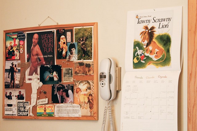
I did learn to take lighting and exposure into account when choosing a color though. And I now know the tedium of painting (and painting over) stripes. I so wish I had photos of the whole fiasco. I did find this picture from our kitchen, so we can end this post with another example of mid-twenties decorating brilliance. Brandon was big into David Cross, Dan the Automator, and Evil Dead (still is), and I’m guessing I was behind the Little Golden Books calendar.



Kirsten
January 13, 2016 at 3:00 pmOh man! I wish you had pictures of that beauty.
The lessons we learn :)
Mary
January 13, 2016 at 3:03 pmBeen there, done that! I cringe when I think about how I decorated years ago. But it’s brought me to where I am. How else would I have learned what works & what I like?
Making it Lovely
January 14, 2016 at 1:12 pmExactly. And paint is easy enough to fix, anyway.
Kate
January 13, 2016 at 4:14 pmMaybe you’ve mentioned it before but what shade of purple was that in your living room – any guesses or do you remember? Even a brand tip? I totally love it! (And also I wanted a light green bedroom once. It looked like the whole room was sick by the time it went up. So next I painted it tan, which was equally awful but in a more depressing way, so then it went to blue. NAVY TO THE RESCUE!)
Making it Lovely
January 14, 2016 at 1:13 pmYes, I remember exactly what color it was! Pale Purple, Pittsburgh Paints. It’s a really great shade — not too vibrant or juvenile, just pretty.
Sarah @ 702 Park Project
January 15, 2016 at 9:02 amA friend of mine recently bought a house that had thick horizontal stripes in light pink and hot pink in the dining room. It looked like a Victoria’s Secret bag! Like your room, that room gets a ton of natural light, and the white built ins ended up looking pink. It took forever to paint over and get the room back to a light gray!
Lesley
January 15, 2016 at 1:38 pmI was thrilled when my two teenagers wanted to paint their bedrooms pink, it looks so great with bright white trim. What I failed to realize was how the east-facing windows absolutely dumped light into those rooms, and each morning it was as if the house was ablaze! They loved it for awhile but we all got tired of squinting. I repainted one room a pale lavender, which I totally recommend. The other room went to a robin’s egg blue with gray bedding. I thought I would leave the closet interiors until later and, 2 years on, I still haven’t gone in there to fix it. Did I mention this is a rental? Sample boards would have helped. Lessons BRIGHTLY learned!!!
Can I also say I just love #9 and while it’s certainly a work of art, it’s also a staggering sum for a single light source. Love to know who buys that.
Kate
January 15, 2016 at 3:48 pmUgh I know the pain of painting over ‘interesting’ paint choices – we moved into our first house in 2005 and it had huge circles in one of the bedrooms. It took 3 coats of base white and 2 coats of the new colour to eradicate those circles!!! :)
Emily
January 20, 2016 at 12:06 pmA couple years out of college, my then-boyfriend and I bought a house. It had a huge master bedroom and we painted dark navy stripes over pale gray on one large wall. Even as we painted, though I found it beautiful, I was thinking about how much of a pain it would be to paint over in the future. When we split up and he kept the house, the thought of him having to paint over those stripes gave me quiet pleasure.
In the Pink – Making it Lovely
October 10, 2016 at 2:53 pm[…] The entryway and my home office in our apartment (before this blog existed). The basement, my former studio, Eleanor’s old room, my home office, and the living room in our first house — all shades of pink at various times. The library and dining room here. I even went for hot pink once, with disastrous results. […]