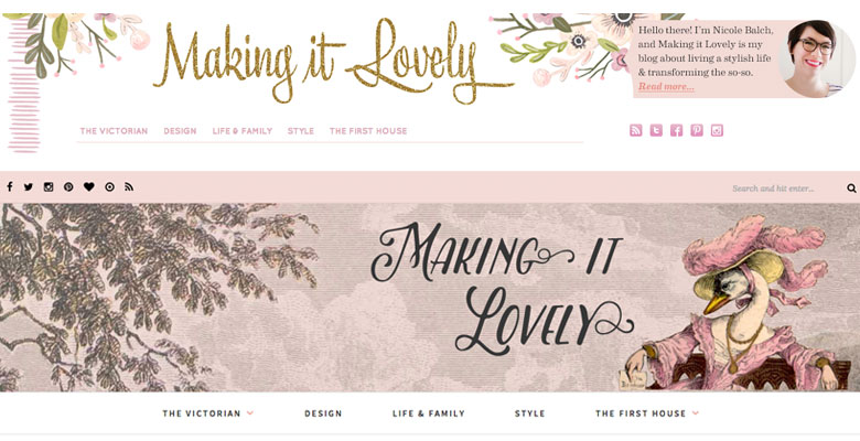
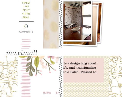
The watercolor flowers in the header have given way to etched clouds and flowering branches. The glittery script is gone, replaced by a storybook title. I had designed the previous blog theme in 2012 (!) and it was a perfect representation of where I was at in the old house, but the direction I’ve been heading in with this house is a bit different and the site needed to reflect that.
The redesign is everything I’m into these days. It’s the wallpaper patterns I love (“lush, mysterious, and just a bit sinister”). It’s a reference to motherhood by way of a few of my favorite illustrated children’s books — the wonderment of Alice in Wonderland, the sincerity of Charlotte’s Web, and the absurdity of Where the Sidewalk Ends. It’s anthropomorphic animals in fancy dress. It’s the house’s Victorian modern, and of course it is pink.
![]()

![]()
I’m terrified of birds, so naturally I had to include the swan in the header when I came across her. The illustration is from a book that predates my 1891 Victorian by more than twenty years, Les Métamorphoses du Jour by J. J. Grandville. It’s rather pretty and feminine, but at the same time, absolutely frightening. I’ve collaged her in front of an etching several decades older of clouds and flowering branches that I’ve tinted pink. We’ll see how long she stays since she has nothing to do with anything else, but you do have to admit that she is doing her best to make it lovely! I am that swan. We are all the swan. Deep.
![]()

![]()
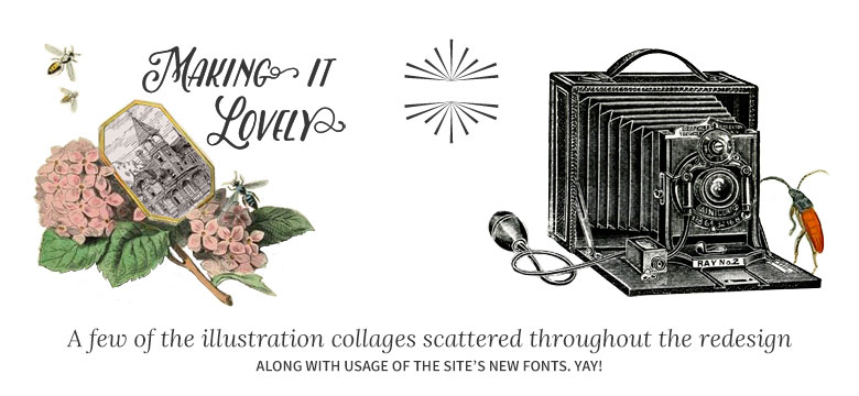
There are other illustrations I’ve altered and added throughout that I love to pieces. Oh, and the site is responsive and mobile-friendly with wider images, improved navigation, and a better focus on content too. (I say that like it’s no big deal, but it’s a big deal.)
I began creating the new design on the Genesis framework, but it’s just not for me. I don’t want to relearn WordPress with hooks — let me dive into the code directly and muck about with the PHP and CSS. I found Solo Pine’s themes to be a great foundation to build upon, and what you’re seeing is a customized version of Oleander. The serif font is Lora and the sans-serif is Source Sans Pro.
There are several features that I may experiment with — a featured posts slider, promo boxes, and additional space in the footer. I’ll also be tinkering with any issues that come up during the switch. My old theme had been altered a great deal as I made changes and additions over the years, and I’ll want to reincorporate any of the old div classes I may have missed. Please do let me know if you encounter any errors so I can be sure the blog is working well for everyone across various operating systems.
This new redesign has been a long time due, and a long time in the making. I hope you like it as much as I do! Thank you so much to all of you for reading, and I’d love to hear what you think.


Eppu
February 15, 2016 at 12:58 pmLooking good on my devices!
Andrea Jane
February 15, 2016 at 1:17 pmIt is lovely and I adore the swan. My only teeny tiny little quibble is the font is really small on my my laptop (but fine on my Android phone).
Making it Lovely
February 15, 2016 at 1:19 pmThanks! If it seems small to others, I can increase the size a bit.
AshleyM
February 15, 2016 at 2:00 pmI agree that the font size is a teensy bit small. Still readable, but would be nice to not have to refocus for tiny font. Site looks great!
Making it Lovely
February 15, 2016 at 2:07 pmI’ve bumped up the type size just a little, so hopefully that helps!
Andrea Jane
February 23, 2016 at 5:26 pmPerfect! Thank you.
Elizabeth
February 15, 2016 at 1:31 pmI really liked your old design, but I think I like this one even better. The swan-in-a-fancy-hat is quite fabulous, and I love the storybook air. (At first I thought the swan was Mother Goose.)
Making it Lovely
February 15, 2016 at 2:09 pmShe does have a Mother Goose quality to her, doesn’t she? I’m still going with swan. ;)
JessiBee
February 15, 2016 at 1:32 pmThe last design was 2012? That is nuts. Where exactly did that time go? I love the new look and the world’s fanciest swan…it’s looking sharp on my machine. Also! What’s up INTP? I’m INTJ! #rationals
Making it Lovely
February 16, 2016 at 10:28 amRationals represent!
Antonina
February 15, 2016 at 1:45 pmAwsome!!!!
I like last one a lot,this one look gorgeous on my Apple :) from top to bottom.
Cristina
February 15, 2016 at 2:02 pmHey Nicole! Awesome redesign! I am digging the type, the colors, everything about it. :) I think the only thing that stands out for me is that because I am viewing it on a 27″ iMac the header image isn’t full width. It’s only 1,970 pixels wide which means anything bigger than that has pink on either side which looks kind of funky. Not sure if that was done on purpose or not. I can send you a screenshot if you like. Other than that it looks great! Well done!
Making it Lovely
February 15, 2016 at 2:08 pmThanks for the heads up. I’m on a 27″ iMac too and can see what you’re talking about. I’ll adjust shortly.
KaseyB
February 15, 2016 at 2:32 pmLooks beautiful on an iPhone 6! I think I’ll start reading directly instead of through feedly. Well done!
Jessica S.
February 15, 2016 at 2:38 pmIt’s certainly a cleaner look! :)
Personally, I find myself gravitating more towards the old look and feel…but, I think my own taste is closer to where yours was back in 2012. (Very mid-century modern, with a touch of whimsy.) However, I think the face-lift totally reflects your evolved taste, along with where you are in life today!
Nice work, chica.
Making it Lovely
February 16, 2016 at 10:27 amYes, definitely more of a mid-century feeling before. But I think it’s a natural progression — the individual elements are still there, and I purposely echoed the flowers/branches for continuity. It feels good to be in the new look. :)
joanna // jojotastic
February 15, 2016 at 2:52 pmgorgeous! way to go :)
Erin (@ErinKwed)
February 15, 2016 at 3:29 pmIt looks fantastic! Very cool that you did it yourself, too.
Making it Lovely
February 16, 2016 at 10:26 amThanks! I used to offer web design and I love doing it, I just don’t have as much time for it these days.
andrea
February 15, 2016 at 5:32 pmI love the new look :)
Leanne
February 15, 2016 at 6:55 pmThe new blog design looks fantastic! Where the sidewalk ends is is probably one of my favorite childhood books, just love it. Great work :)
infinitequery
February 15, 2016 at 7:24 pmNicole- faithful follower since pre-babies but I must admit I have drifted away,I think because as a person I’m endlessly curious about everything I learn and observe in blogs, about human nature,our nesting practices,the lust for granite and stainless and now they are passe and on to the next fashion,
I love the new look and I wish you would show me more of what everyday life is like in your neck of the woods, Take me for walks again in your neighborhood and show me the snow. Tell me about the schools and what you do for fun. Are the children into the library yet-curling up in a comfy chair with their favorite book, Do you have a fire in the evening and make cocoa and cuddle over their story time. You are obviously very talented and creative but I miss the more personal you of the other house. You’re a business woman now but you are a very talented and wonderful Mother,wife and homemaker. I wish you gave us more of that and I almost forgot your artwork,it was very pretty and always interesting. Hope this doesn’t offend,just some of my favorite things about your writing.
Sarah
February 15, 2016 at 8:45 pmI first saw the redesign before you posted about this and I was like, “What in the actual hell”. But now? I love it. You never fail to make me laugh. “I’m terrified of birds, so naturally I had to include the swan in the header when I came across her”. HA. My only anything would be the Read More thing because I’m not a huge fan of the magazine style thing, but other than that it looks awesome.
Making it Lovely
February 16, 2016 at 10:35 amExactly the reaction I was going for, ha! And the ‘read more’ thing, I know not everybody likes it. It’s wonderful for mobile and tablet readers though, which is nearly half of my audience. I kept the first post in full format, but then with the others shortened, I’m able to fit more posts per page while still making it easy to scroll through to the bottom.
chrustinalynn
February 15, 2016 at 8:54 pmI love Solo Pine so very much!! I’ve been mulling over their Florence theme until they released Oleander and now I just can’t decide. I was seriously just looking at that theme tonight. LOVE the new design & how it reflects where you are now, Nicole. : )
Making it Lovely
February 16, 2016 at 10:37 amFlorence is a great theme too. I felt like there was more flexibility with this one and I liked the integration of WooCommerce (even though I have no plans as of yet to use it, it’s nice that it’s an option).
Orlee
February 15, 2016 at 9:32 pmThis is super pretty! Love!
Kelsey
February 15, 2016 at 9:51 pmI love the theme so much! It’s gorgeous :)
Cassidy
February 16, 2016 at 12:31 amWere you working on this around the same time you posted about the Smashing Pumpkins album cover?
Making it Lovely
February 16, 2016 at 10:33 amThat’s a big yes. How did I forget to mention that in my inspiration? When that album came out, I spent hours drawing the art from the liner notes, and so to pull from that again all these years later feels like things have come full circle. The decoupage Victorian elements incorporated in a somewhat bizarre way… it’s all here.
Ari Baker
February 16, 2016 at 3:37 amI love it, it’s gorgeous!
Eileen
February 16, 2016 at 5:34 amGorgeous! Love the swan.
Juliet
February 16, 2016 at 5:44 amI really think you missed the mark with the font that you used. This feels old and looks like something my Grandma would have designed 15 years ago after she first got the internet. You can do better and should do better. This inspires nothing and actually is creepy as all get out. I don’t get a Victorian vibe, i get a morbidity vibe and am sure i am not alone.
Making it Lovely
February 16, 2016 at 10:41 amMaybe I would like your grandmother? I welcome the morbid vibe though — I used insects to that end (and I’m quite proud of the “shutterbug” — I made him to go on my photos page). The pink and flowers can get a little cloying without something to cut all the sweetness.
Celeste
February 16, 2016 at 5:10 pmI’ll be honest… I had a similar reaction at first but the more I play around on it, the more I like it. I feel like this is an extension of your current home.
And, two thumbs way up for doing it yourself! I remember talking to my friend Melissa Esplin about your 2012 redesign and how you coded it. We were both super impressed/jealous and it inspired me to learn some code! Not capable of this at all, but some basic HTML/CSS with cheat sheets. ha.
Consider me converted to this redesign! I’d love to see how it corresponds with stationery/business cards.
erin @ thh
February 16, 2016 at 7:40 amOh, I love it! Has it really been four years since the last redesign? Wow!
Janis
February 16, 2016 at 10:19 amEnjoying the new platform on my ipad this AM. Start reading Bbeatrix Poter to the kids. Delightfuly misbehaving creatures!
Elena
February 16, 2016 at 10:42 amI like it a lot. Love the new feel. Only thing I would change is to make the “IT” lowercase. At first glance it looks like two “I’s” (II). Other than that, the swan is exquisite and so is everything else. :-)
Making it Lovely
February 16, 2016 at 10:45 amNow that you say it, I see it. I’ll adjust!
Making it Lovely
February 16, 2016 at 11:35 amI played around with it, and I love it even more now.
Elena
February 16, 2016 at 4:12 pmGoing bigger on the T worked! I like it too!
silver bells
February 16, 2016 at 10:55 amAll I can think of is Mother Goose.
kategarwood
February 16, 2016 at 12:46 pmI love it! i too thought Mother Goose but I like that!!!
http://k-g.us/
Amy
February 16, 2016 at 5:39 pmOoh! Big changes. Change is good!
http://www.lifewithleroy.blogspot.com
Kayla aka I Am Kilo Bravo
February 17, 2016 at 11:43 amI dig it! Change is always hard at first – I’ve done a double take the past two mornings – but I like the new direction while still staying true to you!
Vanessa
February 18, 2016 at 2:57 amLove the redesign! I can’t believe it’s been 2012 since your last one — it still looked fresh. Oh, and I’m a big fan of Solo Pine. (I’m also using Oleander on my site, and I love it.)
Erica Smith
February 18, 2016 at 11:46 amLove it! Gorgeous!
janis
February 18, 2016 at 8:58 pmNicole, you were the first blog I ever read way back in 2007!! And I have adored following you every step of the way. Love the new redesign and seeing how your style has evolved. Always amazed by your creativity, hard work and how you’ve managed to do this as a mom of 3! Bravo!
Suzanne
February 19, 2016 at 2:46 pmLongtime reader, infrequent commenter popping in. The re-design is delightful and the swan is a whimsical touch! Great work, Nicole!
Nuri
February 20, 2016 at 3:19 pmAnother longtime reader here. Excellent job. I’ve kept up via rss for awhile now and when I have clicked, I haven’t scrolled to the bottom so I’m just now noticing your awesome IG display. You may have had it in your last design; apologies if I’m super late. But I was just wondering if you mind sharing what plugin you used for it?
Jody
February 21, 2016 at 3:46 pmLove it!
Meet the Beetles – Making it Lovely
March 3, 2016 at 2:30 pm[…] you enjoying the swan in the redesigned blog’s header? Because it was either her or a giant beetle. (Basically, what I’m saying is that things […]