
This post is sponsored by Dutch Boy Paint.
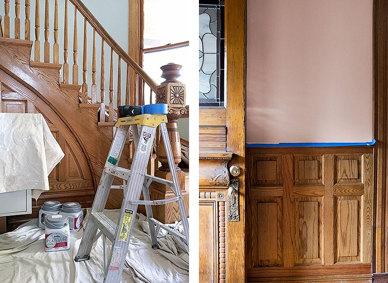
We took on several spaces for the latest round of the One Room Challenge. The work spanned all three floors of our Victorian from the front entry, up the stairs, down the second and third floor hallways, and then back down the other set of stairs and out to the back door. Dutch Boy Paint provided all of the paint we needed, and as you might imagine, there was a wee bit of painting involved.
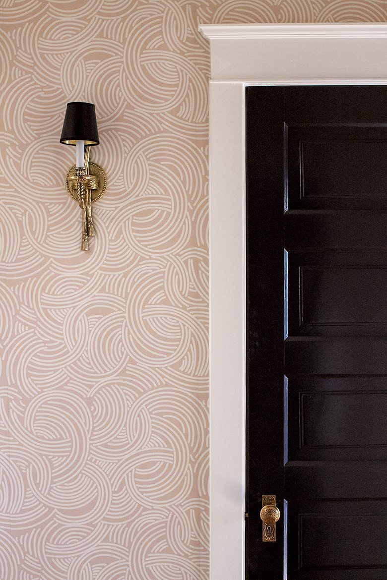
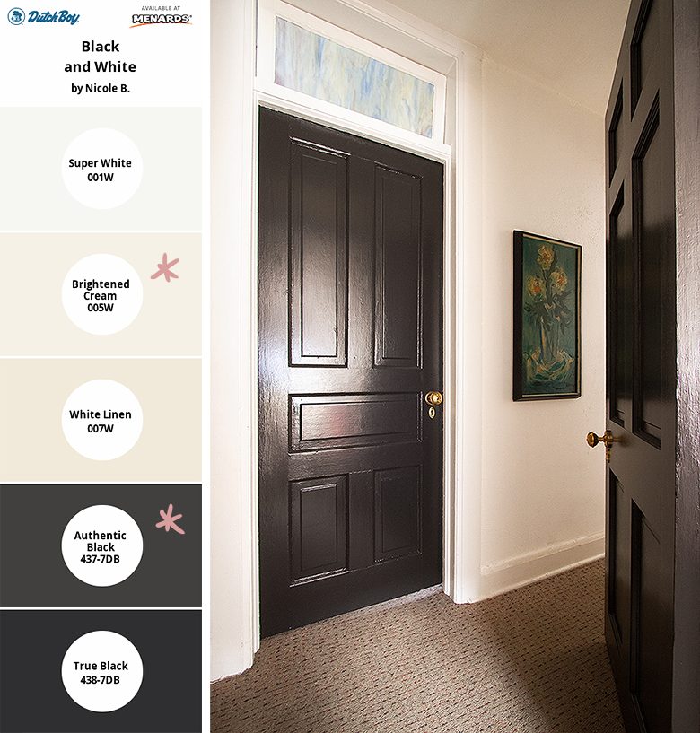
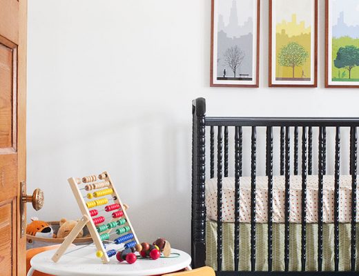
I wanted each space to have its own identity, but the entries and pass-through areas touch every single room, so there still had to be a sense of continuity and a color palette that would work well throughout the whole house. I knew I wanted black doors and white trim upstairs, so that was an obvious place to start. Here’s a tip — you don’t necessarily want to use the darkest, most true black or the brightest, purest white. The contrast may be too stark and you’ll likely get a better result with a creamier white and a less severe black.
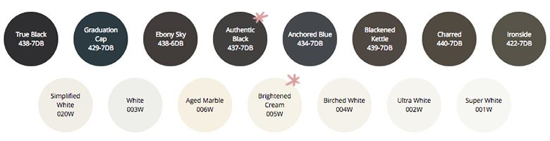
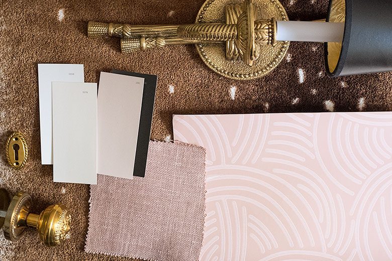
Here’s how the colors I chose (Authentic Black, 437-7DB, and Brightened Cream, 005W) compare to similar shades.
I played around with the colors using Dutch Boy’s Simply Yours Tool. I started with the most extreme black and white, then brought my choices in and added a creamy white (White Linen, 007W) to be used on the stairway walls.
Next, I turned my attention to the front entry color, which I knew would be a shade of pink. I was looking for a pink that was strong enough to stand up to our unpainted oak, muted (not too bright or saturated), and on the peachy/coral side or with a beige/brown base. I’ve starred some of my favorites below, and again, I played around with those in the Simply Yours Tool, then picked up some paint chips to help make my final decision.
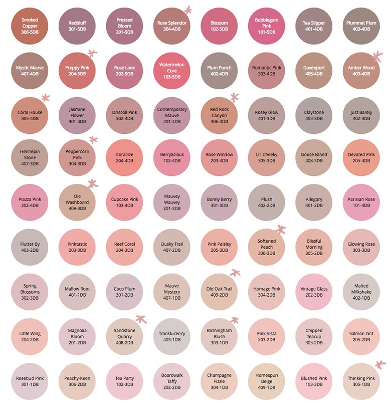
There were four strong contenders: Amber Wood (409-4DB), Ole Washboard (409-3DB), Old Oak Trail (409-2DB), and Sandstone Quarry (408-2DB). Each of the four would have looked great with the wood in our front entry, but Sandstone Quarry also worked well with the wallpaper for the second floor hall and the two spaces connect at the top of the stairs.
There were several surfaces to paint, each with their own specific requirements. Below is a breakdown of the products, finishes, and colors used throughout. You can find Dutch Boy Paint at your local Menards store.
Walls and Ceilings
- Dutch Boy Platinum® Paint + Primer (Flat)
- Brightened Cream, 005W (2nd and 3rd floor ceilings, 3rd floor walls)
White Linen, 007W (1st floor ceiling, front and back stairway walls)
Sandstone Quarry, 408-2DB (front entry walls) - Most people will choose a flat finish for ceilings, but it’s also my preferred finish for walls. I like a matte look.
Trim and Baseboards
- Dutch Boy Dura Clean Cabinet, Door, & Trim
- Brightened Cream, 005W
- A durable choice for the woodwork in a great shade of white.
Doors
- Dutch Boy Dura Clean Cabinet, Door, & Trim
- Authentic Black, 437-7DB
- A glossy black finish sets the doors apart and will offer protection against daily wear.
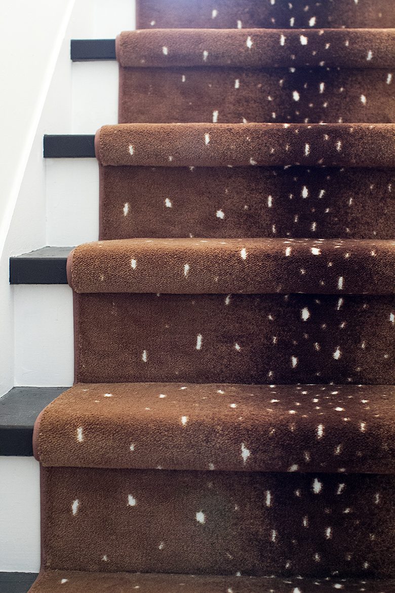
Stair Treads and Risers
- Dutch Boy Platinum® Porch & Floor Paint + Primer (Satin)
- Brightened Cream, 005W
Authentic Black, 437-7DB - Black and white stairs are classic, and using the same colors as the doors and trim ties them all together.
Once I had made all of my color decisions, I paired them up together with the Simply Yours Tool one last time. I referenced it while creating design boards and choosing fabrics, furnishings, and accessories. The brown (Olde Metal, 414-7DB) is there to represent the stair runner I had chosen, but I do like the idea of it as a wall color. (Brown is back, I’m telling you.)

If you want to try your hand at creating a color palette, you can do so right here with Dutch Boy’s Simply Yours Tool. Give it a go, and you could win a color consultation or Dutch Boy Paint prize pack (but hurry, the contest ends on 11/24)! You can also like Dutch Boy Paint on Facebook for more inspiration.


Amelia
November 21, 2016 at 11:27 amJust curious – How does the new pink play with the pink in the library? That one is much cooler, yes?
Making it Lovely
November 25, 2016 at 10:59 amNo, I suppose I should have mentioned that! The reason I wanted a coral/peach or beige/brown pink was so that it would work with the library color (which is a pale peachy pink). The dining room is also a similar beige pink and all three rooms flow together nicely, but the plan is to wallpaper that room eventually.
Julie
November 25, 2016 at 2:50 amThanks for sharing the list of paint color – somtimes the categories can not display the real color in wall when you paint it. I have experienced some bad memories because of the difference in color.